Special Cases
In this section, we'll talk about several accessibility issues that you may not have considered before. These special cases are easily resolved once you know the requirements and how to meet them.
Never Depend on Color Alone
If you present information using only color, a person who cannot distinguish color will not have access to that information.
The Section 508 standard concerning this problem states:
§1194.22 (c)
Web pages shall be designed so that all information conveyed with color is also available without color, for example from context or markup.
Color is useful in conveying important information. But when you use only color, by saying for example, "Please click the green button," you are excluding those people in your audience who cannot decipher color alone. Instead, you should put text (e.g., "OK") on the button and say, "Please click the green OK button."
An article on how color blindness affects vision included this example. Imagine that you were faced with the following:

Click the Green button to continue,
the Yellow button if you need help,
or the Red button if you want to quit.
Looks easy, right? But what if you instead saw:

or

or

These are actual examples of how various forms of color blindness affect vision.
Here is an example of a fairly common mistake; an actual customer survey form modified from one on a major commercial site that indicates required fields in red.
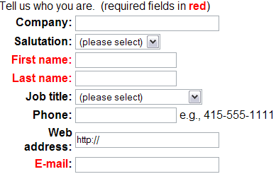
A form using color only
The form is easily modified to be accessible by adding a second indication of a required field. In this case, asterisks are used.
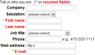
The same form with additional indication
Also see: http://www.taxslayer.com/.
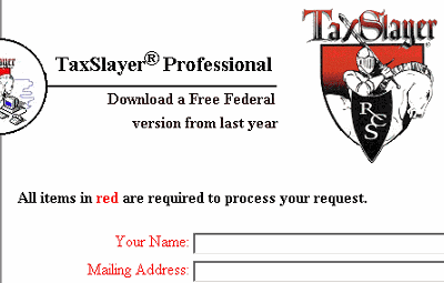
Figure 7.3: Taxslayer.com uses color only for information
When we requested permission to use the screenshot, TaxSlayer.com made a simple change so that the information is conveyed both in color and with text.
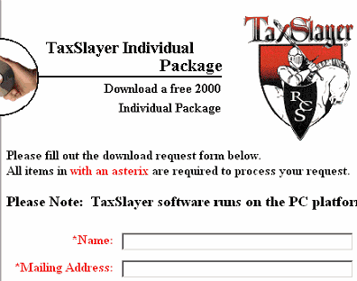
TaxSlayer.com with additional indication
When color is used to convey important information, also use context and markup to convey the same information. For example, "Books that are available appear in green and in bold font."
Color Contrast
In addition to the problem of using color alone, you need to be cognizant of the combinations of foreground and background colors you use. If the foreground and background are too close to the same hue, they may not provide sufficient contrast for people with different types of color deficits or for people who are using monochrome displays. The easiest way to avoid this problem is to choose highly contrastive colors for the foreground and background.
The current Section 508 Web Accessibility Standards do not have a requirement relating to color contrast, however the revised 508 standards under consideration in the summer of 2007 do.
Presentation of text (and images of text) in electronic documents must have a default contrast ratio of at least 5:1, except if the text is pure decoration. Large-scale text (or images of large-scale text) can allow a contrast ratio of at least 3:1.
That may sound ominous, what is the contrast ratio? You can find such a definition in the Web Content Accessibility Guidelines working document (http://www.w3.org/TR/WCAG20/#contrast-ratiodef), or you can use the the Web Accessibility Toolbar, Colour -> Contrast Analyser[application] to find the contrast settings on your web page. The following screenshot shows how this tool is used.
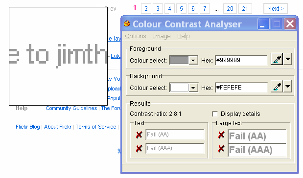
Contrast analysis
Using the mouse one can point to foreground and background colors and then the tool calculates the contrast ratio for you. In the example in the screenshot above, the light gray text on a white background at the bottom of a Flickr.com page does not have adequate contrast, in this example the contrast ratio is 2.8 to 1. It should be at least 5 to 1 for normal text, and 3 to 1 for large (bold) text.
Avoid Flicker
Often people find animation distracting and confusing. However, individuals can turn off animations in Internet Explorer using Tools / Internet Options / Advanced, and there scroll down to Multimedia and uncheck Play animations. Using Netscape Navigator or Microsoft Internet Explorer, you can stop animated gifs with the Stop button on the tool bar or the Escape key.
People with photosensitive epilepsy can have seizures triggered by flickering or flashing in the 4 to 59 flashes per second (Hertz) range with a peak sensitivity at 20 flashes per second as well as quick changes from dark to light (like strobe lights). This concern caused the Access Board to include the following standard:
§ 1194.22 (j)
Pages shall be designed to avoid causing the screen to flicker with a frequency greater than 2 Hz and lower than 55 Hz.
Other areas not specifically covered by this standard are movement, blinking, scrolling, and auto-updating objects or pages.
Some people with cognitive or visual disabilities are unable to read moving text quickly enough or at all. Movement can also cause such a distraction that the rest of the page becomes unreadable for people with cognitive disabilities. Screen readers are unable to read moving text. People with physical disabilities might not be able to move quickly or accurately enough to interact with moving objects.
Animated images can be a nuisance to many people so you must ask yourself is there anything to be gained in having them in your Web site.
You should:
- Ensure that the user can pause or stop any moving, blinking, scrolling, or auto-updating objects or pages. If you must have movement on the page, use style sheets with scripting to create the effect you want. This allows users to turn off or override it more easily.
- Do not use the
blinkormarqueeelements.
Timed Responses
Accessibility problems can occur if your Web page times-out while a user is completing a form. For security reasons or to reduce the demands on the server, you may be tempted to design pages with scripts so that they disappear or "expire" if a response is not received within a specified amount of time.
A person with a disability may not be able to read, move around, or fill in a Web form within the prescribed amount of time. For this reason, the Access Board included the following standard:
§ 1194.22 (p)
When a timed response is required, the user shall be alerted and given sufficient time to indicate more time is required.
This is actually a performance standard rather than a design standard because it does not reference a specified length of time for users to respond. To satisfy this requirement, the actions you should take are twofold:
- Notify the user if a process is about to time-out.
- Provide a prompt asking whether additional time is needed.
The most frequent instance of situations like this is when, for security or other reasons, access to a system needs to close after a period of inactivity. Examples are access to your bank account or to email on the web. If you have such a system you should add an alert before terminating the access saying that it is going to end and offering more time. If the user responds within, say, 20 seconds, then you should “restart the clock.” If they don’t respond within 20 seconds then you should close the alert and terminate the sesson. A new page should be opened saying that access has been terminated. I think that that would clearly satisfy the most stringent interpretation of §1194.22(p). Check out Success Criterion 2.2.1 of the new WCAG 2.0 guidelines. It gives much more detail about what is needed regarding timed responses. When the Section 508 provisions are refreshed in the near future the refresh will probably contain wording like that.
Text-Only Page as a Last Resort
This last special case was included in the Section 508 Standards as a "last resort method for bringing a Web site into compliance with the other requirements in §1194.22."
§ 1194.22 (k)
A text-only page, with equivalent information or functionality, shall be provided to make a Web site comply with the provisions of this part, when compliance cannot be accomplished in any other way. The content of the text-only page shall be updated whenever the primary page changes.
If you must resort to providing a text-only alternative page, you must ensure the following:
- Provide a clear link to the alternative page.
- Ensure that the alternative page is accessible.
- Ensure that the alternative page has equivalent information or functionality.
- Update the alternative page as often as you update the original page.
Note: Alternative pages are generally updated less often than "primary" pages. An out-of-date page may be as frustrating as one that is inaccessible because, in both cases, the information presented on the original page is unavailable. Automatically generating alternative pages may lead to more frequent updates, but you must still ensure that generated pages make sense, and that users are able to navigate a site by following links on primary pages, alternative pages, or both. Before resorting to an alternative page, reconsider the design of the original page; making it accessible is likely to improve it for all users.
Several sites are adopting an automatic generation of text-only sites using a tool called "Betsie" which stands for BBC Education Text to Speech Internet Enhancer (http://www.bbc.co.uk/education/betsie/).
According to the Betsie site:
"Betsie makes various changes in the HTML code of the page - removing all the images and the unnecessary formatting, so that what you get sent is the text content of the page, unmolested and at the top, with all the links on the BBC Navigation Bar moved to the bottom, so they aren't the first thing you have to deal with every time."
The results of the Betsie transformation are very similar to what a user sees of the site with IBM Home Page Reader.
The Betsie script is available for downloading at: http://www.bbc.co.uk/education/betsie/index.html.
It is rarely the case that a page cannot be made accessible, so that the hypothesis of §1194.22(k) (when compliance cannot be accomplished in any other way) is not met - providing so called "text-only" alternatives is rarely justified bythe 508 standards. Further more, the transformations used by Betsie require that the page be accessible anyway, for example, having alt-text on images and labels on forms.
There is one commercial offering for creating text only versions, and that is from Usable Net (http://transcoder.usablenet.com/tt). At this writing, you can see what the transcoder does at the National Science foundation web site (http://nsf.gov). They offer a link to the transcoded version of the site as alt-text on an invisible image at the top of the page http://transcoder.usablenet.com/tt/nsf.gov/.
Summary
To comply with the Section 508 Standards in the cases that we've talked about here, you must:
- Indicate important information with more than color alone.
- Avoid flicker, moving, blinking, scrolling, or auto-updating objects or pages.
- Give notice of any time-out situation and allow the user to take extra time.
- Provide a text-only page if you exhaust your options for making your web page accessible.
If you have comments or questions on the content of this course, please contact Jim Thatcher.
This course was originally written for the Information Technology Technical Assistance and Training Center, funded in support of Section 508 by NIDRR and GSA at Georgia Institute of Technology, Center for Rehabilitation Technology. The course has been completely revised.