Accessible Navigation
In this section we will discuss navigation of web pages, navigation within a page which is something sighted users don't usually think about, and navigation from page to page.
Accessible In-page Navigation
As you use the Web, it may not occur to you how important your vision is for navigation, not through the site, but within the current page. If you can see the page, then the chances are that without reading any words at all on the page it is pretty easy to quickly scan it and see the area that could be called "main content." Once you see that "main content" area you can zoom in and read the information you're looking for or click on the link you are interested in.
For users who are blind, scanning for "main content" is not a possibility. Because they cannot zero in on the main story, blind users rely on their screen reader to speak the page, link at a time, advertisement at a time, item by item until they find what may be the main content area - which was the reason they came to the page in the first place.
There are lots of people with physical disabilities that are not able to usa a mouse. For those folks, navigation within the page is as challenging as for those who are blind (who also don't use a pointing device). A keyboard user may clearly see the "main content" - and a link in there she/he wants to follow. That may require extreme patience tabbing through dozens, even hundreds of links to get at the desired target. Even the details of the process are daunting as sometimes the current focus is difficult to see.
When this course was first written I spent a lot of time talking about how tables were linearized and spoken by screen readers. I talked about how you could actually improve in-page navigation just by changing the structure of the layout tables - so that the main content actually come first, for example. But technology has changed and assistive technology has improved. There are important new screen reader functions that contribute to a solution of this in-page navigation problem.
Lets look at how Section 508 deals with In-page navigation.
The 508 Requirements for in-page Navigation
The Access Board, following the recommendations of the Electronic and Information Technology Access Advisory Committee (EITAAC), includes a provision for skipping over all the site navigation links and jumping to the main content:
Paragraph 1194.22 (o)
A method shall be provided that permits users to skip repetitive navigation links.
The following is the comment about paragraph 1944.22 (o) included in the earlier proposed standards.
It is common for Web authors to place navigation links at the top, bottom, or side of every new page. This technique can render use of a Web site very difficult for persons using a screen reader because screen readers move through pages by reading from top to bottom. The use of repetitive navigation links forces persons with visual impairments to re-read these links when moving to each new page. This provision allows the user to more efficiently read the contents of a page.
The standard refers to "repetitive navigation links" because most commercial web sites are built with a template and the navigation parts of that template are repeated page after page. It used to be that the best way of satisfying this provision was to include a skip navigation link at the top of the page.
Skipping To Main Content
The CNN.com site is an incredible example of how difficult it is to find the main content. When the screenshot below was taken, CNN.com had literally hundreds of navigation links at the top of the page and down the left and right sides with the lead story in the middle.

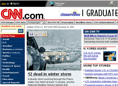
Screen shot of CNN.com in 2002
I listened with IBM Home Page Reader for over five minutes before coming to that "lead" story. The table structure of this page was such that even the navigation column on the right was read before the main content. That has changed with the current CNN site - we will look at the new CNN design below.
I am picking on CNN and in doing so I have a purpose! In fact CNN provided a "skip to main content" link at the top of the page which was not visible under normal circumstances. The target of the link is an anchor just above the main content. The link in the CNN case was attached to a one-pixel image and had no effect on the visual presentation. The following screenshot is taken with images turned off in Internet Explorer; the skip navigation link shows at the top right of the image.
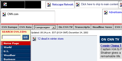
CNN.com skip navigation link
The skip navigation link code looks approximately like this:
<a href="#Main">
	<img alt="Click here to Skip to main content" src="1.gif" width="1">
</a>
	... Search form, select menus, left navigation
	... Right navigation content
<a name="Main"></a>
	... Main content
The alt-text on the image includes the redundant and cluttering text, "Click here to" which is an annoying but relatively minor problem. The simple anchor defining "Main" is just above the main content. Note that the anchor itself has no content. The advantage of this method, independent of that fact that it doesn't alter the visual appearance, is that it can be included in the template of the site, reducing to zero the continuing cost of implementing this crucial accessibility feature.
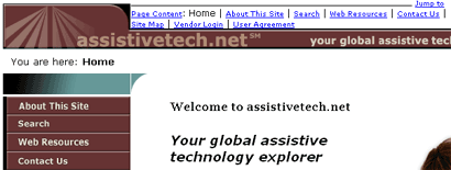
The web site of the American Council of the Blind was the first to use "skip navigation". Theirs is just small text (<font size="-2">), "Skip Navigation links" at the very top of the page.
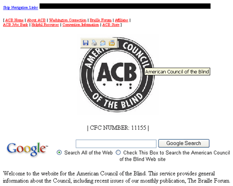
Screen shot - American Council of the Blind
The target of the ACB skip link is immediately after the "navigation link" (ACB Store). Technically this conforms exactly to the Section 508 requirement, a method to skip over the links. But that decision means that the alt-text on the image is read (American Council of the Blind), followed by "CFC NUMBER 11155". A blind visitor would already have the title of the page, so the alt-text on the logo is redundant. Also, I have no idea what the following text means - CFC NUMBER 11155. (Added 3/2010: Sarah, a library science student, pointed out: "'CFC Number 11155' is the code used to distinguish a charity in the Combined Federal Campaign. The Combined Federal Campaign is a Federal Government-wide sanctioned charitable giving campaign. You can go to this website for more information http://www.cfcnca.org/. The CFC is similar to the United Way campaign." Thanks, Sarah.) For these reasons, I would have placed the target of the skip link just above the search field, and maybe even just above the welcome message.
Another technique for skipping to the main content is to use normal text with the background and foreground colors set to be the same. Under usual conditions, this text will be invisible. An example was found on the Georgia Institute of Technology, Center for Rehabilitation Technology site for exploring assistive technology.
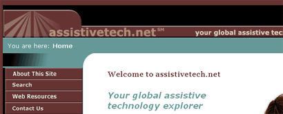
Screen shot - Georgia Tech - CRT
Here is what the code looks like on the CRT site:
<td bgcolor="#000000" >...
	<a href="#Content">
		<font color="#000000">Jump to Page Content</font>
	</a>
As described in Section 3, you can tell your browser to ignore colors specified by the Web page. If you ignore Web page-specified colors, the "jump to page content" link appears at the top of the page, along with, by the way, several other links as the following screenshot shows.
CRT - Web author's colors ignored
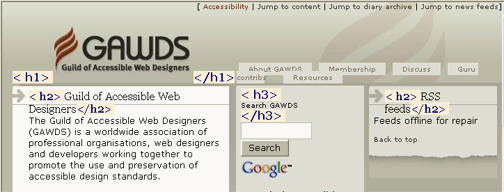
Sometimes sites include visible skip links for everyone to use. This is illustrated on the Guild of Accessible Web Designers (GAWDS) site.
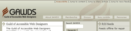
Screen shot of GAWDS home page
The screenshot shows that there are four links at the top of the GAWDS page. The first (Accessibility) goes to a page that discusses the accessibility features of the site. The three links that follow provide jumps to parts of the page; to the "main content" which is at the top left, the "diary archive" which is not visible in the screenshot and the news feeds offering on the top right.
My site (https://jimthatcher.com) has a skip link at the top of the page that is positioned off screen. The skip link becomes visible only when it receives focus as the screenshot below suggests.
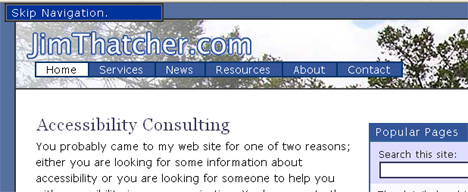
Screen shot of JimThatcher.com showing skip link with focus
The styling for my hidden links (class "skip") is the following
.skip a {
		display: inline;
		position: absolute; width: 14em; left: -200em
		text-decoration:none; }
.skip a:focus {
		position: absolute; left: 0.5em;
		border: solid #333 2px; color: #fff; background: #555}
Notice that the anchor (a) element without focus is positioned at left:-200em. It is off
the screen to the left. When the anchor gets focus, then that left position is changed to .5em (positive) and it is then
displayed at the top left of the screen as it is in the screenshot above. A natural question to ask is why not have the
anchor styled with display:none,
and then change the style to display:inline when the anchor receives focus? That would work for keyboard
users as well as the proposal here. But when the text of the link is positioned off screen as coded here it will be read
by a screen reader in source code order. A blind user can hear the link at the top of the page, and
act on it without even pressing the Tab key to give it focus. However screen readers respect display:none interpreting
it to mean don't display in any medium including speech. So if you used display:none screen reader users
could access the link only by giving it focus.
The code for my skip link is not unusual (it is a list element because there are actually two skip links, the second one jumping to the navigation area on the right.
<li class="skip">
		<a href="#content" id="skpnav">Skip Navigation.</a>
</li>
There is nothing unusual there. But the code for the target of the link, the anchor with name="content" is
unusual so I want to explain that in detail.
In-page links and and Internet Explorer problem
The target of the skip link on my web site used to look like this:
<table>
		<tr><td><a name="content" id="content"></a></td></tr>
</table>
"Why a table?" you should ask. The answer is that there is a bug in Internet Explorer that causes in-page links to not work from the keyboard. But when the target of any in-page link is placed at the top of a table cell, it will work correctly from the keyboard with Internet Explore. By the way , these in-page links work correctly in the other browsers. What does work correctly mean? This description seems to be daunting for many web developers who are so focused on and dependent on the mouse. Here is how to test any in-page link:
- Hide the mouse so you don't mess up this experiment.
- Use the Tab key to move to the in-page link that is to be tested.
- Press Enter. That will (probably) reposition the visual focus on the page so that the target of the in-page link is at the top of the visual window (if there is enough of a page to reposition).
- Now, and this is the key, press Tab again. This time, the Tab key should move to the first link below the target of the in-page link. Often, this is not what happens; instead, this Tab key press puts focus on the first link of the page, or generally some other unwanted place.
If you follow these steps with Netscape, Mozilla Firefox, or Opera (substitute the A key for the Tab key in Opera), everything will work as you would hope and expect. This is not so with Internet Explorer.
For table-based sites
like CNN and IBM (as of the earlier writing of this course), the skip links usually worked because it
was usually the case that the target of the link was at the top of a table cell (td). For more contemporary
sites like that of the Web Accessibility Initiative (WAI) for
example, the in-page links do not work. Try the WAI homepage.
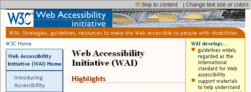
Screen shot of the WAI home page - a skip link at top
There is a visible "Skip to content" link at the top of the page. Tab to that "Skip to Content
"
link and then press Enter. The visual focus will move, putting "W3C Home" at the top of the browser
window. But when you press Tab again,
the input focus is back at the top of the page (actually on the first link which is "Skip to Content."). This
should work. With Firefox, Netscape or Opera, when you tab the second time the first link (W3C
Home)
in the "main content" gets focus. But
it doesn't work with IE, at least up through version 7.
This problem occurs on many sites, and it is not just for skip links. For example, picking on the Web Accessibility Initiative again, their pages often have a simple "table of contents" at the top, a list of links that take you to the various sections of the page as shown in the following screenshot (http://www.w3.org/WAI/eval/preliminary.html).
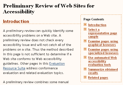
Screen shot of a WAI page with a list of in-page links
If you activate any one of those "contents" links from the keyboard and then Tab again, you will be back at the top of the list of links - in this case, not at the top of the page. But that doesn't make it a lot better because you probably will want to follow another link when you have read one of the sections below. The only way to get there (using the keyboard ) is to tab all the way through all the links on the page.
What is the solution (read "work-around")
for this problem? Through discussions on various mailing lists over several
months in the spring and summer of 2005, the nature of the Internet Explorer 6 (and unfortunately 7)
bug became clearer. In May 2005, Becky Gibson (of IBM) and Mike Scott (of
MSF&W) independently recognized that when targets of in-page links were contained in elements "with width defined
" (whatever
that means), they generally worked from the keyboard. It was Terrence Wood who put
it together with the hasLayout property.
When an in-page link is activated, Internet Explorer 6 places input focus on one of the following:
- The
target if the target is active (a link or an object with
tabindexspecified) - The first ancestor object of
the target, which is a
divorspanwith the propertyhasLayoutequal totrue - A
tdorbodyobject
The fact that table cells are in this
list explains why in-page links usually work in table-based pages. The presence
of body element explains why the input focus after following an in-page link often
goes to the first link on the page.
A Google search for "hasLayout property" will yield a Microsoft MSDN page that describes this property
and methods for setting it to true; setting width
and height is one such method. That same Google search will turn up a number or
articles about in-page links and the Internet Explorer bug.
With that said, here is the work-around that I use to ensure that my in-page links work from the keyboard with Internet Explorer 6 and 7. This is the coding for a typical target corresponding to the skip link above.
<span style="position:absolute;"> <a name="content" id="content"> </a> </span>
The anchor element (a) is not empty, but contains a nonbreaking
space, which is invisible because it is given position:absolute. Without that content of the anchor tag, it
turns out that visual focus doesn't work correctly. The span with position:absolute makes the hasLayout
property true!
These problems all surfaced before the debut of Internet Explorer 7. I had hoped that the Internet Explorer 7 would have this fixed, but it didn't. Fortunately this work-around is not too offensive.
Headings Navigation
I think that the single most important innovation in assistive technology over the past several years is the introduction of headings navigation for screen readers. With the two most popular screen readers (Window-Eyes and JAWS) you can just hit the H key to move from heading to heading - Shift+H to move backwards. When the heading is announced, its level is included, so, for example, the heading for this section would be be spoken as "heading level 2, headings navigation." JAWS also provides navigation by level; the numeric keys (1...5) move through and announce the headings at the corresponding level (1...5).
Now go back to the challenging problem of a blind visitor trying to find the main content on a web page. If that content begins with a heading, then a screen reader user will find it quickly just be using the headings key (H). There are often more sections to web pages, and if a heading begins each section it will be easy for a screen reader user to find the important parts of a page.
A good example of such markup is the Web Accessibility In Mind (WebAIM) Community page. In the screenshot below I have used the Accessibility Toolbar to mark up the headings (Structure -> headings).
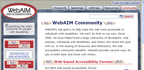
Screen shot of a WebAIM page showing headings markup
The sections of the page are each labeled with text that we would informally call a heading - and in fact, in each
case the text that looks like a heading is marked up as an HTML heading, one h1 and three h2's.
That means that with four key presses a blind user can obtain an outline of the page - well actually there are nine headings
on the page - so nine key presses. But that is easy compared to tabbing though all the links, or listening to the entire
page.
The requirement to use structural markup (headings, lists, blockquotes) on web pages is not part of the 508 requirements, but is part of the Web Content Accessibility Guidelines (WCAG). Both versions 1.0 and 2.0 require that structural markup be used according to specification at the second level - Level AA.
Using structural markup according to specification is the central to accessibility. In particular use blockquote for
quotations, not for indentation, and don't use heading tags for text that is not heading text. Too many heading tags just
reintroduces the in-page navigation problem. An example of inappropriate and very disappointing headings markup is to
be found on my MyYahoo! page - a screenshot of the main content section is shown below.
The groups of stories like
"Reuters: Politics" are level one headings and each story link is an h3.
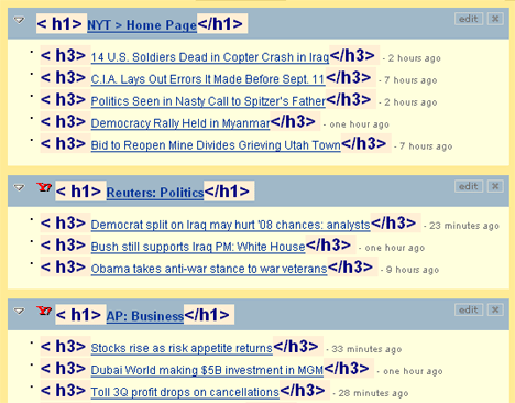
Screen shot of My Yahoo - too many headings
The links for individual stories don't look like "headings" so they shouldn't be marked up that way. More importantly, with the page markup like this, headings navigation is almost as bad as using the Tab key for navigation. It is true that JAWS users can use the 1 key to access the groups of stories, but not so for those visitors with a different screen reader or no screen reader at all.
At the beginning of this section, the CNN home page was a rather startling example of just how difficult it can be for a disable visitor to get to the main story - the main content. CNN has changed there look significantly since we took the screenshot above. Here is what the main story area looks like now - with headings highlighted using the Accessibility toolbar.
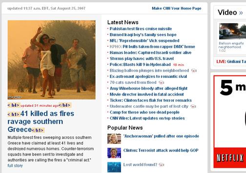
Screen shot of CNN.com with headings highlighted
The main story is a level 1 heading - but that is the end of the good news. The text that gives timing for the picture ("updated 31 minutes ago") is marked up as a level 4 heading. Three other headings are visible in the screenshot, "Latest News," "Popular News," and "Video." These are not marked up as headings. There is no longer a skip to main content link which means that keyboard users not using Opera are out of luck.
In-page Navigation and keyboard users
Speaking of keyboard users, there are lots of people who are not able to use the mouse and yet who can see just fine. These people most likely will not have an expensive screen reader at their disposal to provide this headings navigation function. And the problem is just as serious for them as it is for blind users. Just imagine trying to get to the link that opens the detail on the main story on the CNN page shown above. Even with the new design, it will take a long time to Tab through all the links on the top (not shown in the screenshot) and all the ones down the left to finally get to the link (the actual headline which is not underlined) to the main story.
There is a solution to this problem. The Opera browser is available for free download. Opera includes headings navigation from the keyboard. The S key moves from heading to heading and the W key (above the S key!) moves backwards. If you are not familiar with Opera, you might Tab after you land on a heading, like "Getting Started" in the WebAIM screenshot above, and expect the Tab key to move to the link below (Introduction to web accessibility). It does not work like that. You move through the links with the A key (just to the left of the headings key) and backwards through links with Q (above A).
If you are not using Opera, and if you are not using a screen reader, and if you are not using a mouse, then you are stuck using the Tab key to get around the page. That can be painful and it brings us back to skip navigation links. The Guild of Accessible Web Developers (GAWDS) web site includes the skip links and uses headings as shown in the screenshot below where headings have been highlighted with the Accessibility Toolbar.
Screen shot of gawds.org - skip links and headings
This is the right thing to do! The bottom line is to use headings at the top of each major section of every page and too include visible skip links if possible.
Other Navigation Ideas
We will close out this lesson discussing frames and then the link text.
Creating Quality Frames
Adding skip navigation links is not the only way to satisfy the Access Board Navigation standard on skipping repetitive navigation links. Frames, if correctly implemented, can also provide navigation that is accessible and pleasant for a user who is blind. To create frames that are useful, you must use titles that convey meaning.
If a user knows there are three frames, a banner frame, a navigation frame, and a main content frame, for example, then on entering the site the visitor can go directly to the content frame assuming it is well identified. This is very much like a skip navigation link.
Similarly, if the user prefers to check out some of the navigation links first, that is easy too.
Implementing Frame Titles
For frames to be "correctly implemented," they must meet the following Section 508 provision:
Paragraph 1194.22 (i)
Frames shall be titled with text that facilitates frame identification and navigation.
Frames can be an asset to users of screen readers if the labels on the frames are explicit. Such labels as top, bottom, or left, provide no clue as to what is contained in the frame. Labels such as "navigation bar" or "main content" are meaningful and facilitate frame identification and navigation.
A graphics browser can, in effect, display several pages at the same time by using frames. When a text browser opens a frame site, it can only work with one page at a time. So, text browsers offer a list of frames from which the user can select the one to be explored. If those frames are not meaningfully identified, then the user will not know which way to turn.
The Section 508 standard refers to "titles" of frames. But titles appear in two different ways relating to frame pages. Both of those interpretations are important for accessibility.
First, every page should have a title as given in the title element which is part of head content:
<head> ...
		<title>Test Frame Page</title>...
</head> ...
And for each frame page:
<head> ...
		<title>Navigation Frame</title>...
</head> ...

<head> ...
		<title>Banner Frame</title> ...
</head> ...

<head> ...
		<title>Main Content Frame</title> ...
</head> ...
The second way in which titles are involved is that the frame elements in the main page which point to the individual
frame pages need title (and name) attributes.
The code below illustrates the main page or frameset page of a framed site. There are three frames which
are named (name attribute) "navigation," "banner," and "main" and whose page titles have
been appropriately coded as above. Those names are provided both as the name and the title of
each frame element.
<frameset rows="20,*">
		<frame src="Banner.htm" ... id="banner"
    				name="Banner" title="Banner">
		<frameset cols="150,*">
    		<frame src="Left.htm" ... id="leftnavigation"
     	  			name="Navigation" title="Navigation">
			<frame src="content.htm" ... id="maincontent"
        			name="maincontent" title="Main Content"></frameset>
		</frameset>
</frameset>
When a text browser or a screen reader lists the frames in a site, the text appearing in that list is the title or name attribute of the frame element. Lynx uses the name attribute while IBM Home Page Reader Version 2.5 uses the title attribute. A screen reader is likely to use the title element of the individual frame pages.
The site of the State of Alabama Treasury was a very simple frame site consisting to two frames. (The current site is not a framed site. It has neither headings nor skip links.)

State of Alabama frame site
The left-most frame is a navigation panel while the frame on the right is the main content. Here is the frame list as seen by the Lynx viewer:
FRAME: frame70890
FRAME: frame70888
This Web author did use a name attribute. I am sure that he or she never imagined the names frame70890 and
frame70888 being part of any user interface. And, although the name attribute is not required for the coding
of the frame site, it should be used to properly specify the frame in which pages are to be opened.
If IBM Home Page Reader 2.5 finds no title on the frame element, it will open each frame page
and retrieve the page title and use it in the frame list. Home Page Reader 3.0 did that process by default,
always using the retrieved page title. In the sample Alabama Treasury site, the frame pages do not have titles either,
so no additional information is gleaned this way.
Here is how Home Page Reader interprets this site:
[Frame 1 (frame70890): Untitled]
[Frame 2 (frame70888): Untitled]
Summary for Frames
Assistive technology has not focused in on one method of identifying frames so it is important to provide identification
in more than one way. You should always include meaningful title elements on all your pages. In addition,
place useful title elements on the individual frame pages. Each frame element
in the frameset should have both
meaningful name and title attributes. For example, the title attribute might be "main
content"
while the name attribute could be "maincontent" with the space removed because name attributes
can't have spaces.
Accessible Links
There is not a specific standard for Section 508 regarding the wording of links. But, it makes a big difference for users of assistive technology to have clear link text. Before we look at link text, lets talk about navigation by links.
Link Navigation
Some users of the Web are so mouse-dependent that they may not be aware of the fact that you can tab through all the active elements of a web page. As you do that, a dotted enclosing polygon, called a focus rectangle, moves along with the focus, highlighting the current link. Well this should happen and usually happens, but unfortunately you can style your links so this does not happen! The following screenshot shows an example, which is a piece of the right navigation panel of my current site as seen in Firefox 1.04.
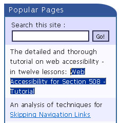
Screen shot showing link with focus.
The link text that currently has focus is
marked with a dotted rectangle, but the foreground and background colors are
also changed by CSS on the site. The text enclosed inside this focus
rectangle is called the link text, which is the
content of the anchor element (a):
<a href="webcourse1.htm">
	  Web Accessibility for Section 508 – Tutorial
</a>
As you navigate around the links of a page with the Tab key (and Shift+Tab to go backwards; A and Q in Opera), you can use the Enter key at any time to activate a link. This action corresponds to clicking the link. If you don't use a mouse and you see the link text, "click here", you interpret that to mean, "use the Tab key to move input focus (the dotted rectangle) to this spot and then press Enter.
When you are listening to a page with a screen reader or talking browser, the link text will be identified in one of a number of ways, but generally screen readers precede the text of a link by saying "link" or "visited link." Home Page Reader has several options for indicating links. With the default settings, Home Page Reader changes to a higher-pitched, so-called "female" voice on a link. Alternatively, you can set Home Page Reader to produce a sound alerting the user as the link is spoken, or you can set it to speak some metatext, (such as "link"), before, or even after, the link.
Link Text
As indicated above, there is no Section 508 provision that deals with link text, so it should not come as a surprise that the WCAG 1.0 requirement on link text is at level AA, priority 2.
The actual link text is important. What does it say? Is the link text clearly explaining what the link is pointing to? Does the link text tell you what will happen when you activate the link? WCAG Checkpoint 13.1 captures this requirement:
13.1 Clearly identify the target of each link. [Priority 2]
The Summer 2007 draft of WCAG 2.0 has, under Guideline 2.4 ("Provide ways to help users with disabilities navigate, find content and determine where they are"), one Level A success criterion (think priority one) and one Level AAA success criterion (think priority 3) that relate to link text. This raises the bar on link text requirements.
2.4.4 Link Purpose (In Context): The purpose of each link can be determined from the link text alone, or from the link text together with its programmatically determined link context, except where the purpose of the link would be ambiguous to users in general. (Level A)
2.4.9 Link Purpose (Link Only): A mechanism is available to allow the purpose of each link to be identified from link text alone, except where the purpose of the link would be ambiguous to users in general. (Level AAA)
These two WCAG 2.0 success criteria are very different from the more ambiguous checkpoint in WCAG 1.0. The second one,
al level AAA says that you must be able to understand where a
link will take you, even if you read the link text out of the context of the
page. As you tab from link to link, the focus rectangle highlights the link
text. Whether you are using magnification, focusing on the focus rectangle, or
listening to the page with a screen reader, the link text must convey's the information in order to satisfy the LEVEL
AAA (think priority 3) criterion. The requirement at Level A is essentially that the purpose of the link can be determined
by assistive technology. For example, the following sentence would satisfy 2.4.4 but not 2.4.9, "For more information
about Guideline 2.4, Click here." The link text is the classically offensive "click
here"
but the sentence containing that link tells the user what the purpose is. Other examples of context to elucidate
the purpose of a link include a table cell or a table heading. The title attribute on the anchor may provide
the required context.
Many assistive technologies can help users by generating a list of links. With JAWS, Ins+F7 brings up the list; the Window-Eyes command is Ins+Tab. The next screenshot shows the Window-Eyes link list for a site that just does not understand the importance of identifying the target of links.
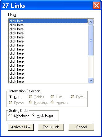
Window-Eyes link list for a site where all links are "click here
".
In the screenshot above, there is a button for "Focus Link". That will put the user on the link so that it is possible to find some of that additional context allowed in Success Criterion 2.4.4, like the sentence containing the anchor, or the contents of the table cell.
There are other, less crucial but still
important, aspects of accessible link text. As I just
mentioned, links are read as "links
" by screen readers and talking browsers, so
there is no need to include "link to" in the link
text, as is commonly done in alt-text for image links. Don't include verbs like
"open our contact form"; instead, just say "contact us". The latter would be typical of the visual text,
while the longer version might appear as alt-text on a "contact
us" image. You already saw an example of annoying link text in the
CNN.com skip link, with "Click here to skip to
main content". It should be just "main content," the function of the link. Unfortunately,
there is historical precedent for using "skip to main
content" and "skip navigation", but both are
poor choices because of the presence of the verb and,
in the second case, because the destination cannot even be determined.
Every image that is a link must have
nonempty and meaningful alt-text because when you tab to a link, there must be
something there. When the link text is the alt-text of
an image, it still should convey the target of the link, not a description of the image. Remember from the Section 2 of this
course that an image inside an anchor tag may have null alt-text (alt="") if text describing
the target of the link is also included within the same anchor.
Finally, there are times when fully spelling out the target of a link really becomes overbearing and annoying for both the visual and auditory experience of a page. The following screenshot shows a section of a page consisting of hotel information on Priceline.com.
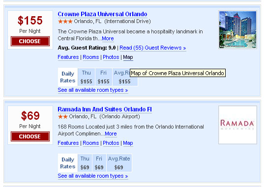
Information for two hotels on Priceline.com
Each of the generic links, including Choose
, More
, Features
, Rooms
, Photos
,and Map
is relevant to the specific hotel property. Those generic links are repeated for each hotel. Some interpret WCAG Checkpoint
13.1 as requiring that each generic link include the specific hotel, such as
"Features of the Crowne Plaza Universal Orlando".
That is the wrong thing to do for all users because the visual design would
become highly cluttered, as would the audible presentation. There is a technique included in the current draft of the WCAG
2.0 document to include the full text, like "Features of the Crowne Plaza Universal Orlando", but to hide most
of it with CSS. I think that is disgraceful, saying that the cluttered view is ok for disabled users, but not
for sighted ones.
It is not clear to me whether the examples in the screenshot above comply with WCAG 2.0
Success Criterion 2.4.4. There is text available in the same table cell (the name of the hotel) which clarifies the purpose
of the link. In cases like these, you could add a title attribute
to the anchor element that specifies the details and thus comply with WCAG Checkpoint
13.1 and WCAG 2.0 Success Criterion 2.4.8. That is what Priceline.com does, as
suggested by the tool tip in the screen shot above.
I am often asked, "What good does that title attribute do?" Can screen readers access that information? The
answer is, "not very easily." For example, JAWS has three options for speaking
a link: the link text, the title text, or the longer of the two. The default,
thank goodness, is link text. I hope one day that screen readers will add an
option to speak additional information about any object, which could announce
the title attributes on links and other elements,
long descriptions of images, and additional information about form controls
(See the Section 8 of this tutorial), as just three examples.
Summary
You can create accessible navigation by:
- Providing "skip navigation" tools that enable a user to move to the main content of a Web page without having to hear or tab through unnecessary information first. Use headings at the top of each major section of the page. Don't use too many headings.
- Creating frames that use descriptive titles. You should always provide titles for all HTML pages. Be sure to include
meaningful
titleandnameattributes for eachFRAMEelement. - Choose wording on your links so the text will make sense in a list of links - or at least that the immediate context of the link tells the user what the link will do..
If you have comments or questions on the content of this course, please contact Jim Thatcher.
This course was originally written for the Information Technology Technical Assistance and Training Center, funded in support of Section 508 by NIDRR and GSA at Georgia Institute of Technology, Center for Rehabilitation Technology. It has been completely revised.