Text Alternatives for Images (alt-text)
The single most important thing you can do to do to make a web page accessible is to include alternative text for images. When you make the decision to add alternative text, you include the many people who use talking browsers, screen readers, text browsers or browsers on small devices.
Use the alt attribute on every img element in the HTML code for your page. Also use the alt attribute
on every input with type="image" (see Section 8 on accessible
forms)
and on every area element (see Section 5 on image maps).
The idea of alternative text is to provide a textual replacement for pictures (images), a replacement that conveys the
same thing as is communicated to a sighted user seeing the image. Screen readers and talking browsers can't do anything
with an image itself - they will announce the alternative text instead. If an image is active, i.e., if the image is inside
an anchor element (<a>), then the alternative text should convey the purpose or function of the link.
If the image is not active, but conveys information, then the alternative text must convey the same information. If an
image conveys no information, or is redundant, specify that with null alt-text, alt="", that's quote,
quote, with no space between.
The Section 508 standard for text alterntives states:
§1194.22 (a)
A text equivalent for every non-text element shall be provided (e.g., via "alt", "longdesc", or in element content).
If you don't provide this information when you have an image on your web page, you will be losing customers, you will not be doing your best for search engine optimization, and you will not be compliant with either the Section 508 Web Standards or with the Web Content Accessibility Guidelines, Version 1.0 or 2.0.
Choosing Text Equivalents for Images And Image Links
The following image is from a Gateway home page some time back. The code that illustrates the inclusion of alternative text, "the Gateway box", follows.
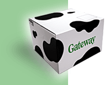
The Gateway box
<img src="box.gif" ... alt="The Gateway box" />
If the Gateway box were an active image, a link to the Gateway home page for example, then the alt-text should give the
function of that link, either alt="Home" or alt="Gateway". If the web designer
considered the image to be "eye candy", i.e., visually setting a mood, then alt="" might be appropriate since interjecting
"The Gateway box" in the flow of a screen reader's speaking of the page might not have an appreciable positive effect.
In the following example from IBM a few years back, the image contains the words "shop IBM" and an abstract shopping cart. The text equivalent should repeat that text.
![]()
Shop IBM icon
<img src="images/shop.gif" alt="Shop IBM" />
It might be tempting to write alternative text like this:
alt="abstract shopping cart to the left of the words shop IBM"
That is the description of the image, not its function. If you used that alt-text then each time a blind person visited
the site he or she would have to listen to "abstract
shopping cart to the left of the words shop IBM." That image and that message would be at the top of every page. Such
a description meets the technical standard (§1194.22 (a)) for providing a text equivalent, but it fails usability
criteria. Instead, use alternative text, as IBM does, that exactly coincides with the text on the image or the function
of the link, alt="Shop
IBM".
Often, the navigation links at the top of a web page, like the Shop IBM link above, are pictures of the words "Home," "Products," "Customer Service," etc. In these cases as well, the alternative text should be identical to text in the images.
You do not have to include a reference to the fact that something is a link, for example, alt="link to shop
IBM page". Text browsers and screen readers inform their users when they encounter a link. So just use alt="shop
IBM" and that will do it. It is redundant and questionable to add verbs to the alt-text for links.

Google logo
For example
Google, for its typical logo (see above) often (but
not always) uses
alt="Go to Google Home". When you listen to that it sounds like a command, it should just be alt="Google" and
a screen reader will announce, "link graphic Google".
The requirement for alternative text also applies to images that carry no information like spacer images sometimes
used in table-based layout. Use empty or null alt-text, written alt="" (no spaces between the
quotes) for the alternative text to say that an image contains no relevant information and is to be ignored.
<img src="images/spacer.gif" alt="" />
This tells an assistive technology, "don't bother me with any information about this image," and the screen reader or text browser will completely ignore the image.
Sometimes you need to make a judgment call about whether or not to use the empty alt-text (alt="").
While blind users may disagree about the correct detail of alternative text, they all agree that the alt attribute
must be included on every image.
Another case where you should use empty alt-text is when the information is redundant. In a list of navigation links,
for example, you might have an icon next to the text for a link, like a picture of a question mark and the word "Help." In
this case, if the image is not a link, it should have empty alt text, alt="".
If that image (question mark) is a link then alt="" is not appropriate because assistive technology will still
include the image link in the tab order and announce the URL (href) of the anchor or other information associated
with the anchor like the value of the src attribute of the imager. In this
situation (and many similar to it) it is best to include the image in the anchor with the text and then you can
use alt="" on
the image.
Sometimes the information that a screen reader finds because you forgot to include alt text can be downright disastrous. Here is an image from a major internet shopping company that does not, at this time have alt-text.

Image with text
This is what a blind user hears:
link graphic /b/ref=amb_link_5174632_1/102-8341830-0338507?ie=UTF8&node=465600&pf_rd_m=ATVPDKIKX0DER&pf_rd_s=center-2&pf_rd_r=083ACQP8E5WJNP9G6MW9&pf_rd_t=101&pf_rd_p=299488501&pf_rd_i=507846
Another common use of images on commercial web sites is for web designers to create their own bulleted lists using graphics that they choose for the bullets.
Look at the list of global navigation links in the left navigation panel and the News items at the bottom of the IBM page.

The arrows are all images with alt="". This is appropriate and the choice made by IBM.
<img src="... arrow.gif" alt="" />
These arrows used to be separate image links. They are not links anymore. When they were separate links, alt="" was
not appropriate because the links would be in the tab order and an announcement is needed when screen readers land on a
link. When you want to have clickable arrows like this, next to text, then include both the arrow image and the text within
the <a> element, with alt="" for the image like this.
<a href="http://www.ibm.com ..." >

<img src= "... arrow.gif" alt="" />

<strong>Home
  / home office</strong>
  </a>
Similarly, the arrows bulleting the News items on the Compaq site should use alt="" but
unfortunately alt-text is not specified.

Bullets on Compaq.com
The Center for Applied Special Technology site used to use ">" as
alternative text (alt=">"); for some "bullets" and screen readers speak "greater
than"; not good! Other sites use alt="bullet".
In trying to decide whether to use empty alt-text or a short text equivalent, you can listen to your page and decide which
sounds better. If the list items are short or if the items are links, alt="" is probably better.
If the items are long and they are not links, the alternative text "bullet" might be better.
However, in all of these cases of alt-text for bullets, it would be much better to code the lists as HTML lists
(<ol>, <ul>, <dl>)
and then there is no issue of alt-text for bullets and screen reader users will be able to navigate to the list and through
the list items. If you use list markup for your lists then your page will comply with the level one Success Criterion,
1.3.1, of WCAG 2.0 which, in effect, requires the use of structural markup for structures (like lists) on the page. And
you lists can look exactly the same as the ones with images included in the text.
For example, again using IBM, here is a screenshot of a list on a business services page.
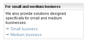
The arrows as bullets come from CSS
the code for the list looks something like this:
<ul class="ibm-link-list">
  <li><a href="http://www.ibm.com/ ..." .. >Small business</a></li>
  <li><a href="http://www.ibm.com/..."...>Medium business</a></li>
</ul>
Then the "bullet" is specified with the CSS style statement like this:
list-style-image: url(images/arrow.gif);
as an example.
Sometimes images are used purely for visual effect. These should have empty alt-text (alt="").
The disabilities community and disabilities advocates debate this issue. The image on the right-hand side of a page
of the National Library service for the Blind and Visually Impaired (from around
2002) is, in my opinion, decorative only. I would use alt="" but the
web authors on this site chose alt="Images of NLS Users." Either is OK.

An image on the NLS site
Choosing Text Equivalents for Client-Side Image Map Areas
A client-side image map consists of an image with the usemap attribute set to the name of a map. The image
map and each area in the map must have alternative text. The properly marked up HTML code for a client-side image map is
illustrated here:
<img src="map.gif" alt="" usemap="#navigation" />

<map name="navigation">

<area coords=1,1,40,100 alt="home" />

<area coords=1,100,40,180 alt="products" />

</map>
We are going to talk about image maps again in Section 5. For now, however, we want to stress how important it is to include
a text equivalent for each area of the image map, a text equivalent that gives the purpose of the corresponding hot spot.
The Yahoo site is notoriously sparse of pictures. At the time that this Web Tutorial was originally written it contained only two or three images. The first image was the Yahoo! banner across the top of the page. (It is split here for formatting purposes!)


The Yahoo! banner
The banner is not a collection of links as it appears. It is one image that is coded as a client-side image map. The links (blue underlined text) in the banner are part of the image. They are not text. The words for the "links" seem to be there, "Calendar," "Messenger," "Check Email," "What's New," "Personalize," and "Help." Here is what Home Page Reader, a talking web browser, tells its users:
[Map: r/a1]

[Map: r/p1]

[Map: r/m1]

[Map: r/wn]

[Map: r/i1]

[Map: r/hw]
The entire banner, including the icons and the simulated-link text, is all one image used as an image map. The map areas are rectangles including each icon and the corresponding text.
None of the map areas have alt-text, as illustrated in this HTML code fragment for the first map area:
<area coords="0,0,52,52" href="r/a1" />
Surprisingly, the portion of the image map offering help was, at the time of the first writing of this course, the only
way to find help on the main Yahoo! page,
http://www.yahoo.com/. Thus the user who is blind, wanting
help, would have to know to follow the link, "r/hw."
You could code the image map hot spots correctly by setting the alt-text to the text that actually appears in the image.
<area coords="..." alt="Calendar" href="r/a1" />

<area coords="..." alt="Messenger" href="r/p1" />

<area coords="..." alt="Check Email" href="r/m1" />

<area coords="..." alt="What's new" href="r/wn" />

<area coords="..." alt="Personalize" href="r/i1" />

<area coords="..." alt="Help" href="r/hw" />
The Yahoo! site that premiered early in 2002 fixed this problem. Their image map hot spots were appropriately marked
up with alt-text. Also their form control fields had proper label elements (see the section
on forms). Adherence to these basic requirements of Section 508 is all too rare amongst major commercial sites.
The Yahoo! banner has and interesting evolution, starting with a completely inaccessible server-side image map back in 1996, shown below.

The Yahoo! banner in 1996
In the beginning of 2006 the appearance of the top of the Yahoo! page was banner-like as shown in below.

The Yahoo banner in the beginning of 2006
Each of the six images are placed immediately above real text, as opposed to pictures of text in the first Yahoo! banner
above. The image and the text are included in the same anchor and the image is given null alt-text, alt="",
a recommendation we talked about above for reducing repetition, while including the ease of visually clicking on the image
or the text. Here is the (elided) code for one of those links.
<a href=r/25>

<img src=" ...125.gif" width=36 height=36 border=0
  alt="" /><br />

... Finance ... </a>
Creating Quality Text Alternatives
It is just as important to have high quality alternative text, as it is to have high quality normal text on the page. The alternative text should be consistent, clear and, most important, useful.
When an image is not a link and carries no information or is redundant, use null alt-text (alt="").
For example, there were many images named c.gif on the IBM web site (http://www.ibm.com/)
that are there for adjusting the visual layout. These carry no information and have been assigned empty
alt-text, alt="".
Similarly, on the left-side navigation area, there is a list of text links, and each is preceded by a graphical image of
an arrow. The alternative text on the image arrow should be and is empty, alt="".
If you do not include the alt attribute with empty text (alt="") for these formatting
images, screen readers with the default screen reader settings will ignore the image. However there are screen reader
settings that would result in the assistive technology announcing meaningless code to the user. Hearing chatter that carries
no useful information can be frustrating and even annoying to a blind user.
When the navigation buttons are images with text, you probably chose that text very carefully. Use the same text in the alt attribute.
Using Long Descriptions for Text Equivalents
Alternative text should be short and simple, but sometimes you may need to provide more explanation or content than is
suitable for alt-text. In these cases, you can use the long description (longdesc) attribute for the img element.
The longdesc attribute points to the URL of a separate description file that contains information conveyed by the image.
<img src="picnic.gif" ... alt="picnic photo" longdesc="picnic.htm" />
The clearest example of the need for a long description of an image is when the image is a graph or a chart as shown below.
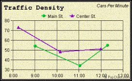
A simple chart showing traffic density
<img src="traffic.jpg" ... longdesc="traffic.htm" alt="traffic density graph">
The longdesc attribute points to the file traffic.htm that includes the following simple contents:
<p>Traffic Density Graph</p>

<p>This graph shows traffic density on Main and Center streets measured in cars per minute between 8:20 AM and 12 noon
on Center and between 9:00 and 12:20 on Main Street. Density ranges from a high of 70 down to 50 cars per minute on Center.
On Main street the density drops from 55 down to 35 at 11 AM and then back up to 55 at 12:20 PM.</p>
At first writing of this Web Course the longdesc attribute was not supported by assistive technologies.
Because of that, accessibility advocates recommended also using a "d-link" or description link that would open
the description file referenced in the longdesc attribute. Now that the technology supports the longdesc attribute
there is no need for the "d-link" which is welcome news, because even the accommodation itself violates an accessibility
principle of having clear link text!
Pictures in news stories or images in shopping sites are also candidates for long descriptions.
There are good alternatives to the longdesc attribute for providing detailed information
about images. For example, Reuters news stories displayed on Yahoo.com have photos (as links) with the alternative text "Reuters
Photo." That link leads to an enlarged photograph with a detailed description.
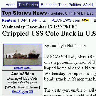
A Reuters photo on Yahoo! news
When a user opens the "Reuters Photo" link, the following page is displayed. The long description is a caption on the larger image.
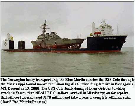
Image (or long) description as a caption
Summary
-
Alt-text is required for all images.
- If the image is active (link, button, area) the text alternative is the function of the image;
- if the image is not active but conveys information, the text alternative conveys the same information;
- if the image is redundant or conveys no information use
alt=””for the text alternative. - If the image is text then the alt-text should (usually) be the same as the text in the image.
If you have comments or questions on the content of this course, please contact Jim Thatcher. I will try to respond to any question or suggestion within one business day.
This course was originally written for the Information Technology Technical Assistance and Training Center, funded in support of Section 508 by NIDRR and GSA at Georgia Institute of Technology, Center for Rehabilitation Technology. It has been completely revised.