
Figure 5-1. Four eight-dot Braille cells that can be installed in a Braille device.
Assistive technologies are an indispensable assessment tool for the web developer. It is not possible to determine a website's compliance with most of the requirements of accessible web design using a conventional browser alone.
Many requirements are indirect, in that they require information to be available to users through their assistive technology. This information may not be exposed by conventional browsers. An example of this is the requirement for markup in data tables to indicate which cells are heading cells (Section 508 provisions §1194.22(g, h) and WCAG 1.0 Checkpoints 5.1 and 5.2). Sometimes, this markup is reflected in the visual presentation. For example, if the <th> tag is used to define the heading cells, then the text contained in those cells will be bold and centered by default. If, instead, the headers attribute is used to indicate heading cells, then there may be no visual manifestation. Another example is that text equivalents for nontext elements may or may not be available for normal visual examination. Also, some guidelines are quite subjective, such as the WCAG 1.0 Checkpoint 14.1 to use the clearest and simplest language appropriate for a site's content. The decision about whether a site complies with this checkpoint can be reached only after careful assessment.
Screen readers are the primary assistive technology through which website content is funneled. People who are blind use them to have the information that is displayed on the computer screen spoken to them with synthesized speech.
This chapter will provide a brief overview of the assistive technologies used in later chapters for exemplifying and examining accessible web techniques, and will also illustrate how to assess a website's accessibility with a standard browser.
Screen reader products in the DOS days literally read the 8025 display buffer to speak the screen. The ASCII codes stored in the display buffer were sent directly to a hardware device to produce synthesized speech. With the advent of the graphical user interface (GUI), screen readers had to become a lot smarter. Now they can capture text as it is written to the display through display driver software. These sophisticated technologies create what is called an off-screen model (OSM), which is, in effect, a database of all the text displayed on the graphical screen. When a screen reader user requests information, it is read from this database, the OSM, rather than from the screen itself.
Even speech synthesis has changed. The first developments in speech synthesis were hardware synthesizers that cost around $1,000. Now speech synthesizer software is included in screen readers and talking browsers, and has even been built into some operating systems.
With the advent of the Web, the way in which screen readers work has changed yet again. Now screen readers look at the document object model (DOM) of the page to know what the browser would display. For the Web, as well as for some other applications, screen readers are not reading the screen any more; instead, the screen reader is using the DOM to provide a speech rendering of data that is a web page.
A screen reader must present the two-dimensional graphical web page to a user who is blind as a one-dimensional stream of characters, which is usually fed to a speech synthesizer. There is an alternative to speech for people who know Braille called refreshable Braille displays. These units can cost as much as $30,000 and typically have 20, 40, or 80 individual eight-dot Braille cells, where the individual dots are raised and lowered with tiny solenoids. Figure 5-1 shows four Braille cells from the Robotron Group (www.sensorytools.com).

Figure 5-1. Four eight-dot Braille cells that can be installed in a Braille device.
It is very important to recognize that this screen-reading process is converting a two dimensional page to a one-dimensional text string, whether spoken or displayed in Braille. This is aptly called linearizing the page. If you are familiar with HTML, the simplest way of picturing linearization is by imagining an HTML document stripped of all its tags, leaving just the text together with the textual values of some attributes like alt and title. The resulting text file is the linearized version of the page. Different parts of that text document will be presented to a screen reader user through synthesized speech or Braille.
Another way to picture the linearization process is to read the page from left to right and from top to bottom. Tables are read left to right and top to bottom before continuing, and each cell is read completely before continuing to the next cell. Of course, there is more to this linear view than just characters. It must also include form elements and links in order to capture the function of the page.
It seems that those users who are blind rarely listen to a page in full. Often, they navigate to the content and controls of the page. Tab and Shift+Tab move forward and backward through the active elements of the page— that is, through the links and form controls. Screen readers have key commands to read by characters, by words, by lines, and by sentences, as well as HTML features like headings, paragraphs, tables, and lists.
Screen readers do much more than read web pages. They can be used with any software running on the computer; therefore, they must be keyboard-compatible with all of that software. This makes screen reader-specific key combinations complicated and even arcane. For example, to move around the cells of a table with JAWS for Windows, you need to use Ctrl+Alt+arrow; to go into table mode with Window-Eyes, you need to use Ctrl++ (plus), and then use Ins+arrow to move around the table.
It is in this linearized world that some of the accessibility requirements begin to make better sense. Clearly, the images that are on the visual page need to be replaced with the text equivalents, the alt-text; otherwise, the information or function they contain will be lost.
Additional help is essential. If the user is reading in the middle of a data table, the screen reader technology needs a way of informing the user of the headers for the current data cell that is being read. Try to imagine— in this linearized text world— making an online order. Having selected the product you want to purchase, you reach the checkout page, only to find several fields where you are required to enter your details, but no clue as to which data goes where. This is the kind of information that must be included in web page markup to make it accessible to a person who is blind.
You can find an excellent short video demonstration of how screen readers work on the DoIT website, www.doit.wisc.edu/ (University of Wisconsin-Madison, Division of Information Technology), "Introduction to the Screen Reader" with Neal Ewers of the Trace Research Center www.doit.wisc.edu/accessibility/video/intro.asp.
In later chapters, three screen readers will be used to illustrate techniques for addressing web accessibility requirements: Hal, JAWS for Windows, and Window-Eyes. These screen readers are probably used by more than 95 percent of users of the Web who are blind.
Hal is a screen reader developed in the UK by Dolphin Oceanic, Ltd. (Dolphin Computer Access). The price for Hal is either $795 or $1,095, depending on whether you choose Hal Standard or Hal Professional. The tests in later chapters use Version 6.5 of Hal Professional. The demonstration version of Hal is fully functional but will time out after 30 minutes. You can run it again after you restart Windows.
JAWS for Windows is the most popular screen reader. JAWS, an acronym for Jobs Access With Speech, is developed by Freedom Scientific. The cost of JAWS is either $895 or $1,095, depending on whether you want the Standard or Professional edition. You can download a demo version, which will operate for 40 minutes before it times out. You can do that again, after the system is rebooted. The tests in the later chapters were run with JAWS Professional Versions 6.2 and 7.0.
Window-Eyes, developed by GW Micro, costs $795. A timed demonstration is available from GW Micro. The demo version is fully functional and will time out after 30 minutes. You may reboot your machine for another 30-minute crack at WindowEyes. The tests in later chapters use Window-Eyes Versions 5.0 and 5.5.
In the past, one commercial screen reader for the Apple Macintosh was available. outSPOKEN, by the Alva Access Group, was the first screen reader to provide access to a GUI (in 1988). Unfortunately, outSPOKEN did not keep up with Windows screen readers, especially in the way web information is handled. Now, outSPOKEN is no longer available. Apple has developed its own screen reader for Mac OS X, called VoiceOver. Jay Leaventhal of The American Federation for the Blind wrote a review of VoiceOver for AccessWorld, titled Not What the Doctor Ordered: A Review of Apple's VoiceOver Screen Reader.
The picture for UNIX is also cloudy. There are no commercial screen readers for X-Windows, the windowing system for UNIX, although there are shareware attempts at accessing X-Windows for people who are blind. In particular, the open source software GNOME (a UNIX and Linux desktop suite and development platform) project has a screen reader project called Gnopernicus. There is at least one sophisticated access system for text-based UNIX, Emacspeak, but that environment is usually accessed with terminal software under Windows, using Windows screen readers.
The bottom line is that when we talk about access to the Web for people who are blind, we are talking about the Windows platform. Examples and samples in subsequent chapters are all taken from Windows, using Microsoft Internet Explorer, Netscape Navigator, or Mozilla Firefox. Among those browsers, Internet Explorer is most effective with screen readers because of the way it exposes the DOM and provides information through Microsoft Active Accessibility (MSAA). The latest version of JAWS and Window-Eyes are providing access to Firefox (Version 1.5.0.2). Representatives of Freedom Scientific (JAWS) say that their support is not yet as good as it is for Internet Explorer 6, and they don't offer customer support for Firefox yet. Although GW Micro (Window-Eyes) has not made such a statement, I found table reading to fail with both screen readers. There are also problems with maintaining point of regard. When you are reading in one page, go to another, and return to where you started, the screen reader should pick up where you were. That doesn't work with either screen reader with Firefox.
In later chapters, I will describe techniques for using screen readers in special circumstances, especially for forms, tables, and skipping blocks of links. The following sections cover the basics of using the screen readers used in the tests and examples for this book.
With the screen readers (and also IBM Home Page Reader, the talking browser) described in the following sections, the active elements of a page, including links and form controls, can be navigated with the Tab key (Shift+Tab goes backwards). The order in which these links and form elements appear in the tab sequence is the same as the linearized page unless the attribute tabindex is used in the HTML source of the document. Then those active elements with valid tabindex attributes appear first and according to the number assigned as the value of the tabindex. The active elements without the tabindex attribute are placed at the end of the sequence. The tabindex feature is supported by JAWS and Home Page Reader and with MSAA Mode off by Window-Eyes; it is not supported by Hal.
When Hal is started, its settings dialog box is displayed, as shown in Figure 5-2.
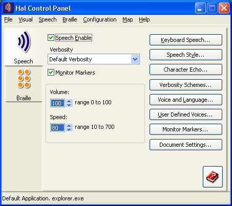
Figure 5-2. Screen shot of Hal control panel.
All the screen readers have some kind of specialized web mode for reading web pages, because there is usually no focus point on the page, like a text cursor, selector, or focus rectangle. For Hal, the web mode is called Virtual Focus because the screen reader must create its own focus point. Virtual Focus mode can be toggled with the minus key on the number pad.
When a web page is loaded in Internet Explorer, Hal announces "Hypertext, Virtual Focus," followed by the page title, and then the number of links, frames, and headings. Hal uses the left Ctrl key to stop speech, rather than the right Ctrl key, which is my habit for the other screen readers and Home Page Reader.
The up and down arrow keys move through a web page line at a time. Hal doesn't have the convenient letter keys shared by other assistive technologies for moving around structures on the page. Some of Hal's advanced navigation keys are listed in Table 5-1.
| Key | Function |
|---|---|
| Left Shift+left Ctrl+Home | First edit field |
| Left Ctrl+Page Up/Page Down | Previous/Next control |
| Left Shift+left Ctrl+Page Up/Page Down | Previous/Next frame |
| Left Shift+left Ctrl+left arrow/right arrow | Previous/Next text |
| Left Shift+left Ctrl+up arrow/down arrow | Previous/Next link |
Hal also has a useful "more information" key, left Shift+0 (zero on the number pad) which, for example, speaks the href when virtual focus is on a link.
In JAWS for Windows, the web mode is known as Virtual PC Cursor (VPC) mode. The screen reader automatically switches to VPC mode when Internet Explorer is the foreground process. VPC mode can be turned on and off manually using Insert+Z, which is a useful command to know when things aren't working quite right and you need to toggle between modes.
When JAWS loads a page, it announces the title, the number of links, and begins reading from the top. The Ctrl key stops speech. The down and up arrow keys give you the next and previous line. Insert+down arrow reads the rest of the page (Say All).
You can move among active elements (links and controls) with Tab and Shift+Tab. Move from heading to heading with H (use Shift+H to move backward through the headings).
To find and read form controls, use Ctrl+Insert+Home to go to the first input element on the page, and then use F to move through the controls (to go backwards, use Shift+F). You need to press Enter to go into forms mode to actually enter text in an input field, and then you can use the plus key on the number pad to exit forms mode and return to VPC mode. This is actually a problem area in assessing the accessibility of forms. When you are in forms mode, the arrow keys don't speak the previous and next line; instead, they are used to move through the input form, so it may be difficult to find (listen to) surrounding information about the control without leaving forms mode. This is one of the reasons that precise labeling of form controls is so important (see Chapter 8).
It is possible to obtain a copy of what JAWS will read— that is, the JAWS view of the page. After the page loads, stop the speaking speech with Ctrl. Then use Ctrl+A to select all (the whole page) and use Ctrl+C to copy all the text to the clipboard. Now you can paste (Ctrl+V) into a word processor or text editor. Some of the metatext used by JAWS, like link, is not included in that JAWS view.
Rather than tabbing to each link, you can open the JAWS Links List with Ins+F7, as shown in Figure 5-3.
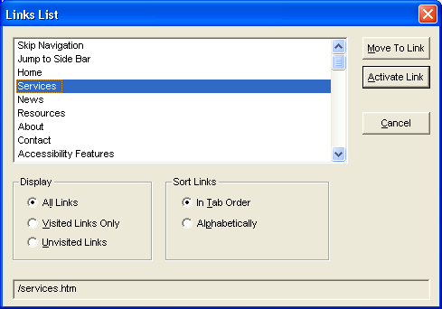
Figure 5-3. Screen shot of JAWS links list.
Other lists are available with Ins+F5 (Form Fields), Ins+F6 (Headings), and Ins+F9 (Frames).
For Window-Eyes, the special web mode is called MSAA Application mode or Browse mode. It is toggled with Ctrl+Shift+A.
Like JAWS, Window-Eyes switches to web mode automatically when Internet Explorer is the foreground process. As the page is loaded, Window-Eyes announces the page title, then "Loading Page, Looking for Visible Line, Visible Line found, Load done." Then it begins speaking with an announcement of the number of links, tables, and headings, followed by the text of the page.
The Esc or Ctrl key stops speech, and the up and down arrow keys speak the previous and next line. Ctrl+Home takes you to the beginning of the document, and Ctrl+End takes you to the end. The Ctrl+Shift+R combination causes Window-Eyes to read from the current point to the end (Say All).
Move among active elements (links and controls) with Tab and Shift+Tab, or move from link to link with L (use Shift+L to go backwards through the links). Move from heading to heading with H (Shift+H to go backwards through the headings).
To find the form controls on a page, use the C key (Shift+C to go backwards). When you are reading a web page with Browse mode (MSAA Application mode), there are many keys that facilitate reading and navigation (like C and Shift+C). When you want to use an input control, say to put text in an edit field, you want those keys to go into the edit field, not to move to the next control. So, it is necessary to leave Browse mode. To do this, press Enter when the focus is on a form control, and then you can type in the input field. Use the Tab key to navigate the form controls. You can return to Browse mode with Ctrl+Shift+A.
To get the Window-Eyes view of the web page, use Ctrl+A to select all, Ctrl+C to copy to the clipboard, and Ctrl+V to paste the text into a text editor or word processor. This is an excellent way for a sighted developer or tester to study the web content for accessibility, especially because the screen reader is unfamiliar and the synthesized speech may be difficult to understand.
Use Ins+Tab when viewing any page with Window-Eyes to bring up a dialog box containing a list of all the links on the web page, as shown in Figure 5-4. By selecting different radio buttons in the Information Selection section of that dialog box (like Headings, Alt+H) you can list and then move to or activate (if appropriate) each item.
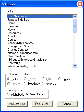
Figure 5-4. Screen shot of Window-Eyes links list.
You can activate any link by moving to it and pressing Enter because Activate Link is the default push button. Alternatively, you can move to the link in the web page with the Focus Link push button. The same dialog box that brings up the list of links also provides the option to see lists of tables or frames.
Screen readers are inherently difficult to use because they must be able to read any application, which means that they must be compatible with any application. Since applications have built-in commands, you often need to use complex keyboard commands that don't clash with any other application commands, such as Ctrl+Alt+down arrow, which are difficult to remember and may be difficult to execute. If you don't have to use a screen reader and if you don't use it every day, chances are that you will have a hard time working with one.
Another way of checking for accessibility with assistive technology and understanding how your web page sounds to someone who is blind is to use talking browsers, which are designed specifically to speak web pages. One of the first such browsers was pwWebSpeak by Productivity Works, but that was discontinued in January 2001. Currently, the most commonly used talking browser is IBM Home Page Reader.
Another helpful type of browser is one that is text-only. Because a text-only browser does not support graphics or technologies such as JavaScript and Cascading Style Sheets (CSS), it offers a way to evaluate whether your page is usable with these technologies turned off.
Home Page Reader from IBM has a retail cost of $149 through one of IBM's authorized dealers; I found HPR for as low as $90 on the Web. IBM used to offer a 30-day trial, but now the demo version is not restricted in time but instead restricted in the sites you can browse. The allowed sites are www.ibm.com, www.adobe.com, www.macromedia.com, and www.w3.org.
Home Page Reader is available in six languages: Brazilian Portuguese, French, German, Italian, Spanish, and English. It is also available in Japanese as a separate product. In addition to having the product in a specific language, Home Page Reader will begin reading a page in the language specified with the lang or xml:lang attribute of the <html> tag if that is present. If there is no language specified in the <html> tag, Home Page Reader will speak using its default language, such as French for a French product. However, in this case, Home Page Reader will also apply its heuristic algorithm to see if it can detect the language of the page (assuming Automatic Language Detection is enabled) and if successful, speak in that language. You can specify changes of languages in a web page using the lang attribute, on a span element, for example. Upon encountering the lang attribute, Home Page Reader will change the speaking language if the designated language is available. Home Page Reader does not try to detect changes in language in a page, except those specified with the lang attribute.
Home Page Reader was originally designed by a blind IBM researcher, Chieko Asakawa, and was first produced in Japanese in 1997. Asakawa was motivated to develop Home Page Reader because Japanese screen readers did not accommodate the Web at all.
Using Home Page Reader is a much easier way for sighted developers to understand the view of the Web experienced by a user who is blind. This is because it is a normal Windows application for speaking the Web with conventional menus and much simpler keyboard commands.
As shown in Figure 5-5, Home Page Reader has four main panes: a graphical browser on the top right, a text pane on the bottom right, a history view to the left, and an information view at the bottom of the window. The important panes for this discussion are the graphical view and the text view. The other two can be closed through the View menu.
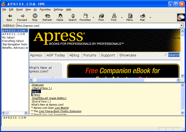
Figure 5-5. Screen shot of HPR reading apress.com
When Home Page Reader opens a web page, it begins speaking, and the text that is being spoken is displayed in the text view. About eight or ten lines are displayed, and as speaking proceeds, the text pane is refreshed. The current word is highlighted in both the text and graphics views. In Figure 5-5, "Search" is being spoken.
If you would like to see all the text of the page as the Home Page Reader view of the page, put the focus on the text view with the mouse or with F6, use Ctrl+A (for select all) and then Ctrl+C to copy the resulting text to the clipboard. Then use Ctrl+V to paste the text view in your favorite word processor or text editor. This is a useful tool for studying the accessibility of your page, as it is with the screen readers.
When using Home Page Reader, the spacebar begins reading from the current point. As mentioned earlier, people rarely listen to the whole page, but instead choose to navigate around the content. Home Page Reader's philosophy for navigation is to always use the arrow keys: left arrow for previous, right arrow for next, and down arrow for current. By choosing a reading mode (from the Read menu), you can specify the size of the "chunk" you move to with the navigation keys. The options available are character, word, line, paragraph (item), link, control, heading, and table. There is a special reading mode for reading tables, and in this case, all four arrow keys navigate the cells of the table. Home Page Reader defaults to item reading mode, which is similar to line-at-a-time with screen readers.
In addition to using the arrow keys in various reading modes, Home Page Reader also implements the single-letter navigation keys: O for controls, H for headings, T for tables, Tab for active elements, and Shift plus the key to go backwards for any of those. Home Page Reader also has link lists (Ctrl+L), as illustrated in Figure 5-6.
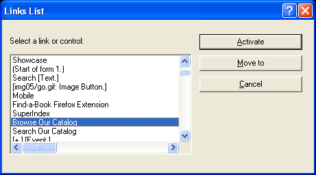
Figure 5-6. Screen shot of HPR links list.
These link lists are especially useful when you know the link text. In addition to navigating with the arrow keys, letter keys move to the next item beginning with that letter. They also illustrate the importance of making sure link text makes sense when taken out of context.
There is no question that Home Page Reader is the easiest assistive technology for sighted people to learn to use. If you want to test your forms or tables for accessibility, try them with Home Page Reader.
If you have never seen Lynx, you are in for a surprise. Lynx is a text browser that is available on UNIX, DOS, and Windows (through DOS emulation). Because it doesn't support graphics, dynamic HTML, or CSS, it is incredibly fast. When you enter a URL for opening a page with Lynx, the page is displayed almost immediately.
Like Home Page Reader and the screen readers, Lynx uses a linearized view of the page. If you don't want to try Lynx, you can visit www.delorie.com/web/lynxview.html and submit a URL in order to see what your page looks like as if it were viewed with Lynx— that is, when it is linearized.
Figure 5-7 shows the Lynx screen for www.jimthatcher.com.
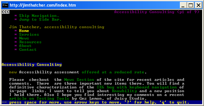
Figure 5-7. Screen shot of Lynx with www.jimthatcher.com open.
The user interface for Lynx is first and foremost command keys, including G (Go) for entering a URL to open, O (Options) for setting user preferences, and H (Help) for an extensive help document. You navigate by using the up and down arrow keys to move through the links on the page. After passing the bottom of the current screen, the next screen of information is presented, or you can use the spacebar to go to the next page.
Lynx makes extensive use of colors to present HTML structures like links, headings, titles, and lists. Those colors can be set in an .lss file. The colors do not carry over well to the black-and-white rendition shown in Figure 5-7. That figure is using the default color settings, including black for normal text, purple (with *) for list items, blue for links, and red for the current link (Home) The down arrow key moves through the links, Services, News, Resources, and so on. To follow a link, use the right arrow. To return to the previous page, use the left arrow. Page Up takes you to the previous screen if you have moved past the first screen display. These are default settings, which can be changed using the Options (O) command.
Any time you need to input text, such as when you need to enter a URL as a result of the Go command, a command line opens at the bottom of the window. Text can be entered in that command line.
Lynx does not support graphics, plug-ins, JavaScript, Java, or CSS. Thus, it is an excellent test vehicle to evaluate whether or not your page is usable and readable with these technologies turned off.
Screen magnification software uses standard display monitors. It increases the size of everything in the display, including text and images in a web page. Screen magnification software provides various degrees of magnification, typically between 1.5x and 32x. Because of the physical limitations of the monitor, the greater the magnification, the smaller the amount of content that is shown.
The following are the primary issues when using screen magnification software:
Screen magnifiers provide multiple settings for magnification. Some also provide a split screen that shows both the magnified page and a nonmagnified page, as shown in Figure 5-8 with 3x magnification using the Windows XP Magnifier.
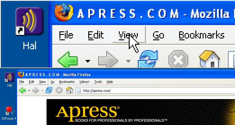
Figure 5-8. Screen shot showing 3× mignification with Windows magnifier.
Windows XP comes with a simple magnifier (Start > All >Programs> Accessories > Accessibility > Magnifier). With its default setting, the magnified part of the screen is a banner across the top (see Figure 5-8). Displayed in that banner (in the default setting) is a section of the screen centered on the mouse pointer.
Commercial magnification programs include ZoomText from AI Squared and Magic from Freedom Scientific. The commercial magnifiers offer amazing features. Figure 5-9 is an example comparing ZoomText magnification with its xFont technology (on the top) versus that of Windows Magnifier (both at 5x). The simple magnification enlarges each pixel, and the result becomes very difficult to read at higher magnification (except for letters that have no round parts). With ZoomText, the result is clean and crisp at all magnifications. Also, ZoomText offers screen reading— the menus and dialog boxes talk as focus changes, just as with a screen reader. A trial version of ZoomText can be downloaded from the AI Squared website.

Figure 5-9. Screen shot comparing ZoomText and Magnifier.
Consistent layout is a very important design consideration for users who depend on screen magnifiers. Placing the navigation links in the same position on every page, for example, will make it considerably easier for users who can see only a small portion of the screen at one time to find their way around your site.
Some users view the magnified and nonmagnified page simultaneously. This lets them see the general layout of the page in the nonmagnified section and the details in the magnified section. Some users will view a page at less magnification first to get the big picture, and then increase the magnification to read the text.
Another assistive technology used by people with reduced vision is large display hardware, such as large monitors and Fresnel lenses. Users can also project the screen display onto a large desk area or a wall. Such solutions may not be feasible depending on the environment. For example, you probably would not want your coworkers to be able to see your display from across the room!
Visual web browsers can be used to assess the accessibility of a website in several ways:
You can visit some websites that will help you analyze a live web page. Two of these are the Lynx Viewer and the WAVE.
Due to security concerns and abuse of the Lynx Viewer service, Delorie Software now requires actions on the part of site owners to permit the Lynx Viewer to work. In effect, a file, delorie.htm, must be present in any directory that the Lynx Viewer is asked to access. I have done this on my site (www.jimthatcher.com), so you can check Lynx View there.
The WAVE was conceived and developed by the late Dr. Leonard Kasday at Temple University, Institute on Disabilities. It is being further refined and is now hosted by WebAIM, www.wave.webaim.org/. There are several ways to use the WAVE. The simplest is to just enter the URL of the page, as shown in Figure 5-10.
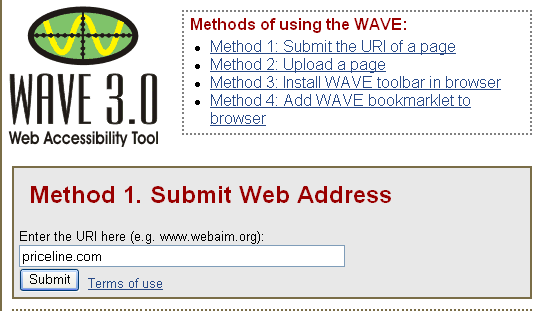
Figure 5-10. Screen shot showing WAVE icons marking up page.
The WAVE tool inserts icons in the page to indicate errors, warnings, and successes relating to accessibility. Figure 5-11 shows the WAVE annotation using the default setting of all annotations.
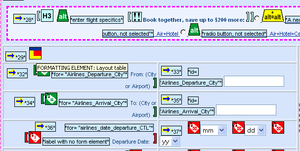
Figure 5-11. Screen shot of Priceline.com modified by the WAVE.
As shown in Figure 5-11, the WAVE analyzes the page and provides a lot of accessibility information through annotation. There are a total of 75 possible icons, which makes the display daunting at first. But you can quickly recognize a few common icons, and you can check the meaning of unusual ones by moving the mouse over the icon to see its alt-text, as illustrated with the Layout Table icon in Figure 5-11. Table 5-2 describes the function of the icons in Figure 5-11.
| Icon | Function |
|---|---|
| The reading order in the linearized page is displayed by the arrow icon, followed by a numeral. The numerals indicate the order in which the page will be read by a screen reader. | |
The alt-text icon (green for an "accessibility feature") shows the alt-text right next to it. |
|
This interesting warning icon alerts the user to the fact that there is possible redundant information, typically where two images have the same alt-text. |
|
| This accessibility feature icon indicates a form control label that seems to be correct. | |
This accessibility error icon indicates a form control that seems to be improperly labeled. (Because of the use of title attributes on this page, these are not errors.) |
One method of assessing how a screen reader will handle a page is by browsing it with images turned off. In Internet Explorer, choose Tools > Internet Options, and then click the Advanced tab. In the resulting list, check Always expand alt text for images at the top of the list. Then move down two pages in the list, under Multimedia, and uncheck the item Show Pictures. (To return the system to normal, use the Restore Defaults button at the bottom of the Advanced tab.) With these settings, images will not be displayed and alternative text will appear instead. Figure 5-12 illustrates how these settings work with www.borders.com.
The small rectangles, each with an icon or part of an icon (the icon just indicates a missing image), are placeholders where images would be. Of thirteen image placeholders in Figure 5-12, three show that alt-text is present: Search, Borders.com, and Browse. All the other images lack text equivalents.
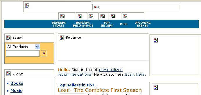
Figure 5-12. Screen shot of Borders.com with images off in Internet Explorer 6.
When you want to turn off images in Netscape (7.2), select Edit > Preferences. In the Preferences dialog box, select (double-click) the Privacy & Security category, and in the resulting submenu, select Images. In the Images dialog box, select the Do not load any images radio button. Now Netscape will not load any images. But there is a fundamental difference from the treatment with Internet Explorer. Images that have alternative text do not have rectangles around them, so if your page is done well (more in the next chapter), the Netscape view is even appealing, and the pages load very quickly. Figure 5-13 shows the top half of the www.priceline.com homepage viewed in Netscape 7.2 with images off.
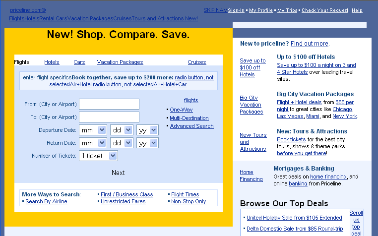
Figure 5-13.Screen shot of Priceline.com with images off in Netscape 7.2.
With Opera (8.51), you also can view the page without images by selecting View > Images > No Images. The effect is similar to Netscape; however, Opera displays a fine-lined box, so you can tell which text comes from the images.
With Firefox (1.5.0.1), select Tools > Options > Content and uncheck the Load Images check box. Similar to the treatment by Netscape, Firefox replaces each image with its alt-text if it is available. When the alt-text is not available, Firefox places a border around the place where the image would be.
The newest tools for checking accessibility are favelets and favelet toolbars that display inline information about a page. This is a lot like what the WAVE does, except it overcomes the problem of information overload that is found in the WAVE by targeting the markup of specific elements or issues. We will look at three of these tools: the Accessibility QA Favelet from WGBH (http://ncam.wgbh.org), the Web Accessibility Toolbar from Vision Australia (www.visionaustralia.org.au/), and the Section 508 Toolbar for Firefox from RampWEB (www.rampweb.com).
Each of these tools is a collection of what are called favelets or bookmarklets. These consist of code, usually JavaScript, which can analyze the current page open in the browser, temporarily change it, and report accessibility information, such as the alternative text or headings on the page. That code is saved as a favorite in Internet Explorer or bookmark in Netscape, which is the reason for the terminology (favelet or bookmarklet).
The NCAM Accessibility QA Favelet is a single favelet available from the National Center for Accessible Media (NCAM), authored by Andrew Kirkpatrick and Rich Caloggero. The NCAM favelet provides a number of functions. This favelet creates a form at the top of the current page with a drop-down menu of options and an Analyze submit button, as shown in the example in Figure 5-14.
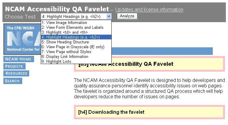
Figure 5-14. Screen shot showing the NCAM Accessibility QA Favelet menu.
I have applied the NCAM QA Favelet once, selecting Highlight Headings in the drop-down menu, and then clicking the Analyze button. As a result of that analysis, two headings are highlighted on the page (one h3 and one h4). After applying that transformation, I then opened the menu again for the purpose of the screenshot. Highlighting of lists, headings, and table markup is done in-page. The other options list information in a new window.
The Web Accessibility Toolbar was written by Steven Faulkner of Accessible Information Solutions. Whereas the NCAM favelet adds a menu to the page, the Web Accessibility Toolbar is a collection of menus, as shown in Figure 5-15. These provide three kinds of functions: information resources, other tools like the WAVE and W3C validation, and inpage markup or lists like those available with the NCAM Accessibility QA Favelet.
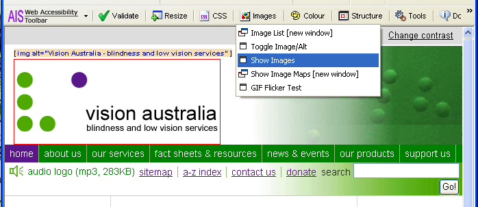
Figure 5-15. Screen shot using the Web Accessibility Toolbar.
Figure 5-15 shows the Images menu with Show Images highlighted. I had already performed the Show Images operation on the Vision Australia page. The only foreground image visible in the figure is highlighted, and its alt text is displayed just above the image.
The Web Accessibility Toolbar is a rich collection of tools for people who want to conveniently explore the effects of accessibility or to carry out serious human reviews of pages for accessibility.
RampWEB offers a toolbar for both Internet Explorer and Firefox with functions similar to those of the Web Accessibility Toolbar, called The Section 508 Toolbar. The basic human review functions of the Section 508 Toolbar mark up the page with icons, similar to those used by the WAVE. Figure 5-16 shows the 508 Accessibility Toolbar for Firefox. After I activated Display Tab Order and Display Headings, these functions were applied, so that each heading is highlighted and each tab stop is indicated with an icon and a number.
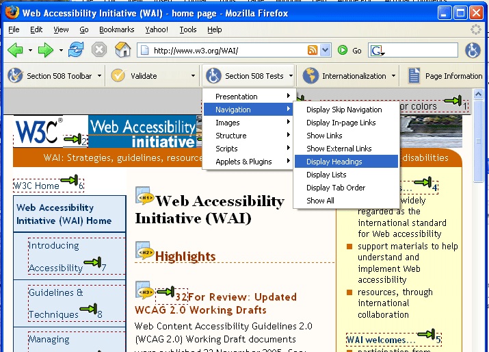
Figure 5-16. Screen shot of thw WAI site marked up with the RampWeb Section 508 Toolbar.
| Icon | Meaning |
|---|---|
| Indicates the tab order | |
Specifies the presence of an HTML heading, in this case <h1> |
In addition to Display Headings and Display Tab Order, you can use the 508 Accessibility Toolbar to test forms, mark up lists, test images, and find online accessibility resources for web accessibility.
As I suggested at the beginning of this section, the favelets and toolbars that have become available recently are the best thing that has happened for experimenting with web accessibility and for human review of web page accessibility. Many other favelets and toolbars are available, including the Web Developer Extension toolbar for Firefox, which stands out with more than 150 distinct functions. For accessibility with Firefox, however, the Section 508 Toolbar from RampWEB is superior.
The indirect requirements for accessible web development are mostly those that make information available to users who are blind through their screen readers. One purpose of this chapter was to help you understand how screen readers use a linearized text view of a page to speak information to their users. This should help you understand the issues that will be discussed at length in later chapters.
The chapter also discussed several ways in which a web developer or designer can use the standard browser as an accessibility checker. These ideas suggest "sniff tests" for the developer or procedures to be integrated into a quality assurance plan. Plus, it covered new accessibility checking favelets and toolbars that provide remarkably simple techniques to assist in the evaluation of web page accessibility.
The best verification of the indirect web accessibility requirements will result from involving professionals with disabilities who fully understand the assistive technology. Short of that, one or more screen readers and a talking browser should be made available for the web development team and the quality assurance process.
With even a moderately sized site, it is very difficult to check to see that every image has alt-text (Chapter 6) or that every form has a label (Chapter 8), even with tools described in this chapter. A number of software tools, both client side and server side, can test web content for the presence of accessibility features. We will explore the question of what can and cannot be tested by such tools and investigate five commercial testing tools in Chapter 13.