Accessibility of MakingHomeAffordable.gov
MakingHomeAffordable.gov is a fairly simple site. It should be easy to use for people with disabilities, to access information and interact with the site. The suggestions provided here will make that happen. Without following these suggestions, people with disabilities will have serious difficulty interacting with the site. The following are the areas that need attention.
- Text alternatives. There are minor errors but they should be fixed.
- In page navigation. The site is seriously deficient in providing headings navigation and skip links.
- Keyboard. Keyboard users can not use the video player (the video is well captioned though).
- Reading order. There is one instance of confusing reading order and the light box panels for the video player and exiting the site are not accessible.
- Contrast. The color contrast between foreground text and background is generally good with the exception of the footer text.
- Form labels. The forms are not adequately labeled.
Scan for Machine Detectable Errors
Lets take a minute and summarize the results of a scan of the site using the Worldspace testing tool from Deque. This time I performed a depth 2 scan which means that the scan includes the landing page, all MakingHomeAffrodable.gov pages linked from the home page and all pages linked from those. That turned up 50 errors on 29 pages, one and two thirds detectable errors per page.
| Error Type | WCAG2 | # Files | # Errors |
|---|---|---|---|
| Alt-text on image elements | 1.1.1 | 4 | 4 |
| Provide heading markup | 1.3.1 | 4 | 4 |
| Provide language of page | 3.1.1 | 29 | 29 |
| Label forms | 3.3.2 | 6 | 13 |
More than half or the errors result from the fact that the language of the page is not identified. This problem, which is trivial to fix, used to be a priority three Web Content Accessibility Guidelines Checkpoint; now it is priority one and included in the proposed Section 508 standards.
Alt-text on the Landing Page
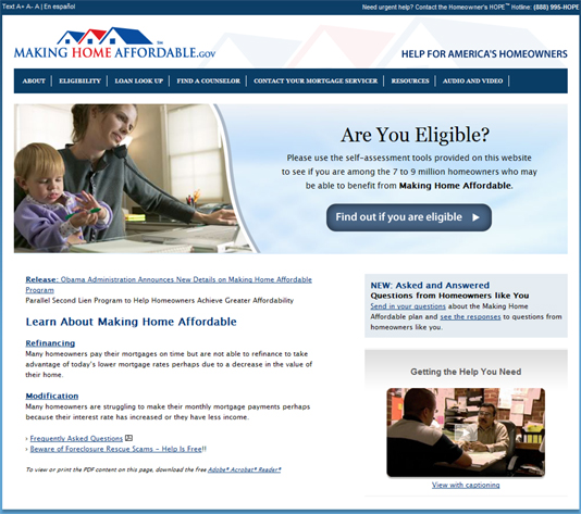
There are about 7 images on the landing page and exactly one image which does not have alt-text.

The image with no alt=text is a long white and blue bar (bottom.gif),
a decorative image, at the bottom of the page. It should have alt="". Even though screen readers
will ignore the image with
their default settings it still must have alt-text. There is also a
"PDF" image next to the link "Frequently asked questions" near the bottom left of the page. The
alt-text on that image is correct, alt="PDF",
but the image should be included in the anchor tag as part of the link text so a screen reader user tabbing to the
link will hear the information that the FAQ page is in fact a PDF file. It is disappointing that the FAQ page is
only available in PDF.
By the way, there is a set of six rotating images at the top of the page, each lasting about 3 seconds before the next image appears. This is all done with a Flash movie and is almost completely transparent to all keyboard users - the only minor exception to that is a blank tab stop on the movie itself - the fact that it is a Flash movie isn't even announced by a screen reader. This is all good because information is not conveyed by the six images; they are "eye candy" trying to create a mood for the site.
Video on the Landing Page
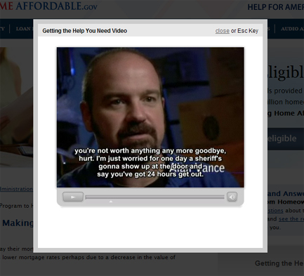
There is also a video on the landing page; and that video is correctly captioned. That is great news. But there is
a problem.  You
can start the video from the keyboard - that isn't a problem. But when the movie is started the enlarged player
appears with a light box effect - in a panel with the background greyed out - there is a screen shot of the player
on the right. This is exactly the same process that occurs when you exit the site (and WhiteHouse.gov or Recovery.gov).
I described the problem in my report
on Recovery.gov. And why is it a problem. If you are sighted it isn't. But if you can't see the screen or
if you rely on the keyboard instead of a mouse, then you are in trouble. A blind user has no idea what has happened
and would assume that they could listen to the video and proceed on with information on the site from the point where
they initiated the video. But this panel does not have input focus; I don't know how to get input focus onto the
panel.
So neither keyboard user nor blind user can tab to the player controls or the close link - worse, the blind user
has no idea that tabbing would be necessary; they would expect to be in the vicinity of the player controls where
the the movue was started.
As explained in the Recovery.gov report, the way to fix this is to use tabindex=-1 on
the heading "Getting the Help You Need Video" to make it focusable; then when the panel is displayed, move
focus to that the heading. In that way keyboard users will be in a position both to stop the process with the "Close" link
or control the player with the player controls. When the video is stopped with the Esc key or the "close" link,
focus must be moved back to the place where the movie was started. It would improve the experience for all users
if that happened automatically when the movie ends (close the panel and move focus back to where the movie was started).
The way it is now all users must dismiss the panel (Esc or "close")
to get back to the page.
The panel that appears when leaving the site, like when following the Treasury Department link at the bottom of the page, needs to be fixed in the same way that this video panel needs to be fixed.
The Video Controls
The video controls in the flash video player can not be accessed from the keyboard. This is a fundamental failing of accessibility requirements. Even if you could find the panel with the keyboard (it is at the bottom of the reading order) you wouldn't be able to access the controls.
In-page Navigation
Making accommodations for in-page navigation is of critical importance for visitors with disabilities. There are two ways in which the accommodations can be made. The first is "skip links," which we will mention below and the second is to use proper headings mark up. With such headings markup, a screen reader user can use headings navigation - just the H key - to move through the sections of the page to find the desired place to read or interact.
Headings on the Landing Page
On the home page of MakingHomeAffordable.gov there seem to me to be at most four sections. The fact that they are "sections" is not as obvious as it is on some sites like WhiteHouse.gov. These are as sections/headings that I see on the landing page. By each I have indicated the heading level I recommend.
- Are You Eligible (
h1) - Learn about Making Home Affordable (
h2) - New: Asked and Answered Questions (
h2) - Getting the Help you need (
h3)
The important thing about adding headings is to do it and to be consistent. The exact numbering (heading levels) is much less important.
There is exactly one HTML heading on the landing page, the first in my listed above, "Are You Eligible" and
that is an h3. For screen reader users, at least that provides a technique for skipping over the navigation
links - a 508 requirement.
Skip links (Template issue)
There is no skip link on the page. Skip links have long been advocated as a technique to permit visitors with disabilities to skip over repetitive navigation links to get to the main content of the page. So they are often labled "skip to main content" or "skip navigation." With headings navigation the importance of skip links has waned. But they still are an important accommodation for people restricted to the keyboard for input. Of course there are no skip links on the page.
A skip to main content link should be available at the top of each MakingHomeAffordable.gov page. It should be visible all the time or it should be positioned off screen and made visible when it receives focus. Skip links of this kind are included on my site, https://jimthatcher.com.
Color Contrast (Template issue)
The requirements for contrast on a web site as specified by WCAG 2.0 are that ordinary text have a contrast ratio of at least 4.5 to 1 and that large text (18 point or 14 point bold) have a ratio of at least 3 to 1. Don't let the "contrast ratio" idea worry you. There is a simple free tool to measure contrast ratios on your page. These requirements are at Level AA (Priority 2) in WCAG 2.0 and they are included in the proposed standards for Section 508. The contrast ratios on the Making Home Affordable site are very good with one exception. The footer text which is white on a light blue background has a contrast ratio of only 2.9 to 1 and it needs to be at least 4.5 to 1. The background/border color for the site moves from dark blue to light blue - and it is white text on the light blue that is problematic. If that gradient went to #7D7CA8 (instead of current #599FD0) then the white footer text would have a passing contrast ratio of 4.5 to 1.
Checking Eligibility, http://makinghomeaffordable.gov/eligibility.html

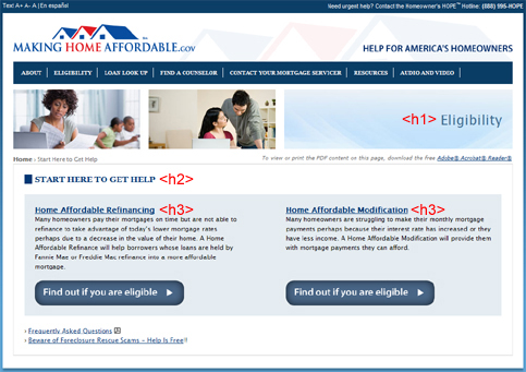
This is a very simple page (screen shot above). There are two alt-text errors. First the "eye candy" image at the top
has alt="image:
heading" and it should be alt="". The blue line at the bottom which has no
alt-text on the landing page here has alt="image:
bottom image bar" which is worse than no alt-text; this too should be alt="". As
on the home page, the PDF icon should be included in the anchor for obtaining a FAQ document.
Reading order & link text
As is evident in the screen shot above, there are two panels under START HERE TO GET HELP, on the left is "Affordable
Refinancing" and on the right is "Affordable Modification." The intention is that your read down one
of the panels or the other to end up at the appropriate "Find Out" button. But for screen readers that is
not what happens; instead the two identically coded buttons follow both of the headings and blocks of text.
Two things should be done to fix this. First include the buttons in the flow immediately after the corresponding
text using CSS to position as desired and second, elaborate the alt-text on both buttons to help distinguish them, alt="Find
out if you are eligible for Refinancing" and alt="Find out if you are eligible for Modification".
Headings
As mentioned above, it is important to be consistent with the headings markup. On this page, as on the landing page,
there is currently only one heading marked up; an h4 on "Start Here to Get Help". I think this
should be an h2.
As indicated in the screen shot above, there should be an h1 on the main heading, "Eligibility",
then level 3 headings on the two panels, "Home Affordable Refinancing" and "Home
Affordable Modification." Headings on subsequent pages should follow this pattern.
Am I eligible? (http://makinghomeaffordable.gov/refinance_eligibility.html)
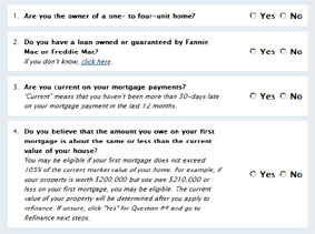
The important feature on this page compared with the previous two is the presence of an input form (screen shot below) so we will discuss form labeling here. The other accessibility issues - alt-text on images and headings markup are similar to the previous pages.
Labeling Forms

Labeling of forms is a critically important aspect of accommodation for people who are blind. The objective is that when a screen reader user tabs to an input field (radio button, text input, select menu, etc.) their screen reader will announce what is to be done. The screen reader will identify the HTML input controls, so the user might hear, "Last name, edit" where "edit" is the way screen readers refer to simple text input fields.
There are three basic techniques for form labeling: (1) The label element when on-screen prompting text
is contiguous and complete; (2) The title attribute on a form control when prompting information is separated
and or inadequate; and (3) the fieldset/legend combination which associates prompting text
with more than one control.
The form in the screen shot above consists consists of a series of 4 questions. For each question there is a pair of
radio buttons, "Yes" and "No".
These are in fact correctly labeled (with the label element) - for each radio button, the label element
wraps the text "Yes" or "No". That means that when a screen reader user tabs to the radio button
they will hear
"Radio button Yes, not checked." But "Yes" for what question. That is the problem - and the fieldset/legend combination
is the solution. The way it works is that the fieldset wraps the question and the radio buttons - the
whole area inside each light blue border in the screen shot above and then the legend element wraps the
question, for example, "Are you current on your mortgage payments". (Don't wrap the explanatory italic text
becaue then the prompts for the controls become so long as to be confusing,) With this markup, screen readers should
announce the question with the radio button, so it would sound like this: "Are
you current on your mortgage payments, radio button, yes not checked."
So that is what should be done with each of these questions. The current use of the label element is correct,
just add the fieldset and legend tags to complete the picture. For suggestions on styling
the fieldset/legend tags see The
Man in Blue.
There are other forms on the Making Home Affordable site. For example a simple input field to Contact
your Mortgage Servicer has no labeling - it needs a label element.
News Items
- Accessibility of Recovery.gov
- Accessibility of the Obama White House website
- Web Accessibility - the book - now in Japanese
- A ruling in the NFB vs. Target Lawsuit
- In-page links and the Internet Explorer Bug
- About Click Here and Other Link Text
- Web Accessibility Toolbar - Version 2.0
- Amazon and NFB sign Agreement
- A decision in NFB vs. Target
- Archived News Items