Figure 7-1. The USDA homepage.
The previous chapter focused on creating accessible content—content that is compatible with assistive technologies and that provides alternatives to nontext elements such as images and audio. We discussed how web pages can be constructed more effectively and designed to be easily accessible by people with disabilities.
In this chapter, we will discuss the
accessibility issues of getting around a given page, within the website and to
other websites. The distinction between navigation and content is somewhat
unrealistic. Several of the issues discussed in Chapter 6 certainly influence
navigation. For example, if you don't provide text equivalents for images that
are links, then people using screen readers or text browsers won't be able
understand the links on the page as they navigate through them. Similarly, if
you have not included alt-text for image map hotspots (<area> tags), then large portions of the page will make no sense at all to
people using assistive technologies. Unrealistic though the distinction may be,
this chapter will cover the navigation topics of reading order, headings navigation,
skipping over navigation links, accessible frames, accessible image maps,
layout effects on navigation, and accessible links. First, let's take a look at
some of the obstacles that people with disabilities face when they try to
navigate through a web page.
Usually, when web designers or developers think about "navigation," it is navigation within the website—getting from section to section to accomplish some task like searching for an item, finding it, and going through the process of checking out and purchasing it. These web professionals are probably not thinking about navigating within a single page because that is not what a sighted user does.
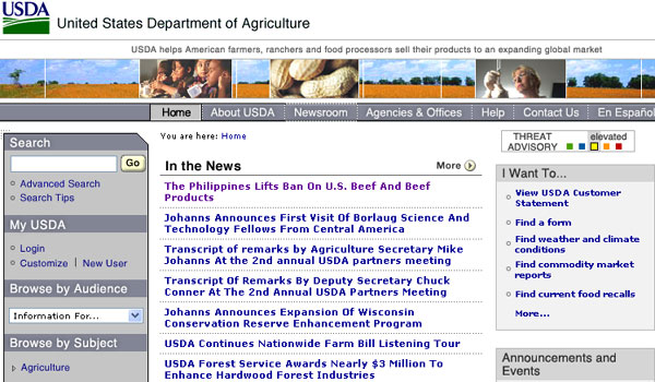
Let's look at a sample page, the homepage of the U.S. Department of Agriculture (USDA), shown in Figure 7-1.
Figure 7-1. The USDA homepage.
The headlines for news items on the USDA homepage are listed in the center of the page, about an inch and a half down from the top. Since I can see the screen, those headlines are very easy for me to spot and read. But if I wanted to read those same news headlines with a screen reader, it would take a while. There are about 106 words before the section heading, In the News, and it takes around 51 seconds to listen to those words with the JAWS for Windows screen reader (at its default speech rate).
The difference between what a mouse user
is able to do to focus on the news items and what a keyboard user must go
through is really quite astounding. If you can see the screen and want to read
the details of the first news item, you simply click the corresponding link,
such as The Philippines Lifts Ban On U.S. Beef And Beef
Products
. It is so easy and takes less than a second. It is what most
web designers and developers do and expect others to do. But if you can't use the mouse, you must use the keyboard (or another more
cumbersome input device) to move the input focus from wherever it is on the
page (if you can find it) to the link that you want to follow (of course, you
may not be able to know what link you want to follow), and then press Enter.
The USDA homepage has about 28 links before the first news item. If you are
starting from the top, that is the number of times you must hit the Tab key to
get there.
Many users can see the screen, but are
not able to use a mouse. If you are one of those users, as you tab through the
links towards your desired target, you must follow the focus rectangle in order
to know where you are. That is often very difficult and even impossible. In
Figure 7-1, input focus is on Newsroom
(in the
center of the horizontal navigation bar at the top of the page), but that
certainly isn't obvious. If you are using a screen reader, at least you have
the advantage of being able to hear each link as you go along.
Keyboard navigation of the web page is very important for many users, whether or not they use a screen reader. As a web author or web designer, you can do some simple things to make that process of page navigation much easier for your site visitors, especially those with disabilities. And there are important things that must be done if your page is going to comply with the U.S. Access Board Section 508 Standards for web accessibility or the Web Content Accessibility Guidelines (WCAG) from the Web Accessibility Initiative (WAI) of the World Wide Web Consortium (W3C).
Whether you use tables or standards-compliant Cascading Style Sheets Version 2 (CSS 2) positioning (see Chapter 9) to lay out your page, a screen reader will find (speak) the page in the order of the HTML source code. The speaking order may have very little to do with the way you see the page, in the sense that blocks of text could appear in quite different positions than those apparent from looking at the page.
If the page uses tables for layout, you can have a general idea about the order in which items will be visited or spoken just by knowing where the table cells are. Linearization, as described in the discussion of layout tables in Chapter 6, is what happens when source code order is applied to a layout table. A table is spoken by starting with the first cell and speaking everything in that cell, including any nested tables. Then you go to the next cell in the first row, speak that, and continue until you finish the first row. Then on to the second row, and so on, continuing in this way through the whole table.
Table reading order becomes confusing or
surprising when spanned rows come into play. In the table shown in Figure 7-2,
the first row consists of a single cell spanning three
columns and that is spoken first ("Sample Layout Table
"); it is first in the
source code order. The first cell of the second row spans two rows, but the
content of that cell comes next in the source code, and so is spoken next
("Navigation link 1 Navigation link 2 Navigation link 3 Navigation link 4
").
Then the second cell of the second row ("Banner ad
") is spoken. Next, the
screen reader speaks the third cell of the second row, which spans two rows
("Right Navigation 1 Right Navigation 2 Right Navigation 3
"). The last part of
this hypothetical layout table might be a main content area of a page. It is
the second cell of the third row and last in the source code order ("Main content area with lots of text and content filling
the center part of the window
").
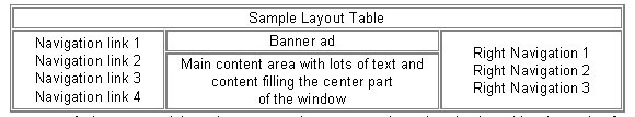
Figure 7-2. A hypothetical layout table
The only thing complicated about this idea of source code order is that you cannot know what source code order is by looking at the page. You need to look at the source code, which can be awkward at best! There are tools that can help. Figure 7-3 shows the CNN homepage modified using the Web Accessibility Toolbar (see Chapter 5). Use the Structure > Table Cell Order menu item to indicate the reading order of table cells.
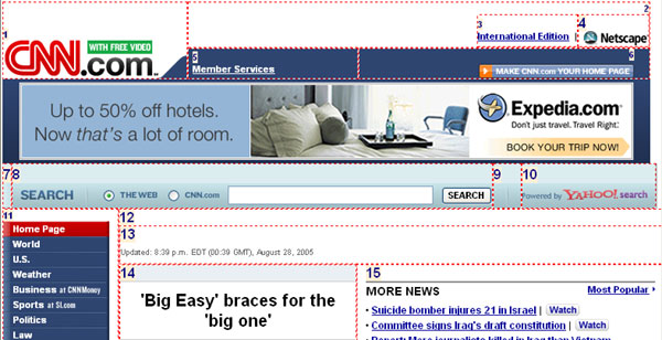
Figure 7-3. CNN homepage showing the reading order of table cells.
If the site uses CSS positioning to present the page, there is no way you can be sure of the order in which blocks of content will be spoken—that is, which blocks come before others in the source code order. Again, there are tools to help with this. The WAVE tool (see Chapter 5) can be use to indicate the order in which a sections of a page will be spoken.
Figure 7-4 shows my homepage (www.jimthatcher.com) modified by the WAVE to highlight the "chunks" on the page (divs) and their position in the source code
order.
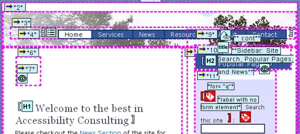
Figure 7-4. Screen shot of jimthatcher.com using the WAVE to highlight reading order.
For CSS-based pages, I think it is much simpler to just view the page with CSS turned off. This is most conveniently handled with the Web Accessibility Toolbar. Use the CSS > CSS On/Off menu item. With Firefox and the Web Developer Extension toolbar, use the CSS > Disable Styles > All Styles menu item. Figure 7-5 shows part of my homepage, this time with CSS turned off. This is precisely the order in which the page will be spoken or visited with a screen reader.
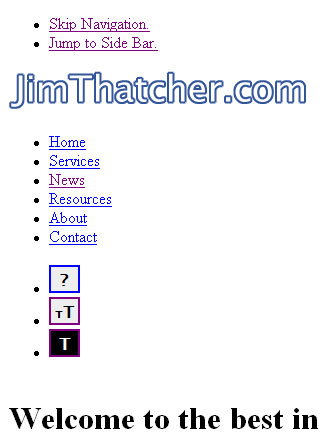
Figure 7-5. Screen shot of jimthatcher.com with CSS disabled to view reading order.
Now you know that text will be spoken and links visited in order of the text in the source code. How can a user get around a web page conveniently with just the keyboard, without using the mouse? "Get around" means being able to read different areas and being able to follow links scattered through the page.
As you saw in the example of a layout
table in Figure 7-2, it is possible that everything is spoken before the "main content.
" It is not that the information
with that layout does not make sense, because it does. In this very simple
mockup of a page, the main content takes up a quarter of the page. People who
are listening to the page may need to wait through three-quarters of the words
when what they really want is that main content. The problem of having to
navigate through the navigation links in order to find the main content reoccurs, page after page after page.
In the late 1990s, I advocated a "skip
navigation
" link at the top of every page (discussed in the next section)
because screen reader users were being overwhelmed with
all the information that preceded the main content on the page. As Vice-Chair
of the Electronic and Information Access Advisory Committee (EITAAC),
empanelled by the U.S. Access Board to propose accessibility standards, I urged
the adoption of a provision addressing this issue, and here is the result:
§1194.22(o) A method shall be provided that permits users to skip repetitive navigation links.
Even though it is far from perfect, it was very important that this provision became part of the Section 508 Standards for web accessibility. It raised awareness of the problems with keyboard navigation and now serves to encourage (or require) headings navigation.
It was disappointing that WCAG 1.0 hardly addressed this fundamental problem of keyboard page navigation at all. Two Priority 3 checkpoints in WCAG 1.0 are related to the issue of keyboard navigation:
13.5 Provide navigation bars to highlight and give access to the navigation mechanism. (Priority 3)
13.6 Group related links, identify the group (for user agents), and, until user agents do so, provide a way to bypass the group. (Priority 3)
But these checkpoints really do not address the problem. The Last Call current draft of WCAG 2.0 brings this issue to the forefront through Guideline 2.4 and its Level 1 success criterion:
Guideline 2.4 Provide mechanisms to help users find content, orient themselves within it, and navigate through it.
2.4.1 A mechanism is available to bypass blocks of content that are repeated on multiple Web units. [Level 1]
HTML has heading tags, <h1> through <h6>. Viewed as navigational features, when you use these heading tags,
their presence can be programmatically determined. If you have "section
headings" just styled with bold or certain background colors, their status as
section headings or navigational features cannot be determined. Refer back to
the USDA web page shown in Figure 7-1. I think it is obvious that Search
, My USDA
, In the News
, and I Want To
are section "headings," but they are not marked up that way. In fact, all of
these sections headings are images. They have appropriate alt-text, and those
images could easily be wrapped in heading tags to provide significantly
improved navigation.
The reason this is all so important is
that recent versions of screen readers allow a user to
navigate the headings on a page by simply pressing the H key (Shift+H to go to
the previous heading). If a page is well structured and the headings are marked
up as HTML heading elements (h1 through h6), then a screen reader user can easily get a useful survey of the
page content and useful access to that content by just navigating through
(listening to) the headings on the page with the H key.
To satisfy Section 508 provision §1194.22(o), if the main content begins with a heading (which certainly should be the case), it is an easy matter to skip over repetitive navigation links to get to the main content.
Figure 7-6 shows the Green Methods homepage. This is an interesting site with several accessibility features, including headings markup. I have used the Web Accessibility Toolbar (discussed in Chapter 5) to mark up those places where heading tags are used. Note that all the section headings are, in fact, HTML headings as they should be, and a keyboard user can, with eight keystrokes, get a quick and comprehensive outline of the structure on the page, and begin to read the section of interest.
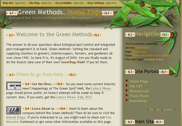
Figure 7-6. Screen shot of Green-Methods.com showing distribution of headings markup.
You might be concerned as to whether or not the U.S. federal government accepts headings markup instead of skip links for Section 508 compliance. The U.S. Access Board developed the Section 508 standards and provides guidance, technical assistance, and resources on accessible design. The Section 508 page of the Access Board site has no skip links and uses headings navigation instead. That should put that concern to rest.
You should use headings markup to address keyboard navigation of your page, in particular to be able to skip over repetitive navigation links and to get to the main content. Additionally, if you think about the sections of each page, and label those sections with headings, your whole site will be clearer and easier for everyone to use.
What about keyboard users who are not using an expensive screen reader? The Opera Browser provides headings navigation from the keyboard. Use the S key to move forward from heading to heading; use the W key to move through headings in reverse direction. Remember that with Opera, links are accessed with the A key instead of Tab, and the Q key goes through links in reverse direction, like Shift+Tab. At the time of this writing, only the first beta of Microsoft Internet Explorer 7 has been released to a small set of MSDN subscribers. I hope that headings keyboard navigation will be implemented in that version.
As discussed in the previous section, the correct way to deal with page navigation is to use headings. This section reviews techniques used to provide the ability to skip navigation links (you may still want to use that approach, in addition to headings). Then we will look at how skipping text blocks works with assistive technologies.
Let's survey the techniques for skipping links. We will look at four methods for providing skip navigation links:
After reviewing these techniques, I will point out a serious issue with skip links and Internet Explorer 6 that applies to all in-page links—all links that go from one spot on a page to another spot on the same page.
The simplest technique is to just place a
text link at the top of the page. I believe that one of
the first skip navigation links was that used by the American Council of the
Blind (ACB). The ACB
site has a link at the top of the page in a small font with link text, Skip Navigation Links
, as shown in Figure 7-7.
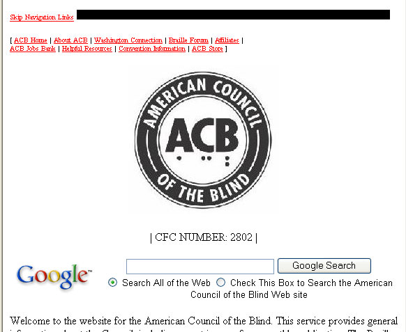
Figure 7-7. The ACB homepage has a visible skip link.
When a visitor using a screen reader opens the ACB homepage, the first announcement is
"Link skip navigation links.
" If users want to listen to the navigation links,
they can just ignore this skip link, just as they can ignore any other link. On
a first visit to the page, the user might indeed want to listen to those
navigation links, but the presence of the skip link empowers the screen reader
user with the choice.
The code for the skip link at the top of the ACB homepage looks like this:
<a href="#nonav"><font size="-2">Skip Navigation Links</font></a>The ACB web developers placed the
defining anchor with name="nonav" on the ACB logo image:
<a name="nonav">
  <img src="acob5.gif" alt="American Council of the Blind"...>
</a>
That means when the skip link is
followed, the alt-text for the logo, "American Council of the Blind
," is the
next item to be announced.
The definition of the local anchor does not need to have content. The code <a
name="nonav" id="nonav"></a> is valid and could have been placed just before the Welcome
to the website for the American Council of the Blind text on the page
(see the following discussion of in-page links). This is a very important part
of the skip navigation idea. The target anchor does not need to enclose any content. As such, it can easily be placed in a
template to be used for all pages based on the template.
The ACB site seems to take the words skip navigation links literally. Their skip link just skips over the two lines of text
links at the top of the page and does not skip over the logo or the search
fields. I would code the target of the skip just before the main content,
starting with Welcome
farther down the page.
A contemporary CSS-based page is the Guild of Accessible Web Designers (GAWDS) homepage. Part of that page is shown in Figure 7-8.
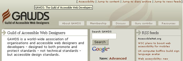
Figure 7-8. The top of the GAWDS homepage has three visble skip links.
Notice that there are three navigation
links at the top of the page, offering jumps to the
content, diary archive, and news feeds. This page
includes 15 headings (one h1,
three h2, and eleven h3),
so heading navigation is well supported. The three navigation links provide
access to key areas of the page in addition to heading navigation.
People with disabilities are best served
when the skip navigation links are on-screen and normal text. Users who can see
the screen but do not use a mouse will not be surprised
when links appear or disappear. For example, on the GAWDS page, users can set
about a task to read about RSS feeds by first tabbing to the Jump to news feeds
link, activating that link, and then
reading in the resulting section. When the links are hidden, as discussed next,
their existence is a surprise and, on an unfamiliar site, a plan of action is
hard to establish.
Alt-Text on an Invisible ImageThe CNN site, shown in Figure 7-9, has had a skip navigation link for a number
of years. The CNN page has a top area, including a logo
and a search field, and then a long list of navigation links down the left and
right sides of the page. The left navigation is site navigation. The MORE NEWS
navigation on the right changes from day to
day and is local to the area of the site (U.S. in Figure 7-9). If you tried to
use the Tab key to get to the main story (the main content)—in this case,
9/11 recordings, documents released
—without
using the skip link, you would tab about 28 times through the left navigation
links. The surprising aspect of this site is that it has exactly one HTML heading: an h2 on the title of the main story. There are about ten other places on
the CNN page that could use HTML headings; MORE NEWS
is one that is visible in Figure 7-9.
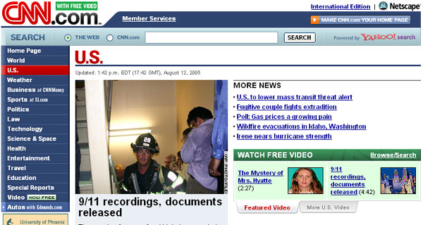
Figure 7-9. CNN.com has an invisible skip link.
An invisible GIF on the top-right of the
CNN page is the skip
navigation link. If you turn off images (for example, for Internet Explorer,
under Windows, choose Internet Options > Advanced, check the Always
expand ALT text for images option, and uncheck the Show pictures option), the link will appear far off to
the right. Instead of turning off images, you can view the source code (View > Source Code in
Internet Explorer), and here is what you will find, first for the image link,
then the local anchor:
<a href="#ContentArea">
  <img src="http://i.cnn.net/cnn/images/1.gif"
    alt="Click here to skip to main content"
    width="10" height="1">
</a>

<a name="ContentArea"></a>
This local anchor, ContentArea
, is just before the U.S. headline in
red (which is actually an image with alt="U.S. News"). The anchor is in the template and above the content that changes
hourly.
Let's summarize this method. At the top of the page, you place a link on an invisible
image with alt-text such as "skip navigation
" or "skip to main content
" and with an href that points to a local anchor with empty content just above the
main content. But do not say "Click here to ...
", as on the CNN site; instead, just express the function of the
link, "Skip
to main content
" (see the "Accessible Links"
section later in this chapter for more on link text). This is a very practical
method of providing a skip navigation link, satisfying the Section 508
provision without changing the visual appearance of the page or site.
The same technique is used on many sites, including IBM. Unlike CNN, which used one heading, IBM (at the time of this writing) uses no headings markup, and the only assistance for page navigation is that provided by one skip link.
This technique is designed so that the visual appearance of the page isn't changed at all. But what about keyboard users who are not using a screen reader? The accommodation of an invisible skip navigation link almost entirely leaves them out. I say "almost" because a keyboard user could, if desperate for keyboard access, watch the status area of the browser and notice the href of the skip navigation link appear, as shown in the example from Netscape 7.2 in Figure 7-10.

Figure 7-10. The href of the focused link shows in the status bar.
Figure 7-11 shows the top of the FirstGov portal site for the U.S. federal government.

Figure 7-11. The FirstGov.gov banner.
In October 2001, the banner was similar to what it is today. There were five links at the top of the page using very small text, which was the same color (white) as the background, styled like this:
<a href="#content">
  <font color="#ffffff" size="-6">Skip to content</font>
</a>
...
The skip links served as a kind of hidden
table of contents, with a link to each of the main content areas of the page.
They were Skip to content
, Skip to Government search
, Skip
to Departments and Agencies
, Skip to Reference
,
and Skip to Customer Survey
. That table of
contents was hidden from all users except those with a screen reader or those
viewing the page with all styling turned off. Figure 7-12 shows the current
page (as of this writing) with styling turned off using the Web Accessibility
Toolbar (see Chapter 5).
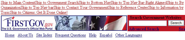
Figure 7-12. Turn off CSS to expose the skip links on FirstGov.gov.
Now there are twice as many skip links as
before, ten of them at the top of the page
preceding the banner, the search field, and the main navigation
links: Skip to Main Content
, Skip to Government Search
, Skip
to Bottom Nav
, Skip to Top Nav Bar-Right Aligned
,
Skip to By Organization
, Skip
to Top Nav bar
, Skip to Contact Your Government
,
Skip to Reference Center
, Skip
to Information by Topic
, and Skip to Citizens:
Get It Done Online!
. The first skip link, Skip to
Main Content
, is a skip skip links link! These links are styled like
this:
<a class="invisiblelink" href="#content">
<span class="invisiblelink">Skip to Main Content</span>
</a>
<a name="content"></a>
The style sheet includes invisiblelink styling:
.invisiblelink {
  font:bold 1pt Arial, Helvetica, sans-serif;
  text-transform:none; color:#ffffff;
  text-decoration:none
}
These ten links are available (essentially) only to a screen reader user. How does this accommodation compare to using heading navigation (if headings had been coded on the page, which they were not)? There is no comparison. First, the many links added to the top of the page become a burden for a blind user with a screen reader. Second, if headings were used, then simple navigation keys can be interspaced with further line-by-line browsing, then continuing with previous or current heading. With the skip link table of contents, the user wanting to browse like that would need to go back to the top and step through the links again in order to skip to a different place.
A fairly new accommodation combines the idea of not cluttering the page with skip links and, at the same time, having links available to keyboard users who are not using screen readers. Figure 7-13 shows an example of a site that uses this approach. The figure shows the top part of the homepage of the Information Technology Technical Assistance and Training Center (ITTATC), which is funded to support Section 508.
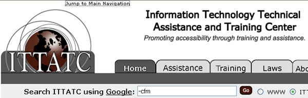
Figure 7-13. The skip link on ITTATC.org appears when it receives focus.
Three links at the top of the page are
styled with a white font on a white background, until the link receives focus.
Then the link becomes visible. In Figure 7-13, Jump to Main Navigation
has input focus and is visible.
The ITTATC skip link looks like this:
<a href="#Content" class="InvisiLink" title="">Jump to Page Content</a> From the ITTATC style sheet, named ultimate.css, here is the style associated with the class InvisiLink:
A.InvisiLink {
  text-decoration: underline; color: #ffffff;
  font-family: Verdana, Arial,
    Helvetica, sans-serif, "MS sans serif";
}
For both pseudo class selectors :active and :hover, the style is slightly different.
A.InvisiLink:active {
  text-decoration: underline; color: #000000;
  font-family : Verdana, Arial,
    Helvetica, sans-serif, "MS sans serif";
}
The only change for the :active and :hover pseudo classes is to specify font color black (#000000), so that when you tab to the link or move your mouse over the
link, it becomes visible.
A second example of this kind of accommodation is from my own site, www.jimthatcher.com, as shown in Figure 7-14.
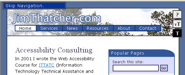
Figure 7-14. The skip navigation link becomes visible on JimThatcher.com when focused.
Here, the skip link becomes visible when it receives focus, but is styled off-screen so it does not occupy screen space. The skip link looks like this:
<li class="skip">
  <a href="#cont" id="skpnav">Skip Navigation.</a>
</li>
In the next section, I will talk about the target of this skip link, which is a bit of a surprise.
Let's look at the styling of the class skip:
.skip a {
  padding: 0 0.5em; display: inline; z-index: 2;
  text-decoration:none; position: absolute;
  width: 14em; left: -200em
}
.skip a:focus, .skip a:active {
  position: absolute; left: 0.5em; border: solid #333 2px;
  color: #fff; background: #555
}
With this styling, the inactive, unfocused skip link lies off-screen (left: -200 em) and is also available to a screen reader user. When the link
receives focus using the Tab key, it is repositioned to be on-screen and is
made visible.
The target of the skip link on my website used to look like this:
<table>
<tr><td><a name="cont" id="cont"></a></td></tr>
</table>
Why a table? The answer is that there is a bug in Internet Explorer 6 that causes in-page links to not work from the keyboard. But when the target of any in-page link is placed at the top of a table cell, it will work correctly from the keyboard with Internet Explorer 6. What does work correctly mean? This description seems to be daunting for many web developers, who are so focused on and dependent on the mouse. Here is how to test any in-page link:
If you follow these steps with Netscape 7.2, Mozilla Firefox 1.04, or Opera 7.54 (substitute the A key for the Tab key in Opera), everything will work as you would hope and expect. This is not so with Internet Explorer 6.
For table-based sites
like CNN and IBM (as of this writing), the skip links usually work because it
is natural that the target is at the top of a table cell (td). For more contemporary sites like that of the WAI, for example,
the in-page links do not work. Try the WAI homepage. Tab to the Skip to Content
link and
press Enter, and the visual focus moves, but when you press Tab again, the
input focus is back at the top of the page. It should work, but it doesn't, at
least as of this writing. This is true of many sites, and not just for skip
links. For example, I have a short "table of contents
" at the top of my
comparison of Section 508 and WCAG. Though they are fixed now, up until recently, if you activated
one of those from the keyboard, then tabbed again, you would be back at the top
of the page.
What is the solution (read "work-around")
for this problem? Through discussions on various mailing lists over several
months in the spring and summer of 2005, the nature of the Internet Explorer 6
bug became clearer. In May 2005, Becky Gibson (of IBM) and Mike Scott (of
MSF&W) independently recognized that when targets of in-page links were contained in elements "with width defined
" (whatever that
means), they generally worked from the keyboard. It was Terrence Wood who put
it together with the hasLayout property.
When a link is activated, Internet Explorer 6 places input focus on one of the following:
tabindex specified)div or span with the property hasLayout equal to truetd or body objectThe fact that table cells are in this
list explains why in-page links usually work in table-based pages. The presence
of body element explains why the input focus after an in-page link often
goes to the first link on the page.
A Google search for "hasLayout property" will yield a Microsoft MSDN page at the top of the list
that describes this property and methods for setting it to true; setting width
and height is one such method. That same Google search will turn up a number or
articles about in-page links and the Internet Explorer 6 bug.
With that said, here is the work-around that I use to ensure that my in-page links work from the keyboard with Internet Explorer 6. This is the coding for a typical target:
<span style="position:absolute;">
<a name="content" id="content"> </a>
</span>The anchor element (a) is not empty, but contains a nonbreaking
space, which is invisible because it is given position:absolute. Without that content of the anchor tag, it turns out that visual
focus doesn't work correctly. I hope that the next version of Internet Explorer
will have this fixed, but Internet Explorer 6 will be around for a while, and this work-around is not too offensive.
Unfortunately, many important websites do not provide any of the simple accommodations discussed in the previous sections to permit people who cannot or do not use the mouse to quickly get to the main content of the page and around the major sections of the page. As is typically the case, the assistive technology developers recognize this problem and make valiant efforts to solve it for users of screen readers and talking browsers.
Navigation with screen readers has become quite sophisticated with keys to move through (forwards and backwards) headings, tables, links, lists, form elements, frames, and "chunks."
In this section, we'll look at the commands to jump over blocks of links in Window-Eyes 5.0, IBM Home Page Reader 3.04 (two updates since 3.00), and JAWS for Windows 6.2.
Window-Eyes was the first screen reader to build in significant mechanisms for skipping over blocks of links, and now has about 20 different commands that have that effect. You can jump to more specific points in the document, such as to the next form control (C), the next link (L), next list (S), or next table (T).
You can also jump to the next block of
normal inactive text (X). This next text jump can be
configured as to how much text will be considered a block of normal text, so
that a word or two, or a heading can be ignored. Settings for the number of
characters and number of lines for the X jump are in the Window-Eyes Verbosity Settings (Ins+V). Choose MSAA > Miscellaneous
> Next Text Minimum Line Length and Next Text Consecutive Lines. Both of these values
default to 1, meaning that, in the default environment, any single nonactive
word will be considered to be a block. The reason this jump might be important
is the possibility of letting the screen reader jump
over those "repetitive navigation links
" all on its own, with no help from the
web page designer.
With the default settings, from the top
of the CNN homepage (Figure 7-9), you need to use about six next text jumps (X)
to arrive at the main content targeted by CNN's skip link. If you change the Next Text Minimum Line Length to 25 text characters and
the Next Text Consecutive Lines to 2 text lines,
three next text jumps work (in a 2001 version of CNN.com, it took only one next
text jump, but now there seems to be an iframe on CNN.com that is complicating the process). But the main story
begins with a heading (h2),
and it is the only heading, so a simple H key press takes you to the main
story.
The difference between a single H key press to move among headings (for Home Page Reader and JAWS as well) and activating the skip link (with Enter) is a difference between day and night. With the H key, Window-Eyes responds by announcing the level of the heading (2) and the heading text. When you press Enter on the skip link, Window-Eyes announces that it is reloading the page and presents the table of statistics for the page (links, frames, Flash objects, and so on), and finally, the text at the target of the link if the jump worked (and sometimes it doesn't work). I don't know why Window-Eyes reloads the page when an in-page link is activated, but it does. And the fact that it does is reason enough that a skip link is a poor accommodation compared with proper headings markup. With the H key, you hear the headline in 2 seconds; it takes about 25 seconds to get through the page reloading message and get to the news.
IBM Home Page Reader includes a command (Ctrl+down arrow) to jump to the next block of text or links, similar to Window-Eyes. So if you are positioned on link text, then this jump takes you to the next nonlink text. If you are positioned on nonlink text, this jump takes you to the next link.
The idea of the next block jump
(Ctrl+down arrow) is to skip over the groups of links. But the problem is that
very often, there are short stretches of nonlink text scattered among the
links, so it still may take a long time to reach the main content. To add to
this problem, Home Page Reader inserts metatext, such as "Internal frame 2:
Untitled
," in its text view, which is then
counted as nonlink text. Similarly, "Start of form 1
" and "End of form 1
" are
both stops for this jump command. Home Page Reader uses six jumps to get to the
headline on the homepage of CNN.com (Figure 7-9).
JAWS provides single-character commands for skipping to most object types, including controls (C), buttons (B), edit fields (E), frames (M), headings (H), same element (D), different element (D), and many more. For headings, you can even jump by level using keys 1 through 6.
JAWS Version 6 introduced the new concept
of place markers. You can insert a place marker
at any position of and page (Ctrl+Shift+K), then return to it with K (Shift+K goes to the previous marker). I experimented by adding place markers at the
beginning of the main content of CNN.com (Figure 7-9) and at MORE NEWS
. A week later, much to my surprise, the main
content place markers still worked, but the MORE NEWS
place marker was off by a line. I am not sure how this is implemented. But it
is a cool idea enhanced by the possibility of
community-based place-marking, since place markers can be shared among JAWS
users.
Although few websites use frames these days, when coded correctly, websites with frames can (in principle) achieve access improvements.
The U.S. Access Board advises that frames be identifiable with titles in this Section 508 provision:
§1194.22(i) Frames shall be titled with text that facilitates frame identification and navigation.
The wording of WCAG 1.0, Checkpoint 12.1 on frames is nearly the same:
12.1 Title each frame to facilitate frame identification and navigation.
So where are these "titles
" that the
guidelines require? The problem with all of these guidelines is that the word title in them is ambiguous.
Guideline 4.1 of the Last Call draft of WCAG 2.0 is the key to accessible frames:
Guideline 4.1 Support compatibility with current and future user agents (including assistive technologies).
The corresponding Level 1 success criterion is the following:
4.1.2 For all user interface components, the name and role can be programmatically determined, values that can be set by the user can be programmatically set, and notification of changes to these items is available to user agents, including assistive technologies. [Level 1]
Success Criterion 4.1.2 requires that it
is possible to determine the role of a frame, and the
simplest way to do that is by providing meaningful title attributes on those frames.
Let's see how frames work, to help make the issues raised by the guidelines clearer.
A frame page is actually a collection of pages displayed in separate windows (or frames) within the main window. The main page of a frame site is called the frameset page, and it specifies the layout of the various pages (frames). What is appealing about this design is that the different functions of various parts of the page are separated into different files, which can contribute to helpful navigation for all users.
Figure 7-15 shows an example of a frame site that duplicates the structure of the table shown earlier in Figure 7-2. This frame page consists of five frames; a title frame, two navigation frames, a banner, and the main content, corresponding to the cells of the table in Figure 7-2.
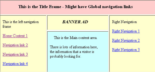
Figure 7-15. An example of a frame layout.
Here is the code for the frame structure in Figure 7-15:
<frameset rows="40,*">
  <frame src="Title.htm" ... id="toptitle"
    name="TopTitle" title="Top Title">
  <frameset cols="150,*,150">
    <frame src="Left.htm" ... id="leftnavigation"
      name="LeftNavigation" title="Left Navigation">
    <frameset rows="40,*" border="2">
      <frame src="Banner.htm" ... id="bannerad"
        name="BannerAd" title="Banner Ad">
      <frame src="Content1.htm" ... id="maincontent"
        name="MainContent" title="Main Content">
    </frameset>
    <frame src="Right.htm" ... id="rightnavigation"
      name="RightNavigation" title="Right Navigation">
  </frameset>
</frameset>
Notice that each <frame> is provided with a title attribute together with both an id and a name attribute. The name and id attributes are how code in the HTML page refers to a frame (the id attribute replaces the name attribute for XHTML, so for a while both should be used). Often,
the name attribute is totally obscure, like name="frame0978", and that is okay, because only programmers
are supposed to see this. Links should specify a target frame in which the new
page will open. When a link in the navigation frame opens up a page in the main
content window, the navigation link should specify MainContent
as its target attribute:
<a href="Content2.htm" target="MainContent">Navigation link 2</a> The beauty of this for all audiences is that, when this link is activated, only the new main content page is opened or refreshed; the other frames, perhaps with a table of contents or large banner images, all stay as they were. If you want to read the main content of this sample frame site, just open the main content frame. If you want to check out the navigation links, read the navigation frame. And when you decide to follow a navigation link, since the target frame is specified, assistive technology can automatically read the main content page where the page you requested will be displayed. This scenario is why frame navigation can and should be easy if it is designed correctly.
Remember that the name and id attributes must be only one word beginning with a letter (A–Z; a–z)
and may be followed by any number of letters, digits (0–9),
hyphens (-), underscores (_), colons (:),
and periods (.).
The title attribute, on the other hand, is the textual description referred
to in the guidelines cited at the beginning of this section. The title attribute is for human consumption. When assistive technologies
list frames, they generally list the title attributes of the frames when available; otherwise, they revert to
the name attributes.
When the Lynx text browser opens a frame site, it presents the user with a list of links to the various frame pages. Although assistive technologies use title attributes, Lynx identifies the frames by the name attribute if one exists; otherwise, each frame is identified with a
number.
Figure 7-16 shows the list of frames as
Lynx sees the example in Figure 7-15. The current link is MainContent
. If the Lynx user follows that link (using
the right arrow key), the main content page is opened, as shown in Figure 7-17.
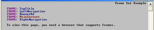
Figure 7-16. The Lynx view of the sample frame page.
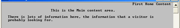
Figure 7-17. The single main frame page displayed by Lynx.
With a meaningful name attribute on every frame, the Lynx user can easily identify which
frame to open. This Lynx view of the frame world captures the idea of frame
browsing as a list of named HTML pages and their contents.
The situation is similar
in the case of JAWS for Windows. However, when JAWS
opens a frame page, it begins reading frame content one frame at a time in the
order seen in the Lynx view shown in Figure 7-16, and which is explicit in the <frameset> page. As a new frame is encountered, JAWS announces "Frame
," along with
the value of the title attribute (or the name attribute if the title attribute is not available) of the frame. The JAWS user can also
request a list of frames using the Ins+F9 command, and the list looks like
Figure 7-18.
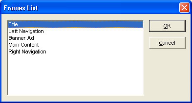
Figure 7-18. The JAWS list of frames.
Window-Eyes and Home Page Reader do the
same thing. If no title attribute is available, these technologies will revert to the name attribute of the frame. With no title or name attribute, Home
Page Reader will try to use the <title> element on the actual frame page instead.
But very often, frame pages do not have <title> elements because the developers of those pages don't see those
titles in the title bar; they see only the title of the <frameset> page.
When Home Page Reader encounters the
sample frame site in Figure 7-15, it opens the first frame, announces the <title> element of the <frameset> page ("Frame Set Example
"), the number of the frame to be read,
"Frame 1 of 5
," the <title> attribute of the <frame> page ("Title
"), and then finally
reads the frame page itself.
Figure 7-19 shows a test frame site hosted on the Freedom Scientific website. The site actually has three frames; the top frame containing an
image has been cropped from the view to save space. The two frames shown in the
figure are a table of contents frame on the left and a content frame on the
right. So, when you want to read one of the sections, say The HTML Frames Challenge
, you find that link in the
table of contents frame and activate it. Then the section will open on the
right in the content frame, ready to be studied and navigated. Well, for some
it is ready—if you can see and don't rely on the keyboard for navigation,
it is ready.
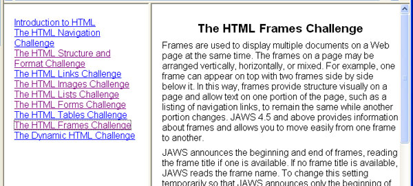
Figure 7-19. Sample frame page showing table of contents. Input focus stays on the link after opening the new frame.
Before capturing the screen in Figure
7-19, I had just used the Tab key to navigate down the table of contents page
and pressed Enter on The HTML Frames Challenge
.
This opened the material in the content frame on the right. But notice in the
figure that Internet Explorer has left focus on the link just activated. The
focus rectangle is just barely visible. So, the next tab will not move around
the content page as it should; it will still be locked in the table of contents
frame. The same thing happens in the Firefox 1.04, Netscape 7.2, and Opera 8.02
browsers.
Basically, this browser focus problem
negates the value of frames that I talked about earlier for people who rely on
the keyboard. Two of the assistive technologies compensate for this and
correctly take care of focus. Both JAWS and Home Page Reader start reading "The HTML Frame Challenge
" (and put input focus there,
too) after the table of contents link is activated. Unfortunately, Window-Eyes
and Hal both continue reading in the table of contents where Internet Explorer
has left the input focus.
There are fundamental usability problems
with frames because they break the unified model of the Web—pages are not
represented by unique URLs. Bookmarking, printing, and sharing of URLs don't
work as they should. However, in some cases, a web application requires frames.
When you must use frames, adding title attributes to the frameset components is a
very small task compared to the development of a framed site. Therefore, you
should have no difficulty following these guidelines:
title attribute for
each <frame> element that clearly describes the purpose of the frame, such as Main Content,
Site Navigation, or
Table of Contents.
<title> element. Make sure this is true for all frame pages as well.There are two kinds of image maps: client-side and server-side. Client-side image maps are by far the most common type of image map to be found on the Web today. In fact, server-side image maps should be avoided.
I talked about client-side image maps in the previous chapter, where I emphasized the requirement of text equivalents for all image map hotspots. These text equivalents are absolutely essential for accessibility.
The image map is called client-side because the browser (the client) must
figure out how to handle the result of a click on the image. Any time there is
a click on the page, the client (browser) figures out whether or not the
coordinates of that click fell inside one of the regions specified as an <area> of the client-side map. If the click is inside one of those
regions, then the browser opens the corresponding URL—that is, the value
of the href for that <area>.
Figure 7-20 shows a client-side image map
from an earlier version of the U.S. Senate website. The alt-text on the image that creates the map is alt="Quick
List".

Figure 7-20. Navigation panel as client-side image map.
Here is the code that designates the image in Figure 7-20 as a client-side image map:
<img src="sidebar.gif" alt="Quick List" ... usemap="#subnav"> Client-side maps need to have a usemap attribute, not an ismap attribute. In this case, the usemap attribute points to a map called subnav, which defines the areas of the image map
that are hotspots. In the example, there are four areas:
<map name="subnav">
  <area shape="rect" coords="4,33,76,72" href="..."
    alt="Committee Hearing Schedule">
  <area shape="rect" coords="5,78,88,117" href="..."
    alt="Yesterday's Senate Floor Activity">
  <area shape="rect" coords="5,121,75,140" href=" ... "
    alt="Senate Art">
  <area shape="rect" coords="5,143,59,172" href=" ... "
    alt="Senate History">
</map>
The four image map areas have alt-text
that is exactly the same as the text in the image; this is perfect. The way
that this client-side image map works is that each <area> specifies a region of the image in which a click will open a
certain URL, namely the href of the <area>.
The shape and coord (coordinates) attributes define the region of each <area>. There are three possible shapes: rect for rectangle, circle, and poly for polygon. The coordinates are pixel coordinates measured from the top left
of the image. For a rectangle, the developer must specify the top-left and
bottom-right corners. A circle is given by the center point and radius. A
polygon is specified by a series of points corresponding to the corners of the
polygon.
Figure 7-21 shows another image map, from www.metrokc.gov/services.htm. It is fundamentally different from the previous example in Figure 7-20.

Figure 7-21. Server-side image map for King County navigation bar.
Figure 7-21 is a server-side image map, with the following elided code.
<a href= "wwwnav.map">
  <img src="... navbar.gif" border="0" ismap="ismap"
    alt="King County Navigation Bar (text navigation at bottom)">
</a>
Since this is a
server-side map, there is no usemap attribute. Instead, the image itself is enclosed in an anchor tag (<a>) and the img element has the Boolean ismap attribute. That attribute tells the browser to send the coordinates
of the user mouse click directly to an associated map
file on the server that is referenced by the href attribute of the anchor element. For any person who cannot use the
mouse, this is a fundamentally inaccessible form
of navigation because it requires positioning the mouse on some part of a
picture indicating a desired action (pressing Enter on a server-side image map
sends click coordinates 0,0 to the server).
The U.S. Access Board recognized the problem with server-side maps and recommends having redundant text links if you do use a server-side map, in this Section 508 provision:
§1194.22(e) Redundant text links shall be provided for each active region of a server-side image map.
WCAG 1.0 has the same requirement at Priority 1:
1.2 Provide redundant text links for each active region of a server-side image map.
Indeed, the King County site in Figure
7-21 has redundant text links at the bottom of the homepage, and the alt-text
for the server-side map tells the user to find text navigation at bottom
.
I can't see any reason why the King County site would use a server-side map for its main navigation. The equivalent text links at the bottom of the page make it accessible and compliant. The King County site, however, does not satisfy the second provision of the Section 508 rule on web accessibility:
§1194.22(f) Client-side image maps shall be provided instead of server-side image maps except where the regions cannot be defined with an available geometric shape.
The Section 508 provision is again almost identical to Checkpoint 9.1 of the WCAG:
9.1 Provide client-side image maps instead of server-side image maps except where the regions cannot be defined with an available geometric shape.
In the Last Call draft of WCAG 2.0, three success criteria relate to server-side maps under Guidelines 2.1, 2.4, and 4.2, respectively:
Guideline 2.1 Make all functionality operable via a keyboard interface.
SC 2.1.1 All functionality of the content is operable in a non time-dependent manner through a keyboard interface, except where the task requires analog, time-dependent input. (Level 1)
Guideline 2.4 Provide mechanisms to help users find content, orient themselves within it, and navigate through it.
SC 2.4.4 Each link is programmatically associated with text from which its purpose can be determined. (Level 2)
Guideline 4.2 Ensure that content is accessible or provide an accessible alternative
SC 4.2.1 At least one version of the content meets all level 1 success criteria, but alternate version(s) that do not meet all level 1 success criteria may be available from the same URI. (Level 1)
There is nothing about the regions in the King County image map that would make them difficult to define with available geometric shapes; simple rectangles would work well. In fact, the main navigation map on the homepage has now been changed to a client-side image map, as shown in shown in Figure 7-22.

Figure 7-22. King County navigation as client-side image map.
As mentioned earlier, client-side maps
provide three shapes to describe regions: rectangles (shape="rect"), circles (shape="circle"), and polygons (shape="poly"). Effectively, any shape can be described with a polygon or collection
of polygons.
Figure 7-23 shows a good example of a client-side image map with rather complex hotspots, which are regions defined by polygons. It is Microsoft's Local District Information map.
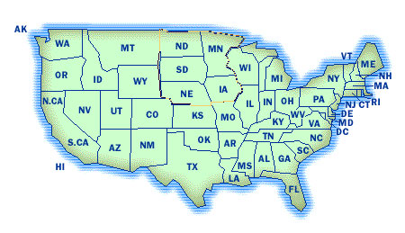
Figure 7-23. A complex client-side map - a stylised map of the USA, divided into states.
Using the Tab key, I moved the focus indicator in Internet Explorer to the upper Midwest area in the map in Figure 7-23 so that the focus polygon is visible. The source code for that area in the map uses a polygon determined by about 45 points:
<area shape=poly
 coords="173,7,181,9,180,10,227,9,232,10,233,12,238,11,244,12,
 250,13,257,14,263,15,267,17,259,27,251,27,245,36,249,41,246,48,
 254,53,256,57,257,61,258,66,262,68,263,73,264,75,263,77,     262,78,260,78,259,80,258,82,257,84,256,86,254,87,243,87,243,88,
 229,88,229,92,207,92,206,90,186,90,184,85,173,82,170,45, 172,30,172,7,174,8"
 href="..." alt="Twin Cities: ND, MN, SD, NE, IA">
In principle, any region of a finite image can be defined by one of the available geometric patterns of a client-side map. In the worst case, individual areas could consist of individual pixels. But, as the map in Figure 7-23 illustrates, complex regions also can be defined using polygons. It is therefore my conclusion that there is no case where a server-side map is permitted under the Section 508 provision §1194.22(f) or WCAG Checkpoint 9.1.
Even though it is hard to imagine, there may be cases where a designer wants every pixel to be a hotspot with different actions. You might argue that there are too many regions in this case. But that is a different issue than the one raised by provision §1194.22(f) and Checkpoint 9.1. A client-side image map still could be used.
The following points apply to accessible image maps:
alt-text for every <area> of the <map> and also don't forget alt-text on the image that creates the map.Most of us will navigate within a page intuitively. If you can see the
page, you can visually move to the main content of the page and read the story,
or indeed look across the top global navigation buttons to find the Search
form or Contact Us
link that you need. You look down the right column to find the other top stories
or shopping specials. The process of finding those items is as much navigation
as the process of moving from page to page. While reading the main content, a
sighted user may have to page down or use the mouse to move down with the
vertical scroll bar. Clearly, layout is affecting the process of navigating the
content of the page. This process is much more complicated and difficult if you
cannot use the mouse or you are partially sighted or blind.
As you've seen, using HTML headings for the sections of your page can make a huge difference in user navigation. A skip navigation link can facilitate movement to the main story. The hidden table of contents at the top of the site (as in the FirstGov site, shown earlier in Figure 7-11) is another approach.
You have also seen how layout tables can make it very time-consuming to find the main content in a page, as in the example shown earlier in Figure 7-2. However, some simple tricks with layout tables actually make it easier to find the main content with a screen reader or talking browser.
It is not clear why at least one column of navigation links is routinely placed on the left side of web pages. On my site in 2004, I used to use a tabular structure like that shown in Figure 7-24, which places the navigation column on the right and the main content on the left.
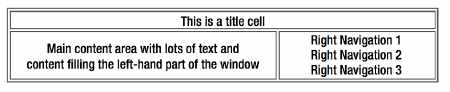
Figure 7-24. Simple table layout with navigation on the right.
With this layout, the main content
follows the "title
" in a text or linearized view of the page. There is no need
to provide a skip navigation link in order to comply with the Section 508
provision §1194.22(o). However, in this situation, I did add a skip to navigation link
attached to an invisible GIF at the top of the page.
This certainly is not required for compliance with the Section 508 Standards or
WCAG 1.0.
When all the layout of a page is
controlled with CSS positioning, the web developer is in control of the reading
order of the sections (divs)
of the page, because the source code order does not determine the visual
presentation order. When you are using CSS, make sure
that your reading order makes sense and mark up the sections of the page with
HTML headings.
The link text you use can have a major impact on your web page accessibility. But before we look at link text, let's review how link navigation works.
Some users of the Web are so mouse-dependent that they may not be aware of the fact that you can tab through all the active elements of a web page. As you do that, usually a dotted enclosing polygon, called a focus rectangle, moves along with the focus, highlighting the current link text inside. This was illustrated in the image map from Microsoft (Figure 7-23) and the frame page from Freedom Scientific (Figure 7-19). Figure 7-25 shows another example, which is a piece of the right navigation panel of my current site as seen in Firefox 1.04.
Figure 7-25. Link with focus.
The link text that currently has focus is
marked with a dotted rectangle, but the foreground and background colors are
also changed by the CSS style on the site. The text enclosed inside this focus
rectangle is called the link text, which is the
content of the anchor element (a):
<a href="webcourse1.htm">
  Web Accessibility for Section 508 – Tutorial
</a>
As you navigate around the links of a page with the Tab key (and Shift+Tab to go backwards; A and Q in Opera), you can use the Enter key at any time to activate a link. This action corresponds to clicking the link.
When you are listening to a page, the link text will be identified in one of a number of ways, but
generally screen readers precede the text of a link by saying "link
" or
"visited link.
" Home Page Reader has several options for indicating links. With
the default settings, Home Page Reader changes to a higher-pitched, so-called
"female
" voice on a link. Alternatively, you can set Home Page Reader to
produce a sound alerting the user as the link is spoken, or you can set it to
speak some metatext, (such as "link
"), before, or even after, the link.
The actual link text is important. What does it say? Is the link text clearly explaining what the link is pointing to? WCAG Checkpoint 13.1 captures an important requirement:
13.1 Clearly identify the target of each link. [Priority 2]
Under Guideline 2.4, the Last Call draft of WCAG 2.0 has one Level 2 success criterion and one Level 3 success criterion that relate to link text:
2.4.4 Each link is programmatically associated with text from which its purpose can be determined. (Level 2)
2.4.8 The purpose of each link can be programmatically determined from the link. (Level 3)
You must be able to understand where a
link will take you, even if you read the link text out of the context of the
page. As you tab from link to link, the focus rectangle highlights the link
text. Whether you are using magnification, focusing on the focus rectangle, or
listening to the page, it is the link text that is important. At Level 3, WCAG
2.0 requires only that the purpose of the link can be programmatically
determined from the link. The requirement at Level 2 is that purpose of the link be available to assistive technology in some
way. I think the wording of this success criterion must change;
"programmatically associated
" is not defined.
The page excerpt shown in Figure 7-26 has a service to sell, but the targets of the links are not clearly identified.

Figure 7-26. Examples of poorly chosen link text
With link text such as Learn more
and Try it free
,
a disabled user is left asking, "Learn more about what?
" and "Try what free?"
The link text needs to be much more meaningful, such as Learn
more about our content management system
and Try
our testing tool for free
.
The worst offender is Click here
. All of the assistive technologies discussed in this chapter can help users by
generating a list of links. With JAWS, Ins+F7 brings up the list. With Home
Page Reader, Ctrl+L generates a list. The Window-Eyes command is Ins+Tab.
Figure 7-27 shows the Window-Eyes link list for a site that just does not
understand the importance of identifying the target of links.
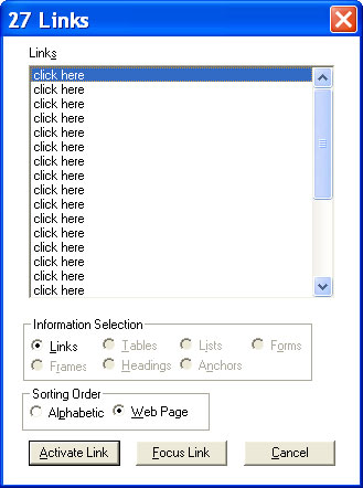
Figure 7-27. Window-Eyes link list for a site where all links are "click here
".
There are other, less crucial but still
important, aspects of accessible link text. As I just
mentioned, links are read as "links
" by screen readers and talking browsers, so
there is no need to include link to
in the link
text, as is commonly done in alt-text for image links. Don't include verbs like
open our contact form
here; instead, just say contact us
. The latter would be typical of visual text,
while the longer version might appear as alt-text on a contact
us
image. You already saw an example of annoying link text in the
CNN.com skip link (described in the "Creating a Link As Alt-Text on an
Invisible Image" section), with Click here to skip to
main content
. It should be just main content
. Unfortunately,
there is historical precedent for using skip to main
content
and skip navigation
, but both are
poor choices because of the presence of the verb and,
in the second case, because the destination cannot even be determined.
Every image that is a link must have
nonempty and meaningful alt-text because when you tab to a link, there must be
something there. When the link text is the alt-text of
an image, it should convey the target of the link. Remember from the previous
chapter that an image inside an anchor tag may have null alt-text if text describing the nature of the link is also included
within the same anchor.
Finally, there are times when fully spelling out the target of a link really becomes overbearing and annoying for both the visual and auditory experience of a page. Figure 7-28 shows a section of a page on Priceline.com.
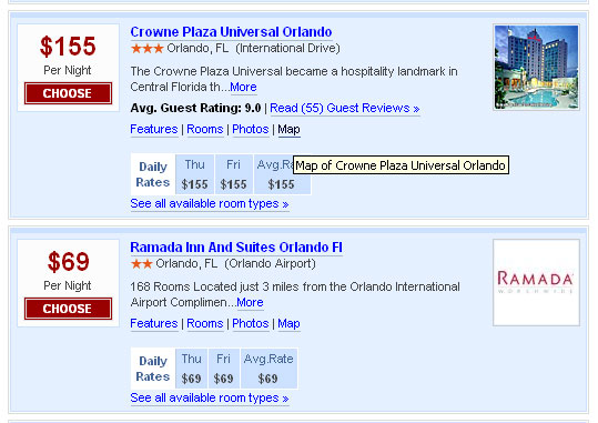
Figure 7-28. Screen shot showing generic link text augmented with the title attribute as pop-up in Internet Explorer 6.
Each of the generic links, including More
, Choose
, Features
, Rooms
, and Photos
, is relevant to the specific hotel property.
Those generic links are repeated for each hotel. Some interpret WCAG Checkpoint
13.1 to require that each generic link must include the specific hotel, such as
Features of the Crowne Plaza Universal Orlando
.
That is the wrong thing to do for all users because the visual design would
become highly cluttered, as would the audible presentation. The examples in
Figure 7-28 do comply with Success Criterion 2.4.4 because there is text available
with which to understand the purpose of the link. In cases like these, you
should add a title attribute to the
anchor element that specifies the details and thus comply with WCAG Checkpoint
13.1 and WCAG 2.0 Success Criterion 2.4.8. That is what Priceline.com does, as
suggested by the tooltip in Figure 7-28.
I am often asked, "What good does that title attribute do?
" Can screen readers access that information? The
answer is, "not very easily.
" For example, JAWS has three options for speaking
a link: the link text, the title text, or the longer of the two. The default,
thank goodness, is link text. I hope one day that screen readers will add an
option to speak additional information about this object, which could announce
the title attributes on links and other elements,
long descriptions of images, and additional information about form controls
(see Chapter 8), as just three examples.
In this chapter, we looked at several
ways of providing navigation that is accessible to users who depend on screen
readers or cannot use the mouse. The most important thing you can do to provide
accessible navigation of your page is to mark up the sections of your page with
HTML headings, including one at the beginning of the "main content.
" You also
saw how a link to the main content at the top of the page can be a useful
facility for users who are visually impaired. You then looked at how frames can
be fairly accessible if meaningful title attributes are placed on the frame elements and title elements are included on the frame pages themselves.
Next, you saw how client-side image maps
can provide an accessible form of site navigation, as long as you provide
alt-text on each area of the map that clearly describes the target of the corresponding hotspot.
Server-side image maps are fundamentally inaccessible, so redundant text links
for all hotspots of the map should be provided whenever server-side maps are
used. It is best not to use server-side maps at all.
Good page layout is another important factor that can increase a website's accessibility, especially for pages with CSS layout.
Finally, you looked at accessible links.
All link text, whether it is visible on your page or the alt-text on image
links, must clearly tell the user the purpose of the link. Phrases like Click Here
or Learn More
are of little use to someone using an assistive technology. Not only that, but
there is no need to preface link text with link to
;
instead, simply specify the target.