
This chapter is for web designers who wish to make accessible, interactive rich media. It's a guide to creating accessible Adobe Flash content that assumes no previous knowledge of accessibility or assistive technology. This chapter covers the following topics:
For many Flash designers, the single greatest challenge to understanding accessibility is how to best appreciate the experience of people with disabilities. Web designers' inherent talent is an ability to perceive the world in a unique visual way. The skill of web designers allows them to view, conceptualize, and translate visual information into layout and graphics. This is a fundamental and powerful way of seeing and understanding the world that should not be taken for granted.
First, we'll look at some of the key questions to ask to consider the user's perspective, and then we'll consider some use case scenarios in which fictional characters provide a framework for understanding users with disabilities.
To understand accessibility and implement it in practice is to ask designers to set their visual skills aside. The first thing to do when addressing accessibility is to step outside your frame of reference and consider the perspective of users with disabilities. Key questions such as the following arise:
The following descriptions of fictional characters illustrate common issues for people with disabilities and may be helpful when planning your design project. The list is certainly not exhaustive but does illustrate the broad range of disabilities and highlights the unique issues, challenges, techniques, and tools associated with them. What is important here is that a consistent set of use case scenarios becomes an integral part of the plan, build, and test phases of your accessible Flash web design project.
John, 53, a user who is blind:
John is a university professor who uses the computer for all of the same tasks as his colleagues, who are not visually impaired. He writes e-mail and research papers, and reviews student work.
John is part of a dance troupe in town and uses the Web extensively to read up on a wide range of topics. He is easygoing, most of the time, but he really finds it frustrating when websites of interest do not make their content accessible.
Ava, 30, a user who is visually impaired (with 20/300 vision):
Ava is a developer for a small consulting firm. She can see, but only with significant magnification or when objects are held very close. She uses the computer every day for work to review and write code for her clients. She uses ZoomText most of the time but will occasionally use a screen reader to read long text passages.
Ava loves music and is a fan of Stevie Wonder. Ironically, Stevie Wonder's site, a Flash site, is completely inaccessible. She has been waiting for the new album and checks the site from time to time for information but finds it frustrating that she is left out.
Jeff, 22, a user who is color-blind:
Like 10 percent of all men, Jeff is color-blind and cannot distinguish between certain colors. Generally, he does not have much trouble using the Web. However, trouble arises on sites where red buttons are placed on a green background, or where red and green buttons are next to one another to "start" and "stop" actions. This lack of contrast in foreground and background colors and red and green combinations can be frustrating for users who are color-blind.
Makoto, 48, a user with a mobility impairment:
Makoto was involved in an auto accident and lost the use of his hands. He relies on a mouth stick (a long stick in his mouth with a small rubber pointer tip on the end) to navigate web pages and applications via the keyboard. He uses the Tab and Enter keys to move between objects on the screen, as well as the Windows StickyKeys tool to create key combinations.
Makoto works at a local rehab center with other adults with disabilities. He uses his computer to complete paperwork for clients and file weekly reports. A devoted New York Yankees fan, Makoto takes a few minutes each day to check the online baseball scores. His favorite baseball page is The Sporting News. However, accessing this page can be a tedious experience due to the many navigational links he must tab through to get to the day's top stories.
Karen, 29, a user who is deaf:
Deaf since birth, Karen is an art teacher at the local high school. She needs to maintain her teaching license. With two young children at home, Karen decided to take the required courses online. Accessing the course was no trouble for Karen; however, a problem arose concerning some instructional video content. While most of the videos used in the coursework contained closed captioning, a few did not. In the cases where no captioning was available, Karen had to request a full transcript from student services, which often took more than a week to be delivered. As a result, Karen fell behind in her course work.
Web accessibility can be broadly described as the capacity of any user, regardless of disability, to access the same content and information. With regard to accessible Flash web content, obstacles for users with disabilities have two sources: issues associated with design and issues associated with assistive technologies. In this section, we'll investigate the technical requirements and review assistive technologies. The next section discusses the techniques for successful, accessible Flash design.
Developers creating accessible Flash sites must design content to work with the following, as a minimum:
The release of Macromedia Flash MX and Flash Player 6 marked the first accessible versions of the Flash platform. This version of the player serves as a minimum requirement for accessible Flash content. The current version of the Flash Player is available at http://www.macromedia.com/software/flashplayer/.
All accessible Flash content must be tested on the Microsoft Windows platform. While there have been recent improvements to the Apple Macintosh OS X 10.4 release (Tiger), including a built-in screen reader called VoiceOver, the Flash Player does not support this screen reader.
All accessible Flash content must be tested using Microsoft Internet Explorer. At the time of writing, Internet Explorer was still the only browser to which the Flash Player exposes accessibility information. The Mozilla Project has made improvements with the Firefox browser, and now both JAWS and Window-Eyes users can use Firefox. However, the version of the Flash Player that runs in Firefox is not yet accessible.
Designers often question the wisdom of testing accessible content using only one browser and one platform. While the future of cross-platform and cross-browser accessibility looks promising (with the recent improvements made by Apple and Mozilla), the reality is that today, assistive technology users are almost exclusively using Windows with Internet Explorer. For now, designers should feel comfortable testing their content using only this configuration.
As part of your development, production, and testing phases for accessible Flash content, you should rely on a minimum of one screen reader. While Flash content does not behave exactly the same in all screen readers, it is generally true that an application that functions properly in one screen reader will likely work in another. If you're designing an application with greater complexity or a wide range of users, you should plan to test using more than one screen reader.
Flash uses Microsoft Active Accessibility (MSAA) to deliver information about Flash movies to screen readers and other assistive technologies. MSAA operates as the go between for the Flash Player and the screen reader. The Flash Player creates a list of objects on the screen and records them on the MSAA "data tree." The screen reader will then read this list as it encounters Flash content. As changes are made to the screen, the MSAA data tree is updated. Changes to the movie prompt the screen reader to return to the top of the movie and start reading through the list again.
By default, text objects in a Flash movie
are read by screen readers. Screen readers are also able to identify buttons
and movie clips with attached scripts. Screen readers, however, cannot look at
a graphic element on the screen and determine its meaning. It is up to the
designer to assign a text description of any graphic or animated elements in a
Flash movie. This information can be assigned via either the Accessibility panel or ActionScript. Some properties,
such as the forceSimple property
(used to toggle the accessibility of child objects), have no counterpart in
HTML. Designers will need to rely on information in this chapter as well as
information found on the Adobe Accessibility Resource Center site to learn more about these properties and the associated
techniques.
Screen readers and MSAA shape the experience of Flash content for users with visual disabilities in ways that are often quite unfamiliar to sighted designers. Given that screen readers always start from the top of the movie and can read only one thing at a time, there are some complex forms of Flash content that simply cannot be made accessible. For example, many simulations require users to attend to several objects at the same time. Users must make decisions based on multiple factors and relayed back to the simulation quickly. This type of multitasking activity may be easy to do in the real world for someone who is blind, but can pose a real challenge while using a screen reader.
For accessible design, you need to consider how users manipulate objects within Flash. User interaction is through controls. It is important to create accessible controls that work both in a technical sense (are accessible to a screen reader) and in a practical sense (controls that are familiar and work as expected). In other words, the user should be able to understand how a control functions without significant effort or help from someone else.
Flash allows designers to create simple objects that can be used as a number of different controls. Take this simple circle for example.

If we add a label and a script to this circle, it becomes a button.

Another slight change, and it becomes a slider.

Yet another alteration, and this same circle is now a dial.

Visually, it may be obvious what these controls are and how to operate them. However, to a screen reader user, it may not be apparent. For simple buttons, no extra effort is required. Yet as controls become increasingly sophisticated, additional information about the control is required.
This is where Flash accessibility begins to approach the accessibility of desktop applications. HTML offers only 12 different types of controls. The screen reader knows how to handle them, and an experienced screen reader user understands how the controls work. Windows has 76 different types of controls (such as sliders, spin buttons, and so on) and an infinite variety of custom objects. Some screen reader users may not understand how a complex control works, and combinations of controls can add greater levels of difficulty to an application.
Flash allows authors to create these types of controls in ways that other applications simply can't. While technologies such as Scalable Vector Graphics (SVG) and Ajax have generated interest in the past couple of years, work to develop accessible controls in Ajax has only just started. (See Chapter 4 for an overview of Ajax and SVG accessibility.) When accessibility is a priority, developers should use these technologies with care and in a manner that degrades gracefully, if at all possible.
Now, let's look at what makes an accessible control in a Flash movie, reviewing labels, roles, states, and structure. These will help you understand how a user with disabilities manipulates objects within Flash content.
The label for a control answers the question, "What is this thing?" Every control in a movie should have a label that describes the purpose of the control. Labels should be concise and read immediately before the control or together with the control. In this simple example, the label for the button is clearly displayed as text inside the button. It is important that the screen reader also reads the label.
When the label for a control is an icon, designers should provide a text equivalent for the label as a text equivalent for the button. For example, the following button shows a commonly used icon for "play." It is up to the designer to make sure this button has a label associated as a text equivalent.
If the function of the control changes, so should the label. The next example shows a pause button from a movie controller. Typically, play and pause are included in the same button. If the user chooses play, the button transforms to a pause button. As the user activates this button, the label should update as well.
The role of a control answers the question, "What does this thing do?" As shown previously, a simple control made of a circle can be a button, a slider, a dial, or any number of possibilities. Flash automatically assumes that if a script is attached to an object, that control is a button. The designer can formally specify a role in MSAA using the Flash component architecture. However, this is a significant amount of effort and well beyond the scope of all but the most complex development projects. Instead, the role can be exposed using simple text objects that provide hints to the user.
The role helps the user to understand how a control operates. If a control is defined as a combo box, then the users will naturally assume it will behave similarly to other combo boxes they have come across in the past. The role provides a quick and easy method of explaining to a user how a control is operated.
The state of a control answers the question, "Is this thing on or off?" or "Is at level 1, 2, or 3?" and so on. Many controls have multiple settings. Think of a dial that sets a skill level in a game using this control:

In this case, there are three possible settings: level 1, level 2, and level 3. The position of the red arrow lets us know visually that level 2 is selected. However, screen readers have no way of knowing anything about the red arrow or how many levels are possible levels.
In controls with multiple settings, designers need to let the user know how many possible states exist for a control and what state is selected. In the game control example, you might use a text object or even the name property to read, "Level 2 of 3 is selected."
The structure of a control answers the question, "How does this thing relate to the other things on screen?" It is important that individual elements within a control not be read separately from the rest of the control. In Flash, this is generally a matter of controlling the reading order. In the example in the previous section, it is crucial that the designer ensure that the text "level 3" is read right after the text "level 2." In some cases, Flash reading order can get jumbled based on the position on screen. Mixing up elements of content and controls can result in a terribly confusing experience for the user.
When developing accessible Flash content, you should adhere to the following basic rules:
This list is not intended to be fixed, nor is it comprehensive. It is up to designers to make decisions about individual applications and whether they meet the requirements as outlined in the use case scenarios.
The following sections describe how to follow these best practices.
Screen readers are not able to discern the meaning of graphic or animated elements on the stage. As a result, designers must provide a brief text description of graphic elements. You can provide text equivalents for an entire Flash movie, a single object within a movie, or a group of objects within a movie.
You should provide text equivalents for an entire movie when the movie can be conveyed using a single text equivalent. Examples of this include movies that show a simple animation or banner ads. You also may need to do this for complex movies that cannot otherwise be made accessible.
When you use a single text equivalent for an entire movie, you should make the child objects inaccessible. This will prevent animations within the movie from causing frequent updates to the screen reader. It will also facilitate automated testing of the content for accessibility.
You can assign the text equivalent using the Accessibility panel. Place the text equivalent in the Name field. It is generally advisable to make the contents of the Name field short and focused in order to describe the function of the movie. The Description field can be used for longer descriptions. However, be aware that both JAWS and Window-Eyes read this content automatically rather than upon user request. As a result, long descriptions can result in a tedious listening experience.
Figures 11-1a and 11-1b show the text equivalent "Moon orbiting a planet" in the Name field of the Accessibility panel, along with the movie to which the name applies.
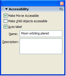

Figure 11-1a and 11-1b. Assign text equivalents in the Name field in the Accessibility panel.
You can also provide a text equivalent using ActionScript, by creating a new object for each instance and then assigning the accessibility information. Once the name value has been assigned, the accessibility objects must be updated. This is done once for all objects when a change is made. It is not necessary to update each instance of the object. Here is an example of using ActionScript to provide a text equivalent:
_root._accProps = new Object();
_root._accProps.name = "Moon orbiting planet";
_root._accProps.forceSimple = true;
Accessibility.updateProperties();
Adobe Flash Player 9 uses ActionScript 3,
which includes some minor changes in the way that accessibility is handled. The _accProps object and global property are replaced by the AccessibilityProperties class and the accessibilityProperties property, but the usage is similar. For example,
the preceding example would be written as follows:
// assumes a movieclip with an instance name of ‘moon_mc'
moon_mc.accessibilityProperties = new AccessibilityProperties();
moon_mc.accessibilityProperties.name = "Play";
moon_mc.accessiblityProperties.forceSimple = true;
Accessibility.updateProperties();
Flash Player 9 is still capable of interpreting ActionScript 2 content, such as that created in Flash 8, but Flash 9 content will use ActionScript 3.
This example includes a line to create
the new object for the entire movie. Next, the value is assigned for the name property, and then the child objects are made inaccessible using
the forceSimple property. Table 11-1 shows a complete list of the ActionScript properties,
along with the corresponding fields on the Accessibility panel.
| Property | Type | Accessibility Panel Equivalent | Applicable Items |
|---|---|---|---|
silent |
Boolean | Make Movie Accessible/Make Object Accessible (inverse logic) | Whole movies, buttons, movie clips, dynamic text, input text |
forceSimple |
Boolean | Make Child Objects Accessible (inverse logic) | Whole movies, movie clips |
name |
String | Name | Whole movies, buttons, movie clips, input text |
description |
String | Description | Whole movies, buttons, movie clips, dynamic text, input text |
Unlike HTML, not every movie clip or button in a Flash movie requires a text equivalent. For example, elements that are purely decorative, are repetitive, or convey no content should be made inaccessible.
You can make a movie clip "silent,"
or inaccessible, through the Accessibility panel
by deselecting the Make Object
Accessible option, as shown in Figure 11-2. This is the Flash equivalent
of a purely decorative image in HTML that requires a null alt attribute value.
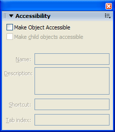
Figure 11-2. Deselect the Make Object Accessible
option in the Accessibility
panel for elements that should remain silent.
To set the object to be inaccessible with ActionScript, use the silent property, as in this example:
logo_mc._accProps = new Object();
logo_mc._accProps.silent = true;
Accessibility.updateProperties();Flash includes an Auto Label option, as shown in Figure 11-3. If a text object is used within a button, the Flash Player will assume that text object is the label for the button. The same holds true for movie clips used as buttons. In these cases, the child objects of the movie clip should be accessible. It is important to keep in mind that only a single text object can be used as a label, and the text object must fit completely within the hit area of the button.
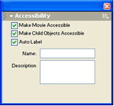
Figure 11-3. The Accessibility panel includes an Auto Label option.
Auto-labeling also works for movie components such as radio buttons and list boxes. The Flash Player will assume text objects above or to the left of the control should be used as the label. Again, only a single text object will be used as a label.
If a text equivalent is assigned via the name property using either the Accessibility panel or ActionScript, that value will override the auto-labeling without disabling the auto-labeling completely. You can turn off auto-labeling only via the Accessibility panel, and it cannot be changed dynamically once set.
You can assign a text equivalent for a single object in a movie via the Accessibility panel. The text equivalent should be relatively short and should address the function of the object, rather than a longer or more detailed description. This will help prevent the movie from becoming verbose and tedious to navigate. As noted earlier, you can use the Description field for longer descriptions. However, JAWS and Window-Eyes will both read this field by default. As a result, there is no advantage to using this field at this time.
Screen readers are not able to provide clues to a screen reader user about the layout or structure of a Flash movie, or about individual controls within that movie. Complex movies should provide descriptions about the movie itself, as well as about its important parts and controls. Determining when a movie is sufficiently complex to merit a description or when a control requires additional cues is up to each designer.
You should provide a description of the movie at the root level to let the user know what the movie or application is about. This description should help the user get oriented to the application quickly and understand the key controls and shortcuts used.
You can provide the movie description in a number of ways. For example, you might place it on a separate screen in the Flash movie or on a separate HTML page. If you use an HTML page, you should place a link to the information screen at the top of the page in a button titled site info. Using this short title will help prevent the application from becoming overly verbose. This site info button can be hidden if desired, but to enable sighted users with disabilities to access the same information, it is recommended that a second link to the same information be placed elsewhere on the screen (most likely at the bottom).
Flash allows designers to create an infinite variety of controls. In cases where the user is provided visual cues about the state of a control or a screen within the movie, this information should also be made available via a dynamic text field that is updated as the control is activated.
Consider the example shown in Figure 11-4. In this case, the movie uses tabs that drop down to indicate which screen is the active screen. While this is a helpful visual cue, this information is not available to screen reader users with standard Flash content (there are tab navigator components in Adobe Flex that do expose information correctly to screen readers).
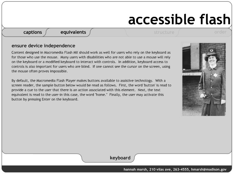
Figure 11-4. Visual clues, such as tabs, to expose state do not work with screen readers.
To provide a cue for the screen reader user, a text field is hidden under the banner (see the circled area in Figure 11-5, where the hidden text is made available). Since it is intended to provide information for screen reader users, it does not need to be visible. As the user moves between screens, the contents of this field can reflect the active screen.
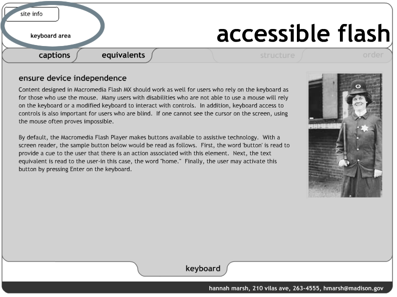
Figure 11-5. Use hidden text fields to provide additional information about state for screen reader users.
In the example shown in Figure 11-5, a screen reader accessing this as a web page would read the following:
Within each area of the site, the text keyboard area will update to reflect the active area.
The default reading order of a Flash movie does not follow a predictable left-to-right, top-to-bottom order. As a result, contents of a Flash movie can be difficult to understand. Take the example shown in Figure 11-6. Based on the visual presentation of the alphabet in three rows, it would be natural to expect the reading order to follow alphabetical order.
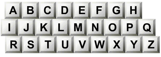
Figure 11-6. Keyboard with keys in alphabetical order. You might expect the reading order to be alphabetical.
However, the actual reader order jumps between letters in each row. The resulting order illustrated in Figure 11-7 shows why you need to control the reading and tab order for Flash movies.
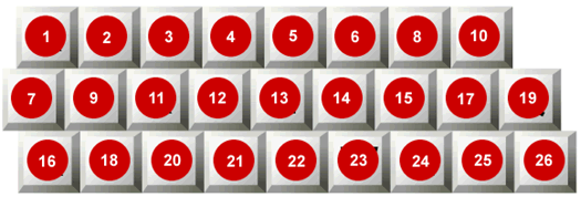
Figure 11-7. Keyboard showing actual reading order, which is non-alphabetical.
With the release of Adobe Flash Player 8, handling issues with the reading order has been significantly simplified. In previous releases, a designer had to specify values for all objects in a movie. Missing one would cause the reading order to revert to the default. This made setting the reading order a tedious and time-intensive task. In Flash Player 8, the reading order can be partially specified. You need to list only the objects that you want to control. The remaining objects will follow the default reading order after the specified values.
It is still important to consider the reading order of a movie from the beginning of the development process. It is certainly more work to retrofit for proper reading order after the movie has been completely built. Therefore, using a screen reader to evaluate the movie during an ongoing development process can definitely make finding and fixing problems much easier.
The key to creating an appropriate reading order is to ensure that the order reflects the structure of the screen. At a high level, the elements of the screen should be reading in a reasonable and consistent order from one screen to the next. For example, you would expect that the title of the site would be followed by the navigation, followed by the content. Placing the title of the application at the end of the reading order might create confusion.
The reading order should also ensure that elements from each of these higher level groups are not mixed together. For example, the title of the application should not be read between buttons on the navigation bar or pieces of the content on screen. To extend this concept, buttons at one level of a navigation bar should not be read mixed in with buttons on the next level.
You can use two strategies to control reading order. The simplest is to keep the physical size of the movie small. A small Flash movie that is less than 300 pixels wide and consists of a single column or a single row of objects usually will not require any specific control over the reading order. Examples might include small animations or applications that pop up in a separate window, a navigation bar that consists of a single row, or an application that consists of a single column. The second strategy requires controlling the reading order using the Accessibility panel or ActionScript.
The most precise means for controlling reading order is to use tab index values, which you can assign using the Accessibility panel or ActionScript. Using the Accessibility panel, you simply assign each object a value that reflects the desired reading order, as shown in the example in Figure 11-8. Objects within a Flash movie that are assigned a tab index value are then placed at end of the reading order, following the default order.
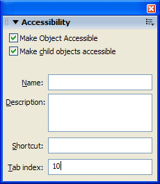
Figure 11-8. You can control reading order by assigning a tab index to each object in a movie from the Accessibility
panel.
Tab index values need not be sequential. In fact, the order should usually not be sequential, to allow designers to add objects into the movie at a later time. Intervals of 10 should be sufficient.
In cases where the reading order is dynamic or objects are created on the fly, you will
need to use ActionScript to assign tab index values. All objects in
ActionScript have a tabIndex property. You do not need to create an
accessibility object to assign a tab index value.
Consider the simple example shown in Figure 11-9, which has three circles with the text Third, Second, and First displayed on screen.
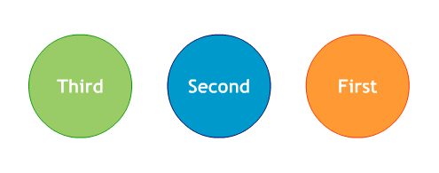
Figure 11-9. An example for reversing the reading order: three circles with the text Third
, Second
, and First
.
When the following ActionScript is added to movie, the reading order reverses to read First, Second, Third.
first_mc.first_txt.tabIndex = 10;
second_mc.second_txt.tabIndex = 20;
third_mc.third.txt.tabIndex = 30;
In general, it is best practice to place the ActionScript controlling the reading order at the root level of the movie in the first frame. This makes it easy to locate the code when changes are needed and ensures that the script is loaded at the very start of the movie.
When controlling the reading order using ActionScript, the tabIndex property value must be assigned to the text object itself, not to
the parent. In the example, the tabIndex property is assigned to the text objects in
the circle movie clips. The values of the parent are not inherited by the
child. Thus, assigning the tabIndex property values to the circles would not result in the reversed
reading order.
It is not possible to provide an instance
name to static text objects. As a result, it is not possible to assign a .tabIndex property to a static text object, so you cannot control the reading
order of static text objects.
In cases that do require precise control over the reading order, designers are encouraged to use dynamic text objects. This will have implications for the font used in the application and potentially impact the overall file size. To learn more about handling font symbols in Flash, visit www.adobe.com/cfusion/knowledgebase/index.cfm?id=tn_15403.
In cases where a series of child SWF
files are loaded into a parent movie, the list of tabindex values must be listed in the child movie clip. However, the values
list in the reading order of each child SWF must be unique. For example, if two
child movies loaded into a parent movie each has three elements with tabindex values of 1, 2, and 3, the screen reader will read the first value
of the first movie loaded, then the first value of the second movie loaded.
Next, the screen reader will read the second value of the first movie clip
loaded, then the second value of the second movie clip loaded, and so on. In
order to read the contents of the first movie followed by the contents of the second movie, the list of tabindex values for the first movie should be 1,
2, 3 while the list of values for the second move should be 4, 5, 6. These
values do not need to be sequential, but they should be unique.
You may want to hide elements from the user and remove them from the reading order temporarily. Realize that objects placed behind another object or tucked just off stage are not necessarily removed from the reading order. Screen readers have no concept of whether one object is in front of another or whether it is just barely on stage or completely off stage. You need to more formally hide objects if you wish to remove them from the reading order.
The easiest means of removing an object from the reading order is to move it completely off the stage. The bounding rectangle of the object needs to be more than 1 pixel off the stage. Even if the visible object itself is off the stage, the bounding rectangle is what matters. Consider the example shown in Figure 11-10. Circle One is off the stage. However, you can see that the blue bounding rectangle is still on the stage. As a result, this object will be read by the screen reader. Circle Two's bounding rectangle is completely off the stage, and this object will not be read by the screen reader.
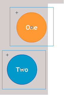
Figure 11-10. The bounding rectangle of the object needs to be more than 1 pixel off the stage to remove the object from the reading order.
A more formal way to make sure a screen
reader does not read an object is to set the _visible property to false or the silent property to true.
Referring back to this example in Figure
11-9, the circles labeled Third and Second can be temporarily removed from the reading
order by using the _visible property, as follows:
second_mc._visible = false;
third_mc._visible = false;
When the _visible property is set to false, the circles are not read by the screen reader. However, they are
not visible either.
Using the silent property ensures that the screen reader
will not read these objects without affecting the visibility of these objects.
second_mc.silent = true;
third_mc.silent = true;Since this case is intended to benefit screen reader users alone, this method is
frequently used in conjunction with screen reader detection. Flash has a unique
advantage over JavaScript in that it is able to use MSAA to detect the presence
of a screen reader. The method Accessibility.isActive() will return a value of true if a screen reader is present and it is currently focused on the
Flash content. It is important that this method not be called in the first
moments in the timeline of the movie, or it could return a false negative.
Rather than calling this method in the first frame of a movie, one strategy is
to attach this method to the first button in the movie.
While Flash is now much more than an animation tool, it is still commonly used to create and deliver animations for a variety of purposes. Three key issues to consider when using animations in Flash are hiding child objects, avoiding constant motion, and avoiding blinking.
Constant changes to the screen can cause a screen reader to refresh continually. This can be very frustrating to screen reader users when they are trying to read through content and the screen reader is repeatedly returning to the top of the page. To prevent constant screen reader refreshes, hide the child objects of the movie clips that contain animation. This can be accomplished via the Accessibility panel by deselecting Make Child Objects Accessible. Using ActionScript, set the forceSimple property to true to hide the child object.
Avoid constant motion on the screen when the user is expected to read text on the screen. For users with certain learning and cognitive disabilities, moving objects or patterns on the screen can be a distraction. It is acceptable to use motion together with text, but the screen must settle after a moment or two.
You should also avoid blinking for more than a second across a large viewable area of the screen. Photosensitive epilepsy can be triggered by blinking at specific rates if viewed at close quarters across a significant portion of one's field of vision. There is no way to predict a flicker rate precisely because it is dependent on the end user's machine. Subsequently, it is important to avoid flicker completely.
All controls that can be manipulated via the mouse should also be accessible via the keyboard. This is intended to support screen reader users as well as users with mobility impairments. The Flash Player facilitates keyboard access on its own by automatically making mouse-defined events accessible via the keyboard. However, two specific techniques commonly used among Flash designers should be avoided. In addition, you should add keyboard shortcuts to facilitate keyboard access in complex applications. Finally, designers should be aware of an issue with the Flash Player 6 and earlier in pages that blend HTML and Flash content.
Consider the following script that might be used to open a web page:
on (click) {
  getURL(index.html);
}
It is directly associated with the instance of the movie clip used as a button. This script should instead be placed in a frame, likely the first frame, of the movie. The revised script could be as follows:
home_mc.onRelease = function () {
  getURL(index.html);
}
Another common technique is to use hit areas, which are empty button clips with a shape defined in the hit state. These allow designers to reuse single library objects repeatedly by placing them over text objects and varying only the scripts used. However, screen readers may find a problem with this technique. The screen reader assumes that if the button clip up state is empty, then it is not a button at all. The solution to this issue is quite simple. By placing a transparent movie clip in the up state, screen readers will recognize the button and allow the user to activate it.
In complex applications with multiple controls, it is extremely helpful for users to navigate the application using keyboard shortcuts. For many users with mobility impairments, pressing keys may be very difficult. Using keyboard shortcuts helps reduce the number of keystrokes required to perform important tasks.
Using the Shortcut
field on the Accessibility panel or the shortcut property in ActionScript
is not sufficient for this purpose. Creating a keyboard shortcut requires you
to define a listener event and associate a script with that listener. The Shortcut field merely announces
a shortcut value via MSAA. It does not create the listener. Moreover, as of
this writing, no screen readers support this feature.
One of the greatest challenges for screen reader and keyboard users in navigating a complex site is moving from the top of the screen to the content they are trying to access. Sites with numerous controls or links can result in a time-consuming and tedious experience for the user. As result, the best user interface for someone who relies on a screen reader or a keyboard is one that is very narrow, offering a limited number of options at the top and increasingly more as the user drills down.
A tactic increasingly used in Flash content is to hide multiple controls under a single control. As the user requests more information, additional controls are progressively revealed to the user. For example, consider the control shown in Figure 11-11. A phone with many buttons is placed near the top of a Flash application. Quite a few key presses would be required to get past it. If it reappears on other screens, then it would require additional key presses on each of these screens just to progress further.
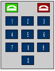
Figure 11-11. A complex control with many buttons, looking like a phone keypad.
To reduce the complexity of this control,
the phone object is grouped into a single movie clip with the name property Pick up Phone. By default, the silent property for each of the buttons is set to true. The screen reader user hears only one
button.
If the user presses the button to pick up the phone, four things happen:
Pick up
Phone
button is temporarily hidden.Hang Up button. It
not only disconnects the call, but it reverts the phone to its default state,
hiding the individual buttons, revealing the Pick up
Phone button and exposing other content on screen.The advantage of this technique is that it allows designers to create interfaces that are narrow for users with disabilities without making significant changes to the layout. In general, this technique can be applied quickly with a few extra lines of code. The only consideration is how to use movie clips to strategically group objects and facilitate the showing and hiding of content.
With the release of Macromedia Flash MX 2004, the following accessible components were included with the application:
For each component, you can enable the
accessibility object by using the command enableAccessibility(). This includes the accessibility object
with the component as the movie is compiled. Because there is no simple means
of removing an object once it has been added to the component, these options
are turned off by default. It is therefore very important that you enable
accessibility for each component. This step needs to be done only once for each
component; it is not necessary to enable accessibility for each instance of a
component. Here is the sample code added for the Label component:
import mx.accessibility.LabelAccImpl;
LabelAccImpl.enableAccessibility();
Again, this code is added only once for each component. It is best to attach this script to the first frame in the movie to ensure that the script is executed immediately and for easy access. The code required for each of the components is shown in Table 11-2.
| Component | Code |
|---|---|
| Simple Button | import mx.accessibility.ButtonAccImpl; |
| Check Box | import mx.accessibility.CheckBoxAccImpl; |
| Radio Button | import mx.accessibility.RadioButtonAccImpl; |
| Label | import mx.accessibility.LabelAccImpl; |
| Combo Box | import mx.accessibility.ComboBoxAccImpl; |
| List Box | import mx.accessibility.ListAccImpl; |
| Window | import mx.accessibility.WindowAccImpl; |
| Alert | import mx.accessibility.AlertAccImpl; |
| Data Grid | import mx.accessibility.DataGridAccImpl; |
No additional code is required for the text input and text area components. The player implements the accessibility for these components automatically.
There is a known bug with screen readers and Flash Player 7. Information following the Combo Box, List Box, and Data Grid components is not passed on to screen readers without entering forms mode.
Flash is frequently used to deliver audio and video content. Any audio used to deliver substantive content should include a synchronized text equivalent in the form of captions. Three key strategies for including captions are by importing previously captioned audio content, by placing text objects directly on the stage, or by streaming caption data via XML.
A simple if rather limited approach to captioning in Flash is to import content that has been captioned in another application. The limitation of this solution is that it restricts the design options and flexibility of the application. By building the caption tool directly into Flash, the designer has an increased number of options in terms of formatting and the user interface.
A second strategy for captioning Flash content relies on placing text objects directly on the stage. This method is the most precise in terms of synchronizing audio content with the captions, yet it is the most tedious in terms of the effort required on the part of the designer. One particular advantage of this method is that it allows for captions to be positioned on the stage to indicate different speakers, as well as to convey emphasis and emotion.
Using third-party tools, you can deliver captions by placing text objects directly on the stage. The single greatest challenge in delivering captions is creating the transcript of the audio. While voice-recognition software has improved tremendously, it still is not a reliable means of converting speech to text automatically.
Once the transcript is available, three commonly used tools for creating captions are Captionate from the Manitu Group, Hi-Caption SE from Hi-Software, and MAGpie from the National Center for Accessible Media. These tools help designers break the transcript into individual screens of text and then set the timing for each of those screens. Hi-Caption SE has the additional advantage of being able to convert this information directly into text objects on the timeline. This is particularly useful in situations where use of XML can result in sandbox violations, such as a Macromedia Breeze presentation.
A straightforward means of delivering caption data in a Flash movie is to stream caption data at runtime. This is possible with both Hi-Caption SE from Hi Software and MAGpie from the National Center for Accessible Media. Both create a custom XML file with caption data that Flash can use. This file strips down XML data included in captioning standards such as Synchronized Accessible Media Interchange (SAMI) for improved performance in the Flash Player.
Hi-Caption SE includes a component that imports this XML file and delivers it via a prebuilt closed-captioning interface. The designer may modify the look and feel of the icon as well as the text used to deliver the captions.MAGpie requires that the developer write code to parse and display the caption data themselves.
Captionate doesn't operate by adding text to the stage or by streaming XML caption data. Rather, it uses Flash Video (FLV) file cue points to display caption information at predefined times.
Music and audio that play as the site loads present a serious challenge to screen reader users. The audio from a Flash movie can interfere with the end user's ability to hear the contents of a movie using a screen reader. Therefore, you should make sure that the user is given control over when music is played.
The simplest strategy for handling audio playback is simply to allow the end user to control audio with play and pause buttons, as shown in Figure 11-12. Allowing the end user to initiate audio provides the experience of the audio without creating additional hurdles.

Figure 11-12. Provide play and pause buttons to give users control over audio playback.
A more advanced strategy for controlling playback relies on the use of keyboard shortcuts. Providing global keystrokes that allow the user to control the audio can greatly enhance the experience for end users. Here are several controls to consider:
When you're selecting
from the wide range of colors available to Flash designers, you must consider
issues for people with color deficits and low vision. This means that color
should not be the sole means of providing information. For example, you should
never say, "Click the red button to move forward and the green button to
move back
." It is acceptable to reference color, but a second indicator
should be used at the same time. The same example would be fine if you added a
reference to position as well, "Click the red button on the right to go
forward and the green button on the left to go back
."
A second issue related to the use of
color is to ensure that foreground and background colors have sufficient
contrast to ensure readability. One way to think of this is by asking the
question, "If the application were displayed on a black-and-white
television, would the colors be readable?
" Colors that lack contrast can
make it very challenging to read elements on the page.
A helpful tool in making decisions about the use of color is the ColorDoctor from Fujitsu, shown in Figure 11-13. This free tool simulates grayscale as well as three different types of color blindness.
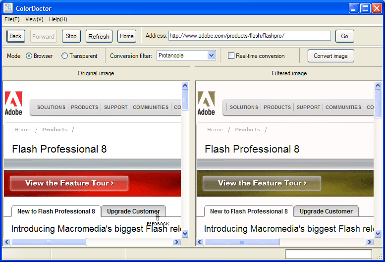
Figure 11-13. The ColorDoctor is helpful for making color decisions.
One of the most complicated situations in accessible Flash design is that of a person with low vision who does not rely on the use of a screen magnifier. Users with moderate to severe low vision rely on the use of a screen magnifier to view content on the screen. Magnifiers, such as ZoomText from AI Squared, not only make the contents of the screen larger but also move the point of focus to the center of the screen to make working with content easier. Many magnifiers also include functionality that allows users to view content in a variety of contrast modes and include screen reader functionality. Screen magnifiers are based on very similar technologies to screen readers. As a result, content that reads well in a screen reader will also tend to read well with a screen magnifier.
However, many people with low vision do not rely on screen magnifiers but instead use the browser settings to change the font size. The Adobe Flash Player does not currently support browser settings for font size. As a result, designers need to take additional steps to consider and support users with low vision. Applications built in Flash should incorporate options that allow users to modify the text size of an application when possible. The simple example shown in Figure 11-14 demonstrates one technique. It allows the user to globally increase the text size from 12 points to 18 points by clicking a button on the homepage of the application.
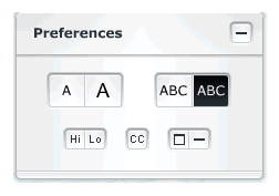
Figure 11-14. Allow users to modify text size, as with this custom control.
Several strategies exist to include Flash in a web page. The Flash authoring tool uses
a tried-and-true method that employs an HTML object element with an HTML
embedded element inside the object as a fallback for browsers that don't
support the object. Some developers dislike this approach because it breaks
page validation, but the alternatives all have shortcomings. Drew McLellan
popularized an approach he titled Flash Satay, which produces valid code, but has the unfortunate limitation of
not working for JAWS screen reader users due to a limitation of JAWS. A
comparison of the various techniques is available at http://weblogs.macromedia.com/accessibility/archives/2005/08/in_search_of_a.cfm.
Another issue to be aware of is when
using the wmode parameter in the
object element. There are three settings for wmode: window (the default), transparent, and opaque. The Flash Player sends information to screen readers only when wmode is set to window. If you need the Flash to be accessible, don't specify the wmode parameter at all, or use <param
name="wmode" value="window" />.
If you are a web designer new to Flash accessibility, it is best to keep in mind that the biggest challenge to creating accessible rich media may not be the technical aspect, but rather the mental. Understanding how people with disabilities use web applications and what makes a great web experience requires designers to revisit their assumptions about user interfaces and interactivity. Designers must create and revisit their use case scenarios regularly, while continuing to test and review using assistive technologies. Getting to know and understand these use cases will help designers develop the instincts they need to build applications that are not only accessible but truly usable for people with disabilities.
The techniques reflected in this chapter are neither technically advanced nor aesthetically challenging. Building a great Flash movie depends on designers developing an instinct for how all users, including those with disabilities, use content and making sound design and development decisions along the way.
For more information, refer to the Adobe Accessibility Resource Center and the accessibility blog.