Accessibility of WhiteHouse.gov

This is a note about the accessibility of WhiteHouse.gov. It may be the first in a series of notes about accessibility and administration web sites. This is not an audit of the site. I'm only going to talk about in-page navigation on the home page. That is a long way from an audit or even an assessment - which is what I usually do as a consultant.
I did run a quick scan (think audit) of http://WhiteHouse.gov including the home page and all WhiteHouse.gov pages linked to the home page. I used Worldspace from Deque and I restricted the analysis to only look for machine detectable errors - not warnings, not potential errors; only certain errors, like missing alt-text or missing labels on forms. The result was 276 errors on 90 pages, an average of a little over 3 serious machine detectable errors per page.
![]() Added 6/10/2009. A scan today yielded 115 pages with
129 machine detectable errors; just over 1 error per page compared with 3 errors per page less than a month ago.
Congratulations.
Added 6/10/2009. A scan today yielded 115 pages with
129 machine detectable errors; just over 1 error per page compared with 3 errors per page less than a month ago.
Congratulations.
None of the problems I'll discuss here will be detected by any testing tool. And these too are serious errors.
In-Page Navigation
In-page navigation is a key to an accessible page for people with disabilities. A sighted mouse user looks at a page, focuses on a section of the page, reads there and zooms in to click on a link. If you can't use a mouse to "zoom in to click on a link", and/or if you can't see the page to know which section is of interest to you - its a problem. When I talk about "in-page navigation," I'm talking about accommodations we can make to facilitate access to parts of the page by people who must use the keyboard to get around including those with screen readers.
Skip Links
In the late nineties we advocated "skip links" - these are links at the top of the page that take you to the main content of the page thereby jumping over all the navigation links. You can read more about skip links here.
Skip links have somewhat fallen out of favor recently for two reasons. First skip links often don't work and second, headings navigation is a better solution for people using screen readers.
But for keyboard users, who are not using expensive screen readers, skip links can be very important. For those keyboard users the skip links must be visible! You can have them visible all the time as on http://webaim.org, or as on this site, only visible when the link gets focus. Try it here on this page. The skip links will appear when they receive focus.

The WhiteHouse.gov home page has two skip links at the top of the page which are never visible. You can carefully
monitor the status area of your browser and notice one link with href="#maincontent" and the
other with href="#sitemap" (going to the footer area). Try (press Enter on) the #sitmap link
and notice how visual focus moves to the bottom of the page - but Tab again and you are back at the top. These skip
links don't work in the sense discussed
here - and there is a simple fix for it.
The WhiteHouse.gov web site should
- Make the skip links visible when they get focus
- Correct the coding of the targets of the links so they will really work with IE6 and IE7 - the target should look like this:
<span style="position:absolute;"><a name="maincontent" > </a></span>.
Headings in the "main content"
Proper headings markup on web pages is one of the most important accommodations possible, at least after forms are labeled and images have good alternative text.
With proper use of headings markup a blind user with a screen reader and a keyboard user with the Opera browser can easily navigate to each of the main sections of the page, deciding which to explore in more detail.
Below is a screen shot of the "main content" part of WhiteHouse.gov. I think all would agree that there are four sections clearly identified with larger reddish brown heading looking text.
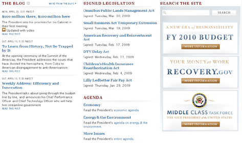
Those headings are:
- THE BLOG
- SIGNED LEGISTALTION
- SEARCH THE SITE
- AGENDA
So those should be marked up as headings - and they are (more later).
There are three image links (FY 2010 Budget, Recovery.gov and Middle Class Task Force) on the right side of the main content area that don't really fall into any section. It certainly is debatable what to do with them as far as headings are concerned. I would leave them as is with no heading; they will be available right after the search field - which is a pretty prominent place.
And now here's a screen shot of the same section of the web page showing which text is marked up as a heading. (This screen shot was taken after using my headings favelet, https://jimthatcher.com/favelets, but could just as well have been marked up with the Web Accessibility Toolbar.)
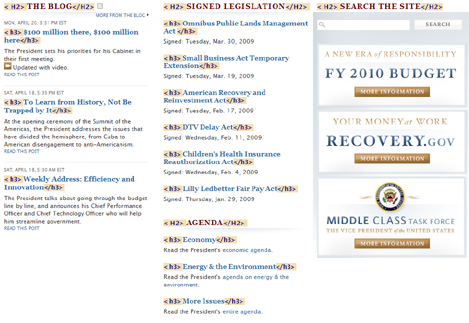
Not only are those headings we listed above marked up as headings - so is every link under each of those headings. Instead of the four nice section headings, there are 16 headings rendering headings navigation close to useless. Those links in each of the sections don't look like headings and they don't act like headings; they should not be marked up as headings!
JavaScript Fly-out Menus
JavaScript fly-out menus are an increasingly common navigation feature on complex web sites. They are usually inaccessible for anyone using the keyboard. Any such menu system requires structured navigation. You need to be able to access the top level menu items, and having found the one you want, navigate down in the submenu. In your browser, for example, the Alt key takes you to the File menu, then Right Arrow goes through the top level menu items and then you can down arrow to go into the submenu items.
The following is a screenshot of part of the menu system at WhiteHouse.gov. The page in the screen shot is the one that is opened by "the Administration," link and, using the mouse, the submenu for "the Administration" is open. Headings are marked up on the page like they were in the previous screen shot.
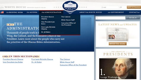
Here there are only two headings visible, "The Administration" is a level one heading and under that, "IN
THIS SECTION"
is a level 2 heading. The links under that h2 are exactly the links in the fly-out menu. So a screen reader
user can follow "the Administration" link, and then under the second heading, find all the links a mouse
user would find in the fly-out panel. It is not as speedy as using a mouse but it is fairly good. Having the submenu
links readily available on the page opened by the main menu item is what I recommend for making these menu systems
accessible.
The structured footer section of whitehouse.gov
Whitehouse.gov has an additional accommodation related to these fly-out menus. In the footer of the page is a nested list of all the menu links, with headings corresponding to each of the main menu items. Below is a screen shot of the footer.
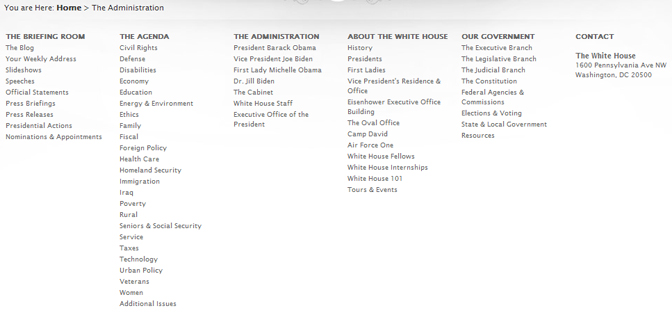
Each list of links in the footer conincides with thelinks available from the corresponding menu that a mouse user sees at the top of the page.
The problem is - those headings are not marked up as headings; if the were, then a screen reader user could move through the topics with the headings key (H) and finding the desired topic, arrow down through the links; not much different than the way a blind user would access a menu on a desk top application. And when you decide you are in the wrong list, use the H key to go to the next top level item. This would be an excellent accomodation if only those headings were marked up as headings.
There is another way this structured list of URL's could be accessed - as a nested list. List navigation is, I believe, not as well understood by screen reader users, as is headings navigation. It should be straight forward. With JAWS go to the list with the L key (S with Window-Eyes); step through the top level items with the I key (same for Window-Eyes) and arrow down in the desired list. But it turns out Window-Eyes doesn't even find any list on WhiteHouse.gov. JAWS works OK, but don't use the item key (I) in a sub-list because that pops out to the top level list - a bug. I have no idea why Window-Eyes finds no lists. Maybe these questions/problems contribute to the fact that list navigation is not as well used!
Changing content at the top
At the top of the Whitehouse.gove home page is a major graphical display, a large photo of a main feature, together with text headlining the feature. Four of these panels display in rotation - staying up about 15 or 20 seconds. Below is a screen shot of one of those panels.
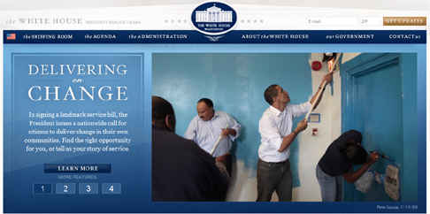
The title on the left, "Delivering the Change," is a level one heading - great! And below that heading the
text description is available to screen readers. The image has alt-text - in this case, alt="the president
paints a home".
That is technically not right because the image links to the video, just like the "learn more" button does
(the heading above this button says what you will learn more about).
The problem is not any of that which I have just outlined - the problem is that this content is changing every 15-20 seconds. If you are reading the descriptive section, under the heading, it may change as you read it, making no sense at all. The heading, for JAWS, doesn't change - that actually is a JAWS bug.
I don't know how to make this accessible. The buttons "1 2 3 4", below "Learn more" on the left will stop the rotation through the features, but there is no indication of that for a screen reader user. Perhaps off-screen text could read,"View the features separately" and next to each digit you could have off-screen text - "feature" - so it would read "feature 1", "feature 2", etc. It would best if this selection process actually was a choice between the features, as in "Delivering for Change" etc. I would be delighted to hear suggestions on how to fix this. Use my contact form or email to jim at this domain.
Summary
Here are the things that should be done to facilitate in-page navigation on the White House web site.
- Skip links should be made visible when they receive focus.
 The target of each skip link must be changed so they really work from the keyboard.
 - Restrict headings markup to headings (in the main content) - don't make the
links headings too.
- Use headings markup for the headings in the Site Map (in the footer).
- Do something to facilitate access to the headlined features for visitors using screen readers.
