The Current State of Accessibility among the Top On-line Retail Sites
Donald Evans, Preety Kumar, Jim Thatcher
It has been 20 years since Tim Berners-Lee released the first line mode browser, 12 years since the W3C published the Web Content Accessibility Guidelines and 5 years since the National Federation of the Blind sued Target Corporation alleging that its web site was not accessible. Meanwhile, buying things online has become commonplace, evidenced by global online transaction volume rocketing from nothing to over US$ 500 billion in 2010.
Looking forward to the 26th Annual CSUN Conference we wondered "How well are E-retailers accommodating persons with disabilities?" In this paper we present how we tried to answer that question. Addressing the question was much more challenging than we thought it would be. We believe that the evaluation methods we developed for this task will contribute to making the web more accessible in the future. The results of the survey are not encouraging.
So why is this question interesting?
The Question is Timely
In February of 2006 the National Federation of the Blind (http://www.NFB.org) sued the Target Corporation alleging that its web site, http://target.com, was not accessible to people with visual impairments and that inaccessibility violated the Americans with Disabilities Act, The California Unruh Civil Rights Act, and The California Disabled Persons Act. NFB was represented by Larry Paradis of Disabilities Rights Advocates (http://www.dralegal.org/) in Berkeley, California and by Dan Goldstein of Brown, Goldstein and Levy (http://browngold.com).
Just a little over two years ago, August, 2008, Target Settled with the NFB paying over 10 million dollars in damages and attorney's fees. They agreed to make their web site accessible - here are specifics of the settlement:
- Target makes no admission or concession that its website is or ever was inaccessible.
- Target admits no violations of the ADA or any other law.
- The website will be brought into compliance with the Target Online Assistive Technology Guidelines (2MB Word Doc) and will be certified by NFB as compliant with these guidelines. NFB will monitor compliance over 3 years from initial certification.
- Target will pay NFB $90,000 for the certification and first year of monitoring and then $40,000 per year thereafter.
- Target's web developers will receive at least one day of accessibility training, to be provided by NFB at a cost of up to $15,000 per session.
- Target will respond to accessibility complaints from web site users.
- Target will pay damages of $6,000,000 to the class action claimants, or at most $7000 per claimant, and will pay $20,000 to the California Center for the Blind on behalf of the primary claimant, Bruce Sexton, Jr.
Whether or not it has anything to do with the Target case, the US Department of Justice announced that it was taking action to include Web Accessibility specifically as part of the Americans with Disabilities Act (ADA) with an Advanced Notice of Public Rulemaking regarding Web accessibility and the ADA: http://www.ada.gov/anprm2010/web%20anprm_2010.htm. The Civil Rights Division of the DOJ has shown its interest with web accessibility in the past. In 1996 the Civil Rights Division issued a legal opinion (http://www.w3.org/WAI/EO/EO-Policy-USDOJ) that the ADA applied to the web - but there were no specific guidelines relating to the Web for businesses as there are relating to physical accessibility like the slope of ramps and the width of doors. In the time period from July, 2010 to January, 2011 the Department received hundreds of comments on exactly how Web Accessibility should be specified. It is likely that the web accessibility requirements on E-retailers will be as specific as the architectural requirements are today for bricks and mortar accommodations.
Is this action by the Department of Justice a big deal; didn't we have Section 508 already? That suggests a common misconception; actually Section 508 of the Rehabilitation Act of 1993 applies only to web sites of Federal Agencies and the U.S. Post Office, not even the Executive Branch, the Congress or the Judiciary. Granted, some states have adopted the Section 508 Web Accessibility Standards, but Section 508 says nothing about public non-governmental web sites.
This is a big deal. Two and a half years have passed since the Target settlement. Now, the Justice Department is getting ready to add Web Accessibility to the ADA explicitly. What about E-retailer websites - did they learn from the Target suit and are they ready for the new ADA regulations?
How can we answer that question?
Clearly, we had to do two things:
1. We needed to establish the standard we would use to judge the accessibility of E-retailer websites, and
2. We needed to find a way to efficiently test a large number of sites
Web Accessibility Standards are Converging
There are several options for accessibility standards and guidelines. As we indicated above, the Section 508 Web Accessibility Standards ( http://www.access-board.gov/sec508/guide/1194.22.htm) must be met for all Federal Agency websites and several states have adopted those standards. The Access Board made these official in 2000 after being recommended by the Section 508 Advisory Committee of which Jim was the Co-Chair. These Standards are closely related to the W3C's Web Content Accessibility Guidelines adopted in 1999 (http://www.w3.org/TR/WCAG10/ (generally referenced as WCAG 1.0). There is a detailed comparison of the two sets of requirements on Jim's web site, https://jimthatcher.com/sidebyside.htm.
For 10 years WCAG 1.0 and Section 508 have been the rule for evaluating accessibility. But now the Web Content Accessibility Guidelines have been redrafted and adopted as an official technical recommendation by the W3C, http://www.w3.org/TR/WCAG20 (generally referenced as WCAG 2.0). Also the Section 508 standards have been rewritten; there has been a public comment period and we await the Access Board to present a final version. The 508 rewritten standards are essentially WCAG 2.0 level AA conformance (roughly corresponding to priority 1 and priority 2 of WCAG 1.0) (http://access-board.gov/sec508/refresh/draft-rule.htm).
There are 37 Level A and level AA Success Criteria (formerly referred to as "checkpoints" for WCAG 1.0 and "provisions" for Section 508). All of those success criteria of WCAG 2.0 are specifically intended to be "testable" - not necessarily testable by a computer, but testable by experts. A perfect example of that testability (and this one could be tested by computer) is to be found in the contrast requirements in WCAG 1.0 compared with WCAG 2.0:
WCAG 1.0 Checkpoint 2.2 . Ensure that foreground and background color combinations provide sufficient contrast when viewed by someone having color deficits or when viewed on a black and white screen. (Priority 2)
WCAG 2.0 Success Criterion 1.4.3 . The visual presentation of text and images of text has a contrast ratio of at least 4.5:1, except for the following: (Level AA)
- Large Text: Large-scale text and images of large-scale text have a contrast ratio of at least 3:1;
- Incidental: Text or images of text that are part of an inactive user interface component, that are pure decoration, that are not visible to anyone, or that are part of a picture that contains significant other visual content, have no contrast requirement.
- Logotypes: Text that is part of a logo or brand name has no minimum contrast requirement.
A word about WCAG 2.0 "Success Criteria:" these are written as statements that must be true in order for a web site to meet the corresponding level of conformance, here Level AA.
For the WCAG 1.0 contrast requirement, "sufficient contrast" was required. For the testable WCAG 2.0 contrast requirement a contrast ratio of 4.5:1 is required (with some very specific exceptions). And for that there is a simple free tool called the Colour Contrast Analyser ( http://tinyurl.com/colourcontrast) that will calculate the contrast ratio for any combination of colors - on any web page. Success Criterion 1.4.3 is testable and Checkpoint 2.2 is not.
Even with the guidelines being testable it would be an enormous task to test any significant number of E-retailer web sites because those tests really must be manual inspections. Think of the simplest example, alternative text for images (pictures). If an image does not have associated alternative text, i.e., an alt attribute, then it is an error and a computer can figure that out. However, if an image does have alt-text then it is up to human evaluation to determine whether or not that alt-text serves the same purpose as the image for someone who can't see that image. Nevertheless, to tackle the survey we needed a reliable automated test because a manual evaluation of a number of pages on each of fifty e-retailer sites would take far more time than we had available.
An Alternative Testing Strategy
There is a small number of issues like the alt-attribute issue we mentioned above that are easy to test with a computer. When the alt-attribute is missing it is an error; when the alt-attribute is present further human evaluation is required to determine if the value of the alt-attribute is adequate. A similar example is the lang attribute which specifies the language of the page and is required in HTML by Success Criterion 3.1.1 of WCAG 2.0. Specification of the language of the page is important because screen readers will change language depending on that attribute. Like the alt attribute it is very easy to check if the lang attribute is present for the page. Of course if it is present that doesn't say that everything is OK. One large commercial site correctly includes the lang attribute on every page. But it is lang="en" (Language is English) on every page including those in Spanish, Italian and in Japanese.
In the late 90's Jim developed the algorithms to determine the language of a page so that IBM Home Page Reader would switch languages automatically. It was fairly reliable but definitely not accurate all the time. Certainly testing tools could carry out such analysis and improve the accuracy of the test, but none do it now. The bottom line here is that the absence of a language attribute is an error but when the language attribute is present it may still be in error.
When there are html headings (h1, h2, etc.) marked up on a page, blind users can navigate the sections of the page with the H key (Shift+H to go backwards). This is a very valuable technique for handling the complex structure of any site and E-Retailer sites in particular. So we believe that having no headings is an error. While missing alt and lang attributes are undoubtedly and unquestionably errors, a page with no headings is not necessarily an error - a web page could be used to just say "Waiting …" and lacking headings would not be an error. But be that as it may, we still take no headings on a page as an error comparable to missing alt or lang attributes.
We will call errors like those we just discussed, "fully testable errors." Unfortunately there are not many of these. Below is our list of fully testable errors. The idea is that a testing tool can be applied to a large number of pages checking them for exactly these errors and we will have a simple way to compare e-retailer sites, with, for example, the number of fully testable errors per page. More on that comparison in a minute.
Here is a list of fully testable errors that can be used to apply a testing tool to a large number of pages and/or a large number of sites.
|
Test # |
Test Description |
WCAG 1.0 Reference |
WCAG 2.0 Reference |
|---|---|---|---|
|
1. |
Missing or invalid alt attribute on an image (<img>), image button (<input type="image" …>), or area of an image map. (Invalid alt attributes are like alt="image" or alt="picture.gif") |
1.1 |
1.1.1 |
|
2. |
Empty alt attribute (alt="") on an image button, an image map area, or an image in an anchor (image link) which does not also contain text. |
1.1 |
1.1.1 |
|
3. |
No title attribute on frame or iframe. |
12.1 |
2.4.2 |
|
4. |
No lang attribute on the html element of the page. |
4.3 |
3.1.1 |
|
5. |
No html headings on the page (h1, h2, …, h6) |
3.5 |
2.4.1 |
|
6. |
Form controls which have neither a well formed and non-empty label tag or a non-empty title attribute (except forms with type="hidden") |
12.4.1 |
3.3.2 |
|
7. |
Presence of a server side image map, an img tag with attribute ismap. |
1.2 |
1.1.1, 2.1.1, 2.4.4 |
Table 1: Fully testable errors
With this set of fully testable errors, and with the proper testing tool, it was now possible to conduct a test on a large sample that would have been difficult or impossible to conduct manually.
Scoring and normalizing test results
The key importance of the fully testable errors is that we are in fact able to compare results. We are not encumbered by potential violations or possible errors; we are counting errors and we can compare the number of errors of on one site with the number on another site. With normal testing and with manual testing those comparisons are very difficult. For us it is easy.
If two sites have 5 pages, one with 25 fully testable errors and the other has 250 fully testable errors then we can be pretty sure that the second is about 10 times worse (less accessible) than the first. And it is obvious that we can normalize to errors per page, the first with 5 errors per page and the second with 50 errors per page. And we can compare!
But wait a minute! Are all these testable errors of equal importance? Certainly not. A missing alt attribute an a decorative or a small image is far less important than missing alt on an image button or on an image link or the presence of a server side image map.
To deal with this we propose a scoring system similar to that used by Knowbility (http://knowbility.org) in judging the sites created by participants in the Accessibility Internet Rally (http://knowbility.org/v/air)
We propose a weighted average of issues per page where the weighting is determined by both the importance of the issue and how easy it is to fix. Obviously web sites differ widely in size. But normalization is fairly simple; we can just considering weighted errors per page, rather than total errors.
Below is a table of the way we have scored the E-retailer web sites:
|
# |
Issue Type |
Weight |
Discussion |
|---|---|---|---|
|
1 |
Missing alt on formatting images |
1 |
A formatting image is a small inactive image, less than 10 pixels in one dimension or the other. This is the least serious error - think of it as "the base" |
|
2 |
Missing alt on active images or empty alt on image in an anchor with no accompanying text |
10 |
Most important image error |
|
3 |
Missing alt on other (larger) inactive images |
5 |
A fair chance nothing lost |
|
4. |
Invalid alt on any image |
5 |
Filenames or "image" for the alt attribute. We treat these the same for all types of images. |
|
5. |
Missing or empty alt on area |
10 |
Most important image error |
|
6. |
Missing or empty alt on image in input with type="image" |
10 |
Also a very important image error |
|
7. |
Missing title for frame or iframe |
5 |
An inconvenience |
|
8. |
Missing lang attribute on the page |
20 |
Not such a huge problem but very easy to fix - and there can only be one of these on any page |
|
9. |
No headings on the page |
50 |
Not having headings makes a page very difficult - and there can be only one of these errors on any page |
|
10. |
Labels or titles for form controls |
10 |
Crucial to E-retail but JAWS guesses well |
|
11. |
Presence of a server side image maps ( img with usemap ) |
20 |
Not keyboard operable so important |
Table 2: Scoring for testable errors
This is the first time (that we know of) that a scoring system has been proposed for automatic testing other than errors per page. One neat thing about this system of scoring is that it is not cast in stone; it can change and evolve over time.
Conducting the Survey
We analyzed the top 50 (by gross sales) E-retailers using Worldspace FireEyes™, Deque's next generation web accessibility testing tool, http://worldspace.deque.com/FireEyes (actually only 47 because some sites were Flash-only!). Worldspace FireEyes™ is a free testing tool from Deque based on their enterprise testing platform called Worldspace. We configured the tests to exactly the testable errors listed above. That means that every accessibility violation we are talking about is, in fact, a violation of the Standards and Guidelines.
Preparation
In order to be able to test a large number of sites, we wanted to first configure an Organization inside Worldspace FireEyes™ so that all the sites could inherit that same analysis settings. This would save us a lot of time in the setup for each of the e-Retailer sites. To do this, we set up an Organization for the e-Retailer survey on the Worldspace FireEyes server and then used the "Custom Standard" feature of Worldspace FireEyes to create a standard that included only the fully testable error tests.
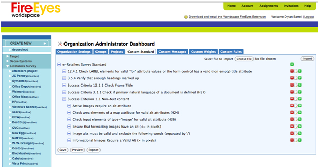
Figure 1: Worldspace FireEyes™ Custom Standard Configuration Screen
We then wanted to apply different weights to the issues that are generated by the tests. To do this, we used the "Custom Weights" feature of Worldspace FireEyes™.

Figure 2: Worldspace FireEyes™ issue weight editing screen
Once we had done this, we could begin to create a project inside Worlspace FireEyes™. We decided to create a single project for each e-Retailer site. This would allow us to differentiate between the issues encountered on every site while simultaneously using the de-duplication features of Worldspace FireEyes without having to worry about common sites (like Facebook connect) that are used by many sites. Figure 3 shows the policy settings for the target.com site with the custom standard settings inherited from the organization.
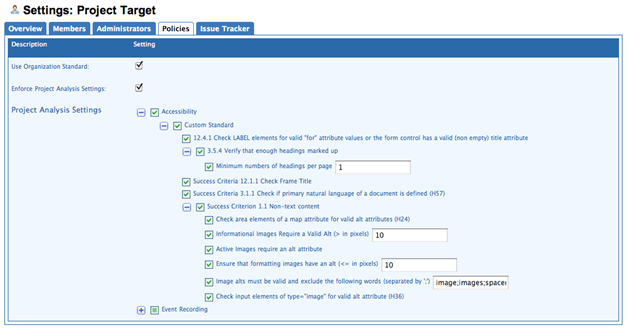
Figure 3: Project policies with custom standard
Analysis
Worldspace FireEyes™ integrates into Firebug™ and is able to do some amazing analysis while the tester uses the site being analyzed. One of the unique features of Worldspace FireEyes™ that we used was the "automatic analysis" feature - this allows for a comprehensive analysis of all content changes to a site that uses DHTML and AJAX to dynamically update the page based on actions taken by the user. These sorts of features are becoming more and more widespread amongst the top e-Retailers and any tool that isn't able to perform this type of dynamic analysis will not catch many of the errors. For example,
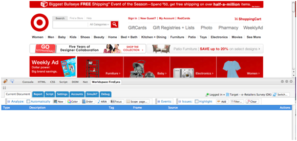
Figure 4: Worldspace FireEyes™ integrated into Firebug
Figure 5 shows an example of how Worldspace FireEyes can directly show the HTML content of an issue in the Firebug HTML explorer.

Figure 5: Using the "Inspect" feature to look at the HTML content of an element with an issue
Our testing methodology was use-case-based. For all of the sites, we wanted to see how easy it would be to search for a product, place a product in the shopping cart and then check out. We turned on the Worldspace FireEyes automatic analysis feature and then simply executed the use case on each site. Worldspace FireEyes tracks all the issues encountered during the session and generates an audit trail consisting of actions that we took and the resulting issues encountered.
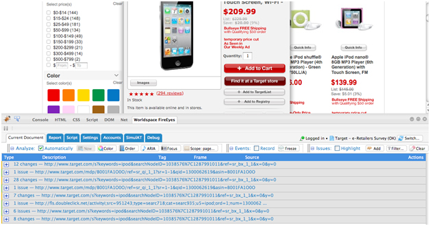
Figure 6: Audit trail captured by Worldspace FireEyes™ as the use case is being executed
Once we had captured the issues for a use case on a site, we needed to upload them to the Worldspace FireEyes server so that the reports could be generated. This was done with an easy single-click "upload" function in the FireEyes plug-in.
In addition to being able to apply weights to the issues and eliminating redundant data that occurred multiple times by "de-duplicating" issues, uploading to the server allows the developers, QA engineers and designers to share issues with one another and collaborate on fixing them and tracking their status (including creating and tracking issues in issue tracker systems like JIRA).
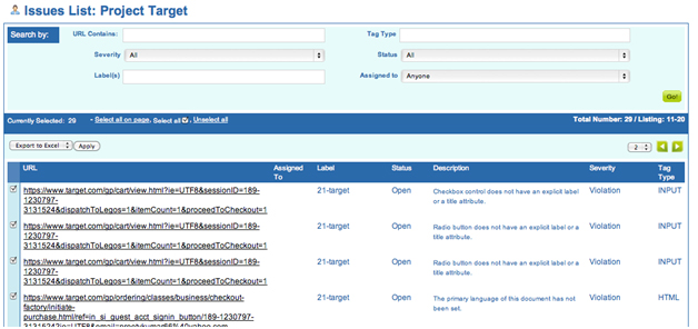
Figure 7: Exporting the issues and their weights to Excel from the issue management screen on the server
The use case analysis features of Worldspace FireEyes™ combined with the custom standards and custom weights allowed us to very easily achieve our goal of analyzing 50 retail web sites in a very short time. We only used a small subset of the functionality available but the accuracy of the rule set and the ease of use of the product were key reasons why we chose to use it over alternatives.
Pass/Fail Results
The bottom line is that the news is not good. Even retailers like Target seem to have forgotten the importance of having an accessible site - one that welcomes people with disabilities. Most of the E-retailers have serious problems with their sites; the only good news is that none of the sites are as bad as the Target site was in 2005.
None of these sites complies with all the standards and guidelines; not one is ready for the Justice Department regulations regarding web accessibility and the ADA.
We anticipated two challenges to this finding:
1. Giving everything a failing grade does not tell us where the problems are most acute; it does not tell us where remediation efforts would yield the greatest benefits
2. Perhaps some sites were failing due to "technical violations" of the standard that did not represent real barriers to access
Regarding the first challenge, there is no question that some errors are much less important than others. For example, the tests for image, includes "formatting" or "spacer" images which are used on sites to fix visual layout problems. Such images are invisible and carry no information; they should have alt="", null alt text, telling assistive technology to just ignore the image. The fact is that these images are ignored by screen readers anyway - with default settings. Some sites have hundreds of these formatting images. Therefore, simply counting errors can be misleading and lead to incorrect conclusions because some errors are just not as important as others, so we had to couple the automated detection of errors with some way to highlight the important errors. Our solution was the scoring technique described above.
The second challenge requires the comparison of our results with the "gold standard" of manual testing by someone who is an expert at using AT and is well versed in the WCAG 2.0 standards. We have started doing that and initial results suggest that the testable errors are symptomatic and we present our initial findings below.
Testable Errors are Symptomatic
It is crucially important to stress that in each of these cases, when the detectable error is not present that does not mean that the corresponding object (image, button, frame, etc.) complies with the guidelines. On the other hand, our experience suggests that these fully testable errors are symptomatic. If we find none of these errors on an HTML site or only a small number, we have a very high expectation that the site is accessible - and will meet most of the standards. Not only are these errors symptomatic, some of these fully testable errors are the most important. Having alt-text on product images and shopping buttons, and having labels on forms are absolutely crucial for any E-commerce site.
Jim was the Expert Witness for the National Federation of the Blind 2005-2008 and besides doing some manual evaluation he stressed exactly these errors. Here is an extraction of the results for Target.com from the time that the NFB action was initiated until recently.
|
Date |
Alt-text |
Forms |
Errors/page |
|---|---|---|---|
|
7/5/2005 |
1287 |
17 |
217 |
|
2/6/2006 |
NFB Files suit against Target |
||
|
2/7/2006 |
1678 |
18 |
283 |
|
11/18/2006 |
73 |
0 |
12 |
|
2/10/2007 |
29 |
0 |
5 |
|
4/8/2008 |
34 |
0 |
6 |
|
8/27/2008 |
NFB/Target Settlement |
||
|
1/15/2010 |
17 |
4 |
4 |
Table 3: Errors on 6 pages of Target.com over time
The errors listed here are the alt-text and form errors. Target.com moved from a high of 283 errors per page to a low 4 errors per page in the recent evaluation. In fact most of the alt-text errors listed in the table starting in November 2006, just 9 months after the suit was filed, are unimportant "formatting images," ones that neither convey information nor are links.
We were motivated to find a method based on computer testable errors instead of detailed manual evaluation which would have been cost-prohibitive for such a large number of E-retail web sites.
Imagine a growing epidemic. If you can quickly find and treat those who have the disease, you have a manageable problem; otherwise you may have a national disaster.
There are two tests for the disease. One is quick, easy and inexpensive -- like a swab for strep-throat. It is not definitive but it is certainly symptomatic - if this test detects a problem you most likely have the disease.
The other involves a full body scan in an expensive MRI machine followed by interpretation by a team of specialist doctors who are overbooked and did we mention, expensive. This test however is the gold standard. If you are found to have the disease according to this test, you really do -- no false positives, no false negatives!
Even though the gold-standard is the only way to establish a definitive diagnosis, from a public health perspective it is clear that the quick and easy test should be deployed widely. It is the only practical solution to deal with the epidemic.
The same can be said of the proposed [automatically] testable web accessibility errors but we knew we bore the burden of proof that the automated tests would identify the sites with real serious accessibility problems.
We looked at the scores from the automated tests and selected 3 sites that scored well, 4 that scored badly and 2 intermediate sites. We gave this list in alphabetical order to a blind tester and asked him to rank each of these sites according to his ability to shop on them. Here are the results:
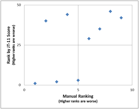
Figure 8: comparison of manual ranking vs. ranking by automatic score
The horizontal axis shows the manual ranking (1 through 9) of the 9 sites and the vertical axis shows the scores of those sites from our automatic tests.
This experiment shows that overall there is agreement in 7 out of 9 cases between the Manual and Automated tests. When the automated test showed a site as "better" the manual tester agreed. Similarly for 4 out of the 6 cases that the automated ranking indicated that the site was "worse", the manual tester agreed. The 2 disagreements were cases were the manual tester judged the site to be better than what the automated testing indicated. Although this is a fairly limited test, this data suggests that when the automated test indicates that a site is "better", it is usually right and when the automated test indicates that a site is "worse", meaning it has a lot of accessibility problems, the odds are that it is right but it may be a bit harsh in some cases. Thus it seems reasonable for us to conclude:
Distribution of Errors on the 50 sites
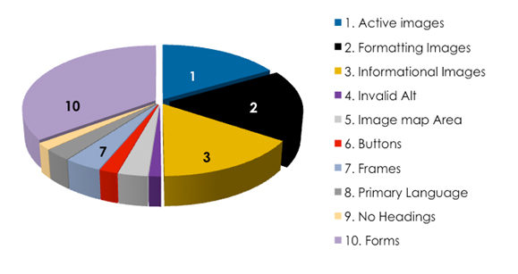
Figure 9: Error Distribution
We summed the errors by each issue type in our tests and found that 4 errors out of the fully testable errors accounted for most of the issues across the 50 websites. The results are in Figure 10 above. Thirty five (35) percent of the errors were form fields without labels or titles. Slightly more than 54% of all issues related to missing or invalid alt. Every other issue type was well below 5%. Not a single instance of a server-side image map was found across the websites tested!
By providing alt-text for images (active images, formatting images and informational images) and labeling form elements, greater than 89% of all issues across all e-retailer sites tested could be fixed.
Discussion
There are several ways to look at the results.
Highest Scoring E-Retailers
Target, the one company that was sued, is rated number one. The second ranked e-retailer has opted for NFB Non Visual Access certification (http://www.nfb.org/nfb/certification_intro.asp). The third ranked e-retailer also has an agreement in place committing them to make their website accessible. Staples'agreement with ACB (http://acb.org), AFB (http://afb.org) and CCB (http://ccbnet.org) was reached through Structured Negotiations, an alternative to litigation, advocated by Lainey Feingold (http://lflegal.com). Amazon, ranked ninth in our scoring, has an agreement in place with NFB. It is obvious who is paying attention.
|
E-Retailers |
Sales Rank |
Score |
Errors/Page |
|---|---|---|---|
|
Target |
21 |
24 |
5 |
|
New Egg |
12 |
35 |
10 |
|
Staples |
2 |
40 |
3 |
|
Williams-Sonoma |
26 |
49 |
5 |
|
Office Max |
7 |
49 |
7 |
|
Costco |
15 |
57 |
6 |
|
Macy's |
20 |
60 |
8 |
|
Cabela |
35 |
71 |
9 |
|
Amazon |
1 |
73 |
11 |
|
Blockbuster |
34 |
92 |
14 |
Table 4: The 10 best scores of the 50 e-retail sites
Distribution by Sales Ranking
It is interesting to consider whether there is any correlation between sales and accessibility ranks. Are the big boys, with their complex large sites, less accessible? Surprisingly not! We grouped the e-retailers conveniently into 5 groups by retailer rank (by sales). Looking at the average score for each group, the top 10 e-retailers by sales are also the ones with the best (most accessible) websites. Conversely, group 5 (lowest sales) is the ones with the worst average scores. Here are those results.
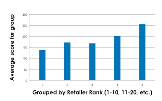
Figure 10. Errors on eretailer sites compared with sales ranking
More work remains to be done to quantify the degree of confidence that we should place in the ability of the automated tests to detect serious barriers to access. We plan to continue this work by refining our scoring method and comparing it with manual assessments by persons with disabilities.
Conclusions
While it is certainly disappointing that all E-retail sites we tested failed to comply with the WCAG 2.0 standard, we are encouraged by two things that emerged from the process of conducting this survey.
First, we think the automated method for detecting the most significant barriers, especially ones that create the risk of litigation can be very useful in a systematic risk mitigation strategy.
Second, since most of the errors were of the same few types, we can see how an organization can make significant progress toward making their sites accessible by teaching their designers and developers a very small set of easy-to-understand rules - the "Ten Commandments" if you will.