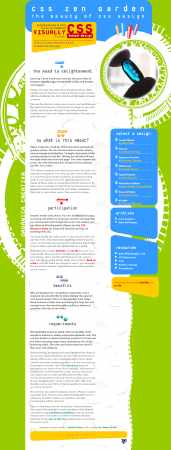
Figure 9-1. CSS Zen Garden design Organica Creativa by Eduardo Cesario.
Cascading Style Sheets (CSS) is a style sheet language that allows authors and users to attach styles to structured documents like HTML pages. Style sheets were designed to allow precise control of character spacing, text alignment, object position on the page, font characteristics, color, backgrounds, and so on.
When used to their greatest advantage, style sheets are defined in files completely separate from the HTML documents. By separating style from markup, authors can simplify and clean up the HTML in their documents. This means site-wide changes can be made in just one place, which should decrease maintenance and increase visual consistency across a website.
This chapter discusses the accessibility features of CSS and provides explanations and examples of how to use them. CSS benefits accessibility primarily by separating document structure from presentation, and we'll begin by looking at some examples of how that works.
The CSS Zen Garden is a website designed to demonstrate the capabilities of CSS. It has a single HTML document for which hundreds of designers have created style sheets that radically change the layout and presentation. Figures 9-1 through 9-4 show some examples (remember the underlying HTML is identical in each).
Figure 9-1. CSS Zen Garden design Organica Creativa by Eduardo Cesario.
Figure 9-2. CSS Zen Garden design Pinups by Emiliano Pennisi.
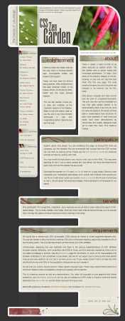
Figure 9-3. CSS Zen Garden design Obsequience by Pierce Gleeson.
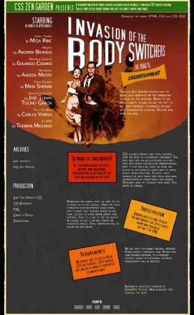
Figure 9-4. CSS Zen Garden design Invasion of the Body Switchers by Andy Clarke.
Without a style sheet attached, the CSS Zen Garden HTML page looks like Figure 9-5.
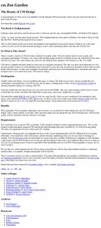
Figure 9-5. CSS Zen Garden HTML without a style sheet attached.
So, you can see that CSS is extremely powerful. It can provide layout and presentation entirely independent of the HTML document, which is extremely important. If you look at the unstyled version of the CSS Zen Garden page (Figure 9-5), it doesn't look very pretty, but it still makes sense. You can still scan the headings, read the text, and see the lists. This is because the underlying content is in a logical order and marked up with semantic—that is to say, structural and meaningful—HTML.
In the U.S. Access Board's Section 508 Standards, the applicable provision is as follows:
§1194.22(d) Documents shall be organized so they are readable without requiring an associated style sheet.
Similarly, the Web Content Accessibility Guidelines (WCAG) 1.0 says this:
6.1 Organize documents so they may be read without style sheets. For example, when an HTML document is rendered without associated style sheets, it must still be possible to read the document.
To accomplish this, you can think of CSS as a presentation "layer" that you can remove and still be left with readable and understandable content. By moving presentational markup into style sheets, HTML documents are left with clean and semantic markup. This more readily enables people to use a website with devices such as text-only browsers, aural browsers, and screen readers.
CSS can provide a benefit only when used
with semantic HTML. You should build the unstyled web page first, paying
attention to the order and structure of the pages. As discussed in Chapter 6,
remember to mark up all your headings with <hn> elements; all your lists using <dl>, <ul>, or <ol> tags; and so on. You can also wrap related content (such as sidebars) inside <div> elements.
In this chapter, you'll learn how to use various CSS techniques to improve the accessibility of a website. But first, let's review some CSS basics.
Although many designers are familiar with the basic syntax used in CSS, this section provides a brief overview, with an emphasis on best practices for accessibility. If you need an in-depth guide to CSS, refer to a book dedicated to that subject, such as CSS Mastery: Advanced Web Standards Solutions by Andy Budd (1-59059-614-5; friends of ED, 2006).
Style sheets are made up of rules that apply to an HTML document (although style sheets can also be applied to XML documents, this chapter will cover HTML only). Style sheet rules are made up of three parts:
An example of a style sheet rule is shown in Figure 9-6.
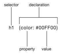
Figure 9-6. An example of a style sheet rule.
In the example in Figure 9-6, the
selector is h1, the property is color, and the value is #00FF00 (the hexadecimal value for pure green). Together, the property and
value form the declaration part of the rule. The selector links the style sheet
rule to the HTML. In this case, all h1 elements will be shown in this shade of green.
More than one declaration can be applied to a selector, and more than one selector can be given the same declaration, as in this example:
cite, blockquote {font-style:italic; font-family:'Myriad Pro', Helvetica, Arial, sans-serif}Here, all cite and blockquote elements will be displayed in italic Myriad Pro (or Helvetica or Arial, depending on which fonts are available on the user's computer.
Style sheet rules can be applied to HTML documents in three ways:
<style> element..css extension, and linked to the HTML document using the <link> element or an @import rule.Let's look at when it's appropriate to use each of these methods, and then at when user and browser style sheets are applied.
Inline styles should be used only when the designer needs to specify a particular style in one place in a single document. Here is an example:
<p style="border:1px solid purple ">In this piece of code, content (the <p> element) and presentation (the style attribute) are both present. The implication is that inline styles
do not separate presentation from content. Therefore, you should use inline styles
only in exceptional circumstances.
Even if you require a single element in a
document to be given a style, there is an alternative to using an inline style:
using an id selector. Give the
element a unique id attribute, as in this example:
<p id="special">You can then use the id attribute as a selector in your style sheet, like this:
#special { border:1px solid purple }If you find yourself repeating the same inline style several times within a document, you should use a class selector. This works in a similar way to the id selector, except it uses a class attribute, like this:
<p class="special">Use the class selector in your style sheet like this:
.special { border:1px solid red }The main difference between id selectors and class selectors is that an id can be applied only to a single element within an HTML document,
whereas class selectors can be applied to as many different elements as you like,
although you should limit the use of id and class selectors where possible. One further difference between class and id selectors—from a CSS perspective—is that id selectors are considered to have a higher specificity. An id is considered more important than a class, so where rules contradict each
other, the id will override the class. For example, consider this HTML code:
<p id="veryspecial" class="special">And the corresponding CSS rules:
#veryspecial {background: purple}
.special {background: red; font-weight: bold}
The paragraph will be displayed in bold,
as specified in the class rule. The class rule also specifies a red background, but the id rule says that the background should be purple. As id selectors are more specific than class selectors, the id overrides the class, and the background of the paragraph will be displayed in purple.
With the embedded method of adding CSS to an HTML document, the CSS rules are enclosed
in a <style> element, which should
be included inside the <head> element. Valid HTML requires that you should always include the type attribute with the <style> element. Here is an example:
<style type="text/css">
h1 {
color: #00FF00;
}
#veryspecial {
background: purple;
}
.special {
background: red;
font-weight: bold;
}
cite, blockquote {
font-style:italic;
font-family:'Myriad Pro', Helvetica, Arial, sans-serif;
}
</style>
Embedding style sheets in this manner goes one step further in separating content from presentation, as all the style rules are containing within a single element and not intermingled with the HTML. However, embedded style sheets can apply rules to only a single HTML document, so in a site-wide context, the styles are still not very separated from the content. The implication is that embedded style sheets should be used only when rules need to be applied to a single page within a website. For styles that need to be applied to more than one web page (as is often the case), a linked style sheet should be used.
By importing or linking to an external style
sheet file, the designer can control the presentation of a whole website from
one or more style sheets. A style sheet file would normally be named with a .css extension and would include style sheet rules like this:
h1 {
color: #00FF00;
}
#veryspecial {
background: purple;
}
.special {
background: red;
font-weight: bold;
}
cite, blockquote {
font-style:italic;
font-family:'Myriad Pro', Helvetica, Arial, sans-serif;
}
Notice the rules are exactly the same as
with the embedded style sheet, but there is no need for the <style> element. The style sheet file is linked to an HTML page using the <link> element in the <head> of the document, like this:
<link rel="stylesheet" type="text/css" href="mystyles.css" />An alternative method
is to use @import from within a <style> element, like this:
<style type="text/css">
@import url("mystyles.css");
</style>
The <link> element is supported by all browsers that support style sheets.
However, the @import method is not
supported by some older browsers, including Internet Explorer 4 and Netscape
Navigator 4 and older. This is often used to the designer's advantage, because
the older browsers have very poor support for CSS. Linking to style sheets
using the @import method means
only capable browsers will be able to use your style sheets. The older browsers
will display the unstyled pages, which should still be usable, assuming you
have used HTML correctly and marked up the content in a meaningful way. Hence, @import is usually the method of choice for linking to style sheets.
So far, I have discussed the use of style sheets created by the author. However, one of the major accessibility features of CSS is that style sheets can be created by users, too. User style sheets are files created by users and stored on their computer. The browser is then configured to apply the user style sheet to all websites that the user visits.
For example, a visually impaired reader may specify a style sheet like this:
body {
color: yellow;
background: black;
}
In this style sheet, the user has set a black background and yellow text for the web page (perhaps because the combination of color makes the text easier to read). The rules in the user style sheet will override rules of an equivalent specificity set by the author. However, if the author sets a more specific rule like this:
p.special {background: green;}Then the author's rule will override the
user's rule. In this case, the result will be yellow text displayed on a green
background for all paragraphs with a class of special, which is clearly undesirable and not at all helpful for the user.
In order to ensure that users can control
styles as they wish, CSS2 defines the !important operator. If a user's style sheet contains !important, it takes precedence over any applicable rule in an author's style
sheet. For instance, the rule in the following user style sheet will ensure that every paragraph on the web page is set to the
desired colors:
p {
color: yellow ! important ;
background: black ! important ;
}
Authors can also use !important in their style sheets, but it will always be overridden by a user
style sheet (although this is only true in Internet Explorer if the
user-defined style sheet also contains the !important keyword).
The CSS2 inherit value, which is available for most properties, enables !important style rules that can govern most or all of a document. For
instance, the following rules force all backgrounds to black and all foreground colors
to yellow:
body {
color: black ! important ;
background: white ! important ;
}

* {
color: inherit ! important ;
background: inherit ! important ;
}
The first rule sets the colors of the <body>, and the second rule uses the * selector to target all elements on the page and the inherit property to inherit the colors from the <body>.
CSS2 also enables further control over the display, including these features:
color, background-color, border-color, and outline-color properties) and system fonts (for the font property) mean that users may apply their system color and font
preferences to web pages.outline property) allow users to create outlines around content in order to
highlight certain information. For example, to draw a thick blue line around an element when it has the focus, and a thick green line when it is active, the following rules can be used:
:focus  { outline: thick solid blue }
:active { outline: thick solid green }
These style rules could help some readers with visual difficulties more readily see which element has focus (in a form, for example).
Even when no user or author style sheet has been specified, browsers still use a style
sheet to render HTML with default styling. For example, Firefox uses a file
called html.css for the default rendering of HTML. Here is an
extract showing how Firefox styles level 1 headings:
h1 {
display: block;
font-size: 2em;
font-weight: bold;
margin: .67em 0;
}
Browser style sheets have a lower specificity than author and user style sheets.
CSS allows users with particular presentation requirements to override author styles. This is very important to users who have problems with certain colors and fonts, as CSS allows users to view documents with their own preferences by specifying them in a user style sheet.
Colors are probably the easiest properties to set using CSS, but they can also be the most problematic. In this section, I will highlight the potential problems and provide solutions to specifying color with CSS.
As explained in the "User Style Sheets" section, it is possible for author style sheets and user style sheets to clash. The example I provided had a user specifying yellow text on a black background, with the author using a more specific rule to set the background to green. This resulted in the user seeing green text on a yellow background, which is difficult to read. It is therefore vital that authors specify both a foreground color and a background color so that text will always remain readable.
Color problems can also arise with certain operating system "themes." For example, a designer may want all the form controls to appear with a gray background:
input, textarea { background: gray }In most situations, this would be fine. However, form control colors tend to be inherited from the operating system, so an operating system theme with gray text might exist, meaning that the text on the form controls would be invisible. To solve this problem, the designer should specify the foreground color of the form controls as well:
input, textarea { background: gray; color: black; }CSS also allows designers to set background images. However, it's important to remember that if you do this, you should always set a background color as well:
p .special {
background: red url(bricks.gif);
color: white;
}
By choosing a suitable background color, you can ensure that the text is always readable, regardless of browser settings or any bandwidth problems delaying the downloading of images.
People with low vision often have difficulty reading text that does not contrast enough with its background. This can be exacerbated if the person has a color vision deficiency that lowers the contrast even further. Another group of users affected by low contrast are people using monitors suffering from reflections (perhaps from a window) or screens that have poor contrast. So, following accessibility advice could also benefit people without disabilities.
Designers should ensure that foreground and background colors contrast well. On this subject, WCAG 1.0 states
2.2 Ensure that foreground and background color combinations provide sufficient contrast when viewed by someone having color deficits or when viewed on a black and white screen. [Priority 2 for images, Priority 3 for text].
A very basic test for determining whether color contrast is sufficient to be read by people with color vision deficiencies or by those with low-resolution monitors is to print pages on a black-and-white printer (with backgrounds and colors appearing in grayscale). The important thing to remember is to rely on lightness differences between foreground and background, not to rely on color differences.
For more specific guidance on color contrast, see "Effective Color Contrast" by Aries Arditi, Lighthouse International, and "Type and Colour" by Joe Clark. Jonathan Snook has developed an online Color Contrast Checker.
I have just stressed the importance of color contrast. It can be inferred that relying on color alone is not a reliable method of conveying information and meaning. Indeed, Section 508 states
§1194.22(c) Web pages shall be designed so that all information conveyed with color is also available without color, for example from context or markup.
As a designer, you should ensure that
information and meaning is also conveyed through means that do not depend on
the user's ability to differentiate colors. For example, when asking for input
from users, do not write "Please select an item from those listed in
green
." Similarly, do not turn off the underlining of links without
providing some other method of visually determining a link. Instead, make sure
that information and meaning are available through other style effects, such as
bold text or grouped under a heading.
This does not mean that you should not use color to enhance identification of important features. Indeed, color is an extremely important weapon in the designer's arsenal. It does, however, require that some other method of identification, such as text labels, be combined with the use of color.
CSS has properties to control font appearance, so authors can avoid using images of text. Using style sheets to style text, rather than creating images of text, makes textual information and meaning far more accessible. Text as text (as opposed to images of text) makes content available to people who use speech synthesizers and Braille displays. It can also more readily be resized and reformatted for visually impaired users or those using alternative devices, such as handhelds and projectors. Another benefit is that the text can be read by other software, such as search engine robots.
In the past, HTML markup was heavily abused and the accessibility implications where ignored in the pursuit of presentational effects. CSS provides many properties for styling text beyond just size, and this opens the door to enabling well laid out pages combined with meaningful, accessible HTML.
Text size is probably the first font
style a designer will need to set. In CSS, this is accomplished with the font-size property:
p {font-size:12px}This sets all paragraphs to display at a font size of 12 pixels, what the designer may consider the perfect size for paragraph text. However, not all users will agree with that design decision—perhaps they are short-sighted, doing a presentation, using a very-high resolution screen, or simply have tired eyes. The beauty of CSS (and the Web in general) is that users can change settings in their browser to make all the page text proportionately bigger or smaller as they require.
As a designer, it is important to create web pages that will allow text to be resized without the layout breaking or the design being otherwise compromised. Users can, and will, change the size of text to suit their requirements, and this should always be taken in account.
There is, however, a complication: Internet Explorer for Windows (up to version 6 at the time of writing) will not resize text that has been defined in pixels. You could reasonably argue that if users require text to be resized, they should use software that is capable doing so, such as Firefox and Opera (both of which are free), but not everyone has that choice. Furthermore, WCAG 1.0 has this to say on the subject:
3.4 Use relative rather than absolute units in markup language attribute values and style sheet property values. [Priority 2]
In this instance, pixels should be
considered absolute units, although they are actually relative to the screen
resolution. The alternative to absolute units is relative units, which include
percentage, keywords (such as bigger), and for text in particular, ems. Sizing text using ems is slightly more complicated than using pixels, and so warrants further
explanation.
The em unit of measure is so-called because it approximates the size of an uppercase
letter M
, although 1 em is actually
significantly larger than this. In The Elements of Typographic Style (0-881-79132-6; Hartley and Marks, 2001), the typographer Robert
Bringhurst describes the em as follows:
The em is a sliding measure. One em is a distance equal to the type size. In 6 point type, an em is 6 points; in 12 point type an em is 12 points and in 60 point type an em is 60 points. Thus a one em space is proportionately the same in any size.
To illustrate this principle in terms of CSS, consider these styles:
#box1 {
font-size: 12px;
width: 1em;
height: 1em;
border:1px solid black;
}

#box2 {
font-size: 60px;
width: 1em;
height: 1em;
border: 1px solid black;
}
These styles will render as shown in Figure 9-7.
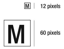
Figure 9-7. Sizing with ems.
Note that both boxes have a height and
width of 1 em, but because they have different font sizes, one box is bigger
than the other. Box 1 has a font-size of 12px, so its width and
height are also 12px.
Box 2 has a font-size of 60px, and correspondingly, its width and height are also 60px.
To explain how sizing text using ems actually works, consider this extract from a short web page:
<body>
<h1>My heading</h1>
<p>A paragraph of text</p>
</body>
In this example, the designer wants the
heading to be 24px and the paragraph
to be 12px. In most browsers, with text set to the default medium size, the
font size of the <body> will be 16px.
To set the font size of the heading to 24px using ems,
you need to apply a little mathematics:
child pixels / parent pixels = child ems
24 / 16 = 1.5
That is to say, the heading is 1.5 times the size of its parent, the body, so you use this rule:
h1 {font-size:1.5em}Applying the same logic to change the font size of a paragraph, you have 12 / 16 = 0.75, so you use this rule:
p {font-size:0.75em}One added complication is that of nested elements. A list might be added to the page like this:
<ul>
 <li>Fruit
    <ul>
      <li>orange</li>
      <li>apple</li>
    </ul>
 </li>
 <li>Vegetable
    <ul>
      <li>potato</li>
      <li>carrot</li>
    </ul>
 </li>
</ul>
If you also want the list of items to be 12 pixels, you could add the same style sheet rule that you did for paragraphs:
li {font-style:0.75em}This will work for Fruit and Vegetable, but orange, carrot, and the other nested list items will be displayed at 9 pixels. Why? Because the rule actually says that any list item should be 0.75 times the size of its parent. So you need another rule to prevent this inherited shrinkage:
li li {font-size:1em}This says that any list item inside another list item should be the same size as its parent (the other list item).
For a more detailed explanation of sizing text using ems, see www.clagnut.com/blog/348/.
Often, the blockquote element is misused to indent a
block of text. This is an unreliable and sometimes harmful approach. It can be harmful because blockquote adds meaning to the text: It tells the browser that the enclosed
text has been quoted from a source. If this is not the case, the blockquote would be misleading. It can be unreliable because the indentation
may not always be applied. Indentation is simply a common style applied by most
browsers, but not necessarily all of them.
If you require a portion of text to be
indented, you should apply the margin property, which allows you to create space on any or all of the
four sides of an element's content. Here is an example:
.attention {
  margin-left:2em;
  margin-right:2em;
}
Figure 9-8 shows an example of using the margin property.
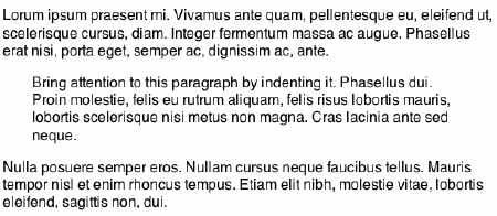
Figure 9-8. Using the margin property to indent text.
As well indenting an entire block of text
using margins, CSS also enables you to indent the first line of a block.
Instead of using transparent images or multiple entities to create an indentation, you should use the text-indent property. This example margin property indents the first line of every paragraph by 1em:
p {text-indent:1em}A slightly more sophisticated rule using
the + adjacent sibling selector would automatically set every contiguous
paragraph to be indented:
p + p {text-indent:1em}Translating the rule more literally, this says to indent every paragraph that directly follows another paragraph, and would render as shown in Figure 9-9.
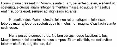
Figure 9-9. Using the text-indent property to indent the first line of paragraphs.
Like the deprecated HTML <font> tag before it, CSS's font-family property provides a way of specifying the display font:
body {font-family: Univers, "Helvetica Neue", Arial, Helvetica,sans-serif}As with HTML, web pages designed with CSS
can be displayed only with the fonts installed on the user's computer. So the font-family property enables you to provide a list of alternative fonts in
order of preference. In this example, the first choice is for the page to be
displayed using Univers. If Univers isn't installed on the user's computer, the
next preference is Helvetica Neue. If that isn't installed either, then the
next choices are Arial, followed by Helvetica, all the way down to a generic
sans-serif font family (which will be a font that really is installed on the
user's computer and specified in the browser preferences).
There are five generic font families: serif, sans-serif, cursive, fantasy, and monospace. It is good practice to always specify one of these at the end of your font list so your design will be rendered somewhere close to your original intent. There is more discussion and advice on font-family at www.clagnut.com/blog/266/.
CSS1 provides three further font properties: font-style, font-weight, and font-variant. These are well supported across modern browsers and can be used as
follows:
cite {font-style:italic}
strong {font-weight:bold}
acronym {font-variant:smallcaps}Further manipulation of text is available in
CSS through the word-spacing and letter-spacing properties. These can result in some very creative styling without needing to resort
to images. Here is an example:
letter-spacing: 0.25em
word-spacing: -0.45em
Figure 9-10 shows the result.
Figure 9-10. Using the letter-spacing and word-spacing properties.
Using letter-spacing in this manner, as opposed to inserting spaces in between the letters, means
the words stay as words. When letters are separated by whitespace characters,
they are read as individual letters. For example, if you put spaces between the characters in a word like
this:
w h a r v e s It will be read by a screen reader as the individual letters—w, h, a, r, v, e, and s—rather than the word wharves. Text without spaces will be transformed effectively to speech and also be more readily understood by software such as search engines.
When you require words or phrases to be shown entirely in all uppercase letters—for
example, in a heading—write the text as you would normally, and then use text-transform to change the case:
h1 {text-transform:uppercase}If a phrase is an acronym or abbreviation that is normally written in uppercase, such as NASA or IBM, you should still write the word in capital letters, rather than use CSS to transform the word.
This book is written in English and so reads
from left to right. Some languages, such as Hebrew, read from right to left. In
some cases, you may need to mix together written languages that read in
opposite directions. You can use the CSS properties direction and unicode-bidi to indicate a change in direction
of presentation. Here is an example:
.hebrew {
  direction: rtl;
  unicode-bidi: bidi-override;
}As outlined in the previous section, a lot of text effects are available through CSS. While the
preferred technique is not to use images of text, many designers will not be
satisfied with what can be achieved with CSS alone. Instead, they will resort
to images of text to ensure their designs use a certain typeface or treatment.
This is fine, provided that the images are marked up correctly with structural
HTML and suitable alt attributes. For example, as explained in Chapter 6 an image of the heading "Introduction
" should be coded something like this:
<h1><img src="introduction.gif" alt="Introduction" /></h1>The disadvantage of this technique is
that the text of the heading is accessible only through the alt attribute of the image.
You can use CSS to make text more accessible through background images and positioning properties. These techniques are known as image replacement (IR). The CSS Zen Garden examples shown in Figures 9-1 through 9-4 at the beginning of this chapter rely heavily on image replacement techniques for their visual impact, and image replacement has been a major factor in the popularity of CSS.
One such image replacement technique can be applied to the previous example by marking up the heading in the following manner:
<h1 id="intro"><span></span>Introduction</h1>To show a designed image instead of real text, you can use the following style rules:
#intro {
  width: 300px;
  height: 100px;
  position: relative;
}

#intro span {
  background: url("introduction.gif") no-repeat;
  width: 100%;
  height: 100%;
  position: absolute;
}
With these style rules, the image text is inserted by
setting the background of the empty span to background:url("introduction.gif"), and then positioning the span on top of the real text (positioning
is discussed in the "Layout and Positioning" section later in this
chapter). The real text will display if CSS or image loading is turned off in
the browser. There are some provisos with this method: An otherwise meaningless <span> element is required, the size of the real text must always be
smaller than the size of the text image, and the text image cannot be
transparent.
Many image replacement techniques fail in the situation where CSS is on but images are turned off. This is usually due to CSS rules hiding the real text off screen, such as the Phark technique proposed by Mike Rundle:
<h1 id="intro">Introduction</h1>/* CSS */
#intro {
text-indent:-100em;
height:25px;
background: url("introduction.gif") no-repeat;
}In the Phark technique, the real text is indented by 100 ems, so that it disappears off the screen, leaving just the background image displayed. However if a CSS-enabled browser has images turned off (or perhaps a very slow Internet connection), the image will not be displayed, and neither will the real text, as it hidden off-screen.
To address this problem, I put together an experiment that uses JavaScript to make image replacement techniques work when CSS is on and images are off, which you can find at www.clagnut.com/sandbox/js-enhanced-IR/.
It's worth noting that the method described at the beginning of this section does work in the situation where CSS is enabled and images are off, as it hides the real text with the image.
One of the more recent image replacement techniques is called scalable
Inman Flash Replacement (sIFR), (pronounced "siffer"), developed by
Shaun Inman and Mike Davidson. This technique combines CSS and JavaScript to
dynamically replace elements (such as headings) with a tiny Flash movie. sIFR
allows you to mark up your documents in a standard, meaningful way, without the need for
superfluous <img> or <span> elements.
Surprisingly, perhaps, this is one of the most accessible of all the image replacement techniques. If JavaScript, Flash, or CSS is not available, the normal text is shown instead. If readers have their default text size set to large (or some other nondefault size), the Flash movies resize accordingly. This is not something that usually happens with image replacement techniques and is clearly advantageous for visually impaired readers.
The main drawback is that sIFR can slow down the rendering of websites as it is quite resource-intensive (especially if overused on a web page). The sIFR files are free and can be downloaded from www.mikeindustries.com/sifr/.
An early image replacement
technique is known as Fahrner Image Replacement (FIR), named after Todd
Fahrner, one of the persons originally credited with the idea. Like all image
replacement techniques, FIR used a background image for the graphical text, but
it also used the display:none property to hide the real text from the browser. This appeared to
work well, but was subsequently found to fail in some screen readers (see alistapart.com/articles/fir/ for detailed testing results) as the text was not read aloud. This
is because the display property
applies to any manifestation, not just visual.
Many image replacement techniques are
documented across the Web. Any that use display:none to hide the real text should be avoided, as they are inherently
inaccessible. The pros and cons of other methods of image replacement are
discussed on Mezzoblue at www.mezzoblue.com/tests/revised-image-replacement/.
img Tag?An img tag with suitable alt text will work well in most situations, including the examples cited
here. The problem with the alt attribute is that its contents can be only plain text. You cannot add any
markup within the alt attribute, so images containing text beyond a few words may not be able to be
adequately represented.
This situation is likely to be addressed with the advent of XHTML 2.0. Markup such as the following will be possible:
<table src="temperatures.png">
<caption>Average monthly temperatures</caption>
<tr> <th>Jan</th> <th>Feb</th>....
<tr> <td>0</td>   <td>-4</td>...
</table>
In this code, a browser that can display
images will show the temperatures.png image; all others will display the table. In XHTML 2, the src attribute can be applied to just about any element, so in the
future, CSS-based image replacement techniques will not be required.
It is vital that you take care not to include important information in images that are displayed through CSS. WCAG 1.0 has this to say on the matter:
6.1 Organize documents so they may be read without style sheets. For example, [when an HTML document is rendered without associated style sheets, it must still be possible to read the document. [Priority 1]
This means that any background images containing information or text must have the equivalent information in the markup. A real-life example of image replacement abuse is the following code:
<p id= "interestrate">The best interest rates available</p>In this example, the paragraph is styled to include an image whose text includes "19.3% Typical Variable." Clearly, this is bad because the important (and possibly legally binding) information that the interest rate is 19.3 percent is available only in an image specified by CSS, making it inaccessible to screen reader users and anyone else without images or CSS.
More examples and discussion of CSS background abuse can be found in the article "Naughty or Nice? CSS Background Images."
CSS allows precise control over
spacing, alignment, and positioning, allowing authors to avoid markup tricks,
such as invisible images and tag misuse. For example, while the <blockquote> and <table> elements in HTML are supposed to be used to mark up quotations and
tabular data, they are frequently used to create visual effects, such as
indentation and alignment. When specialized browsing software, such as a speech
synthesizer, encounters elements that are misused in this way, the results can
be unintelligible to the user.
As mentioned in Chapter 6, the <table> element is often misused to lay out pages rather than to mark up
and display tabular data, for which it was originally designed. Using the
positioning properties of CSS2, designers can control the visual position of
almost any element in a manner independent of where the element appears in the
document. You should always design documents that make sense without style
sheets. This means the document should be written in a logical order, using
structural markup to design content that makes sense when CSS is not applied.
Page layout with CSS has one of the steeper learning curves. In this section, I will demonstrate methods for creating three simplified layouts and leave you to experiment further.
For more information about CSS layouts, see the Max Design website and the css-discuss wiki. Also, Alex Robinson has created the One True Layout, which addresses a multitude of layout issues in CSS (be warned: it covers some very advanced topics).
Figure 9-11 shows the first sample layout. It assumes a simple page with a centered column of text.
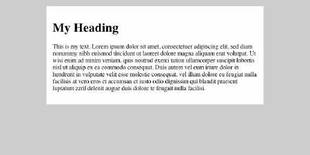
Figure 9-11. Centered elastic-width column layout.
Here is the HTML:
<div id="content">
<h1>My Heading</h1>
<p>This is my text. Lorem ipsum dolor sit amet...</p>
</div>
And here is the CSS to achieve the centered layout:
#content {
  width: 33em;
  margin-right: auto;
  margin-left: auto;
  margin-top: 1em;
  padding: 1em;
  background: #fff;
  color: #000;
}
The first three properties do all the
work in this example. First, the content column is set to 33 ems wide. This
gives a comfortable line length for reading. It also means that if users reduce
the size of their text, the width of the column will reduce accordingly, thus
keeping the text readable with the same number of words on each line. Setting auto as the value for left and right margins has the effect of centering
the column.
This type of layout has been coined elastic, as it can be said to stretch with the text size. A good example of an elastic layout is Patrick Griffiths's Elastic Lawn design for the CSS Zen Garden.
Figure 9-12 shows the next sample layout. This layout has two sidebars of fixed width and a center column of main content, which fills the remainder of the window.
Figure 9-12. Three-column layout.
The following is the HTML for the page. Notice the source order has the middle column first, followed by the sidebars.
<body>
<div id="maincontent">
<h1>My Heading</h1>
<p>This is my text...</p>
<p>Ut wisi enim ad minim veniam...</p>
</div>

<div id="sidebar1">
<h2>Sidebar 1</h2>
<p>Sidebar 1 text...</p>
</div>

<div id="sidebar2">
<h2>Sidebar 2</h2>
<p>Sidebar 2 text...</p>
</div>
</body>
Here is the style sheet that performs the layout:
body {
  margin:0;
  background:#ccc;
  color:#000;
}

#maincontent {
  margin-right:220px;
  margin-left:220px;
}

#sidebar1 {
  width:180px;
  position:absolute;
  top:0px;
  left:10px;
}

#sidebar2 {
  width:180px;
  position:absolute;
  top:0px;
  right:10px;
}

#maincontent, #sidebar1, #sidebar2 {
  margin-top: 10px;
  padding:10px;
  background:#fff;
  color:#000;
}
Stepping through the rules in order,
first the body element is attended to:
body {
  margin:0;
  background:#ccc;
  color:#000;
}
Here, any default margin applied to the body by a browser style sheet is removed, and the
body background is set to a light gray, remembering to set the color as well.
Next the maincontent div is
styled:
#maincontent {
  margin-right:220px;
  margin-left:220px;
}
The maincontent div, which contains all the content of the center column, is given
a large margin to the left and right. This margin is of exactly the right size to fit in the sidebars, which are styled
next:
#sidebar1 {
  width:180px;
  position:absolute;
  top:0px;
  left:10px;
}

#sidebar2 {
  width:180px;
  position:absolute;
  top:0px;
  right:10px;
}
First, both sidebars are given a width of 180px. This will ensure they fit inside the space left by the maincontent margins. Then the sidebars are given a position property of absolute. This takes the sidebars out of the flow of the document and means
they can be placed anywhere on the page, including on top of existing content.
To place an absolutely positioned element, use a combination of the top or bottom and left or right properties.
Sidebar 1 needs to be positioned in the
top-left corner of the page, 10 pixels in from the left edge, so it is set to top:0px and left:10px. Similarly, sidebar 2 needs to be positioned in the top-right
corner of the page, 10 pixels in from the right edge, so it is set to top:0px and right:10px.
Visually, the page reads from left to right as follows: sidebar 1, center column, sidebar 2. This is a design decision and has been accomplished in CSS despite the author's chosen logical source order of center column, sidebar 1, sidebar 2. In fact, sidebar 1 and sidebar 2 could be swapped by interchanging the left and right properties of each.
Being able to separate presentation from source order is extremely good for accessibility, as software such as a screen reader follows source order, meaning it can be helpful to have your content first and navigation at the end. There is also the additional benefit that search engines give more credence to content earlier in the source of a page, so if you can code your content before your navigation, this may improve your page rank.
The third sample layout is shown in Figure 9-13. It contains a content column and a sidebar, both of which are proportional in width to the size of the user's browser window. This content is topped by a heading and finished off by a footer.
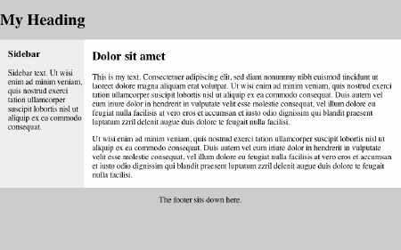
Figure 9-13. Layout with a heading, a footer, and two liquid columns.
Here is the HTML for this page:
<h1>My Heading</h1>
<div id="content">
<div id="maincontent">
<h2>Dolor sit amet</h2>
<p>This is my text...</p>
<p>Ut wisi enim ad minim veniam...</p>
</div>
<div id="sidebar">
<h3>Sidebar</h3>
<p>Sidebar text...</p>
</div>
</div>
<p id="footer">The footer sits down here.</p>
Here is the style sheet that performs the layout:
body {
  background:#ccc;
  color:#000;
  margin:0;
}

#maincontent {
  float:right;
  width:75%;
  background:#fff;
  color:#000;
}

#sidebar {
  width:20%;
}

#footer {
  clear:right;
  text-align:center;
}

#content {
  background:#eee;
   color:#000;
  overflow:auto;
}

#maincontent, #sidebar {
  padding:0 1em;
}
First, the body is colored and the margins removed, as in the previous layout:
body {
  background:#ccc;
  color:#000;
  margin:0;
}
Then the maincontent column is positioned:
#maincontent {
  float:right;
  width:75%;
  background:#fff;
  color:#000;
}
Here, the maincontent column is colored white and given a width of 75%. This width makes
the element three quarters the width of its container. In this case, the container is the content div, which stretches the full width of the window—as the
window is widened, so is the content. The maincontent element is also given the style float:right. This "floats" the element to the right side and allows
any content following it in the source to flow around. This is what enables the
sidebar to sit next to the maincontent column.
The sidebar is styled with this rule:
#sidebar {
  width:20%;
}
The sidebar is given a width of 20% so that it will fit inside the remaining 25% left by
the maincontent column.
Next comes the footer:
#footer {
  clear:right;
  text-align:center;
}
The text-align:center rule makes the text of the footer
sit centered on the page. The clear:right rule clears the preceding float of the maincontent column. This means that, instead of sitting next to the maincontent column underneath the sidebar, it sits underneath the maincontent column.
Finally, the content div is styled:
#content {
  background:#eee;
  color:#000;
  overflow:auto;
}
The content div contains the maincontent and the sidebar. The sidebar is colored light gray. The overflow:auto rule is a little fix that ensures the maincontent column does not flow out of the content div, as floated elements are normally designed to overflow their
container.
Many websites contain a "global navigation" area that provides links to the major section of that website. Often, these global navigation areas run horizontally across the top of the web page, as shown in Figure 9-14.
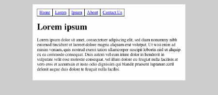
Figure 9-14. A typical global navigation example.
Global navigation is simply a list of links, so it follows that an HTML list should be used:
<ul id="nav">
 <li><a href="home">Home</a></li>
 <li><a href="lorem">Lorem</a></li>
 <li><a href="ipsum">Ipsum</a></li>
 <li><a href="about">About</a></li>
 <li><a href="contact">Contact Us</a></li>
</ul>
By default, an HTML list is rendered vertically and with bullet points, so it wouldn't look at all like the horizontal navigation in Figure 9-14. However, CSS can easily change how the list appears with these rules:
#nav {
  margin:0;
  padding:0;
}

#nav li {
  list-style:none;
  float:left;
  width:auto;
  margin:0;
  padding:0.25em 0.5em;
  border:1px solid #000;
}
In the first rule, the browser default
margins are removed from the nav list. Then for each list item, the bullet point is removed using list-style:none. Next, the list items are floated left, which allows them to line
up next to each other in a horizontal row. The width:auto rule is added so the browser knows to make each list item fit its
content. Finally, the default margin is removed, some padding is added, and a
border is given to each item.
More sophisticated navigation designs using CSS are demonstrated on Max Design's Listamatic page. Figure 9-15 shows a fine example of horizontal navigation based on a list, from SimpleBits.
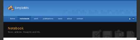
Figure 9-15. An example of navigation based on a list.
As explained in Chapter 8, it is usually best to include visual labels for all form controls. However, sometimes a visual label is not needed due to the surrounding textual description of the control and/or the content the control contains. For example, consider the search field on the Training and Development Agency for Schools website, shown in Figure 9-16.

Figure 9-16. The search field is labeled with only a Go
button.
Despite the fact the search field is labeled with only a Go
button on this website, sighted users can intuitively determine the search functionally because it has been placed in the top-right corner, a familiar position for search boxes. Users of screen readers, however, do not have the benefit of seeing the position of forms and need each form control to be explicitly labeled so the intent of the control is well understood when navigated to directly.
To aid users of screen readers, the search form should be fully specified with a label like this:
<form action="search.cgi" id="search">
  <label for="q">Search</label>
  <input id="q" type="text" />
  <input type="submit" value="Go" />
</form>
You can make the label not display by setting these styles, which set the label as tiny and remove it from the document flow:
#search label {
  position:absolute;
  height:0;
  width:0;
  overflow:hidden;
}
This technique will prevent the label from being seen by sighted users, but screen readers will speak the label even though it is not displayed. The label will be displayed to all users if CSS is turned off in the browser, which could itself be useful, as the positional context of the form would be lost with CSS unavailable.
Sometimes, the standard discs, circles, and squares available as list bullet styles
are not enough for a designer's purposes. Fortunately, CSS provides a method of
specifying images as list bullets. This is far preferable to using the <img> element to add bullet images, as it means the list can still be
marked up as such. To change the bullet style of unordered list items created
with the li element, use the list-style property like so:
li { list-style: circle url(bullet.gif) }Notice that a default bullet type, circle, is specified. In situations where the bullet image does not load,
this default will be used instead.
In some cases, you will need to leave cells in data tables empty. By default, empty data cells do not receive any styling (such as borders). The empty-cells property allows users to leave table cells empty and still display cell borders on the screen or on paper:
table { empty-cells: show }A data cell that is meant to be empty should not be filled with whitespace or a nonbreaking space to achieve a visual effect.
I mentioned the CSS Zen Garden at the beginning of this chapter as a website that demonstrates that completely different designs and style sheets can be created for the same HTML document. The implication is that a document doesn't need to have a single style sheet. In fact, you can give web pages a default style and also provide any number of alternative choices for the reader.
You specify alternative style sheets within the HTML by adding alternate to the rel attribute of the <link> element, for example:
<link rel="stylesheet" href="default.css" type="text/css" />
<link rel="alternate stylesheet" href="green.css" type="text/css" title="Green version" />
This code links to the default.css style sheet in the normal way. The second <link> element includes alternate in the rel attribute and points to the green.css style sheet. When the document is first loaded, the default.css style sheet is used to display the page, and green.css is ignored. However, the reader could then choose the green.css alternate style sheet instead, and default.css would subsequently be ignored.
The title attribute on the alternative style sheet is required,
as groups of links with the same title are automatically combined into one style sheet. To include extra
style sheets, simply
add more <link> elements
in the header, with the right rel and title attributes.
How the reader can select the alternatives depends on the browser. Not all browsers currently offer a menu item for it, but in Firefox, for example, you can find all the styles by selecting View > Page Style, as shown in Figure 9-17.
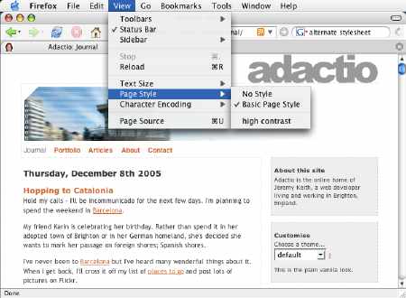
Figure 9-17. The adactio.com website has a Basic Page Style style sheet and an alternative high contrast style sheet, which you can switch to using the View > Page Style option in Firefox.
You can also use JavaScript or server-side scripting to create a style-switcher widget that sits within the web page. This is discussed by Paul Sowden at www.alistapart.com/articles/alternate/. Dustin Diaz has developed an Ajax style sheet switcher, which combines JavaScript and server-side scripting to create the widget; see www.dustindiaz.com/udasss/ for details.
A particular sort of alternative style sheet was suggested by Joe Clark in his article "Big, Stark & Chunky." Clark notes that with the advent of CSS, more could be done to address the needs of low-vision users. Low-vision users have particular design requirements (most obviously, large fonts), and so an alternative style sheet specifically for them would seem a perfect solution. A low-vision design should do the following:
A fine example of a low-vision style sheet can be found at Doug Bowman's Stopdesign, as shown in Figures 9-18 and 9-19.
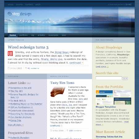
Figure 9-18. The Stopdesign homepage with default styling.
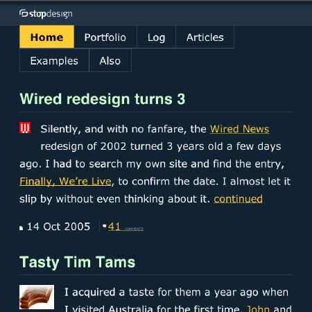
Figure 9-19. The Stopdesign homepage with its low-vision style sheet applied.
As a further mechanism of identifying an
alternative zoom style sheet as such, you can add the rev attribute to the <link> element, as follows:
<link rel="alternate stylesheet" href="zoom.css"
media="screen"type="text/css" title="high contrast zoom" rev="zoom" />
Indeed, there may come a time when a general consensus is reached that a professionally designed, standards-compliant, accessible site isn't complete without a zoom layout alternative style sheet.
Style sheets can be specified for different media (such as screens, Braille readers, or print), and alternative style sheets can be created to help specific groups of people to use a website in graphical browsers.
All the CSS I have discussed so far has involved styling web pages for visual display on screens. However, CSS also provides properties for media other than screens.
CSS2's aural cascading style sheets provide information to nonsighted users and voice-browser
users, much in the same way fonts provide visual information. These include
properties such as volume, azimuth, pause, cue, speech-rate, and voice-family. However, these properties were never implemented by any screen
reader or any other software, so in CSS 2.1, aural style sheets moved to an
appendix.
The hope for aural style sheets now is the CSS3 speech module. The World Wide Web Consortium (W3C) has created a voice browser working group to study and formulate this recommendation, but for the time being, auditory CSS remains largely theoretical. At the time of writing, the only implementation of aural style sheets is Fire Vox, a Firefox plug-in developed by Charles L. Chen. Fire Vox is free and open source.
CSS 2.1 has a number of properties specifically for the printed page. Support for these properties is fairly patchy across browsers;
however, the page-break-before and page-break-after properties are well supported. For example, this rule forces each h1 to start on a new page:
h1 {page-break-before:always}The A List Apart article "Printing a Book with CSS: Boom!" covers some of the advanced paged media properties of CSS2 and CSS3 in more detail.
Entirely separate style sheets can be specified for different media. For example, you could
create one style sheet for use on screen and another for use in print. You
could link a document to those style sheets through the media
attribute of the <link> element or within the @import rule:
<link rel="stylesheet" type="text/css" media="screen" href="screen.css" />
<link rel="stylesheet" type="text/css" media="print" href="print.css" />
@import url("screen.css") screen;
@import url("print.css") print;
In these cases, the screen style sheet would be completely ignored when printing, and likewise the print style sheet would be ignored when displaying the web page on screen.
The @media rule allows authors to embed styles for different media within one style sheet, as in this
example:
@media print {
  body { font-size: 10pt }
}

@media screen {
  body { font-size: 13px }
}

@media screen, print {
  body { line-height: 1.2 }
}
The following are the recognized media types:
all: Suitable for all devices. braille: Intended for Braille tactile feedback devices. embossed: Intended for paged Braille printers. handheld: Intended for handheld devices (typically small screen, limited
bandwidth). print: Intended for paged material and for documents viewed on screen in
print preview mode.projection: Intended for projected presentations, for example projectors. screen: Intended primarily for color computer screens. speech: Intended for speech synthesizers.tty: Intended for media using a fixed-pitch character grid (such as
teletypes, terminals, or portable devices with limited display capabilities).
Authors should not use pixel units with the tty media type. tv: Intended for television-type devices (low-resolution, color,
limited-scrollability screens, sound available).Style sheets can become as large and complicated as HTML documents. I therefore recommend CSS validation as a part of your development and testing routine. The W3C offers a free online testing service, which will test an online style sheet, let you upload one for testing, or test some directly inputted style rules.
Chris Pederick's Web Developer Extension toolbar is a free extension for Firefox and should really be in every web developer's toolbox. Microsoft has recently developed a similar toolbar for Internet Explorer. Figure 9-20 shows the CSS components of the Web Developer Extension toolbar.
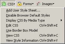
Figure 9-20. Web Developer Extension toolbar for Firefox.
The Web Developer Extension toolbar provides a raft of features than can help you test your style sheets and accessibility in general, including one-click validation and more important, the ability to disable style sheets altogether. By reverting to the default browser styles, you can verify that your website will be understandable without style sheets.
If you have moved all the presentational information to your style sheets and ordered your content logically, marking it up correctly with headings, lists, tables, and so on, this will be evident when style sheets are turned off. And if you do achieve that, you will have successfully separated content and structure from presentation, which is the main goal of using style sheets.
I hope to have demonstrated in this chapter that CSS can contribute greatly to accessibility. However, it is no panacea. CSS is open to abuse and misuse, as with any other web technology. I have already discussed abuse of image replacement techniques, but equally fundamental is the importance of maintaining semantics within your document.
With CSS, it is perfectly possible to
style all your headings by marking up your web page with <p
class= "header">, but that would
render your headings meaningless when CSS is unavailable. Remember to start off
with the correct HTML for the job and add style afterwards. It is also helpful
to avoid presentational class names such as class="bigred". This won't affect the accessibility of your web pages, but it will
hinder maintenance of your style sheets, especially when the time comes for
that text to be small and blue.
CSS is admittedly difficult to become expert in, although in fairness, a lot of the steep learning curve is due to browser inconsistencies and bugs. Many CSS beginners end up littering their web pages with superfluous divs and classes. However, if they use meaningful HTML, accessibility will still be improved through their use of CSS. But it is well worth learning the intricacies of CSS, such as advanced selectors and properties, and the power of CSS will become ever more evident.