The subject of accessibility on the Web can be divided into three main categories: accessible web content, accessible navigation, and accessible interaction. This chapter addresses the first of these: creating accessible content, including the text, images, and audio files that might be available on a web page. Accessible navigation is covered in Chapter 7, and accessible interaction is the subject of Chapter 8. In addition to these basic treatments of accessibility for the Web, see also the coverage of advanced topics, especially Cascading Style Sheets (CSS) in Chapter 9 and JavaScript in Chapter 10.
Content is accessible only if it can be "viewed" or accessed by people with disabilities. Besides getting the information from the page, people with disabilities must be able to use all the functions available to non-disabled users: links, buttons, form controls, and so on. Accessible content must be compatible with assistive technologies, particularly screen readers. There must be alternatives to pure visual content for people who can't see and alternatives to pure auditory content for people who can't hear.
To explain issues and solutions for accessibility, I will refer to four assistive technologies discussed in Chapter 5: one talking browser and three screen readers. The screen readers are Hal Version 6.5; JAWS for Windows Version 7.0, by Freedom Scientific; and Window-Eyes Version 5.5, by GW Micro. The talking browser is IBM Home Page Reader Version 3.04. All are intended to be used by people with very limited or no useful vision. As explained in Chapter 5, demonstration versions of these products are available from their respective websites.
The two important sets of guidelines for accessible web development are the Web Content Accessibility Guidelines (WCAG) and the Section 508 Standards. In order to share in the wisdom of the corresponding community of experts and to give context to the discussion, each of the topics in this chapter will include a review of what the guidelines have to say on the subject. Here, I will provide an overview of these guidelines.
WCAG 1.0, from the Web Accessibility Initiative (WAI) of the World Wide Web Consortium (W3C) became an official Recommendation of the W3C on May 5, 1999. The WCAG consists of 14 guidelines, or principles of accessible design. Each guideline includes a set of checkpoints that explain how the guideline applies to web development. The checkpoints are prioritized according to the following criteria:
[Priority 1] A web content developer must satisfy this checkpoint. Otherwise, one or more groups will find it impossible to access information in the document. Satisfying this checkpoint is a basic requirement for some groups to be able to use web documents.
[Priority 2] A web content developer should satisfy this checkpoint. Otherwise, one or more groups will find it difficult to access information in the document. Satisfying this checkpoint will remove significant barriers to accessing web documents.
[Priority 3] A web content developer may address this checkpoint. Otherwise, one or more groups will find it somewhat difficult to access information in the document. Satisfying this checkpoint will improve access to web documents.
There are 65 checkpoints in all; 16 of them are Priority 1, 30 are Priority 2, and 19 are Priority 3.
The 1999 WCAG is being revised by the WAI at the time of this writing. The WCAG revision process has taken about five years and entered "Last Call" on April 27, 2006. Last Call comments were allowed through late June. After processing Last Call comments, and assuming none are showstoppers, the WCAG Working Group will solicit and then verify WCAG 2.0 compliant websites. This testing phase will last about four months.
There are two dramatic differences between the first edition of these guidelines, WCAG 1.0, and the second edition, WCAG 2.0. Like WCAG 1.0, the second edition is organized around guidelines. WCAG 2.0 includes 13 guidelines, and each contains a list of items similar to the checkpoints of WCAG 1.0 that are called success criteria. These are testable statements of what needs to be done to satisfy each guideline. These success criteria are technology-independent and thus very general. The generality is the first dramatic difference between WCAG 2.0 and WCAG 1.0 and it leads to wording like this:
SC 2.4.4 Each link is programmatically associated with text from which its purpose can be determined.
Instead of this:
13.1 Clearly identify the target of each link. [Priority 2]
With more general constructs, the applicability is also generalized. Success Criterion 2.4.4 (as of Last Call) about link text also applies to server-side image maps requiring text links for each image map hotspot.
After you have become accustomed to the style and the vocabulary of the WCAG 2.0 document, the technology-neutral approach begins to make sense. The second major difference between WCAG 1.0 and WCAG 2.0 is that the success criteria under each guideline are not prioritized by their importance or priority, as they were in WCAG 1.0. Instead, they are ranked by the extent to which the web design and development process must be modified in order to meet the success criteria. The ranking is by levels, as follows (as defined at the time of this writing):
Whereas Level A conformance with WCAG 1.0 required complying with all Priority 1 checkpoints, Level A conformance with WCAG 2.0 requires compliance with all Level 1 success criteria.
Read more about this very important set of guidelines in Chapter 14.
The U.S. Access Board has issued access standards for federal electronic and information technology as required under Section 508 of the Rehabilitation Act: The Electronic and Information Technology Accessibility Standards, 36 CFR Part 1194, Web-based Intranet and Internet Information and Applications (1194.22). The Access Board has also published an online guide for all the standards. This guide site is the easiest route to view the 16 provisions of the Section 508 Standards for the Web.
The force of the Section 508 Standards is that electronic and information technology purchased by the U.S. federal government must comply with these provisions. Because of that force of law, these provisions are seen as playing an important role in defining accessibility, especially in the U.S. There are additional applications of the Section 508 Standards. Several states, including my home state of Texas, use the Section 508 Standards as at least a reference for state accessibility requirements.
Many of the Section 508 provisions correspond to Priority 1 WCAG checkpoints with minor changes for regulatory wording. Some of the Priority 1 checkpoints were deemed by the Access Board to be too restrictive on web development or too difficult to judge for compliance. In addition, the Section 508 Standards add provisions that combine WCAG 1.0 checkpoints of lower priorities, like the Section 508 provision for accessible forms.
The Association of Assistive Technology Act Projects (ATAP) sponsored a detailed side-by-side comparison of the Section 508 provisions and the Priority 1 WCAG 1.0 checkpoints. In the same spirit, I have compiled a mapping from the Section 508 Standards to the WCAG 2.0 success criteria. This chapter will address the individual WCAG guidelines and Section 508 web accessibility provisions, and show how each one can be met.
The one accessibility issue that is probably more important than all others is providing text information for web content that is nontextual. Nontext items include images, image maps, image buttons, audio files, and multimedia files that provide both audio and video.
The reason text is so important is that people with sensory disabilities have ways of accessing text even if they are unable to access the nontext content. If there is a textual equivalent for an image, users who are blind will be able to listen to that text with their screen reader or talking browser. Most images on web pages are simple, and so their text equivalents are simple, too. Even when the images carry more information—as with charts or graphs—there are techniques for conveying that information textually.
A person with impaired hearing may find it difficult or impossible to get information from an audio file. The text equivalent of an audio file is a word-for-word transcript. The transcript can be read by itself or viewed while listening to the audio. In this way, the person who is hearing impaired can get the equivalent information. (See the "Using Text Equivalents for Audio" section later in this chapter.)
It would be convenient if there were a mechanism for creating some sort of word-forword transcript of an image, but, of course, there is no such thing. Therefore, the process of providing adequate and useful alternative text for images—text that does not overburden the user—requires judgment and style.
One measure of the perceived importance of the text equivalents can be gleaned from the fact that the requirement for text equivalents is the first item in most guideline lists.
The first checkpoint in the WAI WCAG deals with providing text equivalents for nontext elements.
1.1 Provide a text equivalent for every non-text element (for example, via "
alt", "longdesc", or in element content). This includes: images, graphical representations of text (including symbols), image map regions, animations (for example, animated GIFs), applets and programmatic objects, ascii art, frames, scripts, images used as list bullets, spacers, graphical buttons, sounds (played with or without user interaction), stand-alone audio files, audio tracks of video, and video.
This checkpoint from the Guidelines Working Group of the WAI lists more types of nontext elements than we will be considering in this chapter. Applets, programming objects, and scripts can often be very textual. The issues with these kinds of content are much more serious than suggested by including them among the candidates for alternative text. Applets and programmatic objects, frames, scripts, and multimedia will be covered elsewhere in this book.
There are also duplications in the WCAG list of nontext elements. Images, graphical representations of text, animations, images used as list bullets, and spacers are all instances of uses of the img element. The classification of nontext elements I'll use in this chapter is discussed in the upcoming "Classification of Images" section.
The first provision of the Section 508 Standards for web content accessibility is very similar to the WCAG, but without the "This includes" remarks.
§1194.22(a) A text equivalent for every non-text element shall be provided (e.g., via "
alt", "longdesc", or in element content).
The guide for this provision (www.access-board.gov/sec508/guide/1194.22.htm#(a)) includes mention of most of the examples included in WCAG Checkpoint 1.1. The Access Board guide also mentions "check boxes" in the discussion of nontext elements, which, I think, is an error.
The WCAG 2.0 success criteria for text equivalents (version as of Last Call) help us understand how to write alt-text. Here is the main guideline and corresponding success criterion (SC):
Guideline 1.1 Provide text alternatives for all non-text content.
SC 1.1.1 For all non-text content, one of the following is true:
- If non-text content presents information or responds to user input, text alternatives serve the same purpose and present the same information as the non-text content. If text alternatives cannot serve the same purpose, then text alternatives at least identify the purpose of the non-text content.
- If non-text content is multimedia; live audio-only or live video-only content; a test or exercise that must use a particular sense; or is primarily intended to create a specific sensory experience; then text alternatives at least identify the non-text content with a descriptive text label. (For multimedia, see also, Guideline 1.2 Provide synchronized alternatives for multimedia.)
- If the purpose of non-text content is to confirm that content is being operated by a person rather than a computer, different forms are provided to accommodate multiple disabilities.
- If non-text content is pure decoration, or used only for visual formatting, or if it is not presented to users, it is implemented such that it can be ignored by assistive technology.
Note that the success criteria are numbered with the guideline and an index. So, SC 1.1.1 is the first success criterion for Guideline 1.1. It is refreshing that these success criteria do a very good job in elaborating on and explaining how Section 508 §1194.22(a) and WCAG 1.0 Checkpoint 1.1 should be handled. SC 1.1.1 covers information-bearing images, for which the alt-text should convey the same information as the image. Here is a sample from www.borders.com.
But image buttons, image links, and image map hotspots are also covered by SC 1.1.1. If the image has text like About us or Go, then the alt-text should be the same. If the image is a question mark that opens a help screen, then the alt-text should be "help" (the purpose of the image link). WCAG 2.0 recognizes that there will be places where it does not make sense to try to provide a text equivalent, and SC 1.1.1 says to identify the purpose of that nontext content. The last clause of SC 1.1.1 covers formatting or spacer images, where alt="" is appropriate for XHTML.
Most of the pictures we see on web pages are images, including animated GIFs. There are also images we do not see, so-called spacer images, which may be used for formatting purposes when tables are used for layout.
Text equivalents for images are provided through the alt attribute, which is a required attribute on the <img> tag. For example, consider the following image link:
Here is the code for this link:
<a href="...><img src= "go.gif" width="21" height="21" alt= "go" /></a>Every img element must have alternative text specified in the alt attribute. That text is referred to as alt-text. As specified in SC1.1.1, alt-text should convey the information in the image or the purpose (function) of the image.
Let's look at the different types of images.
An image link is an image inside an anchor tag, <a>, like the following simple example of a logo at the top of a commercial page (www.corda.com).

Here is the code for this image link:
<a href="http://www.corda.com/" >
  <img src="images/logobutton2.gif" alt="Home" ... />
</a>
In an earlier version of the page, the Corda logo had alt="Corda Logo", which I accepted without comment, but that alt-text is not really correct. The alt-text should specify the function of the link, and "Corda logo" is not the function of the link. It could be alt="Home page" or possibly alt="Corda home page". But "page" is redundant (we don't say "contact us page"), as is "Corda", because what other homepage would it be? And we just heard "Corda" from the page title. The bottom line is that alt="Home" is the correct choice for the alt-text.
A client-side image map is an image (img element) with the usemap attribute whose value is the name of a map element. Here is an example of a client-side image map with four hotspots:
The following is the code for this example:
<img src="banner.gif" width="500" alt="navigation banner"
  usemap="#banner" />
<map name="banner" id="banner">
  <area href="home.htm" alt="homepage"
    shape="rect" coords="0,0 110,24" />
  <area href="services.htm" alt="services"
    shape="rect" coords="111,0 215,24" />
  <area href="comntact.htm" alt="contact us"
    shape="rect" coords="216,0 326,24" />
  <area href="search.htm" alt="search"
    shape="rect" coords="327,0 435,24" />
</map>An image button is an input element with type="image". The following shows a typical image button.
The source for the image is specified with the src attribute of the input element:
<input type="image" src= "llogon.gif" alt="log on" />Some images are primarily for visual appeal, serving as decoration, or sometimes they carry absolutely no information, as is the case with spacer images used for formatting. For this type of image, alt="" is appropriate:
<img src="images/1-pix.gif" width="1" height="1" alt="" />Some images carry a lot of information—more than can reasonably be placed in alt-text— and they require special accommodation. Here is an example:
The following is the code used for the sample chart image:
<img src="images/bargraph.gif" width="400" height="250"
  alt="bar graph of results for three groups"
longdesc="bargraph.htm" />Images that play some active role in the navigation of the site must have meaningful and simple alt-text. Without that text, users with disabilities will not be able to navigate or otherwise interact with your site. Since a user who is blind will be listening to the links, it is very important to make those alternative text strings simple and short while still clear.
Typical of this kind of image are the ones that look like buttons for navigation. Here is an example:
This image typifies groups of images that look like the horizontal tabs on file folders. Here is what the code for this image should look like:
<img src="video-tab.gif" width="39" ... alt="Electronics" />I say "should" because this simple image actually does not have any alternative text at all on the site where it was found. Since there is no alt-text on the image on the subject site, a screen reader must try to hunt for some information about the image elsewhere in order to try to convey the target of the link.
When there is no alt-text, different assistive technologies look in different places: sometimes the href attribute of the anchor tag (<a>), and sometimes the src or the name attribute.
Here is the href attribute (in elided form) for the link in this case:
href="exec/obidos/tg/browse/-/172282/ref=tab_gw_e_4/104-9411283-476802"Because values of href attributes are often very long and complicated (as in this case), with many initial segments that are redundant and do not carry information, IBM Home Page Reader tries to pick a part of the href that is shorter and will hopefully carry some information to the user. Here is the result in this case:
ref equal tab underscore g w underscore e underscore 4 divided by 104 minus 9411283 minus 476802"
I have spelled out the way Home Page Reader reads this href to underscore how ugly it is. The numbers are also spoken as numbers: "nine million, four hundred and eleven thousand, two hundred and eighty three.
" This is not only meaningless, it is painful. The visually impaired Home Page Reader user will not be able to participate in this navigation.
Hal users are better off because they only have to listen to the numbers!
104 minus 9411283 minus 476802 not visited link press insert to click"
Things are different for the Window-Eyes user, but they are not better. They get to hear the whole href, without punctuation and reading only digits instead of spelled-out numbers.
link exec obidos tg browse 172282 ref = tab g w e 4 104 9411283 476802"
JAWS for Windows takes a different approach, which, in this case, is more helpful. It tries to read a part of the src attribute of the image. Here is the src attribute (slightly elided):
src="http://.../G/01/nav/personalized/tabs/electronics-off-sliced.gif"The part that JAWS reads contains valuable information but it is cluttered with meaningless stuff; however, the keyword, electronics, is present!
Link graphic tabs slash electronics dash off dash sliced"
The fact that there is anything good about what JAWS speaks is the result of fortune rather than foresight, and it is still far from ideal! Accessibility should never rely on the use of comprehensible filenames in your web page (not that they are a bad idea, but clear and simple alt-text is the real answer). Because this page does not have alt-text where it needs it, the link becomes completely incomprehensible for the Home Page Reader, Hal, and Window-Eyes users, and even JAWS users are left guessing.
After pulling this terribly inaccessible example into pieces, let's look at a simple example of a nicely accessible image link. This is a common button-like navigation link (on www.evite.com), which is basically a picture of text tailored and refined by graphic designers and then sealed in pixels.
All of the images of text raise a serious problem. If an Internet Explorer user wants to adjust text size for more comfortable viewing (View > Text size > Largest), it will have no effect on these images. Opera's text enlargement (View > Zoom > 200%) does work with images. When you use images of text, be sure to use large fonts and adequate contrast. By the way, the sample image link here fails all the measures of contrast; see the "Color Contrast" section later in this chapter.
This image link is correctly coded with the alt-text, "Planning Ideas", which matches the text in the image and the function of the image link.
<a href="/app/home/viewPlanningHome.do">
  <img id="plan" src="/images/nav/orng.gif" ... alt="Planning Ideas" />
</a>
Each assistive technology handles this link in pretty much the same way—in the way that the web author intended and the way that the user can understand. Here are the results:
Planning Ideas, not visited link, press insert to click"
[Planning Ideas]"
Link Planning Ideas"
Link Graphic Planning Ideas"
The fact that an item is a link is indicated with Home Page Reader speaking in a female voice (with default settings). In the text view, Home Page Reader displays alt-text in square brackets. Hal, Window-Eyes, and JAWS all speak some variation of the word "link" together with the alt-text, Planning Ideas.
This is why alt-text for images is so very important: because the necessary information is quickly and clearly conveyed to the user. It is also important for website owners, because without it, visitors who use screen readers or talking browsers will not be able to use or even understand their site.
Often, context provides information that is not available to a screen reader user listening to links. (This topic is also addressed in the discussion of link text in Chapter 7 and the discussion of forms in Chapter 8.)
Consider the following part of a checkout procedure at Amazon.com.

The natural alt-text for the image link is alt="find out how" (the fact that Amazon has no alt-text on this image is not
the point). If that were the case, when blind users listened to links, all they would hear is "Find out how.
" How to do
what? This is a case where the alt-text on the image can easily and conveniently solve this context problem: alt="Find
out how to save $30 with the Amazon Visa Card".
The importance of text equivalents for image map hotspots is just as great as that for image links. The difference is the form that these client-side image maps take.
Let's begin with an accessible client-side image map instead of an inaccessible one—it's more fun that way. The following is an image from the University of Arizona Web Resources Page (as it was in 2001).

This image is specified in the HTML code as an img element with the usemap attribute, as follows:
<img src="..." alt="Web Resources at The University of Arizona" ...
  usemap="#banner" />
Notice that the image does have an alt attribute, but the image itself is not the important accessibility issue. In the University of Arizona website case, the image has alt-text that corresponds to the text on the image, which is good, in principle. But that text is repeated as image map hotspots.
I tend towards the idea of using alt="" on the image itself, since it is not active and conveys no information beyond the hotspots.
Then the
<map>
tag with name="banner" specifies areas of the image that will be hotspots. In this example, all the areas are simple rectangles (shape="rect"):
<map name="banner" id="banner">
  <area shape="rect" alt="UA Web Resources Homepage"
    coords="10,05 90,75" href="..." />
 <area shape="rect" alt="UA Homepage"
    coords="95,05 360,35" href="..." />
 <area shape="rect" alt="Search"
    coords="260,52 305,70" href="..." />
 <area shape="rect" alt="Comments & questions"
   coords="311,52 37,70" href="..." />
 <area shape="rect" alt="Web Resources Homepage"
   coords="385,52 502,70" href="..." />
 <area shape="rect" alt="UA Homepage"
   coords="515,52 572,70" href="..." />
</map>
A map element can be placed anywhere on the page. Its position is irrelevant to the position of the image, but the hotspot links will appear in the reading order where the area elements appear.
The six hotspot rectangles specified by the area elements in the map surround the text headings in the image. Each rectangle is given by x/y pixel coordinates, where (0,0) is the top left and, in this case, (588, 81) is the bottom right.
If you had visited the University of Arizona site (the image map is no longer there) or if you visit any site with image maps using a traditional browser like Internet Explorer or Netscape, you may be able to see the href of the different areas in the browser status window as you move the mouse around the image. The tooltip also changes to the alt-text of the area element. In parts of the image that are not designated as hotspots, the status window goes blank and the tooltip changes to the alt-text of the image. (As discussed in Chapter 7, much more complicated client-side maps are possible, such as a map of the U.S.)
Assistive technology can cope with a correctly implemented image map just as well as it does with normal links (text or image). Home Page Reader does an even better job because only the number of links in the map is announced initially, so as not to burden the listener when the screen reader is just reading the page. If you want to hear the actual hotspots, you just stop and step through them with the arrow keys. This is the way they sound:
(Start of map with 6 items.)"
[UA Web Resources Homepage]"
[UA Homepage]"
[Search]"
[Comments & Questions]"
[Web Resources Homepage]"
[UA Homepage]"
(End of Map.)"
For sighted people using Home Page Reader as an analytical tool to check their websites for accessibility, it is convenient to see all the text, including the links within image maps. You can do this by moving the focus to the text area and pressing Ctrl+A to highlight the entire text view. Home Page Reader will then load all of the text and highlight it. If you want to make a copy, you can press Ctrl+C to copy the entire text view to the clipboard, and then press Ctrl+V to paste it into another application. That is what I did here in order to display the links corresponding to the areas of the sample image map shown here.
Using Home Page Reader, the value of the alt attribute is always displayed within square brackets, [ ]
. So-called metatext, which is text that is generated by Home Page Reader and does not appear on the page, is enclosed in parentheses, as in "(End of Map.)
".
Window-Eyes, Hal, and JAWS all treat image map links with alt-text just like any other kind of link. This makes sense because, in function, image map links are no different from any other kind of link, and so they should not be treated differently when spoken.
The choice of specific alternative text is a matter of style and judgment. For the six areas of the client-side image map shown in the previous section, I would use alt-text that is the same as that on the image, except where it makes sense to make it shorter. Here is a comparison of the alt-text that the developers at the University of Arizona used and what I would recommend instead:
| Text in Image | Actual Alt-Text |
Suggested Alt-Text |
|---|---|---|
| Web Resources | UA Web Resources Homepage | Web resources |
| The University of Arizona | UA Homepage | U of A |
| Search | Search | Search |
| Comments | Comments & questions | Comments |
| Web Resources Home | Web Resources Home | Web Resources |
| UA Home | UA Home | U of A |
The reason I prefer shorter alt-text is that people using a screen reader must sit and listen to all this. When sighted people look at the text on an image, they have the ability to filter out the "visual noise" and focus on the main concept. It is true that this is still possible when you have to listen to the content, but it is more difficult.
I tend to avoid "homepage" when identifying links. If the link says "The University or Arizona" or "IBM," I know it is going to the respective homepage, so "homepage" is redundant.
Bearing in mind the importance of conciseness when considering alt-text, it is not surprising that my preference is "U of A" over "University of Arizona." But why, you may ask, "U of A" over "UA"? That comes from my experience with screen readers occasionally pronouncing abbreviations like UA (or IBM for that matter) instead of spelling them out. If "UA" is pronounced, it truly fails in conveying the desired information. In this case, it turns out that all of the assistive technologies discussed here spelled out "UA" rather than pronouncing it, probably because it is capitalized. However, since there are other voiceassistive technologies available, it is best to adopt a safe approach.
Sometimes web designers prefer to see longer mouse-over tooltip text than the alt-text so that the mouse user gets more information than that on the image. To do this, you keep the alt-text the same as the image text and put the longer text in the title attribute of the anchor element. With Internet Explorer, this trick works for links, but it does not work for the area elements. Only Internet Explorer displays the alt-text as a tooltip. Firefox and Opera display the title attribute; Opera adds the prefix Title:
.
As an example of an inaccessible image map, consider this Yahoo! banner image from late 2001.

You may be interested in how to find such older pages. Try the Wayback Machine, where you can get archived copies of most sites. Unfortunately, the site seems to have stopped saving pages in mid 2005, but there is still an incredible amount of history available—approximately 40 billion pages!
This banner image looks like it contains text—Finance, Messenger, Check Email, What's New, Personalize, and Help—but it doesn't. The text under each button-looking image is made to look like link text, but it is really part of the image. For mouse users, the text works like a link because the banner is an image map. Had the Yahoo! developers decided to add alt-text to the area elements as follows, the image map would work just like a list of text links for a blind user as well (in fact, that is exactly what they did in mid 2002).
<map name=m>
  <area coords="0,0,52,52" href=r/a1 alt="Finance" />
  <area coords="53,0,121,52" href=r/p1 alt="Messenger" />
  <area coords="122,0,191,52" href=r/m1 alt="Check Email" />
  <area coords="441,0,510,52" href=r/wn alt="What's New" />
  <area coords="511,0,579,52" href=r/i1 alt="Personalize" />
  <area coords="580,0,637,52" href=r/hw alt="Help" />
</map>
The Yahoo! page was designed with efficiency in mind. The web designers tried to minimize the download time by reducing the number of characters on the page; however, the additional text that makes the navigation banner solidly accessible amounts to only 186 bytes—less than 0.6 percent of the size of the page—and increases the download time by only about 0.05 seconds, even on a slow modem.
Without the alt-text, all the assistive technologies were stuck with the meaningless href information like r/11
, r/p1
, and so on. To make matters worse in this case, Hal adds the full URL http://www.yahoo.com in front of the href. But that has all passed; Yahoo! did it right eventually, and currently the site doesn't even use an image map for the banner.
Image buttons are input elements with type="image". The idea is to create something more interesting and eye-catching than the standard push buttons. Here are examples of a search button from IBM and a simple text-based submit button.
The code for image button is as follows:
<input type="image" src="isearch.gif" ... alt="Search" />Obviously, the key again is alt="Search". When screen readers encounter an image button, they treat it much like a push button (command button) and use the alt-text instead of the value. Here is the code for the submit button.
<input type="submit" name="Search" value="Search" />Hal, JAWS, and Window-Eyes don't distinguish between the two buttons (which is appropriate). Home Page Reader says "search image button
" and "search submit button
," respectively.
It is interesting to notice the difference in the ordering of the information presented. Window-Eyes says "button search
," while Hal, JAWS, and Home Page Reader all, in effect, say "search button.
" A strategy for communicating with speech synthesis is to rank the importance of the specific information and speak the most important first. To me, in this case, the most important information is the label, Search. The fact that it is a button is secondary.
As one tabs through active elements with a talking browser or a screen reader, the new item cancels the speaking of the previous one. As soon as you hear enough information to know you are not interested, you can press Tab again, and the speech of that item is stopped and the next one started. In this case, if you hear "button
" first, you have to wait to hear "search
" (Window-Eyes) before you can move along. On the other hand, if you hear "search
" first and are not interested in searching, you can move on right away. This observation can be applied to multiple-word alt-text, encouraging the placement of the "most important" words first.
Here is another image button, this time without alternative text.
Here is the code for the button with some minor changes:
<input type="image" value="Go" src=" ... images/go-button.gif" />In the case of Window-Eyes and Home Page Reader, the careful listener might be able to guess the purpose of the image button because the source filename is go-button.gif. Hal uses the entire source URL, including the main domain, which makes picking out the name difficult. Surprisingly, JAWS finds the value attribute and speaks "Go button.
" The value attribute provides the text equivalent for submit buttons, so it is natural that JAWS would look there.
Using alt="Go" would make life so much easer with all the screen readers. The simple change of adding alt="Go" makes such a total difference—the difference between gibberish and smooth sailing.
Because many, if not most, active images on the Web today do not have a text equivalent, users of screen readers must try to find other ways to interpret those images, and these rarely produce comprehensible results. It is a discouraging and frustrating experience, and it certainly does not make sense for business.
A few screen reader users do find ingenious ways of coping with sites that lack the most basic accessibility considerations. However, they make up only a small percentage of blind users; most struggle through like the rest of us. If web designers make their sites accessible, all those potential customers can have an experience that is comfortable and supportive, rather than frustrating and annoying.
In the preceding sections, I have raised issues of judgment and style on the nature of the alternative text used for active images. Some of these are minor issues; for example, whether to use two or three words. However, everyone agrees that for active images, you always use words. When it comes to images used for decoration, there are some more substantial differences of opinion.
So, let's begin with one area where there is no disagreement: images used purely for formatting.
Spacer images are the small "clear GIFs," with filenames like clear.gif, c.gif, or spacer.gif. They are typically placed in otherwise empty table cells so that those cells do not appear empty to the browser. They ensure consistent formatting of layout tables in different browsers.
These spacer images should always have null alt-text. This means using alt="" (two quotes and no space). Although everyone agrees that formatting images should be treated this way, some still continue to write alt=" " (quote, space, quote).
What is wrong with quote, space, quote? First, to a mathematician and logician, null alt-text means null alt-text—that is, none. Quote, space, quote is something; it is one space. Quote, quote is nothing. Second, and confirming the first point, if you use alt=" " (quote, space, quote) for your image, Internet Explorer will display the tooltip, [ ]
. If you write alt="", Internet Explorer will not display anything.
An example of good practice with handling formatting images can be found on the Department of Defense (DOD) homepage, which has 70 instances of spacer.gif in various places for formatting purposes. The code looks like this:
<img src="/home/images/spacer.gif" alt="" width="10" height="18" />Figure 6-1 shows part of the DOD home page with 25 of the formatting images highlighted in red boxes.
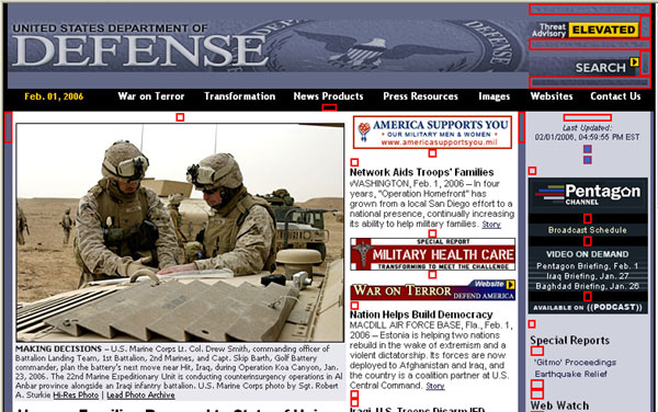
Figure 6-1. The Department of Defense homepage with formatting images (indicated with rectangles).
You can check out formatting images using the WAVE tool discussed in Chapter 5. Submit the URL to www.wave.webaim.org/. The WAVE inserts the following graphic everywhere it finds an image with null alt-text:
Other images are used only for visual effect and should also be assigned empty alt-text. Figure 6-2 shows part of an IBM page (from 2001), which has a number of these formatting images.
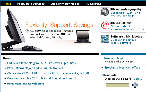
Figure 6-2. The IBM.com page with formatting images.
In Figure 6-2, the small, black right-facing arrows down the left side, in the News section, indicate list items, as they do on the right side. When special images are used instead of the bullets in bulleted lists, as you see on this page, it is the author's decision whether to use alt="" or, say, alt="bullet" or alt="item". Certainly, you do not want to lengthen the alt-text with words like alt="small right arrow" or alt="right facing arrow", because the information content of the graphic is at most "bullet" or "item," and it is just plain burdensome to have to listen to such descriptions over and over. The IBM site uses alt="" for all the graphical bullets, which is the way I would do it as well.
There are more images on the IBM page in Figure 6-2 that should (and do) have alt="", including the faint lines between items on the right (dotted_rule_197pc.gif) and the arrow graphic:  .
.
To repeat, I would use empty alt-text for these graphic arrows indicating list items because nothing is gained by hearing "Bullet ready to buy?
," "Bullet special / advertising offers
," and so on. But there is something to be gained by marking up these bulleted lists as HTML unordered lists. Those HTML lists can be styled with your favorite bullet symbol, and the issue of alt-text doesn't even come up. In this way, users of assistive technology will hear lists announced in a way that is familiar to them, and they will navigate the lists in a familiar way as well.
Another issue that the IBM site shown in Figure 6-2 demonstrates well is images that repeat textual information. Notice that near the top of the right side of Figure 6-2 are three items, each of which has an image followed by text: IBM extends sympathy, IBM e-business, and Software trials & betas. Here is what Home Page Reader speaks for these three highlights:
link: [IBM extends sympathy.]"
link: IBM extends sympathy"
link: September 11th Fund - - Find out how you can help"
link: [IBM e-business.]"
link: IBM e-business"
link: Find out about e-business infrastructure"
link: [Software trials & betas.]"
link: Software trials and betas"
link: Discover the latest in IBM software"
Notice the repetition of the link text. First, the image has alt-text (within the square brackets), IBM extends sympathy. Then there is the text, identical to the alt-text of the image, which is also a link. Next, there is the descriptive text, saying more about the link. All three links have the same target, so effectively, there are three links in a row with the same target, and two with repeated text. How did this come about? An abbreviated fragment of the code will help to explain.
<tr>
<td ...>
  <a href=X ...>
    <img src="... UnitedWay.gif" alt="IBM extends sympathy " />
  </a>
</td>
<td ...>
  <a href= "X...">IBM extends sympathy </a> <br />
  <a href= "X..."> September 11th Fund - -<br />
    Find out how you can help</a>
</td>
...
</tr>
The best thing to do in a case like this is to combine the image with the text, all within one anchor tag, and then give the image alt="". This is the only situation where an active image could have null alt-text—when there is text there anyway. Essentially the code should look like this:
<a href= "X...">
  <img src="... UnitedWay" alt="" ... /> <br />
  IBM extends sympathy
</a>
This idea works for the second two links in each group. They can and should be combined, but it won't work to combine the image with the text, because as you can see from the original code shown earlier, the image and the text are in different table cells and the anchor element is not allowed to span table cells (or contain table data tags, <td>).
There are two possible solutions to this problem. You could change the layout so that the image and the text are in the same table cell. In this way, the anchor tag can include both pieces of text and the image. Since there is some text in the anchor, using alt="" on the image is fine. Alternatively, don't include the image in the anchor, make it inactive, and simply use alt="" on the image.
One practice that is remarkably common and should always be avoided is putting alt="" on an image that is a link. Never use null alt-text on an image that is a link, unless text explaining the target of the link is contained in the same anchor.
One last category of images that may have null alt-text is the decorative image that is just "eye-candy." Figure 6-3 shows part of a Corda Technologies web page (www.corda.com) with an example of such an image.

Figure 6-3. A page with an image that does not carry information.
I think the picture of a man holding a pen is supposed to symbolize a thoughtful and careful customer. So you might use alt="thoughtful and careful customer" for that image. So then, if you listened to the page, you would hear "Customers thoughtful and careful customer home > customers customer list.
" That does not make sense, and it is longwinded besides.
For any such image, there are probably just as many accessibility experts who would want to use non-null alt-text as those who would say to use alt="". But I come down strongly on the side that such eye-candy images convey no information whatsoever, so alt="" precisely describes the information conveyed!
It is easy (at least it should be easy) to decide on alt-text for image links and image map hotspots because the information of the image is the function of the link—that is, where the link will go, like alt="home", alt="products", or alt="services". It is also easy when images convey no information; just put alt=""! But sometimes, there is more information in the image than the concise alt attribute should hold.
It is a pretty standard recommendation that alt-text should have fewer than 150 characters—a number that first appeared because JAWS cut off alt-text at 150 characters. I think alt-text of 150 characters is too long.
Images that typically require more than alt-text are graphs, PowerPoint slides as images, or charts like the pie chart shown in Figure 6-4.
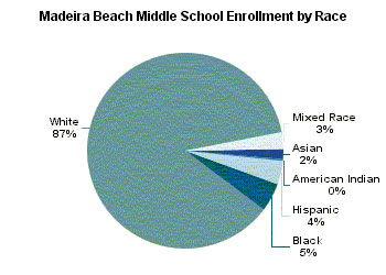
Figure 6-4. A pie chart showing middle school enrollment by race.
What is the information in the pie chart in Figure 6-4? You could write out that information as follows:
"The enrollment by race at Madeira Middle School is 87% White, 5% Black, 4% Hispanic, 3% Mixed Race, 2% Asian, and 0% American Indian."
That is 132 characters, so some might allow that as alt-text, but I wouldn't, because it is too long. The information given in a sentence could just as well be given in a data table, like this:
| Race | Percent |
|---|---|
| White | 87% |
| Black | 5% |
| Hispanic | 4% |
| Mixed Race | 3% |
| Asian | 2% |
| American Indian | 0% |
Some hold the idea that a pie chart like the one in Figure 6-4 is conveying more information than that relayed by the corresponding data table. The message in the pie chart is something like this:
"The enrollment by race at Madeira Middle School is mostly White with other races less than 13% combined."
So that's the idea about the "information in the image." But how do we convey that information in XHTML? There are at least three ways:
longdesc attribute of the <img> tag, like longdesc="longdescriptions.html#piechart1". The information presented this way will be available only to screen reader users.
In the past, before the longdesc attribute was supported, I suggested using the d link as another way to handle long descriptions. The d link, placed next to the image, opened the long description file: <a href="longdescription.htm#piechart1">d</a>. The d link idea uses inadequate link text and repetitive link text, and the longdesc attribute is now supported. So, do not use the d link!

Figure 6-5. Yahoo news photos when enlarged have long descriptions included.
After you have decided on a way to convey the information of your complex image, don't forget to include alt-text for the
image itself. Every image must have it. In the example in Figure 6-4, the alt-text might be as follows:
alt="Pie chart of middle school enrollment by race" The image in Figure 6-5 has alt="photo", which at first seems okay, but I would prefer alt="", because the information is conveyed by the text adjacent to the picture.
Here is a summary of the main considerations for text equivalents for images:
alt-text that conveys the function of the active element.alt attribute conveying the information in the image.alt=""; that is, null alt-text.alt attribute, use the long description attribute (longdesc) on the img element or in-line descriptions of the image that convey the same information the image conveys.In an earlier publication, I randomly picked 10 of PC Magazine's top 100 sites and analyzed them for missing alt-text. I listed the results of this unscientific survey as the number of images, image map hotspots, and image buttons that lacked alt-text. I thought that it would be interesting to see how these pages have changed. Table 6-1 shows the percentage of images (all types) that have alt-text for 2001 and 2006.
| Site | 2001 | 2006 |
|---|---|---|
About (www.about.com/) |
8% | 39% |
Andale (www.andale.com/) |
0% | 58% |
Bizrate (www.bizrate.com/) |
89% | 22% |
Expert City (www.expertcity.com/) |
15% | 11% |
Lonely Planet (www.lonelyplanet.com/) |
74% | 50% |
Britannica (www.britannica.com/) |
19% | 79% |
HotBot (www.hotbot.lycos.com/) |
94% | 100% |
Schwab (www.schwab.com/) |
77% | 28% |
Backflip (www.blackflip.com/) |
94% | 92% |
MyPalm (www.palm.com/ |
96% | 88% |
The unfortunate news from this (unscientific) study is that some sites improved, some completely changed (like HotBot), and others got worse, but there does not seem to be much of a trend. In 2001, the average for the 10 sites was 47 percent of their images included alt-text. In 2006, that was up to 57 percent. Remember that the alt attribute is a required attribute. Yet in 2006, only a little over half of the images on these sites had alt-text.
More and more audio is becoming part of the user experience on the Web. Most common types of streaming audio (RealPlayer, QuickTime, and Windows Media) provide access to news and events, while WAV files add sound to the user experience. If audio is decoration (sounds that the web author feels add to the experience of the site and do not carry information), then there is no need to add text equivalents for those sounds. Text equivalents are needed when audio includes spoken words—when the audio is in fact the message. To be accessible to people who are deaf or hearing-impaired, speeches or news reports need to have associated text transcripts.
As well as applying to the needs of users who are visually impaired, the Section 508 provision §1194.22(a) also applies to audio files:
§1194.22(a) A text equivalent for every non-text element shall be provided (for example, via "
alt", "longdesc", or in element content).
WCAG Checkpoint 1.1 specifically applies to audio:
1.1 Provide a text equivalent for every non-text element (for example, via "
alt", "longdesc", or in element content). This includes: ... sounds (played with or without user interaction), stand-alone audio files, audio tracks of video, and video.
WCAG 2.0 does not change the picture as far as the transcripts are concerned, relying on the requirement that text equivalents be provided for nontext content.
Compared with the subtleties of text equivalents for images and the judgment required to decide on how much text will be adequate, it is refreshing to talk about text equivalents for audio, which are defined simply as transcripts. If you have audio information on your site, provide a link to a transcript of that audio.
There are few examples of websites that include transcripts with their audio content. One site is National Public Radio (NPR). In the example in Figure 6-6, transcripts of programs on Mideast news are offered.
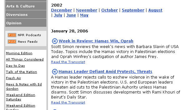
Figure 6-6. NPR offers transcripts of some of its stories.
Unfortunately, the transcripts of many of the NPR programs are only available for purchase, starting at $3.95 per broadcast (www.npr.org/transcripts/).
Color may enhance the experience of visitors coming to a website. It can be eye-catching, add emphasis, or just add to the visual pleasure of the site. However, under some conditions, the use of color will make your website inaccessible to people who are not able to distinguish colors. Another issue regarding color is that of providing sufficient contrast for people with different types of color deficits or for people who are using monochrome displays.
It is estimated that 1 in 20 visitors to a website will have some form of color vision deficiency and may find the website either difficult or impossible to use if color by itself is used to convey information. People who are color-blind (achromatopsia) will have difficulty finding the required fields if they are coded in red, as is often the case. If a library site indicates currently available books using only green text, color-blind visitors to the site will not know which books are available.
Isn't this an issue for users of the Web who are blind? It shouldn't be a problem, because screen readers can provide information about colors to their users; however, that color information is not provided by default, so screen reader users may also be left out when information is conveyed using color by itself.
It is good to use color to convey information. The key is not to use color alone.
All three of our sources of guidance have a top-level requirement that information not be conveyed by color alone. The Section 508 provisions require that color not be the sole way information is conveyed:
§1194.22(c) Web pages shall be designed so that all information conveyed with color is also available without color, for example from context or markup.
This is almost exactly the same wording as WCAG Priority 1 Checkpoint 2.1:
2.1 Ensure that all information conveyed with color is also available without color, for example from context or markup.
WCAG 2.0 addresses this color issue with the following level 1 success criterion (as of Last Call):
SC 1.3.2 Any information that is conveyed by color is also visually evident without color.
There are many ways that information, such as required fields in forms, can be conveyed with color and additional text or markup. Figure 6-7 shows a sample form where the required fields are visually highlighted with red, but prefaced with an asterisk as well.
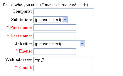
Figure 6-7. A form with required fields indicated by an asterisk
In the example in Figure 6-7, the asterisk precedes the label. This is by far the best method because this adaptation helps screen reader users, too. With the asterisk placed before the prompt, it will be the first thing these users hear, serving effectively as a notice to the user that the field is required.
In the default situation with Internet Explorer, links are blue and underlined, and visited links are magenta and underlined. This is a clear case of using color and also conveying the information in another way, in case the color is not perceived. The underlining does that. Independent of color, screen readers will know that text is a link and announce that property to blind users. But today, links are rarely presented in the default blue underline because it seems so old-fashioned. Styling often makes it difficult to detect links for those who have impaired vision or are color-blind. Designers frequently rely on color change or adding underlines with a mouse-over event handler; however, these methods do not benefit those who must use the keyboard for navigation.
Be sure your links are easy to detect. Use onFocus and onBlur event handlers in addition to onMouseOver when you are highlighting links—or better, use CSS to specify the visual behavior for the :hover and :focus pseudo classes.
In addition to the concern about using color alone to convey information, web designers need to be aware of the combinations of foreground and background colors used on their web page, especially in images. If the foreground and background are too close to the same hue, they may not provide sufficient contrast for some visitors
The reason images are especially important is that users with color deficits may choose to use their own contrast setting in the browser or their own style sheet to provide high contrast and possibly enlarged text. Such adaptations generally apply to the text on the page, not to the images.
Section 508 does not have a provision regarding contrast on web pages, but WCAG 1.0 specifies adequate contrast as a Priority 2 checkpoint, Priority 3 for text:
2.2 Ensure that foreground and background color combinations provide sufficient contrast when viewed by someone having color deficits or when viewed on a black and white screen. [Priority 2 for images, Priority 3 for text]
You can find an excellent discussion of issues of contrast for people with vision loss at the Lighthouse site. Images in the article do a good job of illustrating effective and ineffective contrast.
With WCAG 2.0 (as of Last Call), the requirement for contrast is specific and measurable, it is one of the welcome benefits of the WCAG working group. Note that there is no Level 1 requirement relating to color contrast.
1.4.1 Text or diagrams, and their background, must have a luminosity contrast ratio of at least 5:1. [Level 2]
1.4.3 Text or diagrams, and their background, must have a luminosity contrast ratio of at least 10:1. [Level 3]
The luminosity contrast ratio is defined as follows (from WCAG 2.0):
(L1 + 0.05) / (L2 + 0.05), where L1 is the luminosity of the lighter of the text or background colors, and L2 is the luminosity of the darker of the text or background colors.
Note 1: The luminosity of a color is defined as 0.2126 * ((R / FS) ^ 2.2) + 0.7152 * ((G / FS) ^ 2.2) + 0.0722 * ((B / FS) ^ 2.2).
- R, G, and B are the red, green, and blue RGB values of the color;
- FS is the maximum possible full scale RGB value for R, G, and B (255 for eight bit color channels); and
- the "^" character is the exponentiation operator.
Note 2: Luminosity values can range from 0 (black) to 1 (white), and luminosity contrast ratios can range from 1 to 21.
The WCAG 2.0 luminosity formula is a bit daunting, but there are tools to help you evaluate the contrast ratio. One of these is the Web Accessibility Toolbar, introduced in Chapter 5, which offers a contrast analyzer tool that will grab the color numbers from a page. It is really quite neat.
Figure 6-8 shows an example of the analysis of colors on Amazon.com. After clicking the eye-dropper button in the center of the Colour Contrast Analyser window, a zoom window about two inches square appears. As you position the mouse over a color (either foreground or background), its hex value appears in the main window, along with a sample of the color. You can do the same with the eye dropper in the lower-center area of the window.
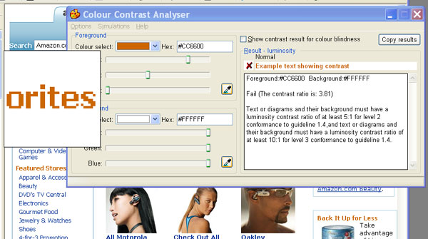
Figure 6-8. Screen shot showing use of contrast analyserto check out the luminosity contrast ratio.
This Colour Contrast Analyser tool provides a calculation of the luminosity contrast ratio on the right side of the window, along with a reminder of the Level 1 and Level 2 success criteria cutoffs. You can also set the tool so that it calculates the color brightness/difference formulas (Options > Algorithm > Colour > Brightness/Difference). By the way, the tool is available independent of the Accessibility Toolbar, also from Vision Australia.
The test illustrated in Figure 6-8 was a surprise to me. This is an example of "heading text" on Amazon.com that should be marked up as an HTML heading (see Chapter 7). The color is a kind of burnt orange. It seems to me to have enough contrast, but the luminosity contrast ratio is only 3.81, which doesn't even meet the Level 2 success criterion cutoff of 5.
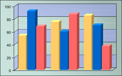
Gez Lemon has an excellent discussion of the luminosity contrast algorithm and other measures of contrast. Linked to this article are color samples that meet Level 2 and 3 success criteria, as well as color brightness and difference requirements. Figure 6-9 is a composite drawn from the table for color combinations with a white background, including the sample from Amazon.com in Figure 6-8. The web-safe color comparisons are listed with fixed background and variable foreground. The table shows a sample of each color combination and icons indicating whether the combination passes the contrast tests. It is remarkable how few combinations pass one or more of the WCAG thresholds.
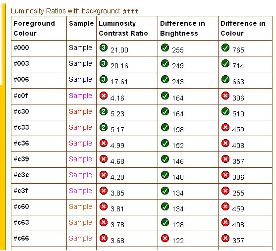
Figure 6-9. Screen shot of color samples with contrast ratios, as part of the color samples table from Juicy Studio.
HTML tables are widely used on the Web. Most of those tables are not used to display data but are used for formatting purposes instead. With regard to accessibility, tables used for data are the primary concern. But before getting to data tables, let's briefly investigate how tables are used to format web pages and the consequences for people using screen readers.
In the past, very few websites did not use tables for formatting pages. Today, that is changing. CSS offers a robust and effective alternative to using table cells to position content on the page (see Chapter 9). However, browser-dependency issues for CSS can make the conversion difficult. Yahoo!, for example, used tables for layout as late as March 2005 (the last page in the Wayback Machine). Today, Yahoo! does not use tables for basic page layout, but there are still nine layout tables scattered around the homepage.
Let's begin with a very basic table to see how it is spoken with a screen reader or other assistive technology. Figure 6-10 shows a simple table with two columns and two rows. The arrows indicate the order in which the table contents are read by a screen reader.
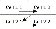
Figure 6-10. A simple two-by-two table, with arrows indicating the reading order. Reads cell 1 1 cell 1 2 cell 2 1 cell 2 2
Here is the HTML code for the table in Figure 6-10:
<table border="1">
  <tbody>
    <tr>
      <td>Cell 1 1</td>
      <td>Cell 1 2</td>
    </tr>
    <tr>
      <td>Cell 2 1</td>
      <td>Cell 2 2</td>
    </tr>
   </tbody>
 </table>
Home Page Reader and the screen readers all start with the first row, completely read each cell there, and then proceed to the second row, repeating that process, as follows.
Cell 1 1"
Cell 1 2"
Cell 2 1"
Cell 2 2"
This method of reading the contents of a table is called linearization. The way the reading (linearizing) is done is to start in the first row, first column ("Cell 1 1
"), read the entire contents of that cell, including any nested tables, and then proceed to the next column, going across the first row. When row 1 is complete, proceed to row 2, and so on, as is illustrated by the arrows in Figure 6-10.
Even if there is a lot of information in any cell, all of it is read before proceeding to the next cell. This is a very important aspect of the linearization of tables, and it is different from the way screen readers worked just a few years ago. Today, they take advantage of the HTML structure of the document. They used to read the screen, so they would, in effect, speak the first line from each cell, then the second line from each cell, and so on. Often, this made no sense whatsoever.
When the linearization process comes to a cell that includes a nested table, that table must be completely linearized before continuing on to the next cell.
Another characterization of this linear reading order is source code order. If you look at an HTML file and strip out all the tags, leaving only text (and alt-text of the images), the resulting file is the linearized version of the page. You can check that out with the code for the simple table in Figure 6-10.
Figure 6-11 shows a typical layout table and illustrates the way tables are used for laying out content on the page.
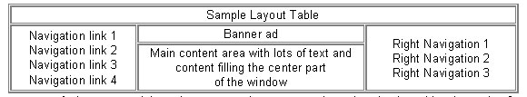
Figure 6-11. Screen shot of a prototype layout table
What is especially important here is that some of the cells "span" rows or columns. In the HTML code for this table, you can see that the very first cell has colspan="3". That means that the first cell goes across (spans) the entire table. Here is the HTML code for the table in Figure 6-11:
<table border="1">
  <tr>
    <td colspan="3">Sample Layout Table</td>
  </tr>
  <tr>
    <td rowspan="2">
      Navigation link 1<br />
      Navigation link 2<br />
      Navigation link 3<br />
      Navigation link 4
    </td>
    <td>Banner ad</td>
    <td rowspan="2" >
      Right Navigation 1<br />
      Right Navigation 2<br />
      Right Navigation 3
    </td>
  </tr>
  <tr>
    <td>Main content area with lots of text and<br />
        content filling the center part <br />
        of the window
    </td>
  </tr>
</table>
So, this is really a table with three rows and three columns, as shown in Figure 6-12.
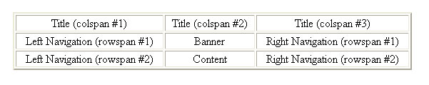
Figure 6-12. Screen shot showing how spanning cells yield the layout of the table in Figure 6-11.
The three cells across the top are merged into one with colspan="3" to give the title bar area across the top of the page. The lower two cells in the first and third columns are combined in a single cell with the attribute rowspan="2". The left navigation panel includes the bottom two cells combined into one, and similarly, the right navigation panel is formed by combining the last two cells of the last column.
The spanning of columns and rows affects the way tables are linearized or spoken. The basic rule is that everything in a cell (independent of its spanning properties) is read when the cell is first encountered.
In the layout table in Figure 6-11, the complete title panel is read first. Then moving to the second row, the entire left navigation panel is read, followed by the "Banner" and all of the right navigation. In the middle row, only the cell called "content" remains to be read, and this is read last.
The formatting illustrated here raises a serious issue for access to a site. The main message of a page may be very hard to find. If you are listening to the page, chances are you want to hear that "main content." With layout like this, it takes a long time before you get to hear the information you were seeking. We will return to this example in Chapter 7 when we talk about accessible navigation.
The WAI addresses table linearization in two Priority 2 checkpoints of WCAG 1.0. The first checkpoint cautions against the use of tables for layout, unless they linearize well:
5.3 Do not use tables for layout unless the table makes sense when linearized. Otherwise, if the table does not make sense, provide an alternative equivalent (which may be a linearized version). [Priority 2]
WCAG 2.0 (as of Last Call) offers Success Criterion 1.3.3, which addresses the concerns of Checkpoint 5.3.
SC 1.3.3 When the sequence of the content affects its meaning, that sequence can be programmatically determined.
To give an example, my personal Yahoo! page used to have the stock prices for a set of stock symbols in a table with just two cells. All the symbols were in the first cell, and all the prices were in the second cell. Visually, the important sequence was stock symbol, stock price, repeated, but there is no way to determine that sequence from the code—the linearized version of the table made no sense at all.
The second Priority 2 checkpoint about layout tables from the WAI recommends the avoidance of structural markup inside a layout table:
5.4 If a table is used for layout, do not use any structural markup for the purpose of visual formatting. [Priority 2]
In general, it is important to use markup for its intended purpose, not to artificially create visual effects. For example, it is a bad idea to use the blockquote element in order to create indenting. When using tables for site layout, don't use the th element to have text centered and bold. If you do, then the assistive technology will think the table is a data table and try to deal with it accordingly.
The WCAG also has a further Priority 3 checkpoint related to how screen readers speak text on the web page:
10.3 Until user agents (including assistive technologies) render side-by-side text correctly, provide a linear text alternative (on the current page or some other) for all tables that lay out text in parallel, word-wrapped columns. [Priority 3]
User agents, including assistive technologies, actually do render side-by-side text correctly, so in my opinion, this checkpoint is moot.
Section 508 has no provision that specifically addresses layout tables because, apparently, these issues are interpreted as less pressing.
It is next to impossible to look at the source of a large commercial web page and determine what it will look like when it is linearized. The linearization algorithm is somewhat hard to apply, even when you know the structure of your page. Fortunately, some readily available tools let developers look at their linearized page.
Lynx is a text-only browser that is popular in the UNIX world and is available for Windows. It is shareware, so you can download Lynx and try it yourself to get a first-hand feeling of linearized view of pages.
Additionally, various "Lynx viewers" emulate Lynx and display what Lynx would display. You can find one such viewer at www.regionet.ch/cgi-bin/lynxview/lynxview.html. I ran the sample layout table in Figure 6-11 through this Lynx viewer. Figure 6-13 shows the result.
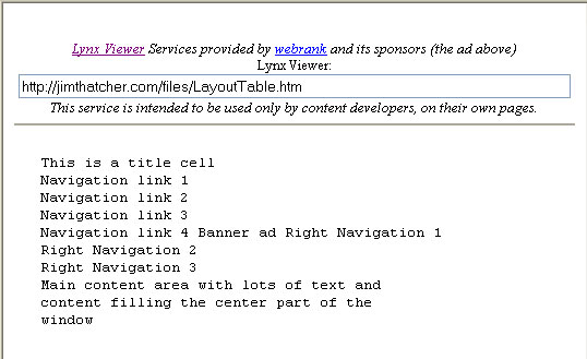
Figure 6-13. Screen shot of a Lynx view of the prototype layout table shown in Figure 6-11
So what are data tables? How are they distinguished from layout tables? Data tables present things like financial results, rainfall totals by city and month, or bus schedules. What do these have in common? It is that the meaning of data in most cells of the table depends on heading information, which is usually in the first row and the first column of the table. You cannot know what the data means unless you are aware of the contents of the corresponding headings.
For layout tables, information in various cells stands on its own. There are no headings— just table cells containing text and images. In contrast, headings are crucially important for understanding (or reading) data tables. That is the problem! Your tables must be designed and marked up in such a way as to ensure that assistive technology will know where the headings are and be able to announce them.
As an example, consider the data table shown in Figure 6-14. This table lists rainfall in Florida cities by month.
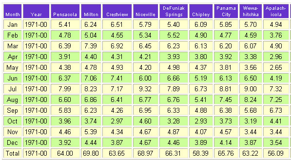
Figure 6-14. Screen shot of a data table showing rainfall totals in Florida.
Notice that the meaning of each number depends on the corresponding heading information: the city from the first row and the month from the first column. This is especially obvious when the same number, say 5.41, appears more than once (for January in Pensacola and for Chipley in August). Additionally, given a row heading, say June (row 7) and column heading, say Niceville (column 6), you can look at the cell at (7, 6) (row 7, column 6) and find the average rainfall of 6.00 inches in Niceville in June.
If you can see the table, then you can look at the March row and see 6.45 for the rainfall in Niceville in March, or 4.67 in December. You can scan for row and column heading information to get the meaning of the data in the table.
If you are listening to the table, you must do it a cell at a time. When you are sitting on any cell, 5.41, for example, you need to know what the row and column headings are—Jan, Pensacola or Aug, Chipley, for example.
What screen readers try to do is to announce the row and column headers as they change. So as you move across the September row, you should hear something like "Year, 1971-00, Pensacola, 5.83, Milton, 6.23, Crestview, 4.6
," and so on. Similarly, moving down the Pensacola column, you should hear something like "Jan, 5.41, Feb, 4.78, Mar, 6.39
," and so on. The purpose of the guidelines for data tables is to ensure that this will be the behavior of assistive technology when reading such a table. Let's look at those guidelines.
The guidelines distinguish between what I call simple tables and all the others. A data table is simple if it satisfies two conditions:
The Section 508 provisions require that row and column headers be identified with markup:
§1194.22(g) Row and column headers shall be identified for data tables.
This provision is essentially the same as Checkpoint 5.1 from the WCAG:
5.1 For data tables, identify row and column headers. [Priority 1]
These guidelines are designed so that the assistive technology can provide information about tabular structure to people who use screen readers or talking browsers.
The following guideline is for tables that are complex (not simple); that is, those that have "two or more logical levels of row or column headers.
"
5.2 For data tables that have two or more logical levels of row or column headers, use markup to associate data cells and header cells. [Priority 1]
The Section 508 provision again uses essentially the same language:
§1194.22(g) Markup shall be used to associate data cells and header cells for data tables that have two or more logical levels of row or column headers.
I will distinguish between two kinds of complex tables: those that are layered, where the headings are always in the same row and column as the data, and those that are irregular, where there are headings for data cells that are not in the row or column of the data. You will see examples in the following sections.
The treatment of the requirements on accessible data tables by WCAG 2.0 (as of Last Call) is very different. It is abstract, and it covers the two preceding cases.
SC1.3.1 Information and relationships conveyed through presentation can be programmatically determined and notification of changes to these is available to user agents, including assistive technologies.
This is saying that whatever the structure of the data table (simple, layered, or irregular), assistive technology must be able to figure out which cells are heading cells.
Simple tables like the one in Figure 6-14 will speak properly with a screen reader if you follow the first Section 508 provision, §1194.22(g) (the same as WCAG Checkpoint 5.1), and identify the row and column headers of the table. The way you do that is to use the th (table header) element instead of the td (table data) element for all header cells. In addition, it is recommended that you use the scope attribute on the th; scope="row" if it is a row header cell, and scope="col" if the cell is a column header. The following is part of the rainfall table in Figure 6-14 with correct table markup satisfying Section 508 §1194.22(g) and WCAG Checkpoint 5.1.
<table>
  <tr>
    <th scope="col">Month</th>
    <th scope="col">Year</th>
    <th scope="col">Pensacola</th>
    <th scope="col">Milton</th>
    <th scope="col">Crestview</th>
    <th scope="col">Niceville</th>
    <th scope="col">DeFuniak Springs</th>
    <th scope="col">Chipley</th>
  </tr>
  <tr align="center">
    <th scope="row">Jan</th>
    <td>1971-00</td>
    <td>5.41</td>
    <td>6.24</td>
    <td>6.51</td>
    <td>5.79</td>
    <td>5.40</td>
    <td>6.09</td>
  </tr>
  <tr>
    <th scope="row">Feb</th>
    <td>1971-00</td>
    <td>4.78</td>
    <td>5.04</td>
    <td>4.55</td>
    <td>5.34</td>
    <td>5.52</td>
    <td>4.90</td>
  </tr> ...
Those th elements are identifying the row and column headers as required by the first of the two table provisions of the Section 508 Standards for web accessibility and the WCAG 1.0 checkpoints. With the table coded like this, it also meets WCAG 2.0 Success Criterion 1.3.1 because it is possible to programmatically recognize the cells that are marked as headers.
The second table provision in the Section 508 Standards and of the WCAG talks about "tables that have two or more logical levels of row or column headers.
" What does that mean? Well, I think the intent is that if the previous technique does not work, then you need more complicated markup.
Figure 6-15 shows a table (from http://frec.cropsci.uiuc.edu/1992/report2/table2.htm) filled with absolutely fascinating information! This table has two (logical) levels of column headers. For its meaning, each number in the data part of the table depends on two column heading cells and one row heading cell.
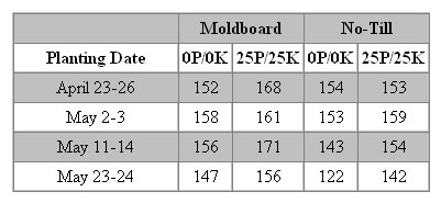
Figure 6-15. Screen shot of a layered data table with two logical levels of column headers.
Tables like this are called layered. They have the property that, for any data cell, heading cells are always in the same row and column as the data, but there is more than one heading cell in the data cell's row or column. This characterization needs to take spanning into account. Data in a spanned cell is viewed as existing in all the cells it spans. For example, in the table in Figure 6-15, Moldboard occurs in row 1, columns 2 and 3, while No-Till appears in row 1, columns 4 and 5.
The accepted technique for specifying which heading cells apply to which data cells is called headers/id markup. The technique is error-prone when done manually, but the basic idea is straightforward. Each heading cell is given an id, and each data cell has a string of ids that are its headers. The string is specified as the value of the headers attribute of the data cell—the string of ids is space-delimited.
In the table in Figure 6-15, let's use ids that tell us which cell we are referencing. Let hxy be the id of the heading cell in row x and column y. So h25 contains 25P/25K (as does h23) and h61 contains May 23-24. Now the markup for the data cell in row 6, column 3 (156) is headers="h61 h12 h23".
Here is the code (with headers/id markup) for part of the table in Figure 6-15.
<table>
  <tr>
    <td></td>
    <th id="h12" colspan="2">Moldboard</th>
    <th id="h14" colspan="2">No-Till</th>
  </tr>
  <tr align="center">
    <th id="h21">Planting Date</th>
    <th id="h22">0P/0K</th>
    <th id="h23">25P/25K</th>
    <th id="h24">0P/0K</th>
    <th id="h25">25P/25K</th>
  </tr>
  <tr align="center">
    <td id="h31" headers="h21">April 23-26</th>
    <td headers="h31 h12 h22">152</td>
    <td headers="h31 h12 h23">168</td>
    <td headers="h31 h14 h24">154</td>
    <td headers="h31 h14 h25">153</td>
  </tr>
  <tr align="center">
    <td id=h41 headers="h21">May 2-3</th>
    <td headers="h41 h12 h22">158</td>
    <td headers="h41 h12 h23">161</td>
    <td headers="h41 h14 h24">153</td>
    <td headers="h41 h14 h25">159</td>
  </tr> ...
The bottom line in this kind of markup is that you should avoid tables that require headers/id markup. The process is confusing at best, and the chance of error is very high.
It certainly can be argued that the fertilizer table (Figure 6-15) has two or more logical levels of row headers, and thus it brings headers/id markup into play. But I want to distinguish this kind of table from one where header information is not in the same row or column as the data. An example that is often used is the expense report table (www.w3.org/TR/WCAG10-HTML-TECHS/#identifying-table-rows-columns), as shown in Figure 6-16.
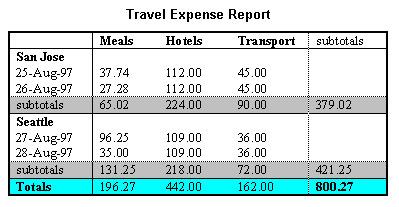
Figure 6-16. Screen shot of the "classic" complex table from the W3C.
Notice how most numeric values in the table depend on a row header (date) and a column header (type of expense), plus the information as to the city where the expense occurred, and this information is not in the same row and the same column as the data. The first expense entry, 37.74, in row 3, column 2, has the heading San Jose in row 2, column 1, in addition to the date (25-Aug-97) and the expense type (Meals).
This is an example of an irregular table, in which heading information for a data cell occurs in cells that are not in the row or column of the data. Irregular tables require headers/id markup to make them accessible. Here is the markup for the table in Figure 6-16.
<table border="1" summary="expenses by date and city">
  <caption>Travel Expense Report</caption>
  <tr>
    <td></td>
    <th id="c2">Meals</th>
    <th id="c3">Hotels</th>
    <th id="c4">Transport</th>
    <td id="c5">subtotals</td>
  </tr>
  <tr>
    <th id="r2">San Jose</th>
    <td></td><td></td><td></td><td></td>
  </tr>
  <tr>
    <td id="r3">25-Aug-97</td>
    <td headers="c2 r2 r3">37.74</td>
    <td headers="c3 r2 r3">112.00</td>
    <td headers="c4 r2 r3">45.00</td>
    <td></td>
  </tr>
  <tr>
    <td id="r4">26-Aug-97</td>
    <td headers="c2 r2 r4">27.28</td>
    <td headers="c3 r2 r4">112.00</td>
    <td headers="c4 r2 r4">45.00</td>
    ...
  <tr>
    <th id="r10">Totals</th>
    <td headers="c2 r10">196.27</td>
    <td headers="c3 r10">442.00</td>
    <td headers="c4 r10">162.00</td>
    <td headers="c5 r10">800.27</td>
  </tr>
</table>
The specific cell with value 37.74 is highlighted in the preceding code. The cell has a headers attribute consisting of a list of three ids: c2 r2 r3. c2 is the id for the cell containing Meals. Cell r2 contains San Jose, and cell r3 contains 25-Aug-97.
Coding these headers/id combinations is very time-consuming and very error-prone. Every attempt should be made to simplify the table or break up the table, to avoid the need for headers/id markup.
There are very few good reasons to use irregular tables. The expense account example in Figure 6-16 could be converted to a layered table by having the location cells span all of the columns. What is so good about a layered table? When marked up with just th (and scope attributes when the applicability to a row or to a column is otherwise ambiguous), screen readers could, in principle, reliably speak the headings for all cells without needing to revert to complex and error-prone headers/id markup. In particular, a layered table marked up this way would meet WCAG 2.0 Success Criterion 1.3.1, because there is a simple algorithm to determine all the relevant heading cells for any data cell.
The expense table in Figure 6-16 has the caption element—Travel Expense Report—which appears as a title (or caption) for the table. This could be just placed on the page and formatted to appear as a caption (bold and centered), but when you use the caption element, you are programmatically connecting the table and its caption, and that is a good thing to do, although use of the caption element is not a Section 508 requirement.
The purpose of the summary attribute on the table element is to give a blind user the kind of table structure overview that a sighted user gains by scanning the table. Michael Moore, of Knowbility gives a great example (www.knowbility.org/whatNot/tableExamples.html). The wrong summary for a table listing three courses is as follows:
summary="schedule of classes for May 23, 2005. There are three classes:
Web Development from 8 am to 9:20 am in Meyer 2.100 with Zeldman.
Creative writing from 11 am to 12:20 pm in Orwell 3.206 with Melville
and Advanced Calculus in Pascal 1.503 with Kepler"
And here is a corrected summary:
summary="schedule by course time, location and instructor" The first summary is giving details that will be found by reading (listening to) the table, but the overall structure is what is needed in the summary attribute, and that is what the second example illustrates.
Like the caption element, the summary attribute is not a requirement of Section 508. When you are listening to a page, the content is linearized and when tables are linearized, information is lost unless steps are taken to recover it. The intent of the guidelines is to allow a screen reader to recover the lost information and present it to the user. In particular, a screen reader or talking browser needs to know which cells contain header information for any given data cell.
The screen readers and IBM Home Page Reader handle tables quite differently. The way you initiate table reading is different, and the results are different. Because of those differences and subtleties, it is a good idea to check your accessible table with the assistive technology.
Home Page Reader has a setting (Settings > Miscellaneous) to read row and column headers. That setting has two check boxes, and both should be checked (they are not checked by default). Pressing T or Shift+T moves to the next or previous table, respectively. Once on a table, press Alt+T to enter table reading mode. In table reading mode, the four arrow keys (up, down, left, and right) move around the cells of the table.
As you move left and right, changing the column, the new column header will be spoken, followed by the data in the cell. When you move up and down, the new row header will be spoken, followed by the data in the cell.
In the example shown earlier in Figure 6-15, as you move from column 2 to column 3, the spanning header, Moldboard, doesn't change, and I would hope that Home Page Reader would not speak it, but it does. In fact, that spanning heading is also spoken by Home Page Reader when you move up and down a row, which is not good.
At any time, you should be able to hear all the headers for a current cell using the "WhereAm-I
" key, which for Home Page Reader is Alt+F1; however, the information delivered to the user includes only row numbers and column numbers; it does not announce heading information.
Home Page Reader is very strict about accessible table markup. If you have some accessible table markup, Home Page Reader assumes you know what you are doing and that all of the headers will be appropriately marked up. So, for example, if you place ids on header cells and only one data cell has a headers attribute, then the header information on that one cell will be the only header information that is spoken. In the process of testing the sample table in Figure 6-15, I removed all the headers attributes, but left the ids. The only heading information that Home Page Reader spoke was the "Planting" cell, which has a <th> tag with scope="col".
JAWS does not have a table reading mode, as such. As with Home Page Reader, the T key moves you to the next table and Shift+T moves to the previous table. When you are in a table, you can press Ctrl+Alt+arrow keys to move around the table. So, Ctrl+Alt+right arrow moves right one cell, Ctrl+Alt+down arrow moves down one table cell, and so on.
The speaking of the header information in the sample table in Figure 6-15 is the same as Home Page Reader, with two exceptions. JAWS seems to ignore the scope attribute and speaks "Planting" as a row header as well as a column header, which the scope attribute "requires". Also, JAWS does not read the spanning headings (like Moldboard) when moving up and down (thank goodness).
JAWS does have a useful "Where-Am-I
" key combination. Use Ctrl+Alt+num pad 5 to hear the row and column and all heading information (as well as contents) for the current cell.
Like Home Page Reader, Window-Eyes has a setting that determines the way table headers are spoken. Use Global > Verbosity > MSAA > Tables. In that dialog box, I think it is best to check the Default header to column or row radio button. This will speak column headings when the column changes and row headings when the row changes. I found the WindowEyes description of how it handles table reading to be somewhat obscure. Here is that explanation:
Window-Eyes uses three methods to examine table headers: header attributes,
<th>tags, and first row/first column (the method used is determined by the verbosity options listed below). You can override the header announcement method by enabling the Header Attrib Override verbosity option. If this option is enabled, and header attributes exist for the current cell, Window-Eyes will read only the header attributes for table headers for that cell. If this option is enabled, and header attributes do not exist, Window-Eyes will revert to the selected table header method for reading table headers. If this option is disabled, Window-Eyes will use the selected table header method for reading table headers. If the table header method "Default Header To Off" is enabled, this option becomes irrelevant. These radio buttons control how Window-Eyes will handle table headers on startup. The table headers hot key will not effect [sic] this radio button group (although changing this option will immediately affect the hot key). If WindowEyes is restarted, the table header rotor will return to the default option (specified with these radio buttons).
At any rate, you can try it for yourself by using Ctrl+Shift+H (the default table headers hotkey) to cycle through the various options for headers announcement, try the table, and decide which you like best.
Window-Eyes, like Home Page Reader and JAWS, enables the T and Shift+T keys to move from table to table.
Window-Eyes also has a table reading mode that you enter by pressing Ctrl+num pad + (plus) and leave by pressing Ctrl+num pad - (minus). When in table reading mode, pressing Ins+arrow keys moves around the table cells.
What happens if there is no accessible table markup (th, scope, headers/id)? JAWS, Window-Eyes, and Home Page Reader will read headings from row 1 and column 1 by default when there is no specific heading markup on the table. It is therefore reasonable to conclude that placing table headers in the first row and the first column amounts to identifying row and column headers as required by all the guidelines. To be certain, it is better to programmatically identify the headers of each data table using th for header cells, td for data cells, and the scope attribute on th or td elements when the scope of the cell is ambiguous.
However, here is a warning (again). If you use some accessible markup, you must do a complete job because Home Page Reader, once it detects accessible markup, will speak only the headings information that you specify.
It is not completely true with any assistive technology today, but I wish they always read (or had an option to always read) only the heading information that changes as the user moves through the table, one cell at a time. In addition, there should be a general "WhereAm-I
" function, which in the case of table cells would announce all heading information for the current cell. For example, as you move across the fourth row in the expense table 172 shown earlier in Figure 6-16, you would hear only the column headings because the date and city headings don't change. Of course, users would have heard that additional heading information the first time they landed on the row.
In terms of money and workload, implementing accessible tables can be an expensive proposition, but that expense can be totally avoided with careful design of data tables. In a table with 10 rows and 10 columns, an irregular table requires that all 100 cells be specially coded. When the table is simple but the header positions are not in the first row or first column, about 20 cells must be specially coded. When the headers are in the first row and first column, you don't need any specially coded cells.
Here is a summary of the main considerations for accessible tables:
th, for all header cells that do not contain data. Use td together with scope or headers attributes for cells containing data together with heading information. You must use the scope on any heading cell if the purpose of the cell is ambiguous. For example, a th in the top-left corner could be either a row or column header, and the scope attribute is needed to resolve the ambiguity.ids on the header cells and the headers attribute on the data cells to explicitly associate header information with data cells. This is essential if the table is irregular, meaning there are data cells whose header information is not in the same row and the same column as that cell.th, scope, headers, or summary) on a table used for layout. In particular, avoid gratuitous announcements resulting from summary="This table used for layout".Rapid visual changes, flashes, or blinking objects on a web page can cause photosensitive epileptic seizures in susceptible individuals. This is particularly true when the flashing has a high intensity and is in the frequency range between 2 Hz and 55 Hz. All of the accessibility guidelines contain some advice on avoiding flicker.
The first and most specific requirement is from the Access Board, in Section 508 provision §1194.22(j):
§1194.22(j) Pages shall be designed to avoid causing the screen to flicker with a frequency greater than 2 Hz and lower than 55 Hz.
The specific frequency range is a region of concern due to the possibilities of inducing seizure upon visitors with photosensitive epilepsy. The wording of this provision was intended to be consistent with that of WCAG 1.0, but phrased in regulatory language and testable.
The WCAG cautions web developers to avoid flicker as long as users have no control over it:
7.1 Until user agents allow users to control flickering, avoid causing the screen to flicker. [Priority 1]
The major browsers permit users to stop animation in GIFs by pressing the Esc key. Opera more effectively allows users to turn off animation by using a dialog box option. Choose File > Preferences, select the Multimedia section, and uncheck the check box labeled Enable Animation (GIF images). But other sources of flickering or blinking content cannot be so easily controlled.
A second checkpoint from WCAG 1.0 is Priority 2 and refers to blinking, rather than flicker.
7.2 Until user agents allow users to control blinking, avoid causing content to blink (i.e., change presentation at a regular rate, such as turning on and off). [Priority 2]
It may be helpful to have an idea of what the frequencies of concern are like. The flashing rate of my text cursor is just shy of 1 Hz. To put this in context, the caret blink rate (or cursor blink rate) in Windows (set in the Keyboard settings from the Control Panel) varies from 0.4 Hz at the slowest setting to 3.1 Hz at the fastest; the middle setting is about 0.8 Hz.
The WCAG 2.0 guideline (as of Last Call) is more specific and less restrictive in the treatment of the problems raised with photosensitivity:
Guideline 2.3 Allow users to avoid content that could cause seizures due to photosensitivity.
SC 2.3.1 Content does not violate the general flash threshold or the red flash threshold. [Level 1]
SC 2.3.3 Web units do not contain any components that flash more than three times in any one second period. [Level 3]
The important difference here is that the technical concepts of "general flash threshold
" and "red flash threshold
" have replaced the Section 508 reference to the frequency range of 2 Hz through 55 Hz. And these new concepts specify not only frequencies, but also the concept of "flash
" and the area of the screen to be involved.
Here is the definition of the general flash threshold:
opposing change" is an increase followed by a decrease, or a decrease followed by an increase.
This characterization of the problematic condition includes the area of flashing (which has not been mentioned in guidelines before) and frequencies greater than 3 Hz.
There are other ways that web pages can be caused to have flicker. One way is by using the blink element, which is not officially part of HTML 3.2 or 4.0:
<blink>This is Blinking text</blink> Here is how it is described on Webmonkey, "Authoring HTML Basics":
Blinkmay well be the most irritating tag available, and not just because it's only supported by Netscape (that is, it doesn't work on IE).
The frequency of the Netscape implementation of the blink element is around 0.8 Hz, so it is not in the dangerous range specified by the Access Board. However, it cannot be controlled by the Esc key. Opera does not support it.
Whereas Internet Explorer does not implement the blink element and Netscape does, the situation is unfortunately reversed for the marquee element. Here's the description of the marquee element on the Advanced HTML site:
A pretty useless tag and like the dreaded
<BLINK>tag it could get very annoying if overused (or even used at all). You can use it to scroll messages across the screen.
In my opinion, the marquee tag is even worse than blink, both in annoyance value and in potential for causing accessibility issues. Admittedly, a simple application of the marquee is not too offensive:
<marquee>This text will scroll right to left quite slowly.</marquee> However, attributes of the marquee element can be modified so that the text is jumping and moving well above the 2-Hz limit, and the Esc key will not stop the movement.
In summary, don't use the blink or marquee elements—because they are not valid HTML and because their effects cannot be controlled in the browsers that support them. Keep flashing frequencies of animated GIFs well below the 2-Hz limit, or much better, avoid animated GIFs altogether.
Bear in mind also that things that jump, flicker, and move about are a nightmare for people who use screen magnification or a magnifying glass and so can see only part of the screen at any one time. Such moving content can also be confusing for people with cognitive disabilities.
Let's distill the message of this chapter into a checklist of specific techniques for creating accessible content relating to text equivalents, use of color, accessible tables, and flicker rate.
alt attribute. The alt attribute should convey the information or purpose of the image.alt attribute that clearly specifies the purpose of the link or function of the image.alt="", null alt-text (that is, alt= quote quote with no spaces between).href, enclose them both in the same anchor tag, and then place alt="" on the image. Inside a button element put non-null alt-text on any image to the extent that the information conveyed by the image is not redundant.alt-text specifying the function of the button.alt-text that clearly identifies the purpose of the corresponding hotspot.longdesc) to provide text equivalents for images like charts or graphs that carry more important information than can be conveyed with their short alt attribute, or include the long description as part of the page.alt-text), or font changes.th element on heading cells that contain no data, and the td element together with the scope attribute when the cell contains data together and acts as a heading.scope attribute on all heading cells in which the scope is ambiguous.id to each heading cell and string of ids as the headers attribute for each data cell to say which are heading cells for that data cell.scope attribute on heading cells (10b).headers attribute approach (10d).