LAURENCE W. PARADIS (California Bar No. 122336) lparadis@dralegal.orgMAZEN M. BASRAWI (California Bar No. 235475) mbasrawi@dralegal.orgDISABILITY RIGHTS ADVOCATES 2001 Center Street, Third Floor Berkeley, California 94704 Telephone: (510) 665-8644 Facsimile: (510) 665-8511 TTY: (510) 665-8716
TODD M. SCHNEIDER (California Bar No. 158253)tschneider@schneiderwallace.com JOSHUA KONECKY (California Bar No. 182897) jkonecky@schneiderwallace.comSCHNEIDER & WALLACE 180 Montgomery Street, Suite 2000 San Francisco, CA 94104 Telephone: (415) 421-7100Fax: (415) 421-7105TTY: (415) 421-1655
DANIEL F. GOLDSTEIN (pro hac vice)dfg@browngold.comBROWN, GOLDSTEIN & LEVY, LLP 120 E. Baltimore St., Suite 1700 Baltimore, MD 21202
|
Telephone:Fax: |
(410) 962-1030 (410) 385-0869 |
|
UNITED STATES DISTRICT COURT |
|
NORTHERN DISTRICT OF CALIFORNIA |
|
SAN FRANCISCO DIVISION |
DISABILITY RIGHTS ADVOCATES 2001 Center Street, Third Floor Berkeley, CA 94704-1204 (510) 665-8644
NATIONAL FEDERATION OF THE BLIND, the NATIONAL FEDERATION OF THE BLIND OF CALIFORNIA, on behalf of their members, and Bruce F. Sexton, on behalf of himself and all others similarly situated,
Plaintiffs,
v.
TARGET CORPORATION and DOES ONE
TEN,
Defendants.
Case No.: C 06-01802 MHP
CLASS ACTION
EXPERT DECLARATION OF DR. JAMES W. THATCHER IN SUPPORT OF PLAINTIFFS’ MOTION FOR PRELIMINARY INJUNCTION
I, James W. Thatcher, declare as follows:
1. The facts in this declaration are based upon my personal knowledge. If called to testify, I could testify competently to the facts described in this declaration.
Background
-
I am an independent Accessibility Consultant, living in Austin Texas.
-
I was contacted by Mazen M. Basrawi of Disability Rights Advocates (hereinafter “DRA”) in July 2005. Mr. Basrawi asked me to provide my expert assessment of the accessibility of the website of the Target Corporation. I submitted my report, “Accessibility Assessment of Target.com,” to DRA. A true and correct copy of that report is attached as Exhibit A. DRA has continued to retain me as a litigation expert.
-
I have consulted on accessibility with clients large and small, including Xerox, Google, Success Factors, CCH, Thomson-West, Clayton College, NFB, The Rehabilitation Clinic of Chicago and The State of Texas. I serve as an auditor of Priceline.com approved by the Attorney General of New York State.
Assistive Technology
-
I received my PhD in Computer Science from the University of Michigan in 1963.
-
After that, my thesis advisor, Dr. Jesse Wright, and I both joined IBM Research in Yorktown Heights, New York.
-
With the birth of the IBM PC in the early 1980’s, Dr. Wright (who is blind) and I had the idea of making the PC “talk” so that it could be used by someone who could not see the screen. We developed a tool which became the IBM Screen Reader in 1986, providing access to computing for people who were blind. The phrase “screen reader” was born as was the industry of providing audio access for blind computer users.
-
In those days computers used an operating system called DOS and screen readers were relatively straight forward. With the advent of the Graphical User Interface in the late 1980’s, the picture darkened and it looked like the access to computing by people who are blind would be lost. I responded to this
challenge leading the development of the first screen reader for a graphical user interface, called IBM Screen Reader/2,
released in 1992. I received the Distinguished Service award from The National Federation of the Blind in 1994 for this work
on access to the Graphical User Interface.
-
Systems like the screen readers and screen magnifiers for people with low vision are called “assistive technology.” I worked primarily on assistive technology until 1996 when I moved from IBM Research to the IBM Accessibility Center in Austin, Texas.
-
When I joined the IBM Accessibility center in 1996 I changed my focus from the assistive technology that had engrossed me for the previous 13 years to accessibility. I took on the challenge of bringing Accessibility into the IBM development process. Since IBM had a long history of employing people with disabilities and of developing innovative assistive technology, it was natural to demand that IBM produce accessible hardware, software, and websites. The key to my approach was to develop accessibility guidelines for all areas where IBM developed products and to get top level management support for requiring that IBM developers follow those guidelines.
My Experience – Accessibility
-
There are two parts to providing access to computing for people with disabilities. One part is the assistive technology, which has improved remarkably over the past fifteen years. The other is the work of the application developer or website designer. Applications and websites must follow certain protocols or standards so that the assistive technology will be able to get the information that is displayed for a sighted user and communicate that information through synthesized speech to a blind user in a clear and organized way.
-
The simplest example of web accessibility is the problem of pictures (images) contained in pages on the World Wide Web. These pictures can be photographs or drawings, but most people don’t realize that there are many “pictures” on most web pages that are important words like “Go,” “Search,” “Contact us” and “Continue Checkout”. These are often actually pictures of words, not text that can be recognized and spoken by a screen reader.
13. Web accessibility requires that “alternative text” is coded with each picture so that a screen reader can speak the alternative text while a sighted user sees the picture. Note that accessibility does not say “don’t use pictures”; it says “include the alternative text along with each picture.” The alternative text does not change the visual presentation except that it appears as a text pop-up when the mouse moves over the picture.
Section 508 Standards
14. Corporate support came when Congress passed the Workforce Rehabilitation Act in 1998. This Act contained Section 508 requiring that all federal agencies purchase only accessible Electronic and Information Technology (IT). Representing IBM, I was Vice Chairman of the Advisory Committee empanelled by the U.S. Access Board that proposed Accessibility Standards for Section 508. These standards became effective in June 2001 for all purchases of IT by federal agencies. This federal requirement on agency purchases led IBM to adopt a policy that all products, those sold to the government, and those sold to nongovernmental customers, would meet the Section 508 standards. That made much more sense than having two sets of products.
Web Content Accessibility Guidelines
15. The World Wide Web Consortium (W3C) is an international consortium where Member organizations, staff, and the public work together to develop Web standards. In 1999 the W3C released the Web Content Accessibility Guidelines (WCAG). These guidelines are organized into three priority groups. The Priority One and Priority Two guidelines are similar to the Section 508 Web Accessibility Standards.
Applying the Standards and Guidelines
-
When I undertake an expert assessment or audit of a website where a specific standard is not specified, I employ a combination of the Section 508 Standards and the Web Content Accessibility Guidelines, Priority One and Two. It is a combination that strongly supports the assistive technology that I know well.
-
There is more to accessibility than just the standards. For the example of pictures I mentioned above, the Section 508 standard just says, “§1194.22(a): A text equivalent for every non-text element shall be provided (e.g., via "alt", "longdesc", or in element content).”
-
This means different things for different kinds of pictures and an understanding of those alternatives is important in creating an accessible website or evaluating website accessibility. Pictures that are links or active buttons should have a text equivalent which is the function of the button or the link, like “Search” or “Continue Checkout”. For pictures which provide information, the text equivalent must convey the same information. Sometimes images are just for decoration or formatting purposes; these pictures need a text equivalent too and it is called the null or the empty text equivalent. That null text equivalent tells assistive technology to ignore the picture.
-
One can’t expect web designers and developers to know how people with disabilities use the Web. That is the reason for the guidelines and standards. But the final test has to be whether a web page can be used by a person with disabilities, in particular by a blind visitor using a screen reader.
Evaluating Target.com
20. Target.com is a commercial website that offers products and services for online sale and home delivery that are available
in Target retail stores. The online store allows the user to browse products, product descriptions and prices; view sale
items and discounts for online shopping; print coupons for use in Target retail stores; purchase items for home delivery;
order pharmacy items and have prescriptions filled for pickup at Target retail stores; find retail store locations; among a variety
of other functions. The homepage of Target.com, captured on March 1, 2006, is attached hereto as Exhibit B.
-
There are hundreds of web pages on Target.com, many of which change every day. There are enterprise-level accessibility testing tools which I could use, but these testing tools are imperfect. One of the leaders in the testing area who developed the first such tool, called “Bobby,” estimates that the testing tools can detect about 25 percent of accessibility problems with the remainder requiring human involvement.
-
A second reason for not depending on the testing tools is that accessibility errors in the Target site are very repetitive. The same error occurs over and over and I believe it is more important to thoroughly understand the accessibility issues on the site rather than just count them. If I explain these errors and include information on what needs to be done to correct them then the company is in a better position to build accessibility into the site in the future.
-
Instead of attempting to evaluate the whole Target.com site, I looked at six top level pages, including the Home Page, Browsing for Products (Men), Search Results, Investor Relations, Press and Diversity. I also went through a complete transaction, finding a product, adding it to the shopping cart, creating an account, entering credit card information, and checking out. I looked for accessibility errors all the way through that purchasing process, which consisted of nine distinct pages. The top level pages and the purchasing process added up to a total of 15 pages.
-
Expanding on my report (attached as Exhibit A) I will focus on four types of access barriers found on the Target.com website. These four are especially important and are violations of both the Web Content Accessibility Guidelines and the Section 508 Standards.
Text Equivalents for Active Images
25. I mentioned this accessibility issue as an example of the concept of accessibility. There is a sense in which it is the prototypical accessibility issue. The importance should be clear and the solution is simple.
-
Section 508 and the Web Content Accessibility Guidelines are almost identical in addressing text equivalents.
-
Section 508: Ҥ1194.22 (a) A text equivalent for every non-text element shall be provided (e.g., via "alt", "longdesc",
or in element content).”
-
WCAG: “1.1 Provide a text equivalent for every non-text element (e.g., via "alt", "longdesc", or in
element content).”
-
Unfortunately there are many important pictures on Target.com that are active and that lack a text equivalent. When I say
“active images” I mean images that look and act like buttons or images which are links to other parts of the site. An example
of such an image from the Target.com home page is attached hereto as Exhibit C.
-
There are two links in this particular picture, one is “Gift Finder” and the other is “Red Hot Shop”. That is the way those
links appear to a sighted user. The following is what the screen reader reports to a blind user for the first link: “Ref
equal sc underscore iw underscore l underscore 1 601 minus 9748238 minus 9274539? Percent 5 Fencoding equals UTF8 ampersand
amp; node=3112881”.
-
That is not only meaningless; it is agonizing to listen to. The numbers, by the way, are spoken in full, like “nine million
seven hundred and forty eight thousand two hundred and thirty eight.”
-
There is a simple explanation for why a screen reader would read this link the way it does. If the page had been coded for
accessibility, the text equivalent, “Gift Finder”, would have been attached to that picture, and “Gift Finder” is exactly
what a screen reader would have spoken. But there is no text equivalent present so a screen reader tries its best to compensate
and find other information that might help the blind user. When a text equivalent is missing, the
screen reader looks at what page the link will open so in the example here, it is speaking part of the URL of that page.
That URL is the text that is displayed in the status area of Internet Explorer when the mouse pointer is placed on the link.
Although this URL information is sometimes helpful, in this case it is a string of nonsense symbols that is only of use to
the content management software that is managing the site and not intended for human reading.
-
On many Target.com pages there are dozens of links similar to this; one following the other making no sense for a blind visitor to the site.
-
On the 15 pages I examined in detail, there were 219 active images which had no text equivalent.
-
Even when text equivalents are provided there can be subtle problems concerning the quality of that text equivalent. An example is the “Continue Checkout” button that initiates the checkout process after an item or items have been chosen. The picture button is attached hereto as Exhibit D.
-
This button does have a text equivalent coded into the page. The text equivalent for this image button should be “Continue Checkout,” because that is what the button does and that is the text on the button. But “Proceed to Checkout” is the text equivalent assigned to this picture on Target.com. This is not a critical error like the ones above but it is serious. If a sighted person is helping a blind shopper, they might say, “Now just find the ‘Continue Checkout’ button in order to make your purchase.” The blind shopper would respond, “I can’t find the ‘Continue Checkout’ button.”
Text Equivalents for Inactive Images
37. Although every picture must have a text equivalent to be valid code for a web page, a screen reader will usually ignore
the image if it lacks that text equivalent. When an inactive image doesn’t have a text equivalent, at least a blind user
is not inundated with gibberish as illustrated on the active images above. That is good news because on the 15 pages I examined
in detail, there were 1,500 inactive images which had no text equivalent.
-
Many of those inactive images are used for formatting and should be assigned the null text equivalent, but either way the screen readers ignore those pictures. However some of those images are important. An example is shown in Exhibit E, which is an image containing the words, “Narrow your results.” This image should have “Narrow your results” as its text equivalent and that information would lead to the form below for a blind user just as it does for a sighted user. This image has no text equivalent on Target.com and is ignored by a screen reader so the information in the image is not conveyed to a blind user.
-
Another example of an inactive image without a text equivalent is attached hereto as Exhibit F. This picture is found on the Diversity page of Target.com. The picture here is not a screen shot of a web page; this is actually a picture on the diversity page, a picture of the words comprising Target’s “Definition of Diversity.” It has no text equivalent, which could easily be coded as the words in the picture. It would be far better to make the definition of diversity part of the text on the page, rather than a picture at all.
-
I have discussed a very small number of examples of missing or inadequate text equivalents. This is an indication of the problem. These are just samples. On each page there are many, sometimes hundreds, of these accessibility barriers.
Keyboard Access
-
It is a fundamental tenet of web accessibility that anything you can do with the mouse you must also be able to do using
only the keyboard. This is typically moving to links or buttons with the TAB key, then pressing ENTER to follow a link or
SPACE to take the action of a button.
-
For a web page to be accessible it must be possible for a user to interact with the page using only the keyboard. The keyboard
as a replacement for the mouse is absolutely essential for some people with disabilities. Blind users can’t use a mouse because
manipulating the mouse is
a visual activity of moving the mouse pointer from one visual spot on the page to another. With other disabilities, especially
some kinds of mobility impairments, Web surfers may be incapable of the hand-eye coordination required to manipulate the
mouse pointer.
-
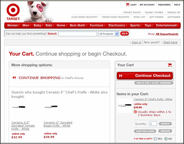
As I explained above, I went through a process of purchasing an item on Target.com. After finding the item and adding it to my shopping cart there is a screen containing a “Continue Checkout” button that I talked about above. A screen shot of the page where the “Continue Checkout” button appears is attached hereto as Exhibit G.
-
The next step in the purchase process is to “press” the “Continue Checkout” button. But it is impossible to do that using the keyboard. It is necessary to use the mouse and click on the “Continue Checkout” button in order to proceed. This is the only place where I found that mouse activation was required and activation by the keyboard did not work. But it is an absolutely critically place! This is an essential step in making a purchase on Target.com and it cannot be completed by any person who cannot use the mouse.
-
I concluded that it is impossible for a blind person using the keyboard to complete a purchase on Target.com using the standard sequence of screens for such a purchase.
-
On April 6, 2006, when teaching a class on web accessibility at the California Web Accessibility Conference, I discovered that the barrier caused by the “Continue Checkout” button on the website of the Target Corporation had been removed. It is now possible to activate that button from the keyboard and complete a purchase without using the mouse. This was not possible in my tests prior to April 6, 2006. All other barriers on the website of the Target Corporation remain as discussed here.
Navigation
47. This issue of navigation is somewhat subtle compared to the other issues I have discussed above. The problem can be illustrated with the page that contains the “Continue Checkout” button that I discussed above shown in the screen shot contained in Exhibit E. If you are not using a mouse the problem of getting to that button is significant because keyboard access proceeds through the page from left to right and from the top to the bottom. In particular there are about 25 navigation links at the top of the page, followed by about 25 more in the shopping options section of the page. All of these precede the “Your Cart” section. That means a blind user must pass through all of these in order to get to the Continue Checkout button.
-
Using the tab key to navigate through the page will require about 50 key strokes just to get the desired button. This takes a long time, it is confusing and it is distracting. This problem persists on every page that contains those navigation links.
-
Screen reader users need some technique for skipping over all those links in order to get to the desired part of the screen. The Section 508 Web Accessibility Standards address this issue with the following provision: “§1194.22(o): A method shall be provided that permits users to skip repetitive navigation links.”
-
There is no accommodation on the Target.com website to comply with §1194.22(o).
-
Screen readers provide for navigation of headings on a page with the keyboard. If heading text is in fact coded as a heading then this navigation works. For example, on the Continue Checkout page shown in Exhibit E, the two main sections have text that looks like heading text, “More Shopping Options” and “Your Cart”. If that text were actually designated as “heading text” in the source code of the page (which it is not), then a screen reader user could get to the desired button with just 3 keystrokes, using the next heading key (H) twice followed by the TAB key.
Labeling Forms
52. Of course forms are very important on a shopping site. You need to enter a description in a search field, specify the number of each item you want, and fill out personal information including your address and credit card information. For each piece of information you enter in a form on a website, there has to be some prompting information near the entry field or check box or radio button to tell you what goes where.
-
If you cannot see the screen it is absolutely essential that you are informed about the prompting information so that you know which information is to be entered into which field.
-
There are simple techniques in a web page that will tie the prompting information to the input elements so that a blind user will hear exactly what information is to be entered in the current field. With this accommodation, a blind shopper can complete a purchase conveniently and confidently.
-
The Section 508 standards and Web Content Accessibility Guidelines both have specific requirements for form labeling.
-
Section 508 §1194.22(n): “When electronic forms are designed to be completed online, the form shall allow people using assistive technology to access the information, field elements, and functionality required for completion and submission of the form, including all directions and cues.”
-
WCAG 12.4: “Associate labels explicitly with their controls.”
-
On Target.com there are no accommodations to facilitate the handling of forms by shoppers who use screen readers.
Conclusion
60. There are many thousands of images on Target.com that lack text equivalents to make them available to people using screen readers. It is impossible before April 6, 2006 to complete a transaction relying on keyboard interaction. Though this one problem appears to have been fixed, many critical barriers remain. None of the form controls on Target.com have proper labeling and there is no accommodation to facilitate keyboard navigation throughout Target.com pages. I have described four types of barriers that are easiest to explain and that are especially important for screen readers. There are other components of Web Accessibility for people with visual disabilities. As of April 12, 2006 the website of the Target Corporation is virtually unusable by a visitor who is blind.
61. If the Target Corporation modifies its existing website or creates a new website so that the result complies with the Section 508 Web Accessibility Standards and the Web Content Accessibility Guidelines, Version 1.0, Priority 1 and Priority 2, then these most severe barriers that I have described will be addressed and the site will be accessible by people with visual impairments.
I declare under penalty of perjury under the laws of the State of California that the forgoing is true and correct.
Executed this April day of ____, 2006, at Austin, Texas.
_________________________________
JAMES W. THATCHER, PHD
Exhibit A
Accessibility Assessment of Target.com
Jim Thatcher
https://jimthatcher.com
July, 2005
1. My background
Accessibility has been a major part of my work since I developed one of the first audio access systems for blind computer users in 1984. This became IBM Screen Reader for DOS (and thus the phrase was born) in 1986. Later I led the development of the first screen reader for the Graphical User Interface (1991) and I was deeply involved in the development of IBM Home page Reader (1998).
This background in assistive technology gives me special insight into IT accessibility issues. I applied that insight leading the process to create the IBM Accessibility Guidelines (http://www.ibm.com/able/guidelines.html) and in bringing accessibility into the IBM development process. I served as Vice-chair of the Electronic and Information Technology Access Advisory Committee empanelled by the U. S. Access Board to draft standards for Section 508 and wrote the web accessibility course for the Information Technology Technical Assistance and Training Center at Georgia Tech that was funded by the U.S. Department of Education in support of Section 508.
I worked for IBM for 37 years. Since retiring in March of 2000 I have been an accessibility consultant (https://jimthatcher.com) working with clients large and small including Xerox, Google, Priceline.com, SuccessFactors, Thomson-West, Clayton College, NFB, The Rehabilitation Institute of Chicago and The State of Texas.
2. Standards for Web Accessibility
One needs some a measure of accessibility or definition of accessibility. How can I judge whether a web page or web site is accessible to persons with disabilities. The answer is to check for compliance with the Web Content Accessibility Guidelines (or WCAG) (http://www.w3.org/TR/WCAG/) from the World Wide Web Consortium (W3C) (http://www.w3c.org) and the federal Section 508 Web Accessibility Standards. These two sets of criteria are very similar and identical on the critical items I shall talk about here.
3. Summary: Target.com accessibility
I have been asked by the National Federation of the Blind to evaluate the accessibility of Target.com. The key issues for accessibility of any site are:
(1) Text equivalents for images. Every image should have associated with it a text equivalent, called alt-text. For visitors to the website who use a
Target.com Accessibility Assessment - July 2005
screen reader, the alt-text replaces the image and is spoken by a screen reader just like any other text on the page.
-
(2)
-
Labeling for forms. Form controls like text entry fields or check boxes require HTML coding that identifies the purpose of the control so that a screen reader user will know what to type in the text field or what is being agreed to with the check box.
-
(3)
-
Techniques for navigation. Large pages with lots of links are organized into groups or sections. When those section headings are marked up as HTML headings the keyboard users can move from section to section with a single key on the keyboard. Without this accommodation it is extremely difficult to use the page for its intended purpose.
-
(4)
-
Keyboard access. Keyboard access to a web site is usually taken for granted. Shoppers with varying disabilities find it impossible to use a mouse and rely on the keyboard instead.
On these key issues, Target fails miserably. Forms are not labeled at all and nothing has been done to improve navigation for screen reader or keyboard users. As a rough estimate, 80% of the images lack text equivalents. There is one spot in the shopping process (on the path I took to checkout) where it is impossible to move forward without using the mouse. Customers who do not use a mouse are not able to buy things on Target.com.
Usually when I evaluate or audit a web site there are a few blatant errors, but many more subtle issues with the style of accessibility accommodations. With Target.com I didn’t get into the subtleties. Errors in the four categories listed above overwhelm any subtle issues. And those errors are almost everywhere.
4. Structure of this report
The results of my evaluation of Target.com, besides the overview above, are contained in the tables in the Section 6. There are three tables. The first table enumerates the problems I found including a count of the errors on the 15 pages that I analyzed.
For those problems that occur frequently (numbers 1 though 7) the second table lists the pages that I evaluated and the number of problems in each category. Finally, for reference, the detailed URL for each page that I checked is contained in the third table.
My method of evaluating Target.com was first to determine a set of representative pages. I chose the home page and then carried out a typical shopping activity, searching, checking out, and purchasing which involved 11 additional pages. I briefly looked at each of the pages linked from the top and the bottom of the home page (Cart, My Account, Gift Registries, etc., on the top and About Target, Careers, Investors, etc on the bottom). With three exceptions (Investors, Press, and Diversity) these seem to be similar to the pages I had already seen.
JimThatcher.com
Target.com Accessibility Assessment - July 2005
I study each page with various tools at my disposal to check for the presence or absence of accessibility markup, and then when the markup is present, the quality of that markup. I test interactivity with the keyboard and with one or more screen readers.
The Discussion in Section 5 below was written as I carried out the evaluation. It contains some details that are not conveyed by the tables in the Detailed Results Section 6).
This evaluation of Target.com pages was conducted between July 21, 2005 and July 30, 2005.
5. Discussion
6.4. Alt-text
When alt-text is present on Target.com (approximately 15 percent of the time) it is generally very well done. It is unusual in my experience to find such a combination of serious accessibility issues and yet what has been done has been done well.
When I came to checkout, I was very surprised to find that all active images had alt-text, and as I said above, the alt text is generally well chosen. There were minor exceptions, like alt=“Proceed to Checkout” and it should be alt=“Continue Checkout” which is the text on the image and the correct description of the action of the button.
As I said, when alt-text was used it was generally ok. An exception in the checkout process is the progress indication at the top of the page consisting of the Target Brand followed by six step names (sign in, address, items, wrap, ship, pay and place order) shown here:

The completed steps are indicated in light red; the current step is dark red (pay in this case) and yet to go steps are in grey (place order in this case). The alt-text for this image on Target.com is “target.com” which is inadequate but it is not clear what is best. There is (what should be) a heading immediately under the image which says “Payment” so to indicate that the current step is payment is redundant. I might use alt=“” believing that the information is redundant or alt=“step 6 of 7”abstracting the key progress information that the image gives.
As I looked at new pages, ones that weren’t similar to those I had checked lready, I continued to find blatant examples of a total disregard for accessibility, for
JimThatcher.com
Target.com Accessibility Assessment - July 2005
access to the web site by people with disabilities. The Investors link on the bottom of the Home page opens a page which consists of two frames lacking title attributes as required both by the Section 508 Web Accessibility Standards and by the Web Content Accessibility Guidelines from the W3C.

The main navigation links in the top frame (news, about us, companies, etc.) are images which do not have text equivalents. The investor information itself is an image of text with no equivalent. The information is not available to a potential investor using a screen reader.
The navigation menu down the left on the Investors page does have alt-text though the main menu across the top does not. Neither left nor top menus have alt-text on the Press page; every single image is missing a text equivalent.
The Diversity page offers a similar problem relating to text equivalents. The text in the “Definition of Diversity” shown in the screen shot below is actually a picture of text:

That picture has no text equivalent and that means that Target’s “Definition of Diversity” is not available to a visitor to the web site who is blind.
JimThatcher.com
Target.com Accessibility Assessment - July 2005
6.5. Keyboard access
When evaluating Target.com for accessibility I stepped through a process of shopping, selection, and purchase with just the keyboard (no mouse) and with a screen reader. That keyboard process hit a snag at the crucial point in the shopping process – continuing checkout (screen shot below):
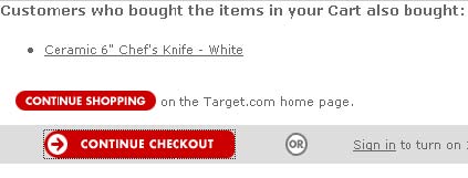
With focus on the “Continue Checkout” button (whose alt text is “proceed to checkout”) both the enter key and the space bar should activate the button. That does not happen. Both the enter key and the space bar just cause the view cart page to reload. It is impossible to get beyond this point using only the keyboard.
6.6. Form Controls
It is essential to be sure that all edit fields, select menus, radio buttons, check boxes and text areas have labelelements or titleattributes that programmatically identify the purpose of the control for screen reader users. When this is done, and a screen reader user lands on a control it will announce that prompt, like “First Name edit” or “Zip Code edit” where the word “edit” is the way the JAWS screen reader tells a blind user that the control is a text entry field. Without this accommodation, JAWS may just say “edit” or worse it may pick up some other words that it guesses might be the prompt and possibly give the user the wrong information.
There are two ways of accomplishing this programmatic identification. One is to assign an id to the control and enclose the on-screen prompt with a label element whose forattribute is the same as the idof the control. The idea is illustrated by the following hypothetical code.
<label for=“fn”>First Name:</label> <input id=“fn” type=”text” size=20>
The second method is to use the title attribute on the inputelement, like title=”first name”. This should only be used if the on-screen text is not adequate or the prompting text is not-contiguous.
I found no instances of providing this vital information for disabled users.
JimThatcher.com
Target.com Accessibility Assessment - July 2005
6. Detailed Results
The table below lists nine different problem types with a brief description of each. The “WCAG” column refers to the checkpoint number of the Web Content Accessibility Guidelines from the W3C (http://www.w3.org/TR/WCAG10/). The 508 column references the section of §1194.22 of the Section 508 Web Accessibility Standards (http://www.access-board.gov/508.htm).
The “Severity” column shows my professional assessment of importance the issue for access to the site by people with disabilities. For example, although Section 508 and WCAG both require that every image have alt-text, I rank missing alttext on an active image (219 instances) as Critical because a disabled user will probably not be able to accomplish the related task because of the problem. In contrast, missing alt-text on a formatting image (1426 instances) is ranked Low severity because screen readers will ignore the image.
The Severity column also includes the number of errors of that type in the 15 pages that I examined.
6.1. Problems
This table contains the description of 9 error types with corresponding references to the Web Content Accessibility Guidelines and the Section 508 Web Accessibility Standards and a severity indication with the total number of occurrences of the error for the 15 pages reviewed.
|
# |
Error Description |
WCAG |
508 |
Severity |
|
1 |
Every active image including image links, image buttons, and image map areas must have clear simple alt-text specifying the function of the image. |
1.1 |
(a) |
Critical (219) |
|
The image map on left should read, “Men, Men’s pants, Men’s Shirts, See all Men’s wear.” Instead it sounds like this: “ref=sc_iw_l_3/601-62647706816961?%5Fencoding=UTF8&node=1162322 ref=sc_iw_l_3/601-62647706816961?%5Fencoding=UTF8&node=1041846 … ” |
|
2 |
Every information-bearing image (including image map images) requires alt-text conveying that information. |
1.1 |
(a) |
Critical or High (74) |
|
Needs alt=“Narrow your results” and is a critical example. |
|
3 |
Every formatting image requires empty alt-text (alt=“”). |
1.1 |
(a) |
Low (1426) |
|
4 |
Form Controls require labelelements or titleattributes |
12.4 |
(n) |
Critical (59) |
JimThatcher.com
Target.com Accessibility Assessment - July 2005
|
# |
Error Description |
WCAG |
508 |
Severity |
|
5 |
Provide navigation methods for keyboard users |
13.6 |
(o) |
Critical (*) |
|
Every page must provide this structured navigation. What needs to be done is most obvious on the search results page where all the “red bars”, should be heading level 2 or 3 and with “Search Results” as heading level 1 and “Narrow your search” as heading level 2. |
|
6 |
Don’t duplicate links text. Combine image with text and use alt=“” on image or make the image not a link and use alt=“”. |
n/a |
n/a |
Medium (62) |
|
The image link and text link are identical. |
|
7 |
Make target of link or function explicit. |
13.1 |
n/a |
Medium (38) |
|
For example needs alt=“Add to Cart”and title=“Add Black and Decker counter toaster oven to cart” assuming this is the button associated with the example in #6 above. |
|
8 |
Every Frame needs a title attribute that specifies the function of the frame. |
12.1 |
(i) |
High (3) |
|
9 |
Interaction with each page (shopping in particular) must be possible without a mouse. |
9.2 |
(n) |
Critical (1) |
6.2. Page Reviews
This is the table of the pages that were reviewed with a tabulation of the number of occurrences of each kind of error.
|
# |
Page Description |
Error # from Table 6.1 |
|
|
1 |
2 |
3 |
4 |
5 |
6 |
7 |
|
1 |
Home Page |
124 |
12 |
174 |
1 |
* |
0 |
12 |
|
2 |
Browse Page (Men) |
16 |
17 |
225 |
2 |
* |
18 |
0 |
|
3 |
Search Results (“oven”) |
40 |
3 |
360 |
2 |
* |
35 |
26 |
|
4 |
Detail on shopping item (Ceramic 5" Utility Knife – White) |
8 |
14 |
137 |
3 |
* |
3 |
0 |
|
5 |
Add to cart (gp / cart / view.html) |
0 |
5 |
144 |
4 |
* |
3 |
0 |
|
6 |
Guest Sign In |
1 |
1 |
14 |
5 |
* |
0 |
0 |
|
7 |
Guest Registration |
1 |
1 |
130 |
5 |
* |
3 |
0 |
|
8 |
Address Book |
0 |
0 |
14 |
7 |
* |
0 |
0 |
JimThatcher.com
Target.com Accessibility Assessment - July 2005
|
# |
Page Description |
Error # from Table 6.1 |
|
|
1 |
2 |
3 |
4 |
5 |
6 |
7 |
|
9 |
Payment Methods |
1 |
2 |
15 |
16 |
* |
0 |
0 |
|
10 |
Billing Address |
1 |
2 |
15 |
8 |
* |
0 |
0 |
|
11 |
Place Order |
1 |
1 |
37 |
2 |
* |
0 |
0 |
|
12 |
Thank you (confirmation) |
2 |
5 |
130 |
2 |
* |
0 |
0 |
|
13 |
Investor Relations |
10 |
3 |
2 |
0 |
* |
0 |
0 |
|
14 |
Press |
14 |
4 |
7 |
0 |
* |
0 |
0 |
|
15 |
Diversity |
0 |
4 |
22 |
2 |
* |
0 |
0 |
6.3. Page URL’s
This table (included for completeness) contains the actual URL copied from the address bar of the browser for each of the pages reviewed and listed in table 6.2.
|
# |
Page Description |
URL |
|
1 |
Home Page |
http://www.target.com/gp/homepage.html/601-6264770-6816961 |
|
2 |
Browse Page (Men) |
http://www.target.com/gp/browse.html/ref=nav_t_spc_2_1/6016264770-6816961?%5Fencoding=UTF8&node=1041828 |
|
3 |
Search Results (“oven”) |
http://www.target.com/gp/search.html/ref=sr_bx_1/6016264770-6816961?fieldkeywords=oven&url=index%3Dtarget&x=24&y=11 |
|
4 |
Detail on shopping item (Ceramic 5" Utility Knife – White) |
http://www.target.com/gp/detail.html/ref=13307891_bxgy_cc_tex t_b/602-13336202499063?%5Fencoding=UTF8&asin=B0002HDV8O |
|
5 |
Add to cart (gp / cart / view.html) |
http://www.target.com/gp/cart/view.html/602-1333620-2499063 |
|
6 |
Guest Sign In |
http://www.target.com/gp/cart/view.html/602-1333620-2499063 (yes seems to be same – must be cookie coming into play) |
|
7 |
Guest Registration |
https://www.target.com/gp/flex/checkout/signin/select.html/602-1333620-2499063 |
|
8 |
Address Book |
https://www.target.com/gp/flex/sign-in.html/602-13336202499063?%5Fencoding=UTF8&step=checkout |
|
9 |
Payment Methods |
https://www.target.com/gp/checkout/address/create.html/6021333620-2499063 |
|
10 |
Billing Address |
https://www.target.com/gp/checkout/pay/select.html/6021333620-2499063 |
|
11 |
Place Order |
https://www.target.com/gp/checkout/billing/select.html/6021333620-2499063 |
|
12 |
Thank you (confirmation) |
https://www.target.com/gp/checkout/confirm/select.html/6021333620-2499063 |
|
13 |
Investor Relations |
http://www.targetcorp.com/targetcorp_group/investorrelations/investor-relations.jhtml |
|
14 |
Press |
http://www.targetcorp.com/targetcorp_group/news/news.jhtml |
JimThatcher.com
Target.com Accessibility Assessment - July 2005
|
# |
Page |
URL |
|
Description |
|
|
15 |
Diversity |
http://target.com/targetcorp_group/diversity/index.jhtml |
JimThatcher.com
Exhibit B
Screen shot of Target.com, captured on 03.01.2006
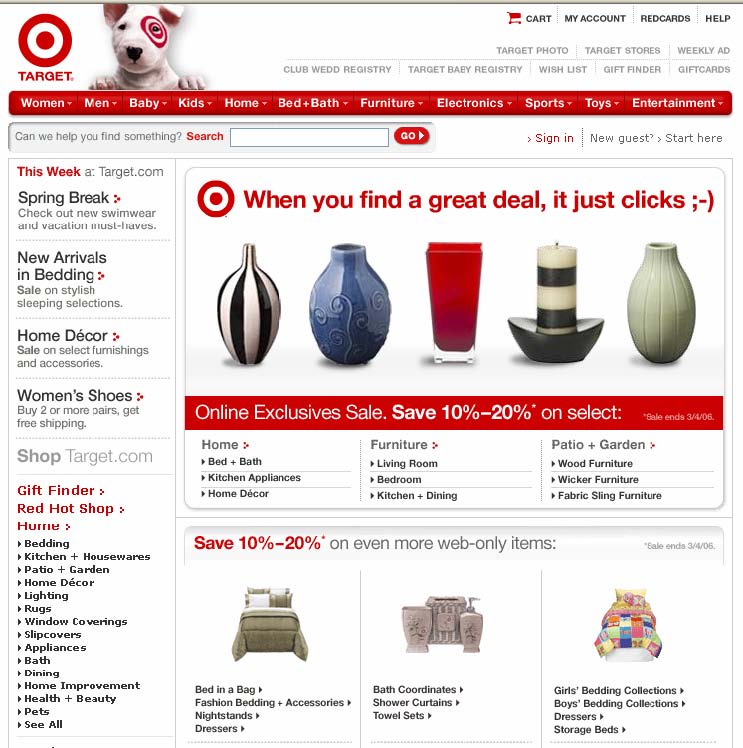
Exhibit C
Image from Target.com home page showing two “picture links” –
Gift Finder and Red Hot Shop, captured on 02.26.2006

Exhibit D
Image button from Target.com showing the words “Continue Checkout” but having “Proceed to Checkout” as a “text equivalent”

Exhibit E
An example of an information bearing image from
Target.com search results page, captured on 02.26.2006

Exhibit F
Picture showing the words of Target’s “Definition of Diversity” from the Target.com website, captured on 02.26.2006

Exhibit G
A screen shot of the web page in the purchase process on Target.com containing the “Continue Checkout” button, captured on 02.26.2006