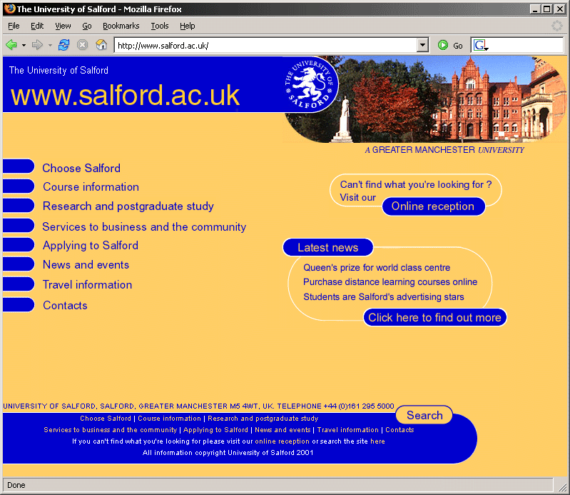
Figure 15-1. The University of Salford homepage in 2001.
My first real contact with accessibility came when I started in my position as Web Editor at the University of Salford in January 2001. As part of the responsibilities of my new job, I started researching some of the legal requirements involving educational websites in the UK, inevitably coming across the Special Educational Needs and Disabilities Act (SENDA) and the wider-reaching Disabilities Discrimination Act (DDA). From there, I delved further into the area of web accessibility. It soon became obvious that the University' s site, which had undergone a year-long redesign process just before I started, presented some fundamental accessibility concerns that urgently needed to be addressed.
This chapter covers the process I went through in redesigning the University of Salford' s website, with an eye on increased accessibility and the adoption of web standards. These techniques should be of use to you if you' re faced with the challenge of retrofitting, or completely rebuilding, a site in order to make it more accessible.
Figure 15-1 shows the original homepage for the University of Salford. Purely from a graphic design point of view, the site was compliant with the University'
s corporate identity guidelines. However, the additional visual elements of the design—the heavy use of large, rounded corners and the complementary blue/orange color scheme (which, to this day, prompts people to refer to it as the "blueberry-and-custard
" site)—were based on the University'
s recent designs for its print campaign.
Figure 15-1. The University of Salford homepage in 2001.
Subjectively, I would say that the rounded corners, both in the overly large header and footer, were too strong a design element in their own right. Because of their size, they often overpowered the actual content presented on each page. In addition, many people (including myself) often criticized the look of the template for being fairly dated; even in 2001, the "rounded-corners
" trend had been gone for a few years.
The design choices for any further visuals on a page were severely restricted. Images with straight edges looked out of place, often requiring them to be "rounded off" first, simply to make them visually fit within the overall feel of the template. An extreme case in point: When asked to include a permanent new feature on the homepage (to advertise the fact that the University had just been awarded a prestigious prize), I ended up having to construct a whole new rounded section as part of the page footer, as shown in Figure 15-2.

Figure 15-2. More rounded edges to make additional graphics fit with the overall design.
As for usability, one of the major pieces of feedback received from users in the weeks following the launch was that the site proved to be very confusing. This sort of problem would have been identified quite early on in usability testing, but unfortunately, no tests were carried out before the launch in December 2000 (apart from a series of focus groups, mainly concentrating on the visual aspects of the site). Because of the drop-down-based navigation and the absence of any indication as to where the current page was situated within the context of the overall site (apart from a simple image in the top-right corner with the generic name for the current section), users were simply lost and often forced to return to the homepage just to orient themselves. This was particularly true of visitors coming to the site through a search engine.
Under the hood, the markup was what, even back in 2001, could be described as "old school
." Any visual aspects were handled directly in the HTML, with no attempt on the part of the original developers to carry out some basic separation of content and presentation. Here is an excerpt:
<TABLE WIDTH="98%" BORDER="0" CELLPADDING="0" CELLSPACING="0">
<TR>
<TD ROWSPAN="4" WIDTH="1%">
<IMG SRC="/images /dot.gif" WIDTH="30" HEIGHT="1" ALT="-" BORDER="0">
</TD>
<TD WIDTH="99%">
<P><FONT FACE="arial,helvetica" SIZE="4" COLOR="#0000CC">
Academic enterprise</FONT></P>
</TD><TD ALIGN="RIGHT" VALIGN="TOP" WIDTH="35%"></TD>
<TD ROWSPAN="4" WIDTH="5%"> </TD>
</TR>
<TR>
<TD COLSPAN="2">
<!—
MAIN BODY OF PAGE—
<TABLE WIDTH="100%" BORDER="0" CELLPADDING="0" CELLSPACING="0">
<TR>
<TD VALIGN="TOP"><FONT FACE="arial,helvetica" SIZE="2">
Salford has always had a reputation for enterprising initiatives… </FONT>
... With no use of Cascading Style Sheets (CSS) in sight, each table cell, paragraph, list item, and so on also featured a <font> tag to set the basic typeface, size, and color.
The entire layout was based on a series of convoluted tables, using rowspan/colspan and set cell dimensions (although, to the designers'
credit, they did use a combination of pixel and percentage values, making the layout halfway elastic). Due to their construction, these tables also didn'
t linearize in a sensible way, which I swiftly demonstrated to management by running the site through the Lynx text-only browser. (See Chapter 6 for an explanation of table linearization.)
Plain HTML does not lend itself well to a design based predominantly on rounded corners. To "fake" the rounded-design elements demanded by the University' s print campaign, a lot of extra markup had been added to the already complex table layout, as shown in Figure 15-3.
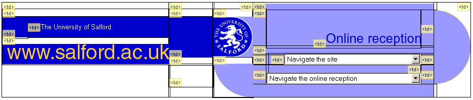
Figure 15-3. Faking rounded corners with tons of table-based markup.
Because of the cluttered table markup and the abundance of table cells used purely for spacing and presentation, the resulting code was unnecessarily cumbersome to work with. This layout was not just used on the University' s core site, but also employed across the whole range of departmental sites.
With the decentralized web management structure at the University, individual departments have their own web authors looking after their particular site. The experience and skill level of these web authors can vary considerably across the institution, ranging from fairly web-confident technicians to administrative staff and lecturers with little or no knowledge of HTML. Particularly for this latter group, the overly convoluted code of the templates proved difficult to understand. This can often lead to vicious circle in development. With an increasingly complex maze of markup, web authors who are not too confident in working directly with HTML will rely more and more on the use of what you see is what you get (WYSIWYG) editors. Although these editors hide the complexity of a page' s underlying markup, they often introduce even further bloated code, thus compounding the problem. Then, when things go wrong and for some reason a page' s layout falls apart at the seams, it' s increasingly difficult to fix the problem at the HTML level.
To achieve the rounded-edges look, the original designers used a mixture of table cell backgrounds for solid areas of color and image elements for the corners. This presented an interesting problem when pages were printed.
By default, browsers will print images present in the markup, but omit any background colors (unless users explicitly set this option in their print settings). The result, as indicated in Figure 15-4, was that our pages looked very odd on paper, with a mixture of text content and isolated images of rounded corners set against the white background of the page.
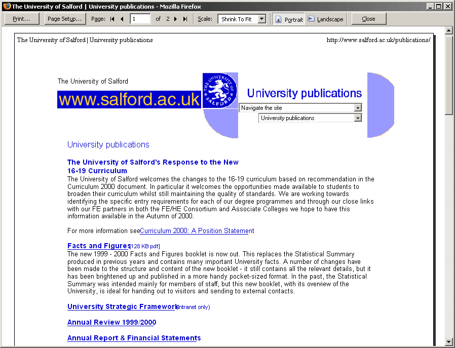
Figure 15-4. Print preview of a typical page from the old site, with rounded-corner images clearly visible.
For this reason, many of the core pages (for instance, all of our online course information) needed a separate "printer-friendly
" version, as in the example in Figure 15-5. Luckily, many of the pages were already database-driven, so I only had to create a new page that pulled the content from the database and presented it without any of the surrounding site template that was causing the problems. But this solution was inelegant and still left the remainder of static pages on the site looking shabby when put on paper.
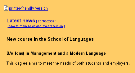
Figure 15-5. Detail of an events page, showing the printer-friendly version link.
Another problem area was the site navigation. As shown in the following code, classic Dreamweaver "jump menu
" drop-downs were used to provide the navigation for all major site areas and subpages within the current section.
<SCRIPT LANGUAGE="Javascript">
<!—

function gotoPage(number) {
  i=document.navform.elements[number].selectedIndex;
  parent.location.href=
  document.navform.elements[number].options[i].value;
}
// —

</SCRIPT>

<SELECT NAME="choose" onChange="gotoPage(0)">
  <OPTION VALUE="#">Navigate the site</OPTION>
  <OPTION VALUE="#">.........................................</OPTION>
  <OPTION VALUE="http://www.salford.ac.uk/">Homepage</OPTION>
  <OPTION VALUE="http://www.salford.ac.uk/reception/">Online reception</OPTION>
  <OPTION VALUE="http://www.salford.ac.uk/choose/">Choose Salford</OPTION>
...
</SELECT>
In the very first version of the site, these navigation menus were completely reliant on client-side scripting. Simply marked up as a couple of <select> elements, not contained inside any <form> and certainly lacking a conventional submit button, these menus relied on the <select> element'
s onchange event to load a new page whenever the user changed the current selection.
Apart from making the navigation unusable when client-side scripting is unavailable or disabled, this makes keyboard access (with or without assistive technology) tricky. Using default cursor keys to move through the available options triggers the script. Effectively, this makes it impossible for keyboard users to move beyond the first <option> unless they are aware of work-arounds built into their browser or assistive technology.
An example of a work-around for keyboard users in Internet Explorer is using Alt+cursor keys to "open" the <select> menu—a concept that certainly doesn'
t translate well to the nonvisual realm. This suppresses any onchange event until the <select> menu is closed by either pressing the Enter key or tabbing away from it.
The worst use of these jump menus was the Online Reception page, shown in Figure 15-6. This was a one-stop-shop page used in lieu of a proper index or site map, which had no less than six <select> elements to provide quick links to the majority of the University'
s top-level pages and departmental sites.
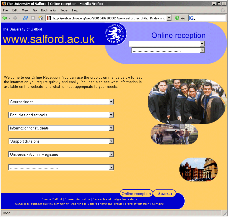
Figure 15-6. The University' s Online Reception page, featuring a total of six JavaScript-driven jump menus (excluding the main navigation).
Some of the drop-downs on the Online Reception page also nicely demonstrate another shortcoming of <select> elements: the difficulty with providing effective levels of grouping and subcategorization. Although HTML does offer the ability of grouping individual <option> elements inside an <optgroup>, support for this element was (and still is, in certain browsers) flaky or nonexistent. Therefore, the designers used a variety of visual tricks to "fake" the semblance of hierarchy and structure within the <select> elements by introducing empty spacer <option> elements and prefixing subpages with a simple dash—a purely visual subterfuge. Figure 15-7 shows an example.
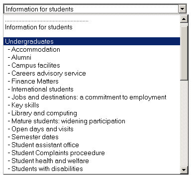
Figure 15-7. Faking a structural hierarchy with spacer <option> elements and dashes.
The following is the code that creates the menu in Figure 15-7:
<SELECT NAME="choose" onChange="gotoReceptionPage(2)">
<OPTION VALUE="..." SELECTED>Information for students</OPTION>
<OPTION VALUE="#">........................................</OPTION>
<OPTION VALUE="...">Information for students</OPTION>
<OPTION VALUE="#"></OPTION>
<OPTION VALUE="...">Undergraduates</OPTION>
<OPTION VALUE="..."> - Accommodation</OPTION>
<OPTION VALUE="..."> - Alumni</OPTION>
<OPTION VALUE="..."> - Campus facilites</OPTION>
<OPTION VALUE="..."> - Careers advisory service</OPTION>
<OPTION VALUE="..."> - Finance Matters</OPTION>
...
</SELECT>Other than inconveniencing, or outright excluding, certain users, this type of navigation also had a noticeable impact on the University' s search engine rankings. With hardly any real links in the markup, content was effectively hidden from search engine spiders. Even our own internal search engine needed to be explicitly pointed to specific URLs to index in order to keep search results relevant.
Along with these problems were the usual suspects of inaccessible sites: a proliferation of "
" links, extensive use of graphical buttons, inappropriate use of markup to achieve a certain type of visual presentation, and so on.click here
In short, the site that I had inherited was a mess. Unfortunately, the University had just launched its new design (after a considerable investment of money and time), and many departments across the institution had already started the process of painstakingly transferring their content into the new cumbersome layout. It was therefore decided that, rather than embarking on yet another redesign so soon after the last one, just the most obvious accessibility issues should be fixed.
A small retrofit in its own right, my initial "damage limitation" exercise concentrated mainly on the two biggest problems: making the table-based layout linearize properly and making the drop-down navigation at least workable for non-JavaScript users.
Paradoxically, to fix some of the linearization issues of the template, the tables themselves had to be broken down into further nested tables, thus adding even further "scaffolding" markup to the already convoluted code.
To make the navigation work even without client-side scripting, I implemented a rudimentary server-side fallback mechanism. The two separate <select> elements in the header (as well as the six jump menus on the Online Reception page) were each wrapped in a proper <form> element, and a discreetly designed image-based submit button was included. When submitted, the destination'
s URL was passed to a simple PHP script, whose only purpose was to redirect the user'
s browser to the desired target page. This approach was not very elegant, as it added an unnecessary round-trip to the server and made it impossible to gather any useful page-referrer information within the site (although, admittedly, the PHP code could have been further expanded to separately log this type of information). Nonetheless, this fallback at least meant that users without JavaScript would be able to navigate the site. Figure 15-8 shows the new menu.
Figure 15-8. Tweaked jump menu, now wrapped in a form element with an unobtrusive image-based submit button to the right.
The following is the HTML that creates the tweaked jump menu shown in Figure 15-8:
<form action="/redirect.php" method="post">
  <select name="select" onchange="MM_jumpMenu('document',this,1)">
    <option value="#" selected="selected">Navigate the site</option>
    <option value="#">__________________________________</option>
    <option value="http://www.salford.ac.uk/">Homepage</option>
    <option value="#">__________________________________</option>
    <option value="http://www.salford.ac.uk/about/">
      About the University</option>
    <option value="http://www.salford.ac.uk/faculties-schools/">Faculties and Schools</option>
    ...
  </select>
  <input type="image" border="0" name="submit"
    src="/images/common/go.gif" alt="Go" width="11" height="11">
</form>
And the following is the corresponding server-side code to handle the redirection:
<?php
// expects a value for 'select' either GET or POST
if (isset($_REQUEST['select'])&&(!($_REQUEST['select']=="#"))){
  // redirect user to selected page
  header('Location: '.$_REQUEST['select']);
} else {
  // default behaviour - go back from whence you came
  header('Location: '.$_SERVER['HTTP_REFERER']);
}
?>
Initially, to address the keyboard access problems for users that did have JavaScript, I also removed the client-side scripting completely. However, this change immediately prompted a barrage of messages from users and management, reporting that suddenly the navigation was "broken." Grudgingly, I had to take the pragmatic decision to reintroduce the JavaScript-based functionality (on top of the server-side fallback) in order to make the fundamentally flawed navigation scheme usable for the majority of users, while acknowledging that keyboard users would still be faced with some difficulties.
At the start of 2003, the University undertook a review of its corporate identity guidelines. A new design agency was tasked with expanding the existing guidelines (which were quite minimal, mainly centered around the appropriate use of the University logo, our two core corporate colors, and the right choice of typeface) to provide additional color combinations and a modular set of templates for print and electronic formats. Although the agency didn' t specifically look at guidelines related to the Web, I worked closely with the designers to ensure that it would be possible to interpret and adapt the revised identity for online use.
In contrast with the comparatively lax previous corporate identity, the new guidelines introduced a set of tighter restrictions. For instance, they prescribed the top-left position of the logo (which was also slightly altered to now include the University name and the "A Greater Manchester University
" slogan in a set configuration next to the original logo roundel) and a limited palette of primary and secondary colors that could be used.
As these new guidelines applied to our site as well, it was clear that the blue-and-orange color scheme and the general page header would have to be revised. So, after two years of "blueberry-and-custard
," we were faced with a fundamental choice: Should we simply apply a new facade to the University'
s web presence, changing only visual aspects of the markup while maintaining the rest of the underlying, table-based structure? Or should we learn from past mistakes, be mindful of the fundamental accessibility problems present in the current site, and make a fresh start?
Clearly, a complete rebuild would have involved a considerable amount of work, with every page of the site having to be recoded. However, remember the complete absence of separation of content and presentation? Because the colors and general layout were hard-coded into the presentational HTML, even superficial changes would have required work on each page. I therefore decided to seize the opportunity of this corporate identity review to radically change the University site for the better, rather than awkwardly carrying on with small fixes and tweaks to the existing markup.
Unlike many other web managers in charge of corporate sites, I was fortunate that management allowed me a certain level of flexibility in making these kinds of decisions autonomously. Apart from a series of briefings to key groups of internal stakeholders, centered mainly on the need to redesign from a corporate identity point of view, I did not have to do a "hard sell" to convince the University to move toward a web standards-based approach. None of these briefing sessions ever actually mentioned web standards or layouts without tables in any technical detail. I merely put the point across that the redesign would follow modern web development best practice. Similarly, for the accessibility side of the redesign, I did not enter into any lengthy explanation of the Web Content Accessibility Guidelines (WCAG), assistive technology, or people with disabilities. I merely reassured management that, in adopting the proposed best practice strategies, the University' s site would fall in line with legal requirements with regard to SENDA.
Web managers who are having more difficulty in convincing their bosses or clients of the value of a web standards-based approach may be interested in the documents put together by the Making A Commercial Case for Adopting Web Standards (MACCAWS) research group.
A number of decisions had to be made during the early planning stages of the redesign. Some of the important ones were to design to web standards, to use XHTML, and to use CSS rather than table-based layouts. The following sections look at these decisions in some detail.
Nowadays, the majority of web professionals should at least have heard of web standards, thanks in no small part to the ongoing efforts of grassroots movements such as the Web Standards Project, the increased availability of valuable online and paper-based resources on the subject, and excellent examples of large corporate sites that have made the switch to valid, table-free, structural markup.
At the time of the University of Salford website redesign, however, these resources were few and far between. Designing with web standards, thoroughly separating content from presentation, and abandoning tables in favor of pure CSS solutions were still the exceptions. However, the fundamental benefits of a web standards-based approach were already becoming evident:
As at the time the University' s central web team was composed of only myself (a team of one), all of these benefits certainly would have helped in "working smarter, not harder" and giving me better control over the institution' s site.
Generally, many developers assume that "designing with web standards
" implies the need to switch to XHTML. Of course, that'
s not necessarily true. It is perfectly possible to use HTML 4.01 (preferably following the Strict DOCTYPE) to create lean, semantically structured sites. With enough "personal discipline"—consciously avoiding presentational language elements such as bold, italic, and <font> tags in favor of structural equivalents and CSS—you can follow the principles of web standards (valid, semantic code and the separation of content and presentation) without the need for XHTML.
Purists will argue that the only real benefits of XHTML can be reaped when combining it with other XML-based technologies (for example, mixing XHTML and MathML). But in order to do this, pages need to be sent with an XML MIME type (such as application/xhtml+xml), which Internet Explorer does not understand. This is a fact that purists will often use as proof positive that, for general-purpose web pages that do not mix XML technologies, there is no reason to use anything other than plain HTML.
The decision to move the University site to XHTML was dictated not so much by any intrinsic advantage of XHTML over HTML, but by the need to make life easier for myself when it comes to testing and quality assurance. Because the majority of presentational markup has been removed from XHTML (with a few debatable exceptions like the sub/sup elements), running pages through the W3C markup validator quickly brings to light any use of presentational elements and attributes. This is a particularly useful first test when checking pages developed by departmental web authors or third-party suppliers. Of course, it' s still possible to create completely nonsemantic and inaccessible documents that are completely valid XHTML/CSS, so this sort of testing needs to be followed up by a proper look at the markup. Nonetheless, it can be helpful as a very superficial initial assessment.
Another thought at the back of my mind when choosing XHTML was the planned adoption of a content management system (CMS) by our IT department a few years further down the line. With the possibilities opened up by simple, readily available technologies such as XSLT and the use of XML-based languages for data import into such systems, it would be possible to repurpose web pages by transforming XHTML into a format suitable for inclusion into the CMS. Further potential applications, such as print-on-demand systems where XML content can be loaded directly into a desktop publishing package such as Adobe InDesign or Quark Xpress, further influenced this decision.
The syntax of XHTML still allows the use of tables, and rightly so, as the table construct is ideally suited to mark up the complex relationships of headings and values of tabular data. In that respect, it' s obvious that tables are not purely presentational. However, web designers have traditionally relied on table markup for exactly that: defining a visual layout. Even stretching the definition, there is usually no relationship being defined in a table-based layout other than "I want these two columns of text to sit next to each other."
If you'
re ever in doubt about whether or not something could be considered "tabular data
," ask yourself if you would put this information in an Excel spreadsheet. This method isn'
t foolproof though, as over the years, I'
ve come to know many managers who treat Excel like a poor man'
s layout tool. Incidentally, these are usually also the people who think PowerPoint is a web design tool in its own right and proudly hand over their mock-ups with an "I'
ve already done the layout of my pages for you as well
" remark.
The original definition for tables from the HTML 4.01 specification is slightly vague on the subject.
The HTML table model allows authors to arrange data — text, preformatted text, images, links, forms, form fields, other tables, etc. — into rows and columns of cells. [...] Tables should not be used purely as a means to layout document content as this may present problems when rendering to non-visual media. [...] authors should use style sheets to control layout rather than tables.
Even WCAG 1.0 mentions the use of tables for layout, but fails to actually prohibit their presentational use.
5.3 Do not use tables for layout unless the table makes sense when linearized. Otherwise, if the table does not make sense, provide an alternative equivalent (which may be a linearized version). [Priority 2]
5.4 If a table is used for layout, do not use any structural markup for the purpose of visual formatting. [Priority 2]
Regardless of wooly definitions in the HTML specification and get-out clauses so readily provided in the WCAG, staying true to the idea of separating content from presentation means abandoning table-based layouts in favor of CSS.
There are obvious advantages to CSS-driven layouts. Externalizing all of a site' s presentation (layout, colors, typeface definitions, and so on) to style sheets provides an excellent way of keeping control over the look and feel of a site at a central location. When rigorously applied to all pages, CSS provides an excellent means of maintaining a consistent layout and presentation across a site. It also gives a certain measure of future-proofing. For example, if the University' s corporate colors or choice of overall design were to change, a large part of the redesign would involve nothing more than a change to the styles, rather than requiring a complete recoding of each individual page.
Another advantage of CSS is the ability to define different presentation styles for a variety of delivery channels. Through the use of @media directives or the media attribute for style sheet <link> elements you can specify how a document should look on the screen or in print, making a separate printer-friendly version unnecessary.
There are still edge cases in which a printer-friendly version may be required. One example would be a lengthy document that was split into separate pages for easier reading. A designer may want to provide the same document as a single, albeit long, page.
See Chapter 9 for details on using CSS for accessible web pages.
A complete redesign is a good opportunity to not only change the appearance of a site, but to also take a critical look at a site' s structure and content. Sites can grow in a very organic fashion. Despite an initially defined information architecture, new pages and sections that don' t quite fit the original structure are added at a later date. It' s often surprising how much legacy content is still present, often carried from one redesign to the next.
Before embarking on a redesign, it is therefore useful to start with a completely blank slate. For the University of Salford website redesign, the first phase involved a meticulous inventory of any content available on the old site. Working with the respective content owners, outdated content was pruned and amended. To work out the new site's overall structure, I enlisted the help of various stakeholders across the University, including a sample of current students, in order to carry out simple taxonomy and card-sorting.
Card-sorting is a user-centered design method in which users sort a series of cards, each representing a particular piece of content or functionality of a site, into groups that make sense to them. Card sorting can help in understanding the users' mental models, thus allowing you to organize your content in a way that matches their expectations.
It' s usually possible to make smaller design or structural changes directly on a live site. However, as this redesign involved a complete restructuring and rebuilding, I requested a new development server to be set up centrally by the University' s IT department. Even if, as was the case with this redesign, you' re the only developer working on a new site, there are many advantages of this approach over simply setting up a local development server on your own workstation. Chief among them is the ability to let management and other interested parties across the institution keep an eye on the work in progress. Coupled with a simple feedback form, this can give them the opportunity to have their say and effectively take a certain amount of ownership of the redesign (be careful to manage their expectations, though; otherwise, they will expect any single suggestion to be implemented immediately).
Based on the new information architecture, I prepared the development server by basically setting up an equivalent directory structure. I then proceeded to copy the relevant existing pages, plus any additional pieces of amended information (mostly provided by the content owners as Word documents) into their respective new folders.
So, with a new streamlined site structure and up-to-date content, it was time to get down to the nitty-gritty of the actual build.
In an ideal web standards workflow, the task of creating a site template can be broken down into two distinct phases:
As shown in Figure 15-9, these phases would normally be carried out in sequence, practically in isolation. Reality, however, is never quite as structured as this ideal model.
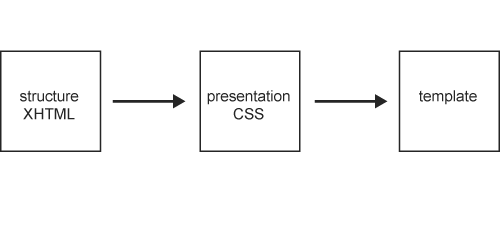
Figure 15-9. Ideal web standards workflow as a one-way process: first create the structure, then the presentation, thus arriving at the final template.
Web designers (as opposed to developers) are often intrinsically visual people. Even at the earliest stages—planning the purpose of a site, what content it will present, what functionality it will offer users—they' re likely to already form a mental picture of the kind of layout and style that would be most appropriate for the finished site. As difficult as it may be, when planning the page structure and how it could best be represented in markup, designers need to try to put their visual interpretation to one side. At this point, it' s not important to dwell on how things will look. Wearing a content editor' s hat, you should first decide which structural blocks will need to be present in a page and in what logical order they should be placed in the markup.
Stylistic decisions should not influence your choice of HTML When checking the unstyled markup (or rather, styled purely with the browser'
s default style sheet), don'
t worry if things looks slightly bland or disproportionate. That overly large <h1> or those bunched up form elements will be dealt with in the styling phase.
So, concentrating purely on the "functional" blocks that I envisaged for our pages, I decided on a structure that included the following:
HTML is fairly limited in terms of the elements that make up the language. Many of these elements are only vaguely defined in the official HTML specification, and the majority are very generic and open to interpretation. There are no ready-made, specific markup constructs to define certain common page elements such as breadcrumb trails, footers, or navigation bars.
For this reason, choosing the most semantically appropriate way to mark up a page' s structure is not always straightforward, and it is a subject of much debate among web standards "purists." Unless designers have an inclination to engage in pedantic discussions, they need to make a pragmatic judgment call, with an eye on current best practices (such as John Allsopp' s "Web Patterns" initiative).
The extensibility of XHTML 1.0, as well as the modular nature of XHTML 1.1 and the upcoming XHTML 2.0 specifications, allow web developers to include other XML vocabularies into their documents, even to the point of creating their very own specialized set of additional markup elements. However, it' s worth remembering that user agents (including browsers and assistive technologies) still need to be able to interpret the markup in order to present it to users in a sensible and structured way.
Translating my simple page outline directly into markup, I ended up with the first draft for the new document template. The following listing shows the general code structure of the site.
<div>
  <a href="/"><img src="/images/logo.gif"
    alt="University of Salford – A Greater Manchester University" /></a>
</div>
<form>...</form>
<div id="navbar">...</div>
<div id="breadcrumbs">...</div>
<div id="content">...</div>
<div id="footer">...</div>
Following a best practice example that was emerging and gaining momentum at the time of the redesign, I opted for an unordered list of links as the most appropriate way in which to mark up the site navigation itself. Or rather: I started off with the idea of a simple unordered list, only to get tangled up in an almost philosophical debate with myself on how to best represent subgroupings within the navigation. I ended up with a structure that, in hindsight, is a rather inelegant mixture of divs and unordered lists (see the "Problems Along the Way—Lessons Learned" section later in this chapter for more on that problem).
<div id="navbar">
  <div class="navgroup">
    <ul>
      <li><a href="/">University Home</a></li>
    </ul>
  </div>

  <div class="navgroup">
    <ul>
      <li><a href="...">About the University</a></li>
    </ul>
  </div>

  <div class="navgroup">
    <ul>
      <li><a href="...">Study at Salford</a></li>
      <li><a href="...">Course Finder</a></li>
      <li><a href="...">Research</a></li>
    </ul>
  </div>
  ...
</div>
With the rough structure completed, I devoted some time to adding a few additional touches of markup for accessibility and usability purposes.
As the template markup included a fairly long navigation bar before the area containing the actual page content, a skip to content
link was included directly after the main logo. As at the time I was primarily concerned with screen reader users, I implemented this as an unobtrusive link wrapped around a single 1-pixel transparent GIF.
<a href="#content" accesskey="2">
  <img src="/images/transparent.gif" alt="skip to content"
    width="1" height="1" />
</a>
As already hinted at in the previous code sample, I also added an abridged and slightly modified set of access keys, based on the UK Government accesskeys standard (mandated by the Cabinet Office' s e-Government handbook):
Access keys are mentioned as an HTML technique in WCAG 1.0 (www.w3.org/TR/WCAG10/wai-pageauth.html#tech-keyboard-shortcuts):
9.5 Provide keyboard shortcuts to important links (including those in client-side image maps), form controls, and groups of form controls. [Priority 3]
Over the past few years, though, access keys have come under much criticism. Some argue that it is not the place of document authors to prescribe which key combinations are available to users (leaving this instead in the hands of users themselves and their respective user agent/assistive technologies). Beyond this (possibly academic) discussion, however, it'
s certainly true that the concept of access keys is good, but their implementation in many browsers is flawed. Taking the common example of Internet Explorer under Windows, access keys are triggered via the Alt+access key combination. Unfortunately, the Alt key is also used to enable keyboard access to browser menus, to enter characters in their numerical key code format (for example, Alt+0228 for an ä), and, in some situations, to activate certain options of assistive technologies or other helper applications running in the background. Therefore, it is almost impossible to find any reasonable set of access key definitions that don'
t have the potential of conflicting with, or outright overriding, other system shortcuts on which a user may be relying. For this reason, web designers should carefully consider whether or not to implement even a minimal set of access keys in their pages. For my own part, I am now considering dropping access keys from the next version of the site.
Before proceeding to the next phase, I made sure that the final HTML validated. Badly formed markup can have unforeseen consequences when it comes to styling. In fact, it' s good practice to get into the habit of regularly validating your markup, particularly after any major changes have been carried out. Nothing can get more frustrating, particularly in the later stages of the design, than a small validation error being carried around in the template.
Once the markup for the overall structure of the template was finished, I proceeded to create the general style sheet that would determine how the functional blocks of a page would be laid out on the screen. Tentatively putting my "design" hat back on, I decided on a classic layout, as shown in Figure 15-10.
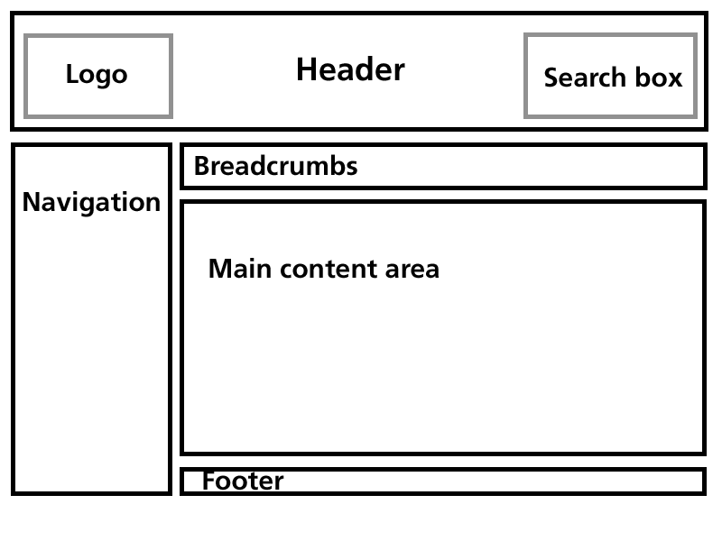
Figure 15-10. Planned layout for the University of Salford website template.
Different web designers will have their preferred method of creating a site' s style sheet. Personally, I find the "top-down" approach most useful, tackling the very general areas first (rough position of elements) before moving on to the finer details (setting margin and padding, adjusting line spacing, and so on). Creating the style sheet for the template probably took longest in the overall build, as I experimented with a variety of positioning schemes before arriving at a layout that proved reasonably robust in different browsers and under different text sizes.
As per the ideal web standard workflow, there should be no need at this stage to make any further changes to the markup. If the HTML is structured correctly and sufficiently conveys the intended semantics, it should simply be a case of working on the styling of this structure. However, because many browsers have still not fully implemented the full CSS specification, and because of limitations in the actual specifications themselves, it is still necessary on occasion to revisit the markup created in the previous phase, as illustrated in Figure 15-11.
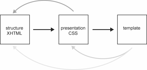
Figure 15-11. In a break with the ideal workflow, requirements in the template or desired presentation effects may require the CSS or even the XHTML to be revisited at a later stage.
This process often involves adding further HTML to group certain functional blocks together or to add additional "hooks" (such as id or class attributes) to facilitate the styling process. However, this should still be done with an eye towards logical structure, and not purely as a styling device. For instance, you should choose id and class names that are representative of the function and purpose of the elements they'
re applied to, rather than names that imply their intended visual appearance. For instance, as an id, "navigation
" makes more sense than "leftcolumn
" and won'
t cause confusion if the navigation is moved to the right side of a layout at a later date. See the W3C Quality Assurance tip "Use class with semantics in mind" for further examples.
To achieve the layout I had in mind for the University template, I ended up needing to add two blocks in the markup: a "header
" div, containing the logo and search form, and a "container
" div to hold the navigation, breadcrumb trail, and main content area in place. Additionally, the footer was moved inside the actual "content
" block.
<div id="header">
  <a href="/"><img src="..." alt="University of Salford
    - A Greater  Manchester University" /></a>
  <form></form>
</div>
<div id="container">
  <div id="navbar"></div>
  <div id="breadcrumbnav"></div>
  <div id="content">
    <div id="footer"></div>
  </div>
</div>
Yes, it could well be argued that, by making those changes, I' ve tainted the structural purity of the template. I won' t dispute that some of these changes were made mainly with an intent to facilitate visual styling. Pragmatically, though, they are far from the excesses of presentational markup, and the resulting document structure still follows a logical order.
Creating complete table-free layouts, or even working on a few subtle visual tweaks, can be a frustrating experience when faced with different browsers and the variety of inconsistencies and bugs related to their particular CSS capabilities. Nothing is worse than working perfectly in accordance with official W3C CSS specifications, only to realize in testing that a particular browser behaves erratically due to certain combinations of markup and style or seemingly unrelated CSS rules. During the styling phase for this particular template, I encountered some classic issues (such as Internet Explorer'
s faulty box model implementation, or the notorious "3-pixel jog
"). Due to the sometimes haphazard nature of these problems, it'
s impossible to give a definitive answer as to how they can be avoided. To avoid chasing your own tail when it comes to compensating for these issues, I would suggest the following methodology:
Even more problematic than current browsers with a few CSS bugs are old browsers with very incomplete CSS implementations. These browsers try, but usually fail miserably, to parse complex style sheets, resulting in page layouts that aren'
t just strange-looking, but are also outright unusable (with symptoms such as overlapping text columns and unclickable links, for instance). Netscape 4.x, and to a smaller extent Internet Explorer 5 for Mac, fall in this particular category. To protect these browsers from their own shortcomings, I split the style sheets for the University template into a series of separate files, called with the following <link> elements:
<link rel="stylesheet" href="salford_basic.css"
  type="text/css" />
<link rel="stylesheet" href="salford_advanced.css"
  type="text/css" />
As the name implies, the first style sheet contains the majority of basic style rules, defining things like overall typeface, colors, and so forth. These styles do not generally cause any problems, even in the oldest of CSS-aware browsers.
The advanced style sheet, however, takes care of most of the "heavy lifting," with all the various layout positioning and media-specific styles. As these rules do cause havoc to the likes on Netscape 4.x, I took advantage of a series of well-documented shortcomings in those problematic browsers (see the CSS filter list at www.centricle.com/ref/css/filters/ for further details). The advanced style sheet is, in fact, only a "wrapper" that calls further CSS files via a couple of @include directives. As these are not parsed by the offending browsers, these style sheets remain effectively hidden from them, circumventing any problems they may have caused.
@import "salford.css";
@import 'salford_print.css';
As I'
ve mentioned, CSS allows designers to specify different styles of presentation for different media. Although the majority of my time was spent tweaking and perfecting the on-screen look and feel of the University site, I did add a simple print style sheet. Due to the way I chose to implement styling (not specifically setting the main style sheets to be screen-specific, but rather to apply to any medium), the purpose of the University'
s print style is to mainly remove certain page elements, which are unnecessary on paper, from the printed version. This includes the search box and the main site navigation. In addition, the print style sheet also displays the href attribute of links as additional text on the page, to clearly indicate their destination in the printed version. CSS offers different methods for including media-specific style sheets into pages (@media directives and the <link> element'
s media attribute). As the print styles for the University template are called in a roundabout way, via the @import in salford_advanced.css, I opted for the @media route. The following is a simplified version of the print style sheet:
@media print {
  #header form { display: none; }
  #navbar { display: none; }
  a { text-decoration: underline; color: #000; }
  #content a:link:after {
    content: " (" attr(href) ") ";
    font-size: 90%;
    color: #000;
  }
}With the template completed both in terms of structure and general style, it was finally time to start putting the new site together.
Taking pages from the existing site as a starting point, this was mostly a case of copying the content (plus any amendments identified during the "taking stock" inventory phase) into the new template, setting appropriate page titles and breadcrumb trails, and placing the resulting new page into the right directory on the development server.
For simple content pages, the content was simply copied "naked": opening the existing page in a browser, copying the (almost exclusively text-based) content, pasting the text into the new template, and manually tagging it as appropriate (headings, paragraphs, list, and so on). This avoided a lot of grief in terms of cleaning up any existing markup (such as <font> tags and surrounding table cells).
This process of tagging the content was similar to the way the template structure was constructed: Focus on the content' s semantics, rather than any desired visual presentation, and mark up things according to their structure and function within the document, pragmatically choosing the HTML element that most closely fits the bill.
Again, in an ideal workflow, at this stage, it should not be necessary to touch any of the template' s underlying HTML or CSS, as shown in Figure 15-12.
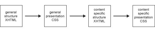
Figure 15-12. In the ideal one-way workflow, first the markup and style of the template are created. After that, the specific content is marked up, with additional styles being created if necessary, and inserted into the template.
It' s certainly easy to create wonderful CSS-driven layouts when the actual markup and content are "frozen" and known well in advance. Showcase sites, such as the seminal CSS Zen Garden clearly demonstrate the limitless possibilities offered by a pure CSS layout. However, it' s important to note that, as beautiful as many of the "garden" designs are, the underlying markup is artificial. It' s immutable, and strewn with a variety of ready-made class names and id attributes designed specifically for the purpose of styling.
Real-world content, however, is rarely predictable. It can offer interesting challenges from a markup point of view (again, because there is often no right way of marking up certain types of content), which cannot always be foreseen when designing a site template. These content types can often completely break a table-free layout that doesn' t take them into account from the start.
As a result, the actual web standards workflow may, on occasion, make it necessary to go back to the overall template style sheets, or even the underlying template structure itself, as illustrated in Figure 15-13. Good planning and experience can help to minimize this, but during the University website redesign, there were a few instances where I needed to make subtle tweaks.
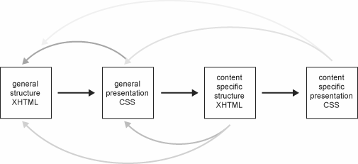
Figure 15-13. Occasionally, unforeseen content may require changes to the template styles or even the fundamental structure of the template itself.
A proper templating system would have helped considerably in this phase. Without any CMS (forgetting for a moment that most, if not all, current CMSs are far from web standards or accessibility friendly in their own right) centrally controlling the University site, this was certainly the most tedious part of the redesign process. Changes to the overall template this late in production often meant revisiting and amending any pages created up until that point. Even when these previously completed pages did not present any particular problems in their current state, it was best to change them in accordance with the revised template structure. You never know how content on those pages might change in the future, so having a consistent template avoids unpleasant surprises further down the line.
In addition to static HTML pages, the University site also features a series of simple, database-driven areas, such as news, events, and the online equivalent of the prospectus, the "course finder."
By design, database-driven pages already have a certain degree of separation of content (stored in the database) and presentation (server-side scripts used to display the content). Carrying these sections over to the new design was mostly a matter of making some minor modifications to the server-side scripts' output. Where necessary, the scripts were further altered to "massage" or postprocess the content to make sure that things like unescaped special characters stored in the database would not introduce validation problems in the final HTML output.
Historically, some of our database fields (for instance, the main body of text for each news item) already contained a certain amount of basic HTML—mainly <br> line breaks. Again, to avoid problems with invalid markup, these chunks of HTML were replaced with their valid XHTML equivalents directly in the database with a series of simple UPDATE statements, effectively running the database equivalent of a "find and replace" on any existing entries.
To try to solve the problem at the root and prevent any future data entered into the database from being malformed or invalid, I made changes to the relevant web-based administration pages for these systems, replacing any "free-form" <textarea> elements that could contain markup using a basic WYSIWYG editor. This made the process of data entry far more intuitive and usable for the majority of staff working with those systems, while guaranteeing a consistent quality of data going into the database.
It'
s worth noting that the Java-based WYSIWYG applet I originally used was itself completely inaccessible. To make the administration pages at least halfway usable, I provided a mechanism for staff to revert back to a plain <textarea>, and complemented this with a server-side cleanup routine (through a PHP implementation of Dave Raggett'
s TIDY utility to correct simple markup errors) to make sure that anything going into the database would be reasonably valid.
In the past year, the inaccessible Java applet was replaced with a slightly better alternative. XStandard, shown in Figure 15-14, is a plug-in-based WYSIWYG editor, currently available only for Windows (an OS X version is scheduled for release). Although far from perfect, it does offer keyboard access and reportedly works reasonably well with assistive technologies such as screen readers.
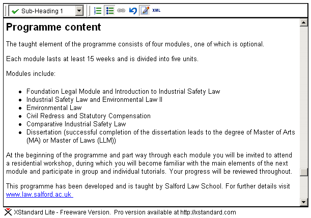
Figure 15-14. XStandard WYSIWYG plug-in.
To cover situations in which the plug-in may not be available, I took advantage of the built-in fallback functionality of the <object> element:
<object type="application/x-xstandard" ... name="[name_of_input]">
  <textarea name="[name_of_input]">...</textarea>
</object>
If the browser fails to launch the XStandard plug-in, it will once again revert back to a simple <textarea>. See my XStandard integration experiment for further details.
In all, the redesign process took approximately six months to complete. At various points throughout the redesign, both the "naked" template and a selection of completed pages were thoroughly checked for cross-browser compatibility. I conducted small, informal user testing (involving a selection of colleagues and students across the institution), mainly to inform certain decisions with regard to the site' s information architecture and the overall usability of key areas such as the course finder.
From an accessibility point of view, I employed a combination of automated checkers (particularly HiSoftware' s "Cynthia Says," checking against WCAG 1.0, aiming for Level AA or better) and informed common sense.
Having already worked with the JAWS for Windows screen reader a few months prior to the redesign (albeit, at a basic level), I was able to carry out a minimal amount of testing with it myself. It' s worth noting, though, that simply giving web designers a copy of a screen reader is not always the best idea. Without appropriate training, and an understanding of the various customizable settings of a complex program such as JAWS and how real blind and visually impaired people actually use it, there is a danger that designers may draw the wrong conclusions from their testing. It may even lead to changes in a site' s code aimed exclusively at "fixing" issues encountered in one particular piece of assistive technology.
Of course, wherever appropriate and in line with semantically correct markup, you should strive to create pages that work well with screen readers and other assistive technologies. But, as these assistive technologies, just like browsers, often behave very differently from each other, optimizing a site to work purely in JAWS, for example, may well make the experience worse for other users, and is no different from the old days of "best viewed in Netscape
." The whole idea of designing with web standards aims to overcome these types of limitations.
After a final round of validation, accessibility checks, and browser testing, the site was finally launched in September 2003. Apart from "flicking the switch," effectively turning the development site into the live site, this process also entailed setting up an extensive list of server-side redirections and URL rewrite rules, to ensure that visitors trying to access content from the old "blueberry-and-custard
" were transparently redirected to the most appropriate location on the relaunched site. Of course, it was also helpful to keep a close eye on the server'
s error logs for the first few weeks following the launch, just to check that no old URL had slipped through the net.
Figure 15-15 shows the current University of Salford website. Looking back at the list of problems present in the original site, let' s see if the redesign addresses the major issues.
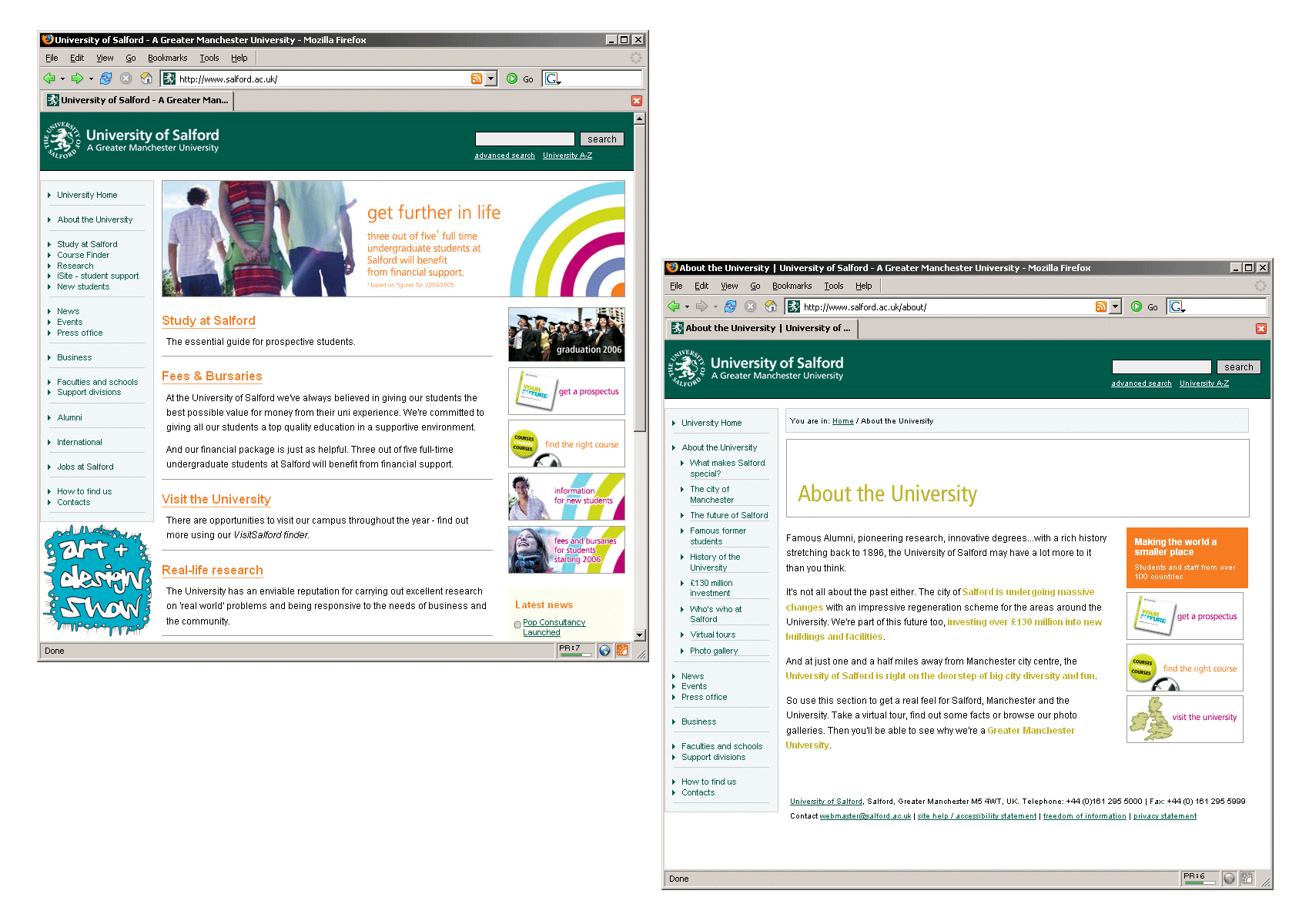
Figure 15-15. The current University homepage and a typical first-level page (despite a few design changes, we' re still using the basic structure of the 2003 templates).
From a visual design point of view, the site now falls in line with the revised corporate identity guidelines with regard to the use of color and the correct position of the new logo.
Far from presenting a dominant design feature in its own right, the overall layout is now fairly neutral. This gives increased flexibility for individual departments, and even campaign-specific sections of the main University site, to adopt their own individual identity and design while remaining within the framework of the template.
In sharp contrast with the criticism faced by the visual appearance of the old site, the redesigned University site—although admittedly a bit dry and conservative in certain text-heavy pages—has often been commended for its "professional
" appearance.
Informal user testing carried out both before and after the launch confirmed that, thanks to the breadcrumb trail and the revised navigation, users were not feeling "lost
" within the site, as was the case with the previous design.
From a technical point of view, adopting the separation of content and presentation inherent in designing with web standards yielded the results expected at the outset. By moving all layout and visual aspects to central CSS files, the HTML markup for each individual page was reduced on average by 20 to 30 percent. For the most part, working with the new "lighter" templates became a lot easier both for myself and the various departmental web authors (although some of those who had become quite adept at wrangling nested tables for their particular layout purposes were initially quite unimpressed by the need to learn a "new" way of realizing their designs).
Thanks to the print-specific style sheets, pages now look reasonable on paper, without the need for any printer-friendly pages, as shown in Figure 15-16.
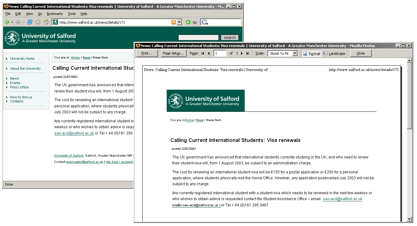
Figure 15-16. Print preview of a typical page in the new site; print style sheets hide unnecessary elements and reformat the content without the need for additional printer-friendly pages.
With any reliance on client-side scripting removed, the simple list of links that makes up the site navigation should not present any problems to keyboard users or those lacking JavaScript.
In the course of the redesign, I had the good fortune to discuss accessibility issues with Adrian Higginbotham, a blind web developer and proficient JAWS user who worked at the University of Salford at the time (later, in August 2004, he took a position as accessibility and inclusion adviser at the British Educational Communications and Technology Agency). Adrian helped to identify some of the major access problems present in the old site and give feedback on proposed changes. Commenting on the redesigned site, he wrote:
The drop-down navigation [on the old site] was poorly implemented—as soon as you highlighted an item, the navigation jumped. Not only did this make the "go" buttons redundant, but it made using the drop-down navigation with a screen reader very complex—impossible if you didn' t take advantage of some of the more advanced functions of the screen reader. It required four different single- or multi-key keystrokes to manipulate the drop-down box, not including the arrowing through the options.
With so many layout elements on each page, there was plenty for the screen reader to hook into for navigation. For example, I know that the main content always begins in the sixth table, so I can use screen reader features to skip from table to table. However, this meant that there was also lots of noncontent-related information being read out when reviewing pages, meaning that it took significantly longer to read a page than it should—poor, as listening is already slow enough compared to visually scanning. And this was the situation for someone who was very familiar with the site, as I used it several times a week (if not daily)—not at all good for someone (e.g., a prospective student) unfamiliar with the site.
Advantages of the new site: mainly the opposites of all the above. Using the quick navigation actually became "quick" rather than something to fight with when I couldn' t find what I was looking for via the textual navigation. Reading became quicker, as the volume of data my screen reader had to process was significantly reduced, but the in-page navigation remained good, as the structural elements were in place for the screen reader to hook into.
The majority of issues encountered during the redesign were largely due to my initial inexperience with XHTML/CSS. As I was effectively learning the concepts of designing with web standards along the way, I often found myself adding further changes and tweaks to the templates and pages in line with emerging best practices. This, combined with the fact that the redesign happened in parallel with the day-to-day maintenance and development on the old site, certainly contributed to the overall length of the redesign process.
As I'
ve mentioned, choosing the semantically most appropriate elements when marking up structure and content in HTML is not always a straightforward process. It'
s often a case of making an informed and pragmatic judgment call. Looking back now at the final code I produced, there are a few areas where I feel I could have taken my markup decisions a bit further. For instance, the breadcrumb trail was marked up as a simple div, with no further structure within:
<div id="breadcrumbs">
You are in: <a href="/">Home</a> /
<a href="/about/">About the University</a> / Virtual tours
</div>
Although among web standards developers' opinions differ on how to best mark up breadcrumb trails (some proposing quite convoluted solutions such as recursively nested unordered lists, vehemently proclaiming them to be "the only semantically valid way"), I would now tend to favor the view that a breadcrumb trail is an ordered list of steps to get from the site' s homepage to the current page, and probably mark it up as such:
<div id="breadcrumbs">
  <p>You are in:</p>
  <ol>
    <li><a href="/">Home</a></li>
    <li><a href="/about/">About the University</a></li>
    <li>Virtual tours</li>
  </ol>
</div>
Similarly, the complex markup I ended up with for the navigation bar could certainly be streamlined into a single list:
<ul id="navbar">
  <li><a href="/">University Home</a></li>
  <li><a href="...">About the University</a></li>
  <li>
    <ul>
      <li><a href="...">Study at Salford</a></li>
      <li><a href="...">Course Finder</a></li>
      <li><a href="...">Research</a></li>
    </ul>
  </li>
  ...
</ul>
Adding the skip to the content link as a transparent 1-pixel image with appropriate alt-text may have made the redesigned site easier to navigate for screen reader users, but it still didn'
t help another user group that could benefit from this sort of feature: sighted keyboard users. For this reason, I recently changed the skip link on the University site, as shown in Figure 15-17.

Figure 15-7. New skip to the content link, now also visible to sighted keyboard users.
In the markup, the skip link now appears as a standard link in the header:
<div>
<a href="#content" accesskey="2" id="skipper">Skip to the content</a>
</div>
Through CSS, the link is hidden from normal view, but becomes clearly visible when a user tabs to it (for example, when the link itself receives focus):
#header #skipper {
  position: absolute;
  top: 0; left: 0;
  margin: 0; padding: 0;
  text-indent: -600em;
  color: #fff;
  background: transparent;
}

#header #skipper:focus,
#header #skipper:hover,
#header #skipper:active {
  display: block;
  width: 100%;
  text-indent: 1em;
  background: #ced318;
  font-weight: bold;
  color: #000;
}
Some developers will say that skip links should always be visible, so that users who may benefit from them are aware of their presence. Again, this is a pragmatic decision that strives to strike a balance between the site' s overall aesthetics and its accessibility features. As the skip link on the University site appears in a logical position and almost immediately at the beginning of the tab order, I would argue that keyboard users (including those using screen magnifiers) will still be able to notice and take advantage of this feature.
It could be argued that skip links themselves are really a stop-gap solution, to compensate for the fact that most user agents still offer fairly rudimentary keyboard controls to navigate a website. Certainly, the onus should be on browser developers to natively provide more powerful functionality, such as the ability to skip entire block-level elements (for example, navigation marked up as lists) or moving directly between structural headings within the page—features that are already available to the majority of screen reader users. It is hoped that a future revision of the W3C User Agent Accessibility Guidelines (UAAG) might place more emphasis on this issue.
Not quite trusting my ability at the time to completely abandon any presentational markup, the redesign was carried out with an XHTML 1.0 Transitional DTD, which still allows a handful of those elements and attributes. As it turns out, the jump from the Transitional to the Strict XHTML DOCTYPE is far less traumatic than I originally anticipated. Any pages I have produced in the past few years have gone directly for the Strict DOCTYPE, and this would certainly be my preferred choice if I had to start over with any new templates today.
Even during late stages in the redesign, it was occasionally necessary to make amendments to the overall template, which then had to be reintroduced to any pages already converted up to that point. The problem was alleviated in part through a certain level of modularization in the template itself. By further splitting up the template into a series of common PHP include files, it was possible to change specific parts such as the page footer in a relatively painless fashion.
Although far from ideal, in the absence of a complete templating solution (such as a full-blown CMS or the integrated PHP Smarty template engine), it would have probably been worth exploring the client-side (from a developer' s point of view) template functionality of Dreamweaver.
Even to this day, I mainly use Dreamweaver as a glorified text editor with built-in FTP capabilities. I prefer to work directly in the code view, and use the WYSIWYG preview as a general way of quickly moving to different parts of the markup.
As a single developer, solely in charge of all phases of the conversion of the core University site, the redesign was comparatively easy. The hard part came after the relaunch of the main site: getting all the departmental web authors, with their varying skill levels, to also adopt the new, standards-based templates.
Detailed Web Publishing Guidelines, easy to understand templates, and a focus on staff development and education all played a key role in this process. Just as accessibility does not simply involve the rote mastery of all WCAG 1.0 checkpoints, but first and foremost an awareness of what the underlying issues are (why things have to be done a certain way), it was important to bring web authors on board with the concept of designing with web standards. From a pragmatic point of view, even with the tightest quality assurance processes in place, the current decentralized model of web management at the University cannot guarantee that, on occasion, a page or two will present some invalid markup, such as an unescaped ampersand or an apostrophe that was copied and pasted straight from Word and now appears in the wrong character encoding. These small errors can always be fixed (and arguably don' t immediately translate into an accessibility hurdle). The important thing is that web authors understand the benefits of the web standards approach.
This case study gave a general (albeit personal) overview of the process involved in retrofitting a fairly large site from an inaccessible and inflexible mess to a functionally accessible site, in line with modern web standards practices.
Apart from the fundamental problems with the way it was originally coded, the University of Salford site did not present complex accessibility issues such as the heavy use of Flash or audio/video files. I' ll also be the first one to admit that there are still certain unresolved issues with the current site, particularly when it comes to the occasional untagged PDF file, but overall, the site' s accessibility has improved considerably thanks to the redesign.
No great truths of web standards development were uncovered along the way, but a series of stumbling blocks that asked for some pragmatic decisions were identified. Overall, though, the process worked successfully, making this one of the first university sites in the UK to switch to web standards.
Since its launch in 2003, the site has undergone further changes and tweaks, with an upcoming rebranding planned for the upcoming academic year. With a few exceptions, though, the underlying structure of the template and site has remained the same.
Using web standards, and particularly moving to XHTML, does not automatically guarantee that a site becomes more accessible in the process. It'
s true that more recent document types like XHTML 1.0 Strict deprecate presentational attributes and elements that used to be present in HTML 4.01, as well as mandating things like alt attributes for every image, which can help in identifying potential accessibility issues through simple code validation. However, XHTML and CSS are not magic bullets, and it is still possible to create highly inaccessible sites while sticking to valid, standards-compliant code. Developers still need to understand the potential problems that users can face.
Nonetheless, separating content from presentation, using CSS rather than tables for layout, and correctly marking up a document' s structure to identify the purpose of each element certainly constitute a first step on the road to an accessible site—a solid foundation on which to build.