Chapter 1: Understanding Web Accessibility by Shawn Lawton Henry
The Web is providing unprecedented access to information and interaction for people with disabilities. It provides opportunities to participate in society in ways otherwise not available. With accessible websites, people with disabilities can do ordinary things: children can learn, teenagers can flirt, adults can make a living, seniors can read about their grandchildren, and so on. With the Web, people with disabilities can do more things themselves, without having to rely on others. People who are blind can read the newspaper (through screen readers that read aloud text from the computer), and so can people with cognitive disabilities who have trouble processing written information. People who are deaf can get up-to-the-minute news that was previously available only to those who could hear radio or TV, and so can people who are blind and deaf (through dynamic Braille displays). People with quadriplegia who cannot move their arms or legs can shop online to get groceries, gadgets, and gifts delivered. People who cannot speak can participate in online discussions, such as through blog comments.
However, this possibility is not a reality throughout the Web. The problem is that most websites have accessibility barriers that make it difficult or impossible for many people with disabilities to use them. And most web software tools are not sufficiently accessible to people with disabilities, making it difficult or impossible for them to contribute to the Web. This is a very big deal. Many millions of people have disabilities that affect their use of the Web.
Web accessibility is about removing those barriers so that people with disabilities can use and contribute to the Web. This chapter helps you get started improving your website to remove accessibility barriers and avoid adding new barriers.
What Is Web Accessibility?
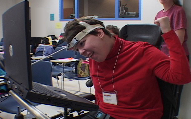
Web accessibility basically means that people with disabilities can use the Web. More specifically, web accessibility means that people with disabilities can perceive, understand, navigate, and interact with the Web. Web accessibility encompasses all disabilities that affect access to the Web, including visual, auditory, physical, speech, cognitive, and neurological disabilities. Here are just a few examples of disabilities that affect web use and some real people with those disabilities:
While access to people with disabilities is the primary focus of web accessibility, it also benefits people without disabilities. For example, a key principle of web accessibility is designing websites that are flexible to meet different user needs. This flexibility also increases general usability and lets people without disabilities use websites according to their preferences, such as using whichever browser they want and using keyboard shortcuts. Web accessibility also provides financial and technical benefits to organizations, as described in the "Additional Benefits from a Business Perspective" section later in this chapter.
There are many more examples throughout this chapter of how web accessibility benefits people with and without disabilities.
An Example of Web Accessibility: alt-text
Alternative text equivalents, called alt-text, are a clear example of web accessibility. Web pages often include images, but some people cannot see images. People who cannot see images can get the information contained in the images when web developers include alternative text equivalents for images. An alternative text equivalent provides the same functional information in text as the image provides visually. The markup for image alt-text looks like this:
<img src="thunder.gif" alt="storms" />
(By the way, alt is an attribute, not a tag.) alt-text is provided as follows:
- Read by screen readers and voicing browsers
- Displayed in text browsers
- Displayed in graphical browsers when images are not downloaded
Alt-text is rendered differently by different browsers and configurations, as shown in Figures 1-2, 1-3, and 1-4. Figure 1-2 shows a page in Microsoft Internet Explorer with images loaded and the mouse hovering over an image, which displays the alt-text (rain) in a pop-up.
Figure 1-3 shows the same page in Opera with images turned off in the browser settings. For images with alt-text provided, the alt-text is displayed. Where alt-text is missing (the middle image), IMAGE
is displayed.
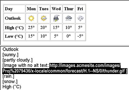
Figure 1-4 shows the display of IBM Home Page Reader set to read images without alt-text. Home Page Reader is a voicing browser that reads aloud web pages, as a screen reader does. The text in the bottom pane indicates what a person using this browser hears. At the time of the screen capture, it was reading across the Outlook row. Notice that for the image with missing alt-text, it reads the filename. (Browsers and assistive technologies handle missing alt-text differently, and some have multiple settings so the user can choose.)
These examples are missing alt-text for only one image. Imagine if all the images were missing alt-text (which is, unfortunately, quite common). In that case, a person who cannot see images wouldn't have any idea when it was forecast to be sunny or storming. However, if all the images had alt-text, a person who cannot see would get the same information as someone who can see.
With equivalent alt-text, the page is equally useful with or without images.
Many websites today use images for navigation, where missing alt-text makes the site totally unusable.
Note that providing alt-text improves accessibility without changing the visual appearance of the website. Indeed, most accessibility improvements are "under the hood" and don't change the user experience for users without disabilities.
The World Wide Web Consortium (W3C) Web Accessibility Initiative (WAI) is developing a demo site that shows an inaccessible site and then the same site with the accessibility barriers fixed, where the visual design (on a common browser configuration) is the same. To find the latest version, search for "before after demo
" on the W3C WAI site (for example, www.google.com/search?q=site:www.w3.org/WAI+before+after+demo).
alt-text is also an example of an accessibility technique that has benefits beyond accessibility for people with disabilities. The following are some ways that alt-text is useful to people without disabilities and to organizations:
alt-text is useful for people using a mobile phone, PDA, or other handheld device that doesn't display images.alt-text is useful for people who turn off image downloading because they have a slow Internet connection.alt-text can increase usability. Most visual browsers display the alt-text for an image as the image is downloading. For long downloads, this helps with both user perception and interaction. Users are likely to be less bothered by a slow image download when they are getting information about the image from the alt-text. When the image is a link, users can click the alt-text without waiting for the image to download.alt-text helps with search engine optimization.
Other Web Accessibility Examples
The alt-text example focuses on people who are blind. It's important to also address other disabilities. Here are some other web accessibility issues, along with some additional benefits:
- Captions for audio:
- Captions are text describing sound in video or audio, such as people speaking and other important sounds. Captions are vital for people who are deaf. Captions are also beneficial for people in a noisy environment who cannot hear audio, as well as for people in a very quiet environment where it is not appropriate to play audio. Search engines don't index the content of audio files; however, when you provide the captions as a text transcript, the information is available to search engines. Also, users can more easily find information in a text transcript, rather than trying to locate it in an audio file; for example, a reporter looking for a quote from a speech can search through a transcript.
- Device independence:
- Websites should be designed so that they don't require a specific type of device, such as a mouse. This also helps "power users" who are faster with keyboard shortcuts, people needing to limit mouse use due to repetitive stress injuries (RSI), and people using mobile phones and other devices without a mouse.
- Clear and consistent design and navigation:
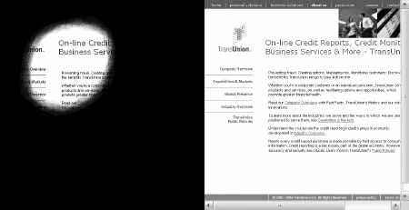
- People with some kinds of cognitive disabilities have difficulty processing visual information. They may not be able to use a site if the navigation is not clearly distinguished and consistent throughout the site. Clear and consistent design and navigation also benefit people who magnify web pages significantly and people with "tunnel vision" who see only a small part of the web page at a time. When the navigation is clearly distinguished, as in Figure 1-5, it is much easier to tell if you are in a navigation area or a content area. Clear and consistent design and navigation also help people without disabilities using mobile phones and other PDAs that have small displays (a "situational limitation"). Additionally, clear and consistent design and navigation increase usability for all users.
The preceding examples apply to websites. Examples of browser accessibility issues include providing keyboard access and the following options:
- Resizing text, images, and areas on web pages
- Turning off background images
- Changing text and background colors
Examples of authoring tool accessibility issues are in the "Interdependent Components of Web Accessibility" section later in this chapter. Now let's look at why accessibility is so important.
Web Accessibility Is Essential for Equal Opportunity
Use of the Web is spreading rapidly into most areas of society and daily life. In many countries, the Web is increasingly used for government information and services, education and training, commerce, news, workplace interaction, civic participation, health care, recreation, entertainment, and more. In some cases, the Web is replacing traditional resources. Therefore, it is essential that the Web be accessible in order to provide equal access and equal opportunity to people with disabilities. The Web is an opportunity for unprecedented access to information for people with disabilities.
Many accessibility barriers to print, audio, and visual media can be much more easily overcome through web technologies. For example, when the primary way to get certain information was go to a library and read it on paper, there were significant barriers for many people with disabilities, such as getting to the library, physically getting the resource, and reading the resource. When that same information is also available on the Web in an accessible format, it is significantly easier for many people to get. In some cases, the Web allows people with disabilities to do things that were nearly impossible without it.
The Web is also an opportunity for unprecedented interaction, enabling people with disabilities to more actively participate in society.
The dream behind the Web is of a common information space in which we communicate by sharing information.
Tim Berners-Lee, inventor of the World Wide Web, "The World Wide Web: A very short personal history"
The Web was initially designed as a medium for sharing information, where people not only read information, but they also contribute information. Ensuring that people with disabilities are able to contribute content to the Web is an important aspect of making the Web accessible. Therefore, authoring tools also need to be accessible, as described in the "Interdependent Components of Web Accessibility" section later in this chapter.
Making the Web accessible can dramatically improve people's lives and benefit society as a whole.
Understanding that web accessibility is a social issue can help position it within an organization, particularly an organization committed to corporate social responsibility (CSR). Providing an accessible website is one way an organization can demonstrate its commitment to providing equal opportunities. (And just as an accessible website demonstrates CSR, an inaccessible website demonstrates lack of CSR.) More on how web accessibility relates to CSR and to the digital divide is available in "Social Factors in Developing a Web Accessibility Business Case for Your Organization."
Benefits for People Without Disabilities
Organizations interested in CSR and the digital divide may want to know how accessibility also improves access for the following groups:
- Older people
- People with low literacy and people not fluent in the language
- People with low-bandwidth connections to the Internet and those using older technologies
- New and infrequent web users
The following sections describe the benefits for each of these groups.
Older People
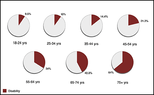
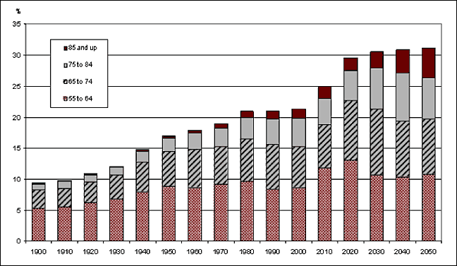
The statistics and trends point to an increasing number of people with functional limitations in the future. As we age, most people experience a decrease in vision, hearing, physical abilities, and cognitive abilities. Figure 1-6 shows the increase in disability as we age, while Figure 1-7 depicts an example increase in the aging population. (Figures 1-6 and 1-7 are used with permission of the Trace R&D Center. For data sources, see http:// trace.wisc.edu/docs/function-aging/.)
As shown in the graph in Figure 1-7, the portion of the population considered "senior
" is dramatically increasing. This has created greater interest in technologies that reduce the impact of various impairments. Older users are an important market for many organizations online.
While older people often experience changes in vision, hearing, dexterity, and memory as they age, they might not consider themselves to have disabilities. Yet the accessibility provisions that make the Web accessible to people with disabilities also benefit older people with diminishing abilities. For example, many people with age-related visual deterioration benefit from sufficient contrast between foreground and background colors. Some older people cannot use the mouse because of diminishing fine motor control and eye-hand coordination. For more information, see "Web Accessibility and Older People."
People with Low Literacy and Those Not Fluent in the Language
Accessible websites can benefit people with low literacy levels and people who are not fluent in the language of the website. Specifically, many of the aspects of web accessibility for people with cognitive disabilities help people who do not know the language well. In addition, accessible sites can be read by screen readers, so people who can understand the spoken language but not read can listen to sites.
People with Low-Bandwidth Connections and Older Technologies
Some aspects of web accessibility benefit people with low-bandwidth connections. Low bandwidth can be due to connection technology (for example, mobile phone or personal data assistant), location (for example, rural), or financial situation (a high-speed connection is unaffordable). Some older technologies load pages very slowly and don't support features used on newer sites. These issues are common in some developing countries and areas of developed countries.
People with low-bandwidth connections and older technologies can benefit from the following:
- Redundant coding for information conveyed with color, and sufficient contrast between text and background colors, for people who have devices with black-and white displays
- Text descriptions of images, for people who turn off images to speed download and for devices or software that don't display images
- Text alternatives for multimedia, for people whose older technology cannot access new multimedia formats and people whose connections are too slow to download multimedia files
- Style sheets used effectively to separate content from presentation, which can decrease file size and file download requirements, and thus increase download speed
- Sites that are organized so they can be read without style sheets, because some older technologies cannot handle style sheets (accessible pages can use style sheets and still be usable, although not great looking, when style sheets are not supported)
- Sites that are usable when scripts, applets, or other programmatic objects are turned off or not supported
New Web Users
Some people have little opportunity to use the Web because of socioeconomic issues. New and infrequent web users benefit from aspects of accessibility such as the following:
- Clear and consistent design, navigation, and links
- Redundant text links for server-side image maps
- Information about new, spawned browser windows
For more examples see the "Web Accessibility Benefits People With and Without Disabilities" section of "Social Factors in Developing a Web Accessibility Business Case for Your Organization."
Interdependent Components of Web Accessibility
Much of the focus of web accessibility has been on the responsibilities of web content developers. This view misses the crucial interdependence of other components of web development and interaction, including browsers, assistive technologies, and authoring tools.
If you understand the interdependencies between the components, you can better perform the following:
- Evaluate the source of accessibility barriers in your site. For example, if during testing you identify problems with a data table, it could be for one of the following reasons:
- The developer did not mark up/code the data table properly (most likely).
- The tester does not know how to use the assistive technology's table-reading feature (not uncommon if the tester is a novice assistive technology user).
- The tester's assistive technology doesn't facilitate reading data tables effectively (rare these days).
- Fix accessibility barriers in your site and develop effective solutions.
- Encourage accessibility improvements in the other components that would make the whole system work better and easier (see the "Call to Action" section later in this chapter).
It is essential that all of the components of web development and interaction work together in order for the Web to be accessible to people with disabilities. When the components don't fulfill their responsibilities, the result is more work for others and a less accessible web. For example, inconsistencies between browsers have by one estimate added "at least 25% to the cost of developing all sites"
because of the extra effort required of content developers (Web Standards Project, "WaSP: Fighting for Standards").
Improvements in browsers, authoring tools, and other components could significantly reduce the amount of effort spent on accessibility overall and substantially improve web accessibility. For example, if the few hundred authoring tools provided ample accessibility support, it would save many millions of content developers an untold amount of effort on accessibility and result in much more accessible sites. (Authoring tools cannot automatically take care of all accessibility issues. There will always be things that developers need to do for accessibility. However, there are many ways that tools can facilitate accessibility and make it much easier.)
Description of Components
One way to look at the components is grouped by technical and human. The following can be considered the technical components:
- Web content: Generally refers to the information in a web page or web application, including text, images, forms, sounds, and such, as well as the markup and code that defines the structure, presentation, and interaction.
- Technical specifications: Refers to Extensible Hypertext Markup Language (XHTML), Cascading Style Sheets (CSS), and such. They are also called web technologies and markup languages.
- Authoring tools: Refers to any software or service that developers use to produce, create, or modify web content, including these:
- Web page editors (such as Dreamweaver, FrontPage, and so on)
- Word processors and desktop publishing software that save files in web formats
- Tools that transform documents into web formats, such as filters to transform desktop publishing formats to HTML
- Multimedia tools
- Content management systems (CMSs), tools that automatically generate websites dynamically from a database, on-the-fly conversion tools, and website publishing tools
- Websites that let users add content, such as blogs, wikis, and sites like Flickr and MySpace
- Evaluation tools: Software programs or online services that help determine if a web page meets accessibility guidelines or standards. See the "Myth: Evaluation Tools Can Determine Accessibility and Conformance" section later in this chapter for more about evaluation tools.
- User agents: Web browsers, media players, assistive technologies, and other software that people use to access and interact with web content.
- Assistive technologies: Software and hardware that people with disabilities use to improve interaction with the Web. Examples include screen readers that read aloud web pages for people who cannot see or read text, and voice-input software and switches for people who cannot use a keyboard or mouse. An official definition is: any item, piece of equipment, product, system or software, whether acquired commercially off the shelf, modified, or customized, that is used to increase, maintain, or improve functional capabilities of individuals with disabilities.
The human components of web accessibility are as follows:
- Tool developers: The people and organizations who develop user agents, assistive technologies, authoring tools, and evaluation tools.
- Users: People using the Web, sometimes called website visitors.
- Content developers: The people and organizations who design, code, write, edit, update, and otherwise create web content. This includes web programmers, graphic designers, technical writers, project managers, blog commenters, wiki contributors, secretaries who edit their organization's website, and others.
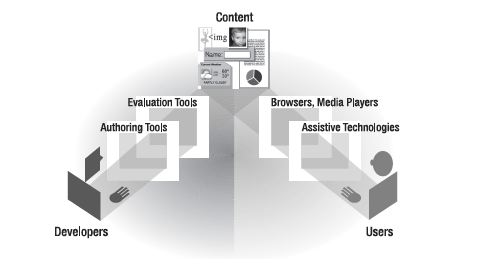
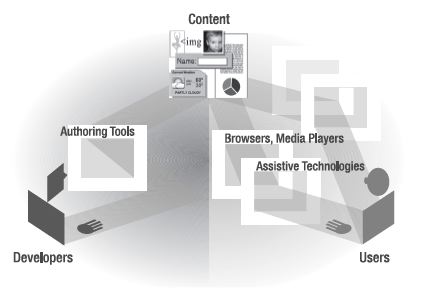
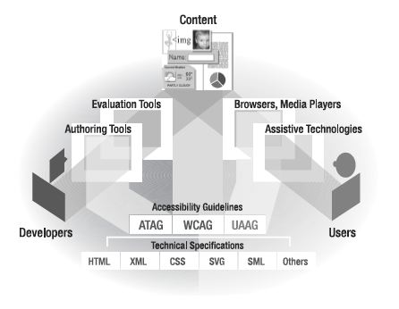
Figure 1-8 illustrates the relationship between the basic components of web accessibility. Content developers usually use authoring tools and evaluation tools to create web content according to technical specifications. Users use web browsers and sometimes assistive technologies to get and interact with the content. Tool developers provide features and functionality in their authoring tools, evaluation tools, and user agents based on user needs (well, really, market demands).
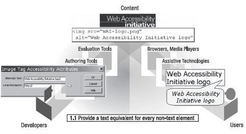
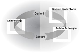
Figures 1-8, 1-10, 1-11, and 1-12 are based on art by Michael Duffy, DUFFCO. See www.w3.org/WAI/intro/components ©W3C.
Let's look at providing and using alt-text for images as an example of how the components must work together in order for the Web to be accessible. Figure 1-9 illustrates the responsibilities of the components.
The technical components have the following responsibilities for alt-text:
- Technical specifications: Provide a standard for marking up
alt-text. For example, in HTML 4.01 the img element used to put images into content has an alt attribute for a text alternative for the image. The World Wide Web Consortium (W3C) HTML 4.01 Specification describes alt as follows:
For user agents that cannot display images, forms, or applets, this attribute specifies alternate text. The language of the alternate text is specified by the lang attribute.
Specifying alternate text assists users without graphic display terminals, users whose browsers don't support forms, visually impaired users, those who use speech synthesizers, those who have configured their graphical user agents not to display images, etc.
The alt attribute must be specified for the IMG and AREA elements.
- Authoring tools: Enable, facilitate, and promote providing
alt-text. The interface to insert an image and provide alt-text should also be accessible to content developers with disabilities.
- Evaluation tools: Check that
alt-text exists and help determine if it is appropriate.
- User agents: Provide human and machine interfaces to the
alt-text.
- Assistive technologies: Provide human interfaces to the
alt-text in different modalities, such as in synthetic speech.
The Web Accessibility Initiative (WAI) guidelines, which are described in the "Bringing Together the Components" section later in this chapter, define how to implement alt-text for accessibility in the different technical components.
The human components have the following responsibilities for alt-text:
- Content developers:
- Provide the appropriate
alt-text, often using authoring tools and evaluation tools.
- Users:
- Need to know how to get the
alt-text from their user agent and assistive technologies.
- Tool developers:
- Provide the functionality of authoring, evaluating, and rendering
alt-text in the tools.
Accessibility in the Implementation Cycle
The interdependencies between components have historically led to a "chicken-and-egg
" problem of who goes first in implementing an accessibility feature. Figure 1-10 illustrates this implementation cycle without a clear beginning.
If an accessibility feature is not implemented in one component, there is little motivation for the other components to implement it when it does not result in an accessible user experience. For example, content developers are unlikely to implement an accessibility feature that most browsers or assistive technologies do not implement consistently or that is difficult to do with their authoring tool. Similarly, browser developers have little motivation to support accessibility features that are not implemented in most content. And authoring tools have little motivation to add accessibility support when content developers (their customers) are not demanding it. The result is that some accessibility features are not implemented at all, and others take a long time to be implemented in all components effectively.
When accessibility features are effectively implemented in one component, the other components are more likely to implement them. The "Call to Action" section later in this chapter discusses ways to encourage implementation of accessibility features throughout the components.
Technical specifications must also be designed with accessibility in mind; otherwise, the technology might not support necessary accessibility features. Indeed, many web technologies were developed without accessibility support.
Due largely to customer demand, technologies such as Portable Document Format (PDF) and Flash are improving their accessibility support.
Many web technology organizations now have explicit focus on accessibility. The W3C's Protocols and Formats Working Group (PFWG) coordinates across W3C Working Groups to improve the level of accessibility support in W3C technical specifications. The PFWG works to ensure the following:
- Web content and applications implemented using the specified technologies can be adapted for people with disabilities.
- Web technologies interoperate well with assistive technologies.
- Accessibility features are integrated into and a natural part of technical specifications and do not require a high level of additional effort by content developers.
Compensating for Weak Accessibility Support
If one technical component has poor accessibility support, sometimes other components can compensate through work-arounds that require extra effort both initially to create and in the long-term to maintain. Figure 1-11 illustrates the compensation for lack of accessibility support in tools.
When authoring tools and user agents do not support an accessibility feature, sometimes the content developer can do more work to compensate with work-arounds. For example, if the authoring tool does not produce accessible markup, the content developer can write the markup "by hand." If a user agent does not provide the ability to navigate through the structure of the content, the content developer can provide additional navigation within the web content.
In some cases, users can compensate for lack of accessibility in browsers or content by using different combinations of user agents or assistive technologies, even for the same web page. Unfortunately, for many accessibility issues, there is no work-around for the user, and the content is inaccessible.
Bringing Together the Components
The W3C WAI (www.w3.org/WAI) helps coordinate international web accessibility efforts to bring together the technical and human component considerations. Figure 1-12 illustrates how WAI's work fits into the components of web accessibility. WAI works with the following:
This coordinated effort developing accessibility guidelines provides the framework for how the components can work well together. It defines what each component needs to do for accessibility. This also helps reduce the chicken-and-egg problem by clarifying what each component should expect from the others.
Authoring Tool Accessibility Guidelines (ATAG)
The ATAG documents explain how to make authoring tools accessible to people with disabilities and define how authoring tools should help web developers produce web content that conforms to WCAG. Through prompts, alerts, templates, and other features, authoring tools can enable, encourage, and assist content developers to create accessible web content. As described earlier, people with disabilities must also be able to contribute content. Therefore, the authoring tools themselves must be accessible.
While ATAG is primarily written for authoring tool developers, ATAG and supporting documents are also intended to meet the needs of many different audiences, including policy makers, managers, and others. For example, the following may use ATAG:
- People who want to choose authoring tools that are more accessible can use ATAG to evaluate authoring tools (see "Selecting and Using Authoring Tools for Web Accessibility").
- People who want to encourage their existing authoring tool developer to improve accessibility in future versions can refer the authoring tool vendor to ATAG.
ATAG 1.0 was published as a W3C Recommendation in February 2000. ATAG 2.0 is currently under development to clarify minor issues with ATAG 1.0 and to update references to other guidelines.
A W3C Recommendation is a specification or set of guidelines that, after extensive consensus-building, has received the endorsement of W3C Members and the Director. W3C recommends the wide deployment of its Recommendations. Note that W3C Recommendations are similar to the standards published by other organizations. See more details on the W3C Technical Report Development Process.
Web Content Accessibility Guidelines (WCAG)
The WCAG documents explain how to make web content accessible to people with disabilities. WCAG is written for content developers as well as for the following:
- Authoring tool developers to create tools that generate accessible content
- User agent developers to create tools that render accessible content
- Evaluation tool developers to create tools that identify accessibility issues in content
WCAG 1.0 was published as a W3C Recommendation in May 1999. The WCAG 2.0 documents are being developed to apply to more advanced web technologies, be easier to use and understand, and be more precisely testable.
For more up-to-date information on WCAG, see "Web Content Accessibility Guidelines (WCAG) Overview)" and "Overview of WCAG 2.0 Documents".
User Agent Accessibility Guidelines (UAAG)
The UAAG documents explain how to make user agents (web browsers, media players, and assistive technologies) accessible to people with disabilities, and particularly to increase accessibility to web content. For example, UAAG defines that users should have control over how browsers display content, and browsers should use standard programming interfaces to enable interaction with assistive technologies.
UAAG is primarily for user agent developers. UAAG and supporting documents are also intended to meet the needs of many different audiences, including policy makers, managers, and others. For example, the following may use UAAG:
- People who want to choose user agents that are more accessible can use UAAG to evaluate user agents.
- People who want to encourage their existing user agent developer to improve accessibility in future versions can refer the user agent vendor to #.
UAAG 1.0 was published as a W3C Recommendation in December 2002.
Approaches to Web Accessibility
The importance of accessibility to people with disabilities and the benefits to others are rarely reflected in how organizations and individuals approach accessibility. Many web projects look at accessibility guidelines and evaluation reports well into the development cycle. There are guidelines that should be at the center of your accessibility efforts—just not the only focus. This section suggests a different approach.
Start Now
Accessibility is often left for the end of web projects. At the end, it costs more and is burdensome and frustrating. For example, if you wait until the end, you could find that your authoring tool or CMS complicates accessibility, whereas a different one with good accessibility support would have made designing an accessible site much easier. Or you could find that one simple thing you did wrong has been propagated throughout the entire website. If you had done it right from the start, it would have taken almost no effort; to go back and fix it will take significant effort.
Incorporating accessibility from the beginning of a website development or redesign process is significantly easier, more effective, and less expensive than waiting until the end of a project. When accessibility is incorporated from the beginning, it is often a small percentage of the overall website cost. (If you already have a website and are going back to address accessibility, most of the following advice still applies, and the "Accessibility Barriers on Existing Sites" section later in this chapter provides additional guidance.)
Start by Understanding the Issues
When people do finally get to accessibility in their project, most approach it as a checklist to tick off. They dive into standards. They run an evaluation tool. Then they are totally overwhelmed. To use a few expressions, they started by "drinking from a fire hose" and became "deer in the headlights."
This approach also has problems (besides turning you into a soaking wet deer about to be hit by a truck). If your project uses only accessibility standards, it will take longer, be more frustrating, and produce less effective results.
Here is an example: A developer (who doesn't know what it's like to use a screen reader) comes to the guideline "Provide text alternatives for all non-text content." To meet this guideline, the developer provides the alt-text: "This image is a line art drawing of a dark green magnifying glass. If you click on it, it will take you to the Search page for this Acme Company website." He writes similarly verbose alt-text for hundreds of different images on his website. He has just wasted a whole lot of time and effort on a totally ineffective solution. For the image that takes you to the search page, the alt-text "Search" is all that was needed. His overly descriptive text throughout the site will be extremely frustrating for people who need the alt-text, because they will have to wade through all the extraneous information.
I have a collection of real-life examples of accessibility efforts gone wrong. A couple are amusing, like the following markup for decorative images: <img src="blue-space.gif" alt=" ">. But most are sad, such as the developer who had coded by hand for every cell in several large data tables: <td> <td .. <td row="1" col="1">... row="1" col="2">... . row="57" col="15">...
It's regretful when developers spend a lot of time but their efforts are ineffective, just because they didn't have some basic understanding of accessibility and how people with disabilities use the Web. There is a better approach that can save you from wasting effort developing ineffective solutions.
Before jumping into guidelines, before studying evaluation tool results, first understand the issues. Learn the basics of how people with disabilities use the Web.
You can find many free resources to help understand accessibility issues. For example, "How People with Disabilities Use the Web" describes in detail how different disabilities affect web use and includes scenarios of people with disabilities using the Web, and "Introduction to the Screen Reader" is a short video. Organizations that can afford it might want to engage a web accessibility consultant or employee who has firsthand experience with how people with different disabilities interact with the Web
Involve People with Disabilities in Your Project
After some background reading, the best way to understand accessibility issues is to actually work with some people with disabilities to learn how they interact with the Web and with assistive technologies. This will give you firsthand experience with accessibility barriers and solutions.
Including people with disabilities in your project may seem like a daunting proposition. Stick with me for a bit; there's a lot of guidance in this section and references to more. While it might be out of the question for some small projects, if you can do it, it will be well worth the effort.
From a little effort to include people with disabilities in your web development, you will get a lot of benefit, including the following:
- Motivation: When web developers, managers, and other project stakeholders see people with disabilities use their website, most are highly motivated by a new understanding of accessibility issues.
- Efficiency: Including users with disabilities early in a project helps web developers be more efficient in addressing accessibility, thus maximizing the results from investment in accessibility. You can more quickly develop accessibility solutions, and spend less time guessing and having to go back and fix things.
- Effectiveness: The better you understand the issues, the better you can implement more effective accessibility solutions (for example, using "
search" for alt-text instead of "this image is a line art drawing of a dark green magnifying glass ...").
Recruiting People with Disabilities
Start by finding a few people with disabilities. "Recruiting Participants with Disabilities" lists places to contact when looking for people with disabilities. Find people close to your "target users." For example, if your site is about applying for college loans, it would be better to get an 18-year-old rather than an 80-year-old.
Find people who are fairly experienced using the Web. Later in testing you might want to include some novices, but for now, you want people who can teach you well. The "Users' Experience Interacting with the Web" section of "Involving Users in Web Accessibility Evaluation" includes a bit about considerations for people's experience with their assistive technology (which applies when including users at the beginning of projects, as well as for evaluation later).
Include more than one person, with different disabilities. People with disabilities are as diverse as any other people. They have diverse experiences, expectations, and preferences. They use diverse interaction techniques, adaptive strategies, and assistive technology configurations. People have different disabilities: visual, auditory, physical, speech, cognitive, and neurological—and many have multiple disabilities.
Even within one category, there is considerable variation; for example, "visual disability" includes people who have been totally blind since birth, people who have distortion in their central vision from age-related degeneration, people who temporarily have blurry vision from an injury or disease, and more. A common mistake is assuming that people who are blind represent all people with visual disabilities.
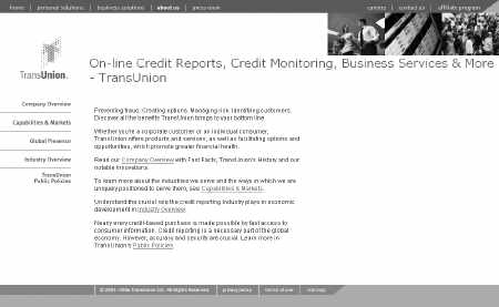
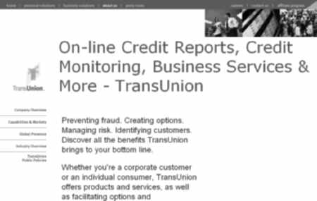
Figures 1-13, 1-14, and 1-15 demonstrate very different needs of people whose conditions are both in the broad category of "low vision." Figure 1-13 is a web page in a common configuration with default settings. Figure 1-14, is a sample setup of a person with blurry vision (poor visual acuity), who needs to increase font and image size to be able to read the page. She also maximizes her browser window and wants the web page to use the full width so that the text line length isn't too short, as it is in Figure 1-14. Figure 1-15 is a sample setup of a person with tunnel vision and good eyesight (sharp visual acuity). He makes fonts and images small so that he can see more at a time. It's easier for him to read when the line lengths are shorter, so he wants to be able to decrease the window width and have the text reflow (rather than requiring horizontal scrolling, as shown in Figure 1-15).
Because of this diversity in user needs, ideally you would include several users with different disabilities and user characteristics. In reality, the number of users will be limited by time and money constraints. That's okay, because you have a resource to cover the diversity (WCAG, as explained in the "Understand the Vital Role of Guidelines" section later in this chapter). For some guidance on choosing which disabilities to include in your recruiting, see "Determining Participant Characteristics." While it's written for usability testing, some of the information applies to including users early in a project.
In deciding the number of people with disabilities to include, consider that users with disabilities also address general usability issues. For example, if you do usability testing with people with disabilities, you will find both accessibility issues and general usability issues that impact all users (including users without disabilities). Knowing that people with disabilities also address general usability can help get more time and money budgeted to include people with disabilities throughout your project.
When recruiting people with disabilities and planning to work with them, remember that if a person uses specific assistive technology, you'll need to arrange for it during your work together. If she has a laptop that she can bring to your site, that's probably best. If not, you could get the assistive technology for your site. However, many assistive technologies are very expensive and demo versions are limited. Also, people may have their own system customized, and that might be difficult to reproduce with your configuration. This is less likely to be a problem with an advanced user. In some cases, it might be best to go to the user's work or home, rather than having the user come to you. A downside to this is that fewer people from your project team get hands-on interaction.
Learning from People with Disabilities
Once you're sitting down with the user, make sure that he had a chance to get the computer and assistive technology set up how he likes. Then start out having him show you some websites that work well for him. It's important to do this first, so you get an idea how things can work well, and he can confirm that the setup is as he expects. Ask a lot of questions to learn how things work. Then you can have him show you things that don't work. Keep in mind that any problems are probably because of the site markup or design; however, if your user is a novice, there is a chance he doesn't know how to get his assistive technology to work with the site. If you already have a website that you are modifying, have him go over your website, particularly the areas that you are redoing. If you already have an idea of how you might redesign your site, ask him to use sites that have similar design, such as sites with the same type of navigation interaction.
Tell your users ahead of time what you'll want them to do. Ask them to prepare to show you good sites and bad sites. Tell them which sites you want them to show you, and what things to concentrate on, such as navigation, data tables, or forms. The better prepared they are, the more comfortable everyone will be and the more you'll get out of it.
To maximize the benefit of this time with users, include several people from your web project: developers who will be doing the coding, managers who approve the budget, and so on. Consider videotaping it to share with those who couldn't participate. Of course, make sure you find users who are comfortable with this. Some people will appreciate a large audience learning about accessibility; others would be uncomfortable with several people watching them.
In addition to involving users early in a project to help you understand accessibility issues, include them throughout the project as you develop accessibility fixes for existing sites or prototypes for new projects. When you have a draft (of a form, or navigation scheme, page layout template, or anything in between) that you are considering, have your users with disabilities test it. That way, you can make any necessary fixes before you propagate it throughout your site.
A word of caution: Avoid assuming that feedback from one person with a disability applies to all people with disabilities. A person with a disability doesn't necessarily know how other people with the same disability interact with the Web, nor know enough about other disabilities to provide valid guidance on other accessibility issues.
More information on including people with disabilities is included throughout "Usability Testing for Accessibility." This is written for formal usability testing, so some of it won't apply to informal interaction early in project development. Much of it does apply, such as ensuring the facility is accessible, setting up the room, and interacting with people with disabilities. Don't worry about getting everything just right. As long as you are respectful, most people with disabilities will appreciate your efforts and not be bothered by any blunders.
To learn more about how to effectively involve users, turn to the usability field and the user-centered design (UCD) process, which we'll look at next.
Understand the Relationship Between Accessibility and Usability
UCD is a user interface design process that focuses on usability goals, user characteristics, environment, tasks, and workflow in the design of an interface, such as a website. UCD follows a series of well-defined methods and techniques for analysis, design, and evaluation. The UCD process is an iterative process, where design and evaluation steps are built in from the first stage of the project and throughout implementation. Accessible design techniques fit well into UCD processes. With a few additions and adaptations, design teams can use UCD practices to focus design on accessibility.
While there is a lot of overlap between accessible design, UCD, and usability, the relationship between accessibility and usability is not clear-cut.
First, let's start with a definition of usability. The International Organization for Standardization (ISO) defines usability as the "extent to which a product can be used by specified users to achieve specified goals effectively, efficiently and with satisfaction in a specified context of use"
(in ISO 9241-11: Ergonomic Requirements for Office Work with Visual Display Terminals, Part 11: Guidance on Usability). Using this definition, accessibility focuses on the following:
- Including people with disabilities as "specified users"
- A wide range of situations, including assistive technologies, as the "specified context of use"
Put more simply, usability means designing your website to be effective, efficient, and satisfying. Accessibility makes sure it is effective, efficient, and satisfying for more people, especially people with disabilities, in more situations—including with assistive technologies.
Looking at definitions is easy. In practice, the relationship between accessibility and usability is more complex. For some people, it's a hotly debated topic. For most people, it's not an issue at all: When designing websites, it is rarely useful to differentiate between usability and accessibility.
However, there are times when the distinction between accessibility and usability is important, such as when looking at discrimination against people with disabilities and when defining specific accessibility standards. Yet the distinction is a common debate when defining accessibility standards such as WCAG. It is not clear what should be included in accessibility standards and what is purely usability and should not be included in accessibility standards.
One way to start looking at the distinction between the two is to categorize interface problems:
- Usability problems impact all users equally, regardless of ability; that is, a person with a disability is not disadvantaged to a greater extent by usability issues than a person without a disability.
- Accessibility problems decrease access to a website by people with disabilities. When a person with a disability is at a disadvantage relative to a person without a disability, it is an accessibility issue.
The distinction between usability and accessibility is especially difficult to define when considering cognitive and language disabilities. Many of the accessibility guidelines to improve accessibility for people with cognitive disabilities are the same as general usability guidelines. The distinction is further blurred by the fact that features for people with disabilities benefit people without disabilities because of situational limitations (that is, limitations from circumstance, environment, or device—such as using the Web on a mobile phone in bright sunlight with one hand because you're holding a sleeping baby with the other), and accessibility increases general usability.
Another point to cloud the distinction is "usable accessibility"—how usable
are accessibility solutions. For example, if a site uses images for navigation
and there's no alt-text, the site is clearly not accessible. If the site has frustratingly verbose alt-text (such as "This image is a line art drawing of a dark green magnifying glass. If you click on it . . ."), one might say that the site is technically accessible because there is alt-text; however, the alt-text is so bad that the usability of the site is awful for anyone who relies on the alt-text (which won't happen when you understand accessibility issues and include people with disabilities in your project).
There can be problems when people don't understand the issues around the distinction between usability and accessibility. For example, if a study reported that sites were not accessible but the problems were general usability issues (that impact all users, not just users with disabilities), the study could report incorrect conclusions about accessibility guidelines. Academic discussions of accessibility and usability can actually harm the cause of accessibility if they are not presented carefully for people who don't understand the complexity of the issue.
The bottom line on the issue of the relationship between accessibility and usability can be summarized as follows:
- Clearly, there is significant overlap between the two.
- The nuances of how they relate is of no consequence for most web development, which should have as its goal both accessibility and usability for all.
- In some specialized situations, such as legal policies, the distinction is important.
- It's a tricky issue; be careful what you do with it.
Using both UCD and WCAG as the basis for addressing accessibility ensures that the broad range of issues is covered well, at both the technical level and the user interaction level. You should be able to get most of what you need from WCAG. Involving users and using the UCD approach makes it easier and better.
For more on this topic, see "The Relationship Between Accessibility and Usability" and "Accessibility in the User-Centered Design Process."
Understand the Vital Role of Guidelines
Now to a topic that is clearer: the role of guidelines in web development projects. I've talked a lot about including people with disabilities in your web development project. While there are many benefits, that alone will not lead you to develop an accessible site, because even large projects cannot include the diversity of disabilities, adaptive strategies, and assistive technologies that would be necessary to sufficiently cover all the issues. WCAG covers the diversity. It was developed with input from people with many different backgrounds, experiences, and perspectives from around the world.
WCAG is comprehensive, covering the wide range of accessibility issues and addressing all disabilities in all situations, as much as possible.
There are other web accessibility guidelines and standards; probably the most well known is Section 508 in the U.S. But note that the web provisions in Section 508 cover only a small subset of WCAG, and a site that meets Section 508 Standards will not be fully accessible to some people with disabilities.
WCAG 1.0 was published in 1999 and is still the stable reference version. WCAG 2.0 is in development and nearing completion. In April 2006, WAI published fairly complete Working Drafts of WCAG 2.0 and very robust supporting documents "Understanding WCAG 2.0", "Techniques for WCAG 2.0", and "Overview of WCAG 2.0 Documents." The April 2006 versions are sufficiently complete to start using as reference material for web development. Although some details may change between now and finalization of the documents, the main points are stable, and WCAG 2.0 is much more robust and flexible than WCAG 1.0.
While I suggest starting with users rather than guidelines, I also suggest that WCAG be central in web development projects. In most cases, the WCAG documents will be the primary reference for accessibility information. A common pattern would be as follows:
- First read about how people with disabilities use the Web. Learn from some real users the basic issues around accessibility barriers and solutions, and generally how common assistive technologies work.
- Mostly use WCAG and supporting documents throughout development to make sure you are covering all issues and for implementation techniques.
- Work with your users as you develop accessibility solutions to check that the solutions are effective.
WCAG should be the guiding force in accessibility efforts, yet be careful to keep it in perspective. The goal of accessibility is not to check off a guidelines list; the goal is to make your site accessible. Using WCAG helps ensure that all issues are addressed, and involving people with disabilities helps address them efficiently and effectively.
Accessibility Barriers on Existing Sites
It's all well and good to say that the best time to start accessibility is at the beginning of a project. However, most websites are already out there. Most were developed without considering accessibility and have accessibility barriers that make it difficult or impossible for some people with disabilities to use the site. Some sites have several significant barriers; others have only a few minor barriers. Sites developed to meet web standards such as XHTML and CSS usually have fewer barriers.
This section provides specific guidance for fixing accessibility barriers in existing websites; in other words, repairing accessibility problems, or retrofitting a site to improve accessibility. The previous sections also apply to retrofitting.
Fixing accessibility barriers on an existing website can be simple or complex, depending on many factors, such as the type of content, the size and complexity of the site, and the development tools and environment. Sometimes, complex sites are easier to fix than simple sites because they use templates and CMS.
The key word for retrofitting is prioritize (to avoid the whole wet-deer-in-headlights thing).
In order to define a prioritized retrofitting plan, it is usually best to first identify all of the accessibility barriers on your site. However, if you have a few serious accessibility barriers that are fairly easy to repair, it may be best to fix those immediately before going further. For example, if your primary site navigation is images without alt-text and you can fix it once in a template that takes care of the whole site, do that first.
Focusing Evaluation
Evaluating before retrofitting has specific goals: to define the accessibility barriers on your site and gather information to help plan an efficient retrofitting project. Rather than thoroughly evaluating every page on your site, you can focus on representative areas in order to get more valuable information with less effort. For example, elements that are the same across pages, such as navigation bars and footers, need to be evaluated only once and can then be skipped on pages where they are repeated. Make sure that your evaluation covers each feature and functionality (for example, data tables, forms, and scripts) from each developer or development group.
Evaluation can focus on specific points to help guide your retrofitting plan, such as determining if a particular accessibility barrier is widespread or isolated. For example, if only a few of your data tables are missing necessary markup, your retrofitting plan would include adding table markup to quality assurance (QA) processes. However, if none of the tables are properly marked up, you would add data table markup to your education plan. If tables from one development group are done properly, but those from another development group are not, this further clarifies where education is needed.
Prioritizing Evaluation and Repairs by Area
One aspect of prioritizing retrofitting is determining which areas of your website to work on first. It is usually best to first evaluate and repair the areas that have the greatest impact on users' experience with your website. Depending on how your site is developed, you may be able to repair many barriers through the following:
- Templates that impact many pages
- Style sheets that impact many pages
- Elements that impact many pages, such as navigation bars and scripts
Certain pages have higher priority, such as these:
- The homepage, which is often the first entry point to the site
- The main pages and functionality based on the purpose of the site (such as ordering products for an office supply site), including the following:
- The path to get there from the common entry points (usually the homepage, but can be other pages as well)
- The path to complete transactions (such as entering shipping address, payment details, and so on)
- Frequently used (high-traffic) pages and functionality, including the path to get there and complete transactions
Prioritizing by area helps scope what to do first. Prioritizing by barriers, described next, helps determine what to do first from a different perspective.
Prioritizing Repairs by Barrier
Accessibility barriers are often identified by WCAG 1.0 checkpoints. Each checkpoint has a priority (Priority 1, Priority 2, or Priority 3) that helps determine the impact of a particular accessibility barrier. An approach to retrofitting is to fix all of the Priority 1 barriers first, and then fix lower-priority barriers later. However, this approach has several disadvantages: You must go back over templates, style sheets, and pages multiple times; you will miss easy-to-do, lower-priority items; and you can get hung up on a few hard problems, instead of getting a lot of easy things done quickly.
A more effective approach in most cases is to do all of the high impact and easy repairs while you are working on a page, template, style sheet, and so on. Then address harder problems later. This approach has several advantages: It usually takes less time overall, and you get many fixes done quickly. This helps make your website more accessible sooner and demonstrates your commitment to improving the accessibility of your website as soon as is feasible.
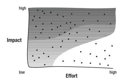
Consider two parameters for prioritizing the order in which to address accessibility barriers: impact and effort. For each accessibility barrier, determine the following:
- Impact on people with disabilities: The actual impact on users of a specific barrier depends on the context of your site. For example, poor color contrast in the main content has high impact on some people with disabilities, whereas in generic footers, it may have low impact. Evaluating with users with disabilities, as described earlier in this chapter, helps determine the impact of accessibility barriers in your website.
- Effort required for repair: The time, cost, and skills to repair a barrier vary greatly based on parameters such as the type of repair and your development environment. For example, repairing barriers in navigation could require a simple change to the template that is automatically propagated throughout the website, or it could require changing every page manually. Repairing missing
alt-text equivalents requires knowing the content and understanding how the text is used; whereas changing a site to effectively use style sheets requires CSS skills.
Imagine that you plot the repairs on a graph with impact on people with disabilities on one axis and effort required for repair on the other, as in Figure 1-16. Your retrofitting project should cover all those repairs that have high impact, and all the repairs that are easy. Repairs that are lower impact and harder to do can be left for later (often in conjunction with a redesign project).
Focusing evaluation to answer the specific questions for retrofitting, prioritizing by area, and prioritizing repairs by barriers helps you to define an effective retrofitting plan.
Harmful Myths About Web Accessibility
There are many myths about web accessibility. A few have some basis, but are focused on one side of the issue and are mitigated when you look at the whole picture. Several are downright wrong. Many of the myths hurt the cause of accessibility overall. I hope that you'll take a little time to understand the truths and help clarify the myths for others.
Long ago (in web time), it was nearly impossible to make visually appealing, complex, dynamic websites that were also accessible. Web technologies didn't adequately support accessibility, and they were not robust enough to provide elegant ways to produce complex visual designs. Web browsers also had little accessibility functionality. Common assistive technologies were not able to handle complex web page designs; for example, screen readers read across the screen, so multicolumn newspaper-style layouts were not usable. Back then, web developers wanting to make accessible sites were faced with the choice of either significant constraints on their design or providing a separate text-only version.
Now technologies let you develop visually appealing, complex, dynamic websites that are also accessible. Web technologies (such as XHTML and CSS), browsers, and assistive technologies have evolved. Style sheets offer more presentation functionality. Browsers provide text resizing. Assistive technologies can handle complex tables.
There is no longer a need to make text-only versions for accessibility, and there hasn't been for quite some time.
This history is part of the reason behind the first two myths I'll cover here: that text-only versions are an acceptable accessibility solution and that accessibility makes sites dull and boring.
Myth: Text-Only Versions Are an Acceptable Solution
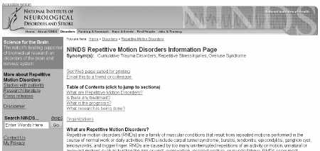
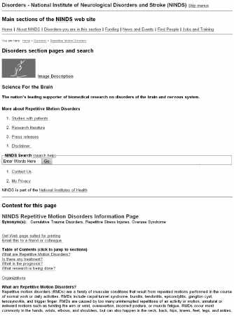
Text-only versions refer to pages without images or graphics, and often with singlecolumn layout, little or no color, and simplified navigation interaction. Figure 1-17 shows a main site page (National Institute of Neurological Disorders and Stroke, NINDS, www.ninds.nih.gov/disorders/repetitive_motion/repetitive_motion.htm), and Figure 1-18 is the text-only version of the same page.
Text-only versions should have disappeared long ago, but unfortunately, they are still around. Text-only versions are not adequate accessibility solutions for several reasons.
Most text-only versions are not accessible for some people with disabilities. In Figure 1-17, the navigation in the main site is easy to distinguish because of the design and colors. The navigation is difficult to distinguish in the text-only version in Figure 1-18. People with some types of cognitive disabilities would not be able to use this text-only version because they couldn't differentiate the navigation from the content.
Separate versions are rarely fully equivalent and often outdated. When there are two versions of a website, invariably, the text-only version doesn't get updated as frequently as the main version. Even when organizations and individuals have the best intentions of keeping two versions in sync, the realities of deadlines and limited resources interfere. Some tools generate both a main version and a text-only version from a single source of content, supposedly eliminating the problem of separate versions not being in sync. Other tools facilitate creating a text-only version of an existing site. Despite claims that these tools provide totally equivalent versions, I have yet to see it. In one such implementation that I reviewed, the text-only version was fairly close in content with the main site; however, the text-only version was missing promotional material. Therefore, users of the textonly version missed out on special offers available through the website. This was not only not equivalent, but in this case, it also was discriminatory.
The main version often lacks even the most basic accessibility. When organizations develop text-only versions, they usually spend little effort to make the main site accessible. Many people with disabilities can use websites with only minor adjustments. For example, take the case of a person who has low vision where she can read text that is just a little larger than what most sites use by default. She doesn't need screen magnification software (which is costly), and instead just increases the text size through browser settings. Providing basic accessibility in the main site allows her and others like her to use it, rather than forcing them to use text-only versions that are usually much more difficult for sighted people to use, as demonstrated in Figure 1-18. Also, people who regularly use the main site may sometimes have accessibility issues from temporary disability or situation limitation (for example, they break their arm, break their glasses, or break their mouse). If the main site is inaccessible, they would be forced to use the text-only version that looks and acts very differently from the one they are used to using.
Clearly, text-only versions are not an acceptable substitute for making the main version of your site accessible. There are rarely good reasons to provide a text-only version. That's not to say that you should never provide a text-only version. If the main site is fully accessible and the text-only version is fully equivalent, then it's acceptable. It would be wise to clarify that, lest people see the text-only version and assume that you're using it as a copout for making the main site accessible.
Myth: Accessibility Makes Sites Dull and Boring
The myth that accessible sites have to be dull and boring, visually and technologically, is another one that comes from the olden days. If you still think that, you are not up with the times...except that, in theory, this myth is no longer true; however, in practice, there sadly is some truth to it. This section looks at the causes of this myth, as a starting point for correcting it.
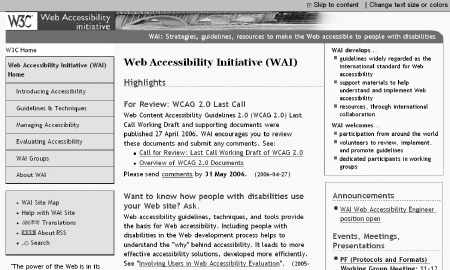
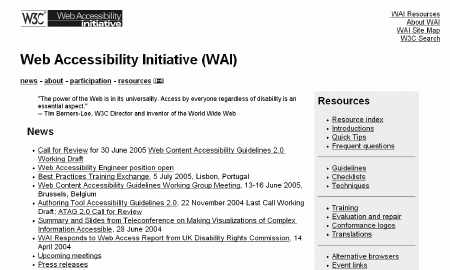
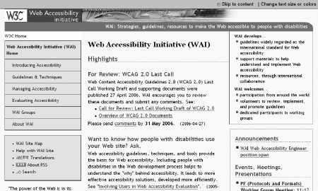
In the past, most sites that focused on web accessibility were dull and boring. But this was not because of the limitations of accessibility. It was primarily because the organizations providing these sites did not have the resources (skills or money) to spend on good design. They focused the limited resources on their main goal, such as providing information and services to people with a particular disability or developing guidelines for web accessibility. When people went looking for examples of accessible sites, all that they found were dull and boring. Unfortunately, the W3C WAI site was one of those. One of the premier web accessibility sites in the world was perpetuating this myth. We have fixed that. In 2005, WAI redesigned its website. Figure 1-19 shows the WAI homepage before redesign, and Figure 1-20 shows it after redesign.
As the lead on the redesign project, I will say that, unfortunately, it is not a shining example of visual design (we still have limited resources); however, it is no longer dull and boring. (And the information architecture, usability, and other aspects are top-notch.) Many other sites that focus on accessibility have also given their site a "face lift" recently and are now much more visually appealing.
Another problem that contributed to the dull-and-boring myth is that web developers misinterpreted accessibility requirements and guidelines as more restrictive than they actually are. People have misinterpreted that WCAG 1.0 says that you cannot use JavaScript and cannot open new browser windows. In fact, the guidelines say that web pages need to be accessible without scripts:
6.3 Ensure that pages are usable when scripts, applets, or other programmatic objects are turned off or not supported. If this is not possible, provide equivalent information on an alternative accessible page.
However, this doesn't prevent you from using scripts. It just means that you also need an alternative method to get the job done without scripts. For example, if you use client-side scripting for error checking, you should have backup server-side error checking for when scripting is not available. If you use scripting for things such as interactive navigation, you should make sure that users can get the navigation without scripting.
WCAG 1.0 Checkpoint 10.1 addresses opening new windows:
10.1 Until user agents allow users to turn off spawned windows, don't cause popups or other windows to appear and don't change the current window without informing the user.
The checkpoint doesn't say don't do it; the checkpoint says inform users if you're doing it. WCAG Checkpoint 10.1 is another good example of why not to start your accessibility work with guidelines or standards, and instead to start with understanding the issues. If you first learn about how people with disabilities use the Web, you'll see the problems that new windows and changes in windows can cause when users don't know about them. Also note this is a big problem for users without disabilities who are new to the Web, as described in "On Spawned Windows." We hope that with continuing education and with the rollout of WCAG 2.0, such harmful misinterpretations will dissolve.
Yet another major contributor to the dull-and-boring problem is that some "flashy" web technologies were developed without accessibility support. Web developers couldn't use these new, trendy technologies and make accessible sites without a lot of extra work to develop alternative versions. To fix this problem, we need to do the following:
- Understand that it's vital that web technologies support accessibility (as explained in the "Interdependent Components of Web Accessibility" section earlier in this chapter).
- Use technologies that support accessibility.
- Encourage those developing technologies to support accessibility.
All W3C technologies are now developed with accessibility support. Other technologies, such as Flash and PDF, have made significant progress toward accessibility support.
Perhaps the strongest reason for the dull-and-boring problem is more cultural. Websites and web designers are not judged on or rewarded for accessibility. From internal managers to external customers, people mostly have based their opinions of a site on the visual design, with no consideration for accessibility (or usability). Most web design competitions have not included accessibility as criteria. For example, in February 2006, I skimmed through the South by Southwest web awards finalists' sites, and the accessibility was abysmal. Most depressing were the accessibility problems in the CSS category that "showcases sites...with standards compliant and accessible code.
"
As a web culture, we need to shift the definition of "cool site" to include accessible. Managers need to include it in the criteria on which their web developers are judged, as do web design contests. As consumers, we can use accessibility as criteria for supporting sites, as discussed in the "Call to Action" section later in this chapter.
Developing and promoting more sites that are accessible and visually exciting will help dissolve the myth that accessibility makes sites dull and boring.
Myth: Accessibility Is Expensive and Hard
Certainly, web accessibility is not cheap and easy. However, it's not as expensive and hard as it often seems at first. When an organization gets started with web accessibility, much of the cost is up-front knowledge and skill acquisition. Accept this as an initial investment, and plan to help it pay off later.
The additional benefits of web accessibility can result in overall cost savings in the long term, and high return on investment from increased site use. Specific examples of financial and technical benefits are discussed in the "Additional Benefits from a Business Perspective" section later in this chapter.
If you are coming up against the expensive-and-hard myth in a particular case, figure out what's behind it. There could be a misunderstanding. For example, one reason people think web accessibility is expensive and hard is that they try to use screen readers. Screen readers are expensive and hard to learn to use. You can save some time, money, and hassle by doing the following:
A few aspects of accessibility, such as captions for multimedia, are costly, no matter how efficient your approach. But you can significantly decrease the cost of most aspects of web accessibility by following the suggestions earlier in this chapter:
- Start accessibility at the very beginning of a web development project.
- Start by understanding the issues, including the different components of web accessibility, then using "Understanding WCAG 2.0" to cover all the issues.
- Involve people with disabilities throughout.
- Prioritize by area and by barrier.
Finally, given that web accessibility is essential for equal opportunity for people with disabilities (and is required by law in some cases), not doing accessibility is expensive and hard in different ways.
Myth: Accessibility Is the Sole Responsibility of Web Developers
Web content developers will always have some responsibility for making their websites accessible. However, content developers currently have more work to do for accessibility than they should.
The "Interdependent Components of Web Accessibility" section earlier in this chapter describes multiple responsibilities for web accessibility. If the other components did a better job at accessibility, content developers would have an easier time of it. For example, authoring tools could make accessibility easier to implement, and if browsers had better and more consistent standards support (especially for CSS), content developers wouldn't waste so much time on browser-compatibility issues. The "Call to Action" section later in this chapter provides guidance on encouraging all components to do their part in web accessibility.
Myth: Accessibility Is for People Who Are Blind
A poorly developed website can have accessibility barriers for people with different disabilities, including visual, auditory, physical, speech, cognitive, and neurological. The examples of accessibility issues with different types of disabilities throughout this chapter illustrate different accessibility barriers.
Much of the work that you do in your accessibility efforts will be related to providing accessibility to people who are blind. Also, several "big names" have focused their accessibility studies and publications on people who are blind. Because of this focus on blindness, you might need to make a conscious effort to keep in mind accessibility issues of people with other disabilities.
One way to keep other disability issues in mind is using personas for people with different disabilities. For help developing personas, see "Accessibility in the Analysis Phase: Personas" and "How People with Disabilities Use the Web."
Myth: Evaluation Tools Can Determine Accessibility and Conformance to Standards
Web accessibility evaluation tools are software programs and online services that help determine if a website meets accessibility guidelines or standards. Evaluation tools are very helpful and can reduce the time and effort required to evaluate a website. However, no tool can determine that a site is accessible and meets accessibility guidelines. Knowledgeable human evaluation is required to determine if a site is accessible.
The most well-known accessibility evaluation is Bobby, which was developed by CAST, the Center for Applied Special Technology. (Old-timers might enjoy http://web.archive.org/web/20020805071053/bobby.cast.org/html/en/index.jsp). Watchfire purchased it in 2002 and integrated it into WebXACT.
There are different types of evaluation tools, as described in "Selecting Web Accessibility Evaluation Tools." For a comprehensive list of web accessibility evaluation tools, see "Web Accessibility Evaluation Tools: Overview," which is a searchable and sortable database of more than 100 tools.
Some tools check a website against a set of standards, such as WCAG 1.0 checkpoints. For some checkpoints, tools can determine automatically if the web page meets the checkpoint. For other checkpoints, tools cannot tell if the page meets the checkpoint, because the issue is not something that a computer can determine. Those checkpoints must be evaluated manually. Many tools provide help with those manual checks; however, human judgment is still required.
Webster's definition of "tool" as an "instrument used by a craftsman or laborer at his work" is useful in understanding the role of web accessibility evaluation tools. Rather than thinking of tools as a substitute for human evaluation, think of tools as an aid to human evaluation.
Consider spell checkers as an analogy for evaluation tools. Spell checkers identify possible spelling errors by evaluating against a set of known words. A human must then determine whether or not the word is indeed misspelled; correctly spelled proper names, technical terms, and such might not be in the spell checker's word list. The human must know the language, and if the document is about a subject with uncommon words (for example, with medical terms), the human evaluator must have some knowledge of the subject.
Similarly, web accessibility evaluation tools identify possible accessibility errors by evaluating web pages against a set of accessibility standards. A human must then determine whether the identified issue indeed doesn't meet standards and is an accessibility barrier. The human must have knowledge of accessibility issues and solutions. "Using Combined Expertise to Evaluate Web Accessibility" lists recommended knowledge for evaluating web accessibility: an understanding of web technologies, evaluation tools, barriers that people with disabilities experience, assistive technologies and approaches that people with disabilities use, and accessibility guidelines and techniques.
To carry the analogy further, spell checkers help fix spelling errors by providing a list of similar words. A knowledgeable human is required to pick the correct spelling or provide the correct spelling if it is not listed. Some evaluation tools help fix accessibility problems, and a knowledgeable human is required to implement the fix properly. A spell checker can have false positives and false negatives. For example, if I type "good text tool," when I meant to type "good test tool," the spell checker will not identify it as an error. Similarly, there are many errors that evaluation tools will not identify. For example, a tool that checks HTML and not CSS would miss absolute font sizes in CSS.
Checking alt-text for images is a good example of using web accessibility evaluation tools to increase efficiency and of the requirement for human judgment. To meet web accessibility standards and guidelines, images must have equivalent alt-text. Evaluation tools help in checking alt-text. Many tools list all images that are missing alt-text. Some tools flag suspicious alt-text. However, no tool can determine if the alt-text is equivalent as required for accessibility. Judging if the alt-text is equivalent requires human evaluation. Some tools help a human evaluator judge if alt-text is equivalent. For example, the WAVE tool displays the alt-text adjacent to the image so that you can see the image and the alt-text together in the context of the page. Some tools help fix missing or poor alt-text by providing a dialog box to enter the alt-text and then inserting the alttext in the markup.
alt-text is also a good example of the benefits of involving users in evaluation. Evaluation tools focus on assessing conformance to accessibility standards. With this focus on the technical aspects of accessibility, the human interaction aspect can be lost. Include people with disabilities in usability evaluation techniques to assess "usable accessibility" and make sure that your implementations of accessibility solutions are done well and are usable by people with disabilities. Usable accessibility is a term introduced in: "Another -ability: Accessibility Primer for Usability Specialists."
There are many benefits to including participants with disabilities in traditional usability testing. However, large-scale formal usability testing is not necessary to evaluate usable accessibility. Short, informal evaluation can gather valuable feedback from people with disabilities without the rigor of formal usability testing.
The "Involve People with Disabilities in Your Project" section earlier in this chapter provides some guidance on including users with disabilities in web development and evaluation. Additional guidance on including people with disabilities ("users") in accessibility evaluation throughout web development is available in "Involving Users in Web Accessibility Evaluation" and "Usability Testing for Accessibility." The latter is written for formal usability testing, yet much of the information also applies to including people with disabilities in informal evaluation focusing on accessibility issues.
Effective and efficient evaluation combines the following:
Myth: Guidelines Are Not Sufficient for Accessibility
A myth I've been hearing more often lately is that accessibility guidelines aren't sufficient to ensure that a website is accessible. I'm in the process of addressing this myth; see "Myth: Guidelines Aren't Sufficient for Accessibility".
Additional Benefits from a Business Perspective
The reason to make the Web accessible is equal access for people with disabilities, period. It is also useful to know the many additional benefits of web accessibility. It is often easier for organizations to allocate more resources to accessibility when they learn that it can increase their potential market, decrease maintenance efforts, and result in many other benefits.
While the primary focus of web accessibility is on access by people with disabilities, for a broader business perspective, you can say that accessibility is about designing your website so that more people can use it effectively in more situations.
Technical Benefits
Implementing web accessibility solutions in a website often results in improved technical performance. The importance of various technical benefits of web accessibility is different for specific organizations and situations. For example, reducing server load might be most important to an organization with a large, mission-critical, high-traffic site; whereas another organization that focuses on cutting-edge technology might be more interested in interoperability and being prepared for advanced web technologies. And these same technical benefits might not be very important for organizations with small, simple sites.
Accessibility is an aspect of high-quality websites. Some developers and organizations pride themselves on producing high-quality websites that meet technical standards. WCAG and other WAI guidelines are widely recognized international standards. Several resources online address the benefits of and business case for web standards in general; use a search engine with the search text "benefits web standards" for more information.
Reduced Site Development and Maintenance Time
Accessibility can reduce site development and maintenance time. Incorporating accessibility usually increases site development time initially. However, in the long term, web accessibility can reduce the time an organization spends on site development and maintenance.
Defining presentation through a style sheet and using proper markup (for example, in XHTML) for structure reduces time and effort needed to change presentation across a site. Presentation includes design and style, such as font size, font face, background color, and page layout. If the presentation is defined in an external style sheet, it can be changed throughout the site by making the modification to that one style sheet. However, if the presentation is improperly defined throughout the HTML, the presentation markup will need to be changed in every instance on every web page.
Using standard markup and style sheets to style and format text, instead of using bitmap images of text, reduces updating and, for sites in multiple languages, reduces translation time and skills. Site designers often use bitmap images for stylized text. In such cases, to change or translate text content or style, each image must be manipulated. If the text is not in an image, and the style is provided in a style sheet, then the text can be changed or translated without touching the image, and the style can be changed in the style sheet.
Reduced Server Load
Web accessibility techniques often reduce the server load, thus reducing the need for additional servers and increasing the download speed. Defining presentation in style sheets rather than in the markup of each page and using text rather than bitmap images of text reduces the size of each page served.
Improved Interoperability
Accessibility can help enable content on different configurations. Many organizations are increasingly interested in web interoperability and device independence—that is, developing websites that work with multiple technologies, devices, and so on. Web accessibility can enable web content to be rendered (displayed) and interacted with on various configurations, including different browsers, operating systems, and devices.
W3C technologies—such as Extensible Hypertext Markup Language (XHTML), Extensible Markup Language (XML), Resource Description Framework (RDF), Synchronized Multimedia Integration Language (SMIL), Cascading Style Sheets (CSS), Extensible Stylesheet Language (XSL), XSL Transformations (XSLT), and Portable Network Graphics (PNG)—were designed to support accessibility. Using current versions of W3C technologies should provide the best rendering across different configurations. Designing for device independence benefits some people with disabilities as well as people without disabilities using input devices other than keyboards, such as with phones and other handheld devices. Using markup for structure and style sheets for presentation allows users and user agents to request content in a way that suits their capabilities.
Preparation for Advanced Technologies
Web accessibility can help organizations take advantage of advanced web technologies and be prepared for future web technologies. Using metadata and representing it using RDF, as described in the "What is RDF?" section of "Frequently Asked Questions about RDF", allows content reuse. Defining presentation in a style sheet, using proper markup structure, and using the latest standards simplify forward migration and backward-compatibility.
Financial Benefits
An organization's efforts to make its website accessible often have a financial impact, and can result in positive return on investment and cost efficiencies. Benefits to organizations that provide accessible websites include financial benefits from increased website use and direct cost savings.
Search Engine Optimization
Making your site accessible can significantly improve search engine optimization (SEO). For some organizations, SEO is a big deal. In such cases, this additional benefit of accessibility is a good selling point if you need to make a business case for spending effort on accessibility.
Several accessibility techniques are exactly the same as SEO techniques—that is, employing accessibility techniques will most surely improve your web pages' ranking. Take, for example, Google's Webmaster Guidelines:
Following these guidelines will help Google find, index, and rank your site.
- Make sure that your
TITLE and ALT tags [sic] are descriptive and accurate.
- Try to use text instead of images to display important names, content, or links. The Google crawler doesn't recognize text contained in images.
- Check for...correct HTML.
- Make a site with clear...text links.
- Keep the links on a given page to a reasonable number (fewer than 100).
- Offer a site map to your users.
- Use a text browser such as Lynx to examine your site, because most search engine spiders see your site much as Lynx would. If fancy features such as JavaScript, cookies, session
IDs, frames, DHTML, or Flash keep you from seeing all of your site in a text browser, then search engine spiders may have trouble crawling your site.
All of these are accessibility guidelines and best practices. And there are other examples of accessibility techniques that improve SEO, such as text equivalents for multimedia. Just as search engines need alt-text for images, they need alternatives for multimedia. Providing a transcript with visual descriptions meets an accessibility requirement and makes the material available for search engines.
Headings are another overlap between optimizing for search engines and accessibility techniques. People with some types of cognitive disabilities greatly benefit from information grouped with clear headings. People who use screen readers benefit from the headings being properly marked up with heading tags (h1, h2, and so on). People who can see are able to visually skim through the headings on a page to get an overview of the content of the page. People who are blind and use a screen reader are not able to do this. Instead, they access the page one word at a time. When headings are properly marked up, screen reader users can also skim through the headings using a screen reader feature. If headings aren't marked up, users who are blind cannot use this feature.
To find several very good articles on the SEO benefits of accessibility, search the Web for "accessibility search engine."
Increased Website Use
A major benefit of web accessibility is the potential for direct and indirect financial gains from increased website use. Web accessibility can make it easier for people to find a website, access it, and use it successfully, thus resulting in more users and increased use.
Many organizations benefit financially when more people successfully use their website. For example, commercial companies can get more sales, educational institutions can get more students, and nonprofit organizations can get more funding by demonstrating successful outreach and dissemination. Increasingly, websites are used to cut costs by decreasing customer support services and letting customers complete transactions online, rather than requiring personnel and paper interactions. The many examples of cost savings from online transactions include citizens renewing licenses, investors trading stock, and students registering for classes online. Thus, more users using the site more often can result in financial gains and cost savings.
Accessible sites can be used by more people (as described earlier in the "Benefits for People Without Disabilities" section), thus increasing the market segments and number of people who can successfully use the site. An important potential market for many organizations is older people. In many countries, older people are the fastest growing group of new web users.
When web use is a significant part of a job, web pages and applications that are accessible to more people can help with employee recruiting and employee retention. Employees, customers, and other users who become temporarily or permanently disabled or impaired due to accident, illness, or aging are more likely to be able to continue using a website if it is accessible.
Accessible sites are generally more usable to everyone, including people with disabilities and people without disabilities. Increased usability means website users achieve their goals effectively, efficiently, and satisfactorily. When users have a positive experience with a website, they are more likely to use the site more thoroughly, return to the site more often, and tell others about the site (called viral marketing). Some accessibility guidelines can indirectly increase usability; for example, by making web pages load faster.
Some accessibility guidelines directly increase usability for all users, such as the following:
- Clear and consistent design, navigation, and links
- Blocks of information divided into groups
- Clear and simple language as appropriate
- Supplemental images and illustrations
- Good color contrast
An organization's efforts in web accessibility are a public relations opportunity to increase its positive image, which can increase website use. As mentioned earlier in the chapter, web accessibility is a social issue and an aspect of CSR. CSR has been shown to improve financial performance, enhance brand image and reputation, increase sales and customer loyalty, increase ability to attract and retain employees, and provide access to capital and funding. To find CSR information such as statistics that show how it impacts customers, search the Web for "corporate social responsibility" and "corporate citizenship."
Direct Cost Savings
In addition to the benefits from increased website use, many organizations realize direct cost savings from efforts to improve web accessibility. Many of the aspects of web accessibility that are discussed earlier in the section about the technical benefits can provide direct cost savings:
- Decreases personnel costs for maintaining the site when accessibility reduces site maintenance over the long term
- Decreases the amount of server capacity needed and saves on additional server costs when accessibility reduces server loading
- Decreases the need for creating multiple versions of a site for different devices when accessibility enables content to work on different devices
- Decreases the cost of upgrading to new technologies when accessibility helps take advantage of advanced web technologies and being prepared for future web technologies
Potential direct cost savings also result from decreasing the potential for high legal expenses, decreasing the cost of alternative format materials, and decreasing the cost of translating. Ensuring that websites are accessible reduces the risk of high legal costs associated with defending against legal action for not complying with web accessibility requirements.
For organizations that provide printed materials in alternate formats (large print, embossed Braille, and computer disk), an accessible website can reduce the demand for alternate formats when people choose to use the Web, thus saving some production and distribution costs. The cost of translating a website to other languages can be decreased by following accessibility guidelines for the following:
- Clear and simple language as appropriate
- Clear and consistent design, navigation, and links
- Separating content from presentation
- Text and markup rather than bitmap images of text to convey information
The Business Case for Web Accessibility
For more details on the technical and financial benefits of web accessibility, see "Developing a Web Accessibility Business Case for Your Organization." It is designed to help develop a customized business case for web accessibility for a specific organization, and presents many different aspects of web accessibility, along with guidance on incorporating these aspects into a specific organization's business case.
Call to Action
Incorporating accessibility is an act of enlightened self-interest, both for organizations and individuals. If individuals and organizations are aware of the benefits of accessibility (they are "enlightened"), they will address accessibility issues in order to benefit themselves as well as others. Most people will experience temporary or permanent disability in their lifetime, and will benefit from technology that is accessible. While some people are born with a disability, others acquire disabilities from accident, illness, disease, or aging. The point is that even if you don't have a disability now, you very well could acquire one at any time.
For many people, understanding that accessibility is the right thing to do is motivation enough. Most who know people with disabilities or have included people with disabilities in their development process, and have witnessed firsthand the failures of inaccessible sites and the successes of accessible sites, are passionate about accessibility. If you understand the social inequality that results from an inaccessible web, and the power of an accessible web for people with disabilities, you will want to do your part for web accessibility.
Perhaps the most influential thing that you can do is foster a positive attitude about accessibility.
A few years ago, I consulted with a company that approached accessibility as a frustrating, burdensome legal requirement. The developers were only trying to tick off a checklist with as little effort as possible, and with that approach, they wasted a lot of effort trying to get around accessibility and developing ineffective solutions that had to be redone. It was no fun for anyone. Another company I consulted with at the time had a totally different approach to accessibility. The management saw accessibility as a market differentiator that would put the company above its competition. The developers took on challenging issues like engineers with a puzzle. They almost welcomed finding difficult accessibility problems because they loved coming up with innovative solutions. They also had a couple of people with disabilities come into the office periodically to help them understand the issues and test potential solutions. It was an exciting project for everyone involved.
These examples illustrate the importance of attitude. Embrace accessibility as a rewarding challenge.
If you've already had some success with web accessibility, you can help foster a positive attitude throughout the web development community by sharing success stories. This will also help others who are trying to get support for accessibility in their projects. We need more data or even empirical evidence of how improving accessibility of a website (Internet or intranet) resulted in improved SEO, increased business, decreased maintenance, and other benefits. Write a conference paper or a web article, or post to a web accessibility list (such as the WAI Interest Group and WebAIM) telling of the additional benefits that your organization realized. (You can also get some marketing value out of this for your own organization.)
Another way to mutually benefit yourself, your organization, and web accessibility in general is to encourage accessibility improvements in the different components (browsers, authoring tools, and so on). Earlier in this chapter, I talked about the chicken-and-egg issue of which component implements an accessibility feature first. Encourage each to go first in order to prompt others. When accessibility features are effectively implemented in one component, the other components are more likely to implement them:
- When web browsers, media players, assistive technologies, and other user agents support an accessibility feature, users are more likely to demand it and developers are more likely to implement it in their websites.
- When developers want to implement an accessibility feature, they are more likely to demand that their authoring tool make it easy.
- When authoring tools make a feature easy to implement, developers are more likely to do it.
- When an accessibility feature is implemented in most websites, developers and users are more likely to demand that browsers and other user agents support it.
As the customers for authoring tools, web developers have particular clout to encourage authoring tool developers to make their tools accessible. Send e-mail saying that accessibility support and conformance to ATAG will be criteria in your future authoring tool purchasing. Provide feedback on specific accessibility improvements you would like implemented in their future releases.
You don't have to be directly involved in web development to help make the Web more accessible. Anyone can contribute by communicating to others the importance and benefits of web accessibility. Encourage sites to be accessible. Send e-mail messages (and letters and phone calls) to sales, marketing, customer service, and web development departments, asking them to improve the accessibility of their website. Point them to resources to learn more about accessibility. Explain how the accessibility barriers on their site affect people with disabilities.
Please use a positive, encouraging approach, rather than an attacking, threatening, or otherwise negative approach. While you may feel negative, that approach is not the best way to get accessibility. I've seen organizations make some accessibility improvements in their sites and get harshly criticized because they didn't do it well enough. One manager said with exasperation, "Why even try? We get attacked when we're doing the best we can."
When you approach organizations, I think it's best to assume that they don't understand accessibility, rather than as if they are purposely excluding people with disabilities. What's usually needed is education and encouragement, not criticism. Certainly, there is a time for different approaches, but they should be a last resort after you've tried more cooperative approaches.
Reward accessible sites by giving them your business and telling others about them. Send an e-mail message saying that you appreciate that they've made their site accessible. This will help them know the benefits of their accessibility efforts, and can help them budget for additional accessibility enhancements in the future.
Be an accessibility evangelist.
Summary
This chapter addressed key issues in understanding web accessibility, including its essential role in equal opportunity for people with disabilities, additional benefits to others and to organizations, interdependent components, approaching web accessibility by including people with disabilities throughout development, and myths surrounding web accessibility. For updates to this chapter, see www.uiaccess.com/understanding.html.
Some of the information in this chapter was developed through the W3C WAI, and the Education and Outreach Working Group in the following documents. Check the latest online version of these resources for additional and updated information.
- Introduction to Web Accessibility, S.L. Henry, ed.
- Essential Components of Web Accessibility, S.L. Henry, ed.
- How People with Disabilities Use the Web [Draft], J. Brewer, ed.
- Developing a Web Accessibility Business Case for Your Organization, S.L. Henry, ed.
- Improving the Accessibility of Your Web Site, S.L. Henry, ed. ("Prioritizing the Repairs" section at www.w3.org/WAI/impl/improving#prior)
- Web Content Accessibility Guidelines (WCAG) documents
- Web Content Accessibility Guidelines (WCAG) Overview, S.L. Henry, ed.
- Web Content Accessibility Guidelines 1.0, W. Chisholm, G. Vanderheiden, I. Jacobs, eds.
- Overview of WCAG 2.0 Documents, S.L. Henry, ed.
- Web Content Accessibility Guidelines 2.0, B. Caldwell, W. Chisholm, J. Slatin, G. Vanderheiden, eds.
- About Baselines and WCAG 2.0, D. MacDonald, J. Slatin, G. Vanderheiden, eds.
- Authoring Tool Accessibility Guidelines (ATAG) documents
- Authoring Tool Accessibility Guidelines (ATAG) Overview, S.L. Henry, ed.
- Authoring Tool Accessibility Guidelines 1.0, J. Treviranus, C. McCathieNevile, I. Jacobs, J. Richards, eds.
- Authoring Tool Accessibility Guidelines 2.0, J. Treviranus, J. Richards, M. Matt, eds.
- Selecting and Using Authoring Tools for Web Accessibility, J. Brewer, ed.
- User Agent Accessibility Guidelines (UAAG) documents
- Web accessibility evaluation documents
- Evaluating Web Sites for Accessibility: Overview, S. Abou-Zahra, ed.
- Preliminary Review of Web Sites for Accessibility, S. Abou-Zahra, ed.
- Involving Users in Web Accessibility Evaluation, S.L. Henry, ed.
- Using Combined Expertise to Evaluate Web Accessibility, J. Brewer, ed.
- Selecting Web Accessibility Evaluation Tools, S. Abou-Zahra, ed.
- Web Accessibility Evaluation Tools, S. Abou-Zahra, ed.
- Basic Glossary for WAI Documents, H. Snetselaar, S.L. Henry, eds.
References from other than W3C include the following:
- Accessibility in the User-Centered Design Process, S.L. Henry and M. Grossnickle, Georgia Tech Research Corporation, Inc, 2004
- Interdependent Components of Web Accessibility, W. Chisholm and S.L. Henry, Proceedings of the 2005 International Cross-Disciplinary Workshop on Web Accessibility (W4A), 2005, ISBN:1-59593-219-4
- Introduction to the Screen Reader video, University of Wisconsin-Madison
- Another -ability: Accessibility Primer for Usability Specialists, S.L. Henry, Proceedings of UPA 2002 (Usability Professionals' Association annual conference)
- The Relationship Between Accessibility and Usability, S.L. Henry
- Myth: Guidelines aren't sufficient for accessibility, S.L. Henry
- On Spawned Windows, S.L. Henry
- Web Accessibility Evaluation Tools Need People, S.L. Henry
- Web Accessibility and Older People, S.L. Henry
There are now many good resources on accessibility—too many to list here. And if I listed some, it would be bad not to list others. So I've (mostly) listed only those from WAI or that I wrote elsewhere. Of course, the remainder of this book covers details on many of the issues introduced in this chapter.
