CAPTCHAs, CAPTCHAs everywhere (Posted March 2, 2009)
The whole CAPTCHA issue is a can of worms. They are appearing more frequently by the day, whether to sign up for email accounts or to play games. To avoid spam (they assert) some have added CAPTCHAs to the process of commenting on Blog entries. The letters stand for "Completely Automated Public Turing test to tell Computers and Humans Apart". The name was coined by folks at Carnegie Mellon University in 2000. The basic idea goes back to Alan Turing which revolves around the idea of distinguishing a human from a computer. The idea of CAPTCHAs as they are used today simple enough. Here are some samples and some complaints.
A Yahoo CAPTCHA
For example (this is just one kind of CAPTCHA) the user is presented with an image like the one in the screen shot below from a Yahoo page where you sign up for an email account.

The "solution" for the individual is to just enter the letters in the available text entry field.
My business and passion is accessibility and there is obviously a huge problem with these visual CAPTCHAs. If you used alt-text on this image, alt="e3TJ6Jdp", that would be fine and very welcome for blind visitors. It would also be welcome for any computer system seeking to sign up for lots of emails. Using alt-text on the image does not solve the problem! The visual image CAPTCHA is fundamentally inaccessible. For the example above, this means very simply that Yahoo excludes people who are blind (or vision impaired) from signing up for Yahoo email accounts.
reCAPTCHA from Carnegie Mellon
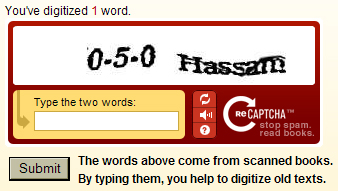
I really like the idea of reCAPTCHA, from Carnegie Mellon where the word "CAPTCHA" was coined in the first place. A screen shot of a sample from the reCAPTCHA site is shown below.

The reCAPTCHA interface displays two distorted words, a text entry field, some branding and three icons, whose alt-text is "Get a new Challenge", "Get an Audio Challenge" and "Help". More about those icons in a minute. What is presented is two words, one of which is really your challenge and you are performing a service by identifying the other. During The digitizing books project at Carnegie Mellon there are words that the character recognition programs can't figure out. One of these words is paired with your challenge word. You don't know which is which. You actually only have to get one right. In the example above, which looks like "0-5-0 Hassam", I used "xxx Hassam" and it was declared correct. Sometimes it is not so obvious which is the real key. Now, you mighty ask, if that entry is acceptable what good is this for digitizing? The answer is that the Carnegie Mellon computer scientists are pretty smart and they will repeat the word that needs to be solved for the digitization project on many reCAPTCHA problems so as to be able to analyze the responses; my "xxx" will be discarded because there was only one of like that!
I said I would get back to the icons. They are all important, but the most important one is the "Get an Audio Challenge" icon. So what happens here if you click on the Get an Audio Challenge icon - is that some sounds are played and you must enter the information you hear in the text entry field so that this CAPTCHA can be solved by someone who is blind in principal. But ... the icons are a huge problem. These icons are not in the tab order. You cannot activate any of those icons from the keyboard. This is almost as fundamentally inaccessible as the CAPTCHA itself. There is no good reason for this and no excuse for not having the icons accessible from the keyboard.
I complained about this to Carnegie Mellon about two years ago. Their inane response was that reCAPTCHA had to be
accessible to everyone! No one should use this technology until they make
it accessible from the keyboard. This is especially tragic, because they have another innovation. Instead of
incredibly distorted letters or numbers (more later) they use a phrase in text for the audio challenge. For example,
one I just entered was "all three of these guys traveling under assumed names." I could not have
done it with JAWS running because the audio starts immediately while the screen reader makes announcements including
the focus change to the entry field with the label "Type
the two words Type what you Hear." By the time JAWS was done speaking for me (granted speech rate for me is slow!),
the audio challenge was complete. The audio challenge is not repeated. There is a play button to repeat it! That
button is not accessible either and if you could find it, you would still need to find your way back to the text
entry field to enter the words - while the words are being spoken - or later I guess. So, reCAPTCHA is fundamentally
inaccessible too.
The AOL CAPTCHA
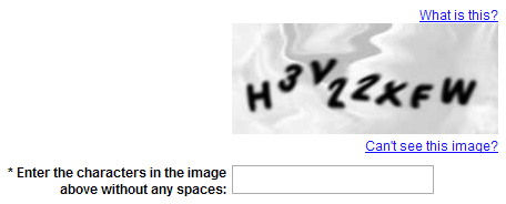
The folks at AOL have worked very hard to make their CAPTCHA as accessible as possible while still providing the security to guard against spammers signing up for thousands of emails. The AOL CAPTCHA is the first instance that I found where a serious (and successful) effort was made to address the tricky problem of a user interface for blind visitors to hear an audio CAPTCHA and enter the results. The visual version of the AOL CAPTCHA is in screen shot below.

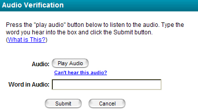
There is a link just before the entry field, "Can't see this image?" If you follow that link a new window opens as shown in the following screen shot.

On this page there is a "What is this?" link, a "Play Audio" button, the text entry field and then two additional buttons, "Submit" and "Cancel." When you tab to the "Play Audio" button and press enter the sound begins with 3 beeps - about 3 seconds worth - which gives a screen reader adequate time to announce the automatic focus change and be quiet for the letters and numbers of the challenge. And quiet it must be because those letters and numbers are very hard to hear with lots of background talking and noise. It is possible and AOL has done as much as I would have imagined to make the interface accessible - this is a huge part of making CAPTCHAs accessible - because the recordings are so garbled, the user interface must be near prefect so as to not add to an already nearly impossible task.
Of course there is a very good reason for the speech being garbled. It is the same reason that the words are "garbled" for the visual CAPTCHA. You don't want those who would hack into your system to be able to use speech recognition to decode the audio CAPTCHA - thus the distortion. However, I am absolutely convinced that the audio distortion is much much worse than the visual distortion. I believe I can succeed on the first try for about 95% of the visual CAPTCHAs and fail 95% of the time for the Audio CAPTCHAs (percentages not scientific). When I first posted this article, I forgot to write about the reason for the audio distortion - which I had planned to do - until Peter Krantz contacted me. Peter reported that he had proposed an audio alternative in 2005 but that it seemed that the audio distortion had to be so complete that the result is recognizable by neither human nor machine. Could it possibly be that speech recognition is better - more accurate - than character recognition?
A Google CAPTCHA
Google also has simple interface to provide an audio CAPTCHA.

The interface is quite simple - there is the image of distorted characters, the text entry field and a disabilities icon (wheelchair). The alt-text on the icon is "listen and type the numbers you hear." When you activate that icon, focus automatically moves back to the input field. Like AOL, there is a pause, then a couple of beeps, to allow the screen reader to finish speaking. Then the garbled numbers are spoken mixed with background speech characters and noise. The sequence is repeated a second time which is an easy and very helpful addition.
An evaluation of CAPTCHA's and a really new idea
Two students at the Computer Science Department of University of Washington, Seattle, have written a fascinating paper about providing an alternative user interface for audio CAPTCHAs - even for existing ones, Evaluating Existing Audio CAPTCHAs and an interface Optimized for Non-Visual Use. Though they don't acknowledge other's efforts at improving the user interface for blind users, their idea goes one giant step further in making the interface accessible. In particular they have a script that adds functionality to the input field itself, allowing play, pause, and rewind while staying on the input field. These functions are activated by characters not included in CAPTCHAs - so far.
Alternatives to visual and audio CAPTCHAs
Lainey Feingold is a disability rights lawyer who works through structured negotiations in an effort to make things more accessible for people with disabilities, especially those who are blind. She has reached a number of important agreements with major corporations and organizations dealing web sites and point of sale devices. And a couple of those negotiations that involved CAPTCHAs. One of those was Rite Aid. You can experience that CAPTCHA by going to log in screen, then following the "Forgot your userid or password" link. There you will see the CAPTCHA. You will be impressed.
An alternative that is neither an audio or visual challenge
AnnualCreditReport.com, has a CAPTCHA protecting the next step of registration. Just get to the form (https://www.annualcreditreport.com/cra/index.jsp) after entering state - you don't have to fill in any information and you will see the CAPTCHA - there is a 6 digit number there - you call an 800 number, enter the 6 digit number you found on the page and the voice response system will give you another 6 digit number which you enter in the text entry field.